Monday, February 15, 2021

Management degrees - how I went from a C to an A: buzzword bingo

How to do well on a management degree

I'm having a spring clean, I'm scanning old documents and throwing away the paper copies. It's a trip down memory lane as I'm reviewing old management essays and course notes. The management degree I did was part-time in the evenings and I did it over several years as well as doing a full-time job, so my notes built up over time and there's a lot to scan. Looking over it all, here's my guide to doing well on essays in a management master's degree program.

Sever Hall, Harvard
(A classroom in Sever Hall. I had several lectures in rooms just like this. Image source: Wikimedia Commons, License: Creative Commons, Author: Ario Barzan)

Why I did badly at first

I had been in the technology industry for a long time before I took management classes. I was used to coding and writing technical documentation and I'd become stuck in my ways. The thing about most technical documents is that no one reads them, and very rarely do you get feedback on your writing style. In the few years before I began the classes, I'd started to do more marketing work, and I found it challenging - for the first time, I was getting negative feedback on how I was writing, so I knew I had a problem.

My first course was accounting, which I did very well in. But of course I did well, accounting is another technical discipline. It's like coding, but with different rules and the added threat of lawsuits and jail time.

The second course I did was an HR course and we used the case study method in class. I was gung-ho for my first essay and I was convinced I was going to get a great mark for it. I got a C.

I did what every bad student does when they get a bad grade: I blamed the lecturer. Then I stopped and gave myself a talking to. I was determined to do better.

I did badly for two reasons:

  • A stilted, over-technical writing style.
  • I didn't understand what the lecturer wanted. The goal was to show that I had absorbed the terminology of HR and could appropriately apply it. The goal was not to solve the business problem. In my essay, I focused on solving the business problem and I didn't mention enough of the HR concepts we covered in class.

How I did well

The first order of business was fixing my writing style. I had a short period between essays, but fortunately, it was long enough to do some work. I did crash reading on how to write better in general and how to write better essays. Unashamedly, I went back to basics and read guides for undergraduates and even high school students.  I talked to other students online about writing. I realized I had some grammar and style issues, but I also knew I couldn't fix them all in one go, so I focused on the worst problems first. 

Next was understanding what the lecturer wanted. Once I understood that the essay was a means of checking my understanding of concepts, I had a clean way forward: buzzword bingo. Prior to beginning any essay, I made a list of all the relevant concepts we'd covered in class, and I added some that weren't covered but I'd found through reading around. My goal was to ensure that I applied every concept to the case study and make it clear I'd done so. The essays were a vehicle to show understanding of concepts.

The third step was a better essay plan. I figured out how I would apply my buzzwords to the case study and built my work into a narrative. I made sure that the logical steps made sense from one concept to another and I made sure to link ideas. Every essay has a maximum word (or page) count, so I developed a word budget for each idea, making sure the most important ideas got the most words. This also helps with a perennial student problem, spending too many words on the introduction and conclusion. The word budget idea was the biggest step forward for me, it made sure I focused my thoughts and it always led to my essays being too long. In the editing process, I chopped down the introduction and conclusion and removed extraneous words, I also cut down on the use of the passive voice, which is a real word hog.

My essay process

Buzzword bingo. Make a list of every concept you think is relevant to the case study, making sure to use the correct terminology. This list must cover everything mentioned in class but it also must cover ideas not mentioned in class, you have to go above and beyond.

Weighting buzzwords. Which concepts are more important? More important concepts get a higher word count, but you have to know what's more important.

What's the question? What precisely are the instructions for the essay? Make sure you follow the rules exactly. If necessary, make a tick list for the essay.

Word budget. You have a word count, now allocate the word count in proportion to the importance of the ideas, including the introduction and conclusion.

Link ideas. What ideas go together? If there are multiple linkages, what are the most important ones?

Essay plan. Plan the essay paragraph-by-paragraph and allocate a word budget for each paragraph.

Write the essay.

First-pass revision.  Are you under the word count? If so, you missed something. Does the written essay change your understanding of the problem? If so, re-allocate your word budget. Do you need to change the order of paragraphs or sentences for the narrative to make sense?

Rest. Leave the essay alone for a few days. You need some distance to critique it more.

Second-pass revision. Remove the passive voice as much as possible. Check for word repetition. Check the introduction and conclusion make sense and are coherent.

Rest. Leave the essay alone for a few days. You need some distance to critique it more.

Third pass revision. Have you missed any concepts? Does the essay hang together? Does it meet the instructions precisely?

Allocate plenty of time. This is a painstaking process. You can't do it at the last minute and you can't compress the timescales by doing it all in a day, you need time for reflection. You have to start work on your essay as soon as it's set. Realistically, this is at least two weeks of work.

What happened?

For the next essay, I got an A- and it went up from there. In pretty much every course I did after that, I got an A for my essays.

The degree program offered a writing module, which I took. Prior to the writing course, I read every writing book I could get my hands on, including many grammar books (most of which I didn't understand). Part of the writing course was writing an article for publication and I actually managed to get an article published in a magazine. The editor made minimal changes to my text, which was immensely satisfying. Bottom line: I fixed my writing problem.

Did my approach to essay writing help me learn? Yes, but only marginally so. It did result in a huge boost to my grades though, and that's the main thing. It taught me a lesson in humility too - just because you're an expert in one thing doesn't make you an expert in everything.

Of course, I did get my degree and I did graduate, I was on the Dean's list and I was the commencement speaker for my class. I got there partly because of a better approach to essay writing, and you can too.

Monday, February 8, 2021

Frequency hopping and the most beautiful woman in the world

Spread spectrum

Modern digital wireless systems rely on spread spectrum techniques. The story of how the most obvious of them, frequency hopping, was invented is not what you think. It involves a beautiful Hollywood actress (possibly the most beautiful ever), a music composer, and a dinner party. Let me tell you the story.

(The most beautiful girl in the world, and the inventor of modern communications.  Image source: Wikimedia Commons, License: Public Domain)

Hedy Lamar

This woman lived an incredible life, if you get the time, read some of her life story. I'm just going to summarize it here.

Hedy was born Eva Maria Kiesler in 1914, in Vienna. Her parents were both Jewish, which was to play a part in this story. Her father was an inventor, which was also to be important. 

She got her first film role in 1930, and her first starring role in 1932. However, her big break came in 1933 with the notorious movie Ecstasy. I've heard the movie described as soft porn and it has a number of notable cinematic firsts - even today, it's NSFW so don't look for it from your work computer. 

In 1933, Hedy married Friedrich Mandl, an arms dealer with strong connections to the Nazis and the Italian fascists. Mandl was controlling and domineering. By 1937, Hedy knew she had to escape, so she left Austria and headed for the United States via London. Of course, she headed for Hollywood.

In Hollywood, she appeared in a number of films, some very successful, others not so much. The studios labeled her 'the most beautiful girl in the world' and marketed movies based on her beauty. She also actively and successfully raised millions for the war effort.

George Antheil

George was born in Trenton, New Jersey in 1900 to German parents and grew up bilingual. As a musician, he was strongly influenced by the emerging avant-garde music coming out of Europe, in particular, 'mechanical' music. He wrote music for piano, films, and ballets.

The dinner party and the piano roll

Hedy and George met at a Hollywood dinner party. They talked about the problem of radio-controlled torpedoes. Although a good idea, the controlling radio signals could easily be intercepted and jammed, or even worse, the torpedo could be redirected. What was needed was some way of controlling a torpedo by radio that could not be jammed.

George knew about automatic piano players, Hedy knew about torpedoes from her ex-husband. Together, they came up with the idea of a radio control where the radio frequency changed very rapidly; so rapidly, a human trying to jam the signal couldn't do it because they wouldn't be able to keep up with the frequency changes.  Here's a fictitious timeline example:

  • 1.2s - transmitter transmits at 27.2 MHz, receiver receives at 27.2 MHz
  • 1.3s - transmitter transmits at 26.9 MHz, receiver receives at 26.9 MHz
  • 1.4s - transmitter transmits at 27.5 MHz, receiver receives at 27.5 MHz
  • etc.
(A piano roll for automatically playing the piano. Image source: Wikimedia Commons, License: Creative Commons, Author: Draconichiaro)

To keep the transmitter and receiver in sync, you could use the same technology that powers automatic piano players. In an automatic piano player, a perforated roll is fed through a reader, which in turn presses the appropriate key. The perforated roll is a list of which keys to press and when. 

In the torpedo case, instead of which keys to press, the piano roll could instruct the transmitter or receiver which frequency to use and when. The same piano roll would be inserted into the torpedo and controller and both roll readers would be synchronized. After the torpedo was launched, the controlling frequency would change dependent on the roll, and the transmitter and receiver would stay in sync so long as the piano roll readers stayed in sync. 

Using a mechanism like this, the controlling frequency would change, or hop, from one frequency to another, hence the name 'frequency hopping'. Frequency hopping takes up more radio spectrum than just transmitting on one frequency would, hence the more general name 'spread spectrum'.

Hedy and George patented the idea and you can read their patent here.

Although Hedy and George thought of torpedoes as their application, there's no reason why you couldn't use the same idea for more secure voice communications.

What happened next

The patent sat in obscurity for years. The idea was way ahead of the technology needed to implement it, so it expired before anyone used it. Hedy and George made no money from it.

By the 1960s, the technology did exist, and it was used by the US military for both voice communications and guided munitions. Notably, they used it in the disastrous Bay of Pigs Invasion and later in Vietnam.

Moving forwards to the end of the twentieth century, the technique was used in early WiFi versions and other commercial radio standards, for example, Bluetooth.

Frequency hopping isn't the only spread spectrum technology, it's the simplest (and first) of several that are out there. Interestingly, some of them make use of pure math methods developed over a hundred years ago. In any case, spread spectrum methods are at the heart of pretty much all but the most trivial wireless communication protocols.

Hedy and George lived out their lives and things continued for them as they had before.
George continued to write music and opera until his death at the age of 58.

Hedy's career had ups and downs. She had huge success in the 1940s, but by the 1950s, her star had waned considerably. She filmed her last role in 1958 and retired, spending much of the rest of her life in seclusion. She died at age 85.

When I first started to work in the radio communications industry, the Hedy Lamar story was known, but it was considered a bit of a joke. I'm pleased that over the last few years, her contribution has been re-assessed upwards. In 2014, she was inducted into the US National Inventors Hall of Fame - it would have been nice had this been done in her lifetime, but still, better late than never.

If you liked this post you might also like

Monday, February 1, 2021

What do Presidential approval polls really tell us?

This is a technical piece about the meaning of a type of polling. It is not political in favor of or against President Trump. I will remove any political comments.

What are presidential approval polls?

Presidential approval polls are a simple concept to grasp: do you approve or disapprove of President X? Because newspapers and TV channels can always use them for a headline or an on air-segment, they love to commission them. During President Trump's presidency, I counted 16,500 published approval polls.

But what do these polls mean and how should we interpret them? As it turns out, understanding what they're telling us is slippery. I'm going to offer you my guide for understanding what they mean.

(Image source: Wikimedia Commons. License: Public domain.)

My data comes from the ever-wonderful 538 which has a page showing the approval ratings for President Trump. Not only can you download the data from the page, but you can also compare President Trump's approval ratings with many previous presidents' approval ratings.

Example approval results

On 2020-10-29, Fox News ran an approval poll for President Trump. Of the 1,246 people surveyed:

  • 46% approved of President Trump
  • 54% disapproved of President Trump

which seems fairly conclusive that the majority disapproves. But not so fast. On the same day, Rasmussen Reports/Pulse Opinion Research also ran an approval poll, this time of 1,500 people, their results were:

  • 51% approved of President Trump
  • 48% disapproved of President Trump.

These were both fairly large surveys. How could they be so different?

Actually, it gets worse because these other surveys were taken on the same day too:

  • Gravis Marketing, 1,281 respondents, 52% approve, 47% disapprove
  • Morning Consult, 31,920 respondents, 42% approve, 53% disapprove

Let's plot out the data and see what the spread is, but as with everything with polls, this is harder than it seems.

Plotting approval and disapproval over time

Plotting out the results of approval polls seems simple, the x-axis is the day of the poll and the y-axis is the approval or disapproval percentage. But polls are typically conducted over several days and there's uncertainty in the results. 

To take a typical example, Global Marketing Research Services conducted a poll over three days 2020-10-23 to 2020-10-27. It's misleading to just plot the last day of the poll; we should plot the results over all the days the poll was conducted. 

The actual approval or disapproval number is subject to sampling error. If we assume random sampling (I'm going to come back to this later), we can work out the uncertainty in the results, more formally, we can work out a confidence interval. Here's how this works out in practice. YouGov did a poll over three days (2020-10-25 to 2020-10-27) and recorded 42% approval and 56% disapproval for 1,365 respondents. Using some math I won't explain here, we can write these results as:

  • 2020-10-25, approval 42 ± 2.6%, disapproval 56 ± 2.6%, undecided 2 ± 0.7%
  • 2020-10-26, approval 42 ± 2.6%, disapproval 56 ± 2.6%, undecided 2 ± 0.7%
  • 2020-10-27, approval 42 ± 2.6%, disapproval 56 ± 2.6%, undecided 2 ± 0.7%

We can plot this poll result like this:

Before we get to the plot of all approval ratings, let's do one last thing. If you're plotting large amounts of data, it's helpful to set a transparency level for the points you're plotting (often called alpha). There are 16,500 polls and we'll be plotting approve, disapprove, and undecided, which is a lot of data. By setting the transparency level appropriately, the plot will have the property where the more intense the color is, the more the poll results overlap. With this addition, let's see the plot of approval, disapproval, and undecided over time.

Wow. There's quite a lot going on here. It's hard to get a sense of changes over time. I've added a trend line for approval, disapproval, and undecided so you can get a better sense of the aggregate behavior of the data.

Variation between pollsters

There's wide variation between opinion pollsters. I've picked out just two, Rasmussen Reports/Pulse Opinion Research and Morning Consult. To see the variation more clearly, I'll just show approvals for President Trump and just show these two pollsters and the average for all polls.

To state the obvious, the difference is huge and way above random sampling error. Who's right, Rasmussen Reports or Morning Consult? How can we tell?

To understand what this chart means, we have to know a little bit more about how these polls are conducted.

How might you run an approval poll?

There are two types of approval polls.

  • One-off polls. You select your sample of subjects and ask them your questions. You only do it once.
  • Tracking polls. Technically, this is also called a longitudinal study. You select your population sample and ask them questions. You then ask the same group the same questions at a later date. The idea is, you can see how opinions change over time using the same group.

Different polling organizations use different methods for population sampling. It's almost never entirely random sampling. Bear in mind, subjects can say no to being involved, and can in principle drop out any time they choose. 

It's very, very easy to introduce bias by the people you select, slight differences in selection may give big differences in results. Let's say you're trying to measure President Trump's approval. Some people will approve of everything he does while others will disapprove of everything he does. There's very little point in measuring how either of these groups approves or disapproves over time. If your group includes a big measure of either of these groups, you're not going to see much variation. However, are you selecting for population representation or selecting to measure change over time? 

For these reasons, the sampling error in the polls is likely to be larger than random sampling error alone and may have different characteristics.

How accurate are approval polls?

This is the big question. For polls related to voting intention, you can compare what the polls said and the election result. But there's no such moment of truth for approval polls. I might disapprove of a President, but vote for them anyway (because of party affiliations or because I hate the other candidate more), so election results are a poor indicator of success.

One measure of accuracy might be agreement among approval polls from a number of organizations, but it's possible that the other pollsters could be wrong too. There's a polling industry problem called herding which has been a big issue in UK political polls. Herding means pollsters choose methodologies similar to other pollsters to avoid being outliers, which leads to polling results from different pollsters herding together. In a couple of notorious cases in the UK, they herded together and herded wrongly. A poll's similarity to other polls does not mean it's more accurate.

What about averaging?

What about aggregating polls? Even this isn't simple. In your aggregation:

  • Do you include tracking polls or all polls?
  • Do you weight polls by their size?
  • Do you weight polls by accuracy or partisan bias?
  • Do you remove 'don't knows'?
  • If a poll took place over more than one day, do you average results over each day the poll took place?

I'm sure you could add your own factors. The bottom line is, even aggregation isn't straightforward.

What all this means

Is Rasmussen Reports more accurate than Morning Consult? I can't say. There is no external source of truth for measuring who's more correct.

Even worse, we can see changes in the Rasmussen Reports approval that don't occur in the Morning Consult data (and vice versa). Was the effect Rasmussen Reports saw real and Morning Consult missed it, or was Morning Consult correct? I can't say.

It's not just these two pollsters. The Pew Research Center claims their data, showing a decline in President's Trump approval rating at the end of his presidency, is real. This may well be correct, but what external sources can we use to say for sure?

What can I conclude for President Trump's approval rating?

Here's my takeaway story after all this. 

President Trump had an approval rating above 50% from most polling organizations when he took office. Most, but not all, polling organizations reported a drop below 50% soon after the start of his presidency. After that, his approval ratings stayed pretty flat throughout his entire presidency, except for a drop at the very end. 

The remarkable story is how steady his approval ratings were. For most presidents, there are ups and downs throughout their presidency, but not so much for President Trump. It seems that people made their minds up very quickly and didn't change their opinions much. 

Despite the large number of approval polls, the headline for most of the last four years should have been: "President Trump's approval rating: very little change".

What about President Biden?

At a guess, the polls will start positive and decline. I'm not going to get excited about any one poll. I want to see averages, and I want to see a sustained trend over time. Only then do I think the polls might tell us something worth listening to.

If you liked this post, you might like these ones

Monday, January 25, 2021

3D plotting: how hard can it be?

Why aren't 2D plots good enough?

Most data visualization problems involve some form of two-dimensional plotting, for example plotting sales by month. Over the last two hundred years, analysts have developed several different types of 2D plots, including scatter charts, line charts, and bar charts, so we have all the chart types we need for 2D data. But what happens if we have a 3D dataset? 

The dataset I'm looking at is English Premier League (EPL) results. I want to know how the full-time scores are distributed, for example, are there more 1-1 results than 2-1 results? I have three numbers, the full-time home goals (FTHG), the full-time away goals (FTAG). and the number of games that had that score. How can I present this 3D data in a meaningful way? 

(You can't rely on 3D glasses to visualize 3D data. Image source: Wikimedia Commons, License: Creative Commons, Author: Oliver Olschewski)

Just the text

The easiest way to view the data is to create a table, so here it is. The columns are the away goals, the rows are the home goals, and the cell values are the number of matches with that result, so 778 is the number of matches with a score of 0-1.


This presentation is easy to do, and relatively easy to interpret. I can see 1-1 is the most popular score, followed by 1-0. You can also see that some scores just don't occur (9-9) and results with more than a handful of goals are very uncommon.

This is OK for a smallish dataset like this, but if there are hundreds of rows and/or columns, it's not really viable. So what can we do?

Heatmaps

A heatmap is a 2D map where the 3rd dimension is represented as color. The more intense (or lighter) the color, the higher the value. For this kind of plot to work, you do have to be careful about your color map. Usually, it's best to choose the intensity of just one color (e.g. shades of blue). In a few cases, multiple colors can work (colors for political parties), but those are the exceptions. 

Here's the same data plotted as a heatmap using the Brewer color palette "RdPu" (red-purple).

The plot does clearly show the structure. It's obvious there's a diagonal line beyond which no results occur. It's also obvious which scores are the most common. On the other hand, it's hard to get a sense of how quickly the frequency falls off because the human eye just isn't that sensitive to variations in color, but we could probably play around with the color scale to make the most important color variation occur over the range we're interested in. 

This is an easy plot to make because it's part of R's ggplot package. Here's my code:

plt_goal_heatmap <- goal_distribution %>% 
  ggplot(aes(FTHG, FTAG, fill=Matches)) + 
  geom_tile() +   
  scale_fill_distiller(palette = "RdPu") +
  ggtitle("Home/Away goal heatmap")

Perspective scatter plot

Another alternative is the perspective plot, which in R, you can create using the 'persp' function. This is a surface plot as you can see below.

You can change your perspective on the plot and view it from other angles, but even from this perspective, it's easy to see the very rapid falloff in frequency as the scores increase. 

However, I found this plot harder to use than the simple heatmap, and I found changing my viewing angle was awkward and time-consuming.

Here's my code in case it's useful to you:

persp(x = seq(0, max(goal_distribution$FTHG)), 
      y = seq(0, max(goal_distribution$FTAG)), 
      z = as.matrix(
        unname(
          spread(
            goal_distribution, FTAG, Matches, fill=0)[,-1])), 
      xlab = "FTHG", ylab = "FTAG", zlab = "Matches", 
      main = "Distribution of matches by score",
      theta = 60, phi = 20, 
      expand = 1, 
      col = "lightblue")

3D scatter plot

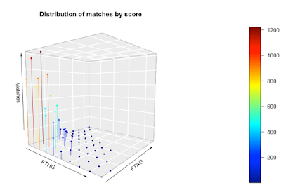
We can go one stage further and create a 3D scatter chart. On this chart, I've plotted the x, y, and z values and color-coded them so you get a sense of the magnitude of the z values. I've also connected the points to the axis (the zero plane if you like) to emphasize the data structure a bit more.


As with the persp function,  you can change your perspective on the plot and view it from another angle.

The downside with this approach is it requires the 'plot3D' library in R and it requires you to install a new graphics server (XQuartz). It's a chunk of work to get to a visualization. The function to draw the plot is 'scatter3D'. Here's my code:

scatter3D(x=goal_distribution$FTHG, 
          y=goal_distribution$FTAG, 
          z=goal_distribution$Matches, 
          xlab = "FTHG", ylab = "FTAG", zlab = "Matches",
          phi = 5, 
          theta = 40,
          bty = "g",  
          type = "h", 
          pch = 19,
          main="Distribution of matches by score",
          cex = 0.5)

What's my choice?

My goal was to understand the distribution of goals in the EPL, so what presentations of the data were most useful to me?

The simple table worked well and was the most informative, followed by the heatmap. I found both persp and scatter3D to be awkward to use and both consumed way more time than they were worth. The nice thing about the heatmap is that it's available as part of the wonderful ggplot library.

Bottom line: keep it simple.

Monday, January 18, 2021

Dinosaurs and time-travel: the wrong kind of air

Dinosaurs and time-travel don't mix

Time-traveling to see dinosaurs has been a science-fiction trope for a long time and of course stories of dinosaurs in modern times have been around since at least the Professor Challenger books of the 1910s. Like everyone else, I enjoyed the Jurassic Park movies, but sadly, something nagged at the back of my mind: could these animals breathe?

(Do you think he saw us? Author: Lothar Dieterich, Source: Pixabay, License: Pixabay.)

From what I've read, some re-animated dinosaurs would have serious trouble breathing today's atmosphere, and time travelers may have convulsions breathing ancient atmospheres. How we know this is an interesting story of itself.

Ice and amber and simulation

In the Jurassic Park movies, InGen scientists extracted dinosaur DNA from mosquitos trapped in amber. After sucking on dinosaur blood, mosquitos landed on trees, where they were trapped by sap that turned into amber. But mosquitos weren't the only thing trapped in amber. Amber also contains air bubbles, in other words, air samples from dinosaur times. By analyzing the gas composition of amber air bubbles, we can estimate the atmospheric composition at the time the bubble was formed [Cerling]. Obviously, these samples are rare.

(Beetle in amber - and maybe some ancient air. Image source: Wikimedia Commons, Author: Anders L. Damgaard, License: Creative Commons)

Less directly, ice cores also give us a way of looking into atmospheric change. Voids in ice cores capture ancient air, and of course, some atmospheric gases dissolve in water and are trapped when the water freezes.

(Ice, ice, baby - preparing an ice core. Author: NASA Ice, Image source: Wikimedia Commons. License: Creative Commons)

Amber and ice only take us back so far in time. To go all the way back, we have to rely on simulation and understanding the processes that drive the composition of the atmosphere. 

For dinosaurs and human time travelers, the most important gas to understand is oxygen. Bear in mind, oxygen is a very reactive gas. It reacts with iron and water to form rust, and when things burn, oxygen turns into carbon dioxide, carbon monoxide, and other combustion products. It's also partially soluble in water; fish rely on dissolved oxygen and there's dissolved oxygen even at great depths

The fraction of oxygen in the atmosphere is the result of two processes: non-organic processes that absorb oxygen, and organic processes that generate oxygen. To say it another way, free oxygen in a planet's atmosphere is a sign of life.

Oxygen by time - the l-o-n-g view and the long view

I went into the literature and pulled all the sources I could find that talked about the fraction of the atmosphere that contained oxygen [Kump, Holland]. Here are the chart and the story. This is a long story over deep time, so I'm going to give you the l-o-n-g view and then focus on more 'recent' times (the long view) that includes the dinosaurs and us.

4 to 2.45 billion years ago

In the beginning, the earth's atmosphere would have contained trace amounts of oxygen. Bear in mind, there was no plant life and the only source of oxygen was geological processes which would have produced minute amounts of the gas at best. The oceans would have had no oxygen, with the possible exception of 'oxygen oasis' in shallow oceans.

Single-celled life began at about -4 billion years, with photosynthesis appearing around -3.5 billion years. 

2.5 to 1.85 billion years ago

As life got going, simple organisms produced more oxygen and the oxygen content of the atmosphere rose. The earth's oceans absorbed some of this oxygen (but the deep oceans remained oxygen-free), limiting the build-up in the atmosphere. The period 2.4 to 2.0 billion years ago is known as the "Great Oxidation Event", and the chemistry of the "earth system" changed, though geologists are unsure of some of the mechanisms [Holland, Kump].

1.85 to 0.85 billion years ago

Life keeps pumping out the gas. Eventually, there was enough to form the ozone layer, and of course, exposed iron deposits would have rusted, consuming more oxygen. The surface oceans became mildly oxygenated.

Multicellular organisms evolved, with fungi appearing about 1.5 billion years and the earliest plants around 0.85 billion years.

0.85 to 0.54 billion years ago 

More of the same. The oxygen content rose in the atmosphere and the shallow oceans, but not in the deep oceans. This was a period of great change, there were three ice ages followed by unusually hot climates. Animals appeared on the scene.

0.54 billion years ago to the present time

Things start to get interesting around 360 million years ago, so that's where I'll focus.

Geologists separate the deep past into named periods. In some cases, there are clear boundaries between them, in others not so much. Here are the periods, the major plants and animals, and the oxygen content of the atmosphere for the last 360 million years.


Period (million years) Name Animals and plants Oxygen content
360-299 Carboniferous Large plants using lignin. Arthropods and amphibians. 20-34%
299-252 Permian Seed-bearing plants. Cicadas and beetles. Synapsids (very early line that lead to mammals) and Sauropsids (very early line that lead to reptiles). 34-14%
252-201 Triassic Turtles, flies, ichthyosaurs, early dinosaurs. Ferns, conifer trees. 14-20%
201-145 Jurassic Allosaurus, Stegosaurus, Diplodocus, Pterosaurus. Pine trees. 20-27%
145-66 Cretaceous Bees, ants, velociraptors, Tyrannosaurus rex. Palm trees. 28-30%
66-23 Paleogene Primates, bats, camels, cats, penguins, elephants. 24-28%
23-2.6 Neogene Hyenas, mammoths, kangaroos, hippopotamus. 21-24%
2.6-now Quaternary Bears, humans, sabre-toothed cats 21%

I've re-drawn my plot of oxygen content so you can orient yourself to the changes and periods.

During the Carboniferous period, plants evolved to use lignin which enabled them to grow much, much larger than before. Lycopods (relatives of the club moss), for example, grew to the size of trees. Lignin is resistant to bacterial decomposition and when it first appeared, bacteria couldn't digest it at all, meaning the world was littered with dead plants. Because they weren't digested and recycled, the dead plants went on to form coal (giving this period its name). Bacteria's inability to munch lignin is important for the atmosphere too; as bacteria breakdown carbon-rich material, they consume oxygen. In the Carboniferous period plants were busy pumping out oxygen, but bacteria weren't consuming it, so the oxygen content rose [Black]. As you might expect, the oxygen-rich atmosphere was a huge boon to animal life. Arthropods, early relatives of the insects, grew to enormous sizes. Arthropleura, a giant millipede, ranged in size from 0.3 meters to 2.5 meters, and famously, Meganeura, an early relative of the dragonfly, had a wingspan of about 70 cm.

The Permian period saw a huge drop off in oxygen content. My researches suggest this was triggered by volcanic activity pumping vast amounts of carbon dioxide (a greenhouse gas) into the atmosphere, leading to global warming, which caused reduced ocean circulation and a sharp drop in oxygen content in the deep oceans [Benton]. An oxygen content of about 14% put an end to a large number of species, it also isolated animal populations from one another as mountains became impossible to pass because of low oxygen [Huey]. This really was the great die off.

Things recovered slowly in the Triassic period. The oxygen content rose gradually as plants pumped it out. Early dinosaurs appeared on the scene and rapidly diversified. The oxygen content at the end of the Triassic period was about today's levels, so those dinosaurs could survive in modern times. Some of them were already getting big, Lessemsaurus for example was around 9m long. The Triassic came to an end with another mass-extinction event that occurred about 201.3 million years ago, and again it may have been caused by vulcanism. Volcanoes in what's now the Atlantic ocean (in an area called Central Atlantic Magmatic Province (CAMP)) released vast amounts of carbon dioxide and sulfur dioxide, which sparked huge climatic change, killing off many, many species.

Once again, life recovered and the oxygen content continued to rise. We're now in the Jurassic period. The dinosaurs really got going, but the oxygen levels weren't that much higher than today, so Stegosaurus probably could survive in today's atmosphere. The era ended with another extinction event, but this one is poorly understood.

During the Cretaceous period, the oxygen content rose to about 32%. By this time there were trees and a great deal of plant life, so an upper limiting factor on the oxygen content is forest fires; at 30% oxygen, forest fires would have raged out of control. Everyone's favorite dinosaur, Tyrannosaurs rex, was around at the end of Cretaceous period, as were Velociraptors and Brachiosaurus. The high oxygen content would have favored big animals, but these monsters wouldn't be able to breathe today's atmosphere.

meteor impact put an end to the party about 66 million years ago.

The oxygen content has fluctuated over the last 66 million years, but not as much as in the prior billions of years.

It's in the bag

Some dinosaurs could be revived and live among us, but not others. The modern oxygen content of 21% spells bad news for reanimating Tyrannosaurus Rex and velociraptor and friends, on the other hand, Stegosaurus probably would be OK. But what about our time travelers?

(The one thing a time traveler must have: a paper bag. Image source: Wikimedia Commons, Author: Donald Trung, License: Creative Commons.)

It depends on when our time travelers travel back to. They might arrive at a time when oxygen was roughly at current levels, or maybe at a time with too much or too little. For too little oxygen, a small oxygen tank would do the trick. For too much oxygen, a gas mask that reduced oxygen would be enough to survive, but there could be an even simpler solution. 

For people having panic attacks and hyperventilating, medical advice is often to breathe into a paper bag. This reduces the oxygen content in the blood because we re-inhale our exhaled carbon dioxide. Perhaps all our intrepid time travelers need to survive with the dinosaurs is a paper bag - maybe even the one their lunch came in.

Posts like this

If you liked this post, here are some others you might like.

References

[Benton] Michael J. Benton, Richard J. Twitchett, How to kill (almost) all life: the end-Permian extinction event, TRENDS in Ecology and Evolution Vol.18 No.7 July 2003

[Black] Riley Black, The history of air, Smithsonian Magazine, April 2010, https://www.smithsonianmag.com/science-nature/the-history-of-air-21082166/

[Cerling] Cerling, T. Does the gas content of amber reveal the composition of palaeoatmospheres?. Nature 339, 695–696 (1989)

[Holland] Heinrich D Holland, The oxygenation of the atmosphere and oceans, Philos Trans R Soc Lond B Biol Sci. 2006 Jun 29; 361(1470): 903–915.

[Huey] Raymond B. Huey, Peter D. Ward, Hypoxia, Global Warming, and Terrestrial Late Permian Extinctions, Science  15 Apr 2005, Vol. 308, Issue 5720, pp. 398-401

[Kump] Kump, L. The rise of atmospheric oxygen. Nature 451, 277–278 (2008)

Monday, January 11, 2021

How to grow a market segment

Growing a new business

I'm going to tell you how I grew a market segment from almost nothing to multi-millions. It's kind of an instruction manual if you're trying to grow a new segment within a larger business and I hope you find something useful in it. I'm going to be deliberately vague about the segment and the company and I've obscured some of the details.

(Every new business segment starts from small seeds. Image source: Wikimedia Commons, License: Creative Commons, Author: Laitche)

Some background

A few years ago, I was working for a large company that produced products that could be used in many different industries. Part of my role was to find new business segments to sell into, but I had no budget to research or grow segments. On the upside, I had access to a large team of very good salespeople and sales engineers.

First, catch your hare

The first job was to find the market segment to sell into. I was friendly with one of the company's very experienced sales engineers. He knew what I was trying to do and suggested a market he was very familiar with. We'd had this conversation before and I was skeptical. This time, I decided to take a closer look.

I didn't fully understand the market segment, but my friend was correct. The company's products had sold into this segment. They'd sold because my friend had customized the products for that market and developed a sales pitch that worked. He'd largely been ignored and was the only person who sold into the market. Bottom line: there was maybe something there.

How does this market work?

To sell into a segment, you need to:

  • understand it 
  • know what your value proposition really is
  • know where you sit in the value chain. 

I needed a crash course in understanding the segment and I needed prospective customers to tell me their pain points. 

Fortunately, there was a major trade show/conference coming up and I went to it. I got the speaker list and identified over ten people who I thought could help. By guessing emails, I reached out to them and asked for an informational interview at the conference. Of course, not everyone responded or talked to me, but I got enough feedback to understand how my company's products could fit and I understood the pain points.

Market sizing 

This is the piece that gets all the attention, but it shouldn't. Lots of people are spilling lots of ink talking about market sizing and offering paid-for sizing products. I found no one who could give me a good market size for my new segment; they could offer me details on some aspects of the market, but not the ones useful to me. In the end, I found the best market sizing data came from free resources on the web. I coupled this data with my own analysis, viewing the segment in different ways and calculating different sizing estimates. I got slightly different estimates of market size, but the difference was immaterial, the segment was big enough to be profitable.

Making marketing content

I wanted the sales team to sell, but they were skeptical. Their belief was, the experienced sales engineer could sell the story to the segment, but no one else could. I needed to change this perception. I also needed to gather customer proof that the product worked in the segment.

One of the salespeople told me of a well-known company that had bought the product for use in our new market segment. There were some things that weren't ideal about their use of the product, but it was a start.

Fortunately, about this time I had a new SLR camera and was experimenting with photography. I was also doing a part-time management degree and had chosen a business writing option. Putting both together, I flew out to the customer and interviewed them for a case study, taking photos to illustrate the piece. Normally, this would be done by a writer, but because this was so new, I wanted to take control. I wrote up the case study and my company published it. I had my first piece of marketing content for my segment.

Not long after, I found another segment customer who was using the product. We asked about a case study, but they gave a firm no. We then asked if we could do a ghost-written article that would appear in their name and that they would have editorial control over ('nothing published without your consent'), they said yes, and we found a trade magazine that would publish the story. Once again, I flew out and interviewed the customer. I wrote up the ghost-written article, but I did it carefully and subtly; my company's product wasn't the biggest feature of the piece (it was a quarter or less) and other company's products were mentioned in the article too. The goal was to establish credibility, and the piece succeeded brilliantly. The customer was hugely pleased with the article, to the extent that the person I interviewed took credit for writing it. I submitted the piece for part of my writing class and got an A grade.

I did this a couple of times and ended up with several pieces of content, crucially, they included usable customer quotes (not by accident).

(Like new market segments, saplings need attention and nutrients to grow. Image source: Wikimedia Commons, License: Creative Commons, Author: RobbieRoss123)

Selling

By this stage, I had marketing content to help sell the product and I had a known segment user base. The next step was to convince the sales team to sell and for sales engineers to help sell it.

Salespeople have quotas to fulfill so they have to be extremely careful about how they fill their time. This means they can be very suspicious about new market segments; they don't know if it'll be worth investing their time.

I found a sales rep who was willing to try selling into the market. It helped that he was also very friendly with the sales engineer too. We did some pitches together using the new marketing content and the sales rep worked closely with the sales engineer. To cut a long story short, the sales rep brought in a $300,000 order. This got people's attention. Other, smaller orders came in too.

Sales engineering management decided to invest in the segment and started to train some sales engineers in how to sell to it.

Salespeople started to get interested in selling into the market. I created some sales presentations for them, and of course, they had the case studies to use.

Pseudo-freemium

The engineering team had other priorities and was unable to customize the product for the segment, but I needed some good demos. Fortunately, my sales engineer came to the rescue again. He had developed a number of demos that worked very well. Another sales engineer had developed some simpler models too. Collectively, we had enough to do something, but the packaging was bad.

Because I have an engineering background, I was able to create a form of product customization that combined the existing demos. In effect, it was a shadow product. We put the product online on the company's website, for free, in exchange for registration. In other words, we had a lead generation tool based on a free product.

Now we had demos and a website, we ran a series of webinars to drive traffic to the shadow product website. The leads went through the standard process and were handed to sales. Bear in mind, by this time, we had a sales deck, demos, and the sales team and sales engineers could sell into the market.

(Eventually, your segment may grow into something big. Image source: Wikimedia Commons, License: Public Domain, Author: AlabamaGuy2007)

Big boys can be bad boys

I did learn a negative lesson in this process. There were a couple of large and prestigious companies in this space. While we were selling into the smaller companies, I faced no political interference, but that changed as soon as we had a big fish on the hook.

I visited a group in a very large and well-known company to talk to them about the market segment. Before visiting the group, I was warned they were doing weird things and had a reputation for giving people the run-around. But what they wanted to do was cool. I came back to the office with a positive message about the big company.

As soon as people found out who the large company was, they wanted to be involved. I went to a meeting where 15 people sat around discussing the sales strategy. Soon, I was cut out of the discussion as more and more strategy meetings were held. The meetings were divorced from reality because no one in them had spoken to the account. However, the meetings were high-profile.

Sadly, the warnings turned out to be right. The group really was doing weird things, and soon they moved on and forgot they'd ever spoken to us. The strategy meetings died off after a month or two as it dawned on the attendees that the opportunity wasn't going anywhere.

After that, I was skeptical of large players. I purposefully downplayed large accounts and kept things technical.

Becoming an expert

I had a very limited background in the segment, but I found I had developed some useful knowledge through this market-building process. I ended up speaking at a segment conference and running an IEEE tutorial. It was bizarre speaking on industry panels next to people who had spent their entire careers in the segment.

Where did this end up?

The market segment went from being less than about $100,000 a year to several million $ per year. Sales reps went from ignoring it, to actively selling into the market, and we went from one sales engineer focused on it to several. We started with zero marketing pieces, and by the end, we had about 15 pieces of focused marketing content, including webinars, articles, and case studies.

Checklist

Here's my checklist for growing a new segment:

  • Be humble: listen to others and learn from them.
  • Share credit: make sure the people who work with you get credit.
  • Be there for others: this isn't a solo endeavor, you have to support your colleagues.
  • Find out if anyone in your organization has experience in the segment. Learn from them.
  • Talk to and learn from industry experts. Never sell to them at this point.
  • Create marketing content:
    • Create case studies.
    • Create ghost-written articles. 
    • Create great content that adds value.
    • Have a webpage to capture leads.
    • Run webinars.
  • Sell internally.
    • Understand the dynamics of the sales and sales engineering team.
    • Hold their hand until they get the first sales, and even beyond that.
    • Make sure they know you'll stand by them.
  • Avoid politics.
    • Watch out for high-profile accounts, they can mislead and distract and they invite internal politics.

Could I do this again? 

I'm going to be honest with you. I got lucky. I benefited from a one-off combination of circumstances that let me succeed:

  • I stumbled on the segment. If it hadn't been for the sales engineer, I would never have looked at it.
  • Benign neglect. Except towards the end, I didn't suffer company politics or people stopping me.
  • Pre-existing content. The sales engineer had developed much of the content I needed.
  • Skills. I had the photography and writing skills I needed, I also had the technical skills to take the sales engineer's work further.

I owe a lot to that sales engineer, as does the company I worked for. Without him, this wouldn't have happened.

Could I do this again? Maybe. I tried again in a different company in different circumstances but had more limited success. Company politics really held things back.

Would I try and do it again? Yes, but. If you want to know what the 'but' is, you'll have to talk to me.

Monday, January 4, 2021

COVID and soccer home team advantage - winning less often

Home advantage

Is it easier for a sports team to win at home? The evidence from sports as diverse as soccer [Pollard], American football [Vergina], rugby [Thomas], and ice hockey [Leard] strongly suggest there is a home advantage and it might be quite large. But what causes it? Is it the crowd cheering the home team, or closeness to home, or playing on familiar turf? One of the weirder side-effects of COVID is the insight it's proving into the origins of home advantage, as we'll see.

(Premier League teams playing in happier times. Image source: Wikimedia Commons, License: Creative Commons, Author: Brian Minkoff)

The EPL - lots of data makes analysis easier

The English Premier League is the world's wealthiest sports' league [Robinson].  There's worldwide interest in the league and there has been for a long time, so there's a lot of data available, which makes it ideal for investigating home advantage. One of the nice features of the league is that each team plays every other team twice, once at home and once away.

Expectation and metric

If there were no home team advantage, we would expect the number of home wins and away wins to be roughly equal for the whole league in a season. To investigate home advantage, the metric I'll use is:
\[home \ win \ proportion = \frac{number\ of\ home\ wins}{total\ number\ of\ wins}\]
If there were no home team advantage, we would expect this number to be close to 0.5.

EPL home team advantage

Let's look at the mean home-win proportion per season for the EPL. In the chart, the error bars are the 95% confidence interval.

For most seasons, the home win proportion is about 0.6 and it's significantly above 0.5 (in the statistical sense). In other words, there's a strong home-field advantage in the EPL.

But look at the point on the right. What's going on in 2020-2021?

COVID and home wins

Like everything else in the world, the EPL has been affected by COVID. Teams are playing behind closed doors for the 2020-2021 season. There are no fans singing and chanting in the terraces, there are no fans 'oohing' over near misses, and there are no fans cheering goals. Teams are still playing matches home and away but in empty and silent stadiums.

So how has this affected home team advantage?

Take a look at the chart above. The 2020-2021 season is the season on the right. Obviously, we're still partway through the season, which is why the error bars are so big, but look at the mean value. If there were no home team advantage, we would expect a mean of 0.5. For 2020-2021, the mean is currently 0.491. 

Let me put this simply. When there are fans in the stadiums, there's a home team advantage. When there are no fans in the stadiums, the home team advantage disappears.

COVID and goals

What about goals? It's possible that a team that might have lost is so encouraged by their fans that they reach a draw instead. Do teams playing at home score more goals?

I worked out the mean goal difference between the home team and the away team and I've plotted it for every season from 2000-2001 onwards.

If there were no home team advantage, you would expect the goal difference to be 0. But it isn't. It mostly hovers around 0.35. Except of course for 2020-2021. For 2020-2021, the goal difference is about zero. The home-field advantage has gone.

What this means

Despite the roll-out of the vaccine, it's almost certain the rest of the 2020-2021 season will be played behind closed doors (assuming the season isn't abandoned). My results are for a partial season, but it's a good bet the final results will be similar. If this is the case, then it will be very strong evidence that fans cheering their team really do make a difference.

If you want your team to win, you need to go to their games and cheer them on. 

References

[Leard] Leard B, Doyle JM. The Effect of Home Advantage, Momentum, and Fighting on Winning in the National Hockey League. Journal of Sports Economics. 2011;12(5):538-560.

[Pollard] Richard Pollard and Gregory Pollard, Home advantage in soccer: a review of its existence and causes, International Journal of Soccer and Science Journal Vol. 3 No 1 2005, pp28-44

[Robinson] Joshua Robinson, Jonathan Clegg, The Club: How the English Premier League Became the Wildest, Richest, Most Disruptive Force in Sports, Mariner Books, 2019

[Thomas] Thomas S, Reeves C, Bell A. Home Advantage in the Six Nations Rugby Union Tournament. Perceptual and Motor Skills. 2008;106(1):113-116

[Vergina] Roger C.Vergina, John J.Sosika, No place like home: an examination of the home field advantage in gambling strategies in NFL football, Journal of Economics and Business Volume 51, Issue 1, January–February 1999, Pages 21-31