A spy, a scoundrel, and a scholar
William Playfair was all three. He led an extraordinary life at the heart of many of the great events of the 18th and 19th centuries, mostly in morally dubious roles. Among all the intrigue, scandal, and indebtedness, he found time to invent the bar and pie charts, and make pioneering use of line charts. As we'll see, he was quite a character.
Playfair the scoundrel
Playfair's lifetime (1759-1823) contained some momentous events:
- The development of the steam engine
- The French revolution
- American independence and the establishment of a new US government
- The introduction of paper money
and in different ways, some of them fraudulent, Playfair played a role.
He was born in 1759 in Dundee, Scotland, and due to his father's death, he was apprenticed to the inventor of the threshing machine at age 13. From there, he went to work for one of the leading producers of steam engines, James Watt. So far, this is standard "pull yourself up by your bootstraps with family connections" stuff. Things started to go awry when he moved to London in 1782 where he set up a silversmith company and was granted several patents. The business failed with some hints of impropriety, which was a taste of things to come.
In 1787, he moved to Paris where he sold steam engines and was a dealmaking middleman. This meant he knew the leading figures of French society. He was present at the storming of the Bastille in 1789 and may have had some mid-level command role there. During the revolution, he continued to do deals and work with the French elite, but he made enemies along the way. As the reign of terror got going, Playfair fled the country.
Before fleeing, Playfair had a hand in the Scioto Company, a company formed to sell land to settlers in the Ohio Valley in the new United States. The idea of setting up in a new land was of course attractive to the French elite who could see how the revolution was going. The trouble was, the land was in territory controlled by Native Americans and it was also undeveloped and remote. In other words, completely unsuited for the French Bourgeoisie who were buying the land for a fresh start. The scheme even ended up entangling George Washington. It all ended badly and the US government had to step in to clean up the mess. This is considered to be the first major scandal in US history.
By 1793, Playfair was back in London where he helped formed a security bank, similar to institutions he'd been involved with in France. Of course, it failed with allegations of fraud.
Playfair had always been a good writer and good at explaining data. He'd produced several books and pamphlets, and by the mid-1790s, he was trying to earn a living at it. But things didn't go too well, and he ended up imprisoned for debt in the notorious Fleet Prison (released in 1802). He tried to write his way out of debt, and notably, some of his most influential books were written while in prison.
There were no official government spying agencies at the time, but the British government quite happily paid for freelancers to do it, which may be an early example of "plausible deniability". Playfair was one such freelance secret agent. He discovered the secrets of the breakthrough French semaphore system while living in Frankfurt and handed them over to the British government in the mid-1790s. He was also the mastermind behind an audacious scheme to bring down the French government through massive counterfeiting and inflation. The idea was simple, counterfeit French "paper money" and flood the country with high-quality fakes, stoking inflation and bringing down the currency and hence the government. The scheme may have worked as the currency collapsed and Napoleon took power in a coup in 1799, though Napoleon was worse for the British government than what had existed before.
By 1816, Playfair was broke again. What better way to get money quickly than a spot of blackmail targeted against Lord Archibald Douglas, the wealthiest man in Scotland? If you can dispute his parentage (and therefore his rights to his fortune), you can make a killing. Like many of Playfair's other schemes, this one failed too.
Bar charts and pie charts
Playfair invented the bar chart in his 1786 book, "Commercial and Political Atlas". He wanted to show Scottish imports and exports but didn't have enough data for a time series plot. All he had was imports and exports from different countries and he wanted to display the information in a way that would help his book sell. Here it is, the first bar chart. It shows imports and exports to and from Scotland by country.
This was such a new concept that Playfair had to provide instructions on how to read it.
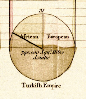
Playfair's landmark book was "The Statistical Breviary, Shewing on a Principle Entirely New, The Resources of Every State and Kingdom in Europe, Illustrated with Stained Copper-Plate Charts Representing the Physical Powers of Each Distinct Nation with Ease and Perspicuity", which was a statistical economic review of Europe. This book had what may be the first pie chart.
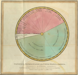
This chart shows how much of the Turkish Empire was geographically European and how much African. Playfair repeated the same type of visualization in 1805's "Statistical Account of the United States of America", but this time in color:
He was an early pioneer of line charts too, as this famous economic chart of England's balance of payments deficits and surpluses shows (again, from 1786's "Commercial and Political Atlas").
Playfair on TV
To my knowledge, there's never been a TV depiction of Playfair, which seems a shame. His life has most of the ingredients for a costume drama mini-series. There would be British Lords and Ladies in period costumes, French aristocrats in all their finery, political intrigue and terror, the guillotine, espionage, fraud on an epic scale (even allowing George Washington to make an appearance), counterfeiting, stream engines and rolling mills (as things to be sold and as things to make counterfeit money), prison, and of course, writing. It could be a kind of Bridgerton for nerds.
Reading more
Surprisingly, William Playfair is a bit niche and there's not that much about him and his works.
The best source of information is "PLAYFAIR: The True Story of the British Secret Agent Who Changed How We See the World" by Bruce Berkowitz. The book digs into Playfair's wild history and is the best source of information on the Scioto Company scandal and counterfeiting.
Here are some other sources you might find useful (note that most of them reference Bruce Berkowitz's book).
- https://projecteuclid.org/journals/statistical-science/volume-5/issue-3/William-Playfair-1759-1823/10.1214/ss/1177012100.short
- https://www.researchgate.net/profile/Ian-Spence-7/publication/228091928_William_Playfair_and_the_Psychology_of_Graphs/links/0fcfd4ff0d4ac8653e000000/William-Playfair-and-the-Psychology-of-Graphs.pdf
- https://www.researchgate.net/profile/Ian-Spence-7/publication/303110411_Who_was_Playfair/links/57376aa608ae9ace840bf514/Who-was-Playfair.pdf
- https://www.m-a.org.uk/resources/PE4LifeofPie.pdf


