Pretty, but misleading
You see choropleth maps everywhere: on websites, on the TV news, and in applications. They’re very pretty and they appeal to our sense of geography, but they can be horribly misleading. I’m going to show you why that’s the case and show you ways designers have sought to get around their problems.
What's a choropleth map?
A choropleth map is a geographic map with regions colored according to some criteria. A great example is election maps used in US Presidential elections. Each of the states is colored according to the party that won the state. Here’s an example result from a US Presidential election. Can you see what the problem is?
Looking at the map, who do you think won the election (I’m deliberately not telling you which election)? Do you think this election was a close one?
The trouble is, the US population density varies considerably from state to state, as does the number of Electoral College votes. In 2020, Rhode Island will have 4 Electoral College votes compared to Montana’s 3, but Montana is 120 times larger on the map. If you just glance at most US Presidential election choropleth maps, it looks like the Republican candidate won, even when he didn’t. That's because geographically large rural states are mostly Republican and have relatively low populations and hence fewer Electoral College votes, so the election choropleth map looks mostly red. Our natural tendency is to assume more ink = more important, but the choropleth map breaks this relationship giving a misleading representation.
By the way, the map I showed you is from the 1976 election, in which Jimmy Carter won 267 Electoral College votes to Gerard Ford's 240 (24 states to 27). Did you get who won from the map? Did you get the size of the victory?
Let’s take another example, the 2014 Scottish Independence referendum. Here’s the result by council area (local government area), pink for remain, green for independence. In this case, the remainers won, but what do you think the margin was? Was it close?
Despite the choropleth map’s overwhelming remain coloring, the actual result was 55%-45%. It looks like an overwhelming remain victory because the Scottish population is concentrated in a few areas. As in the US, there are large rural areas with few people that take up large amounts of chart space, exaggerating their level of importance.
Cartograms
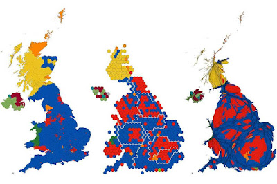
Can we somehow represent data using some kind of map in a more proportional way? Cartograms distort the underlying geography to better represent some underlying variable. There’s a great example on the Geographical.co.uk website for the UK 2019 general election.
The chart on the left is a straight-up choropleth map of the UK by parliamentary constituency - note that constituencies have roughly equal populations but can have very different geographical areas. Blue is a Conservative parliamentary seat, yellow is SNP, orange is Liberal Democrat and red is Labour. The result was a decisive Conservative victory, but the choropleth map makes it look like a wipeout, which it wasn't. The middle chart makes each parliamentary constituency the same size on the page (actually hexagons for reasons I won't go into). Rural areas are shrunk and urban areas (especially London) are greatly expanded. The cartogram shows a much fairer, and in my view, more reasonable representation of the result. The chart on the right is a 'gridded population cartogram' that sizes each constituency by the number of people living in it. There are several of these maps on the web, but frankly, I've never been able to make much sense of them.
Cartograms in the house of mirrors
Mark Newman at the University of Michigan has a site presenting the 2016 US Presidential election as cartograms which is worth a look. Here's his map scaling the states to their Electoral College votes. Because the proportion of red and blue ink follows the Electoral College votes, the cartogram gives a fairer representation of the result (I find this representation easier to understand than the 2019 UK election result in the third chart above).
An alternative approach is to use hexagons to represent the result:
The hexagon representation has become much more popular in recent years, leading to designers calling this kind of chart a hexagram. As you might have guessed, on the whole, I prefer this type of cartogram.
All this is great in theory, but in practice there are problems. Hexagrams are great, but they're still unfamiliar to many users and might require explanation. They can also distort geography, reducing the display's usefulness, for example, can you easily identify Utah on the 2016 US Presidential hexagram above? Most packages and modules that display data don't yet come with out-of-the-box cartograms, meaning developers have to create something from scratch, which takes a lot more effort.
What I do
Here's my approach: use choropleth maps for planning, and use hexagrams or other charts to represent quantitative results. Planning usually involves some sense of geography, for example, territory allocation in sales, in this case, a choropleth map can be useful because of its close ties to the underlying geography. To represent quantitative information (like election results), I prefer bar charts or other traditional charts. If you want something that's more geographical, I recommend some form of hexagram, but with the warning that you might have to build it yourself which can be very time-consuming.
Finding out more
Danny Dorling has written extensively about cartograms and I recommend his website: http://www.dannydorling.org/
The WorldMapper website presents lots of examples of cartograms using social and political data: https://worldmapper.org/


