Showing posts with label data analytics. Show all posts

Monday, March 3, 2025

Outliers have more fun

What's an outlier and why should you care?

Years ago I worked for a company that gave me t-shirt that said "Outliers have more fun". I've no idea what it meant, but outliers are interesting, and not in a good way. They'll do horrible things to your data and computing costs if you don't get a handle on them.

Simply put, an outlier is one or more data items that are extremely different from your other data items. Here's a joke that explains the idea:

There's a group of office workers drinking in a bar in Seattle. Bill Gates walks in and suddenly, the entire bar starts celebrating. Why? Because on average, they'd all become multi-millionaires.

Obviously, Bill Gates is the outlier in the data set. In this post, I'm going to explain what outliers do to data and what you can do to protect yourself.

(Jessica  Tam, CC BY 2.0 <https://creativecommons.org/licenses/by/2.0>, via Wikimedia Commons)

Outliers and the mean

Let's start with the explaining the joke to death because everyone enjoys that.

Before Bill Gates walks in, there are 10 people in the bar drinking. Their salaries are: $80,000, $81,000, $82,000, $83,000, $84,000, $85,000, $86,000, $87,000, $88,000, and $89,000 giving a mean of $84,500. Let's assume Bill Gates earns $1,000,000,000 a year. Once Bill Gates walks into the bar, the new mean salary is $90,985,909; which is plainly not representative of the bar as a whole. Bill Gates is a massive outlier who's pulled the average way beyond what's representative.

How susceptible your data is to this kind of outlier effect depends on the type and distribution of your data. If your data is scores out of 10, and a "typical" score is 5, the average isn't going to be pulled too far away by an outlier (because the maximum is 10 and the minimum is zero, which are not hugely different from the typical value of 5). If there's no upper or lower limit (e.g salaries, house prices, amount of debt etc.), then you're vulnerable, and you may be even more vulnerable if your distribution is right skewed (e.g. something like a log normal distribution).

What can you do if this is the case? Use the median instead. The median is the middle value. In our Seattle bar example, the median is $84,500 before Bill Gates walks in and $85,000 afterwards. That's not much of a change and is much more representative of the salaries of everyone. This is the reason why you hear "median salaries" reported in government statistics rather than "mean salaries".

If you do use the median, please be aware that it has different mathematical properties from the mean. It's fine as a measure of the average, but if you're doing calculations based on medians, be careful.

Outliers and the standard deviation

The standard deviation is a representation of the spread of the data. The bigger the number, the wider the spread. In our bar example, before Bill Gates walks in, the standard deviation is $2,872. This seems reasonable as the salaries are pretty close together. After Bill Gates walks in, the standard deviation is $287,455,495 which is even bigger than the new mean. This number suggests all the salaries are quite different, which is not the case, only one is.

The standard deviation is susceptible to outliers in the same way the mean is, but for some reason, people often overlook it. I've seen people be very aware of outliers when they're calculating an average, but forget all about it when they're calculating a standard deviation.

What can you do? The answer here's isn't as clear. A good choice is the interquartile range (IQR), but it's not the same measurement. The IQR represents 75% of the data and not the 67% that the standard deviation does. For the bar, the IQR is $4,500 before Bill Gates walks in and $5,000 afterwards.  If you want a measure of 'dispersion', the IQR is a good choice, if you want a drop in replacement for the standard deviation, you'll have to give it more thought. 

Why the median and IQR are not drop in replacements for the mean and standard deviation

The mean and median are subtly different measures and have different mathematical properties. The same applies to standard deviation and IQR. It's important to understand the trade-offs when you use them.

Combining means is easy, we can do it through formula understood for hundreds of years. But we can't combine medians in the same way; the math doesn't work like that. Here's an example, let's imagine we have two bars, one with 10 drinkers earning a mean of $80,000, the other with 10 drinkers earning a mean of $90,000. The mean across the two bars is $85,000. We can do addition, subtraction, multiplication, division, and other operations with means. But if we know the median of the first bar is $81,000 and the median of the second bar is $89,000, we can't combine them. The same is true of the standard deviation and IQR, there are formula to combine standard deviations, but not IQRs.

In the Seattle bar example, we wanted one number to represent the salaries of the people in the bar. The best average is the median and the best measure of spread is the IQR, the reason being outliers. However, if we wanted an average we could apply across multiple bars, or if we wanted to do some calculations using the average and spread, we'd be better off with the mean and standard deviation.

Of course, it all comes down to knowing what you want and why. Like any job, you've got to know your tools.

The effect of more samples

Sometimes, more data will save you. This is especially true if your data is normally distributed and outliers are very rare. If your data distribution is skewed, it might not help that much. I've worked with some data sets with massive skews and the mean can vary widely depending on how many samples you take. Of course, if you have millions of samples, then you'll mostly be OK.

Outliers and calculation costs

This warning won't apply to everyone. I've built systems where the computing cost depends on the range of the data (maximum - minimum). The bigger the range, the more the cost. Outliers in this case can drive computation costs up, especially if there's a possibility of a "Bill Gates" type effect that can massively distort the data. If this applies to your system, you need to detect outliers and take action.

Final advice 

If you have a small sample size (10 or less): use the median and the IQR.

If your data is highly right skewed: use the median and the IQR.

Remember the median and the IQR are not the same as the mean and the standard deviation and be extremely careful using them in calculations.

If your computation time depends on the range of the data, check for outliers.

Monday, August 22, 2022

How the post-hoc fallacy can cost businesses millions

The post-hoc fallacy

Over my career, I’ve seen companies make avoidable business mistakes that’ve cost them significant time and money. Some of these mistakes happened because people have misunderstood “the rules of evidence” and they’ve made a classic post-hoc blunder. This error is insidious because it comes in different forms and it can seem like the error is the right thing to do.

In this blog post, I’ll show you how the post-hoc error can manifest itself in business, I’ll give you a little background on it, and show you some real-world examples, finally, I’ll show you how you can protect yourself.

A fictitious example to get us started 

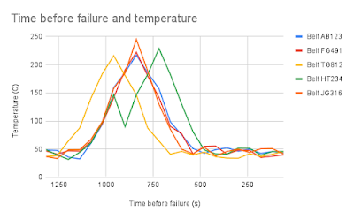
Imagine you’re an engineer working for a company that makes conveyor belts used in warehouses. A conveyor belt break is both very dangerous and very costly; it can take hours to replace, during which time at least part of the warehouse is offline. Your company thoroughly instruments the belts and there’s a vast amount of data on belt temperature, tension, speed, and so on.

Your Japanese distributor tells you they’ve noticed a pattern. They’ve analyzed 319 breaks and found that in 90% of cases, there’s a temperature spike 15 minutes before the break. They’ve sent you the individual readings which look something like the chart below. 

The distributor is demanding that you institute a new control that stops the belt if a temperature spike is detected and prompts the customer to replace the belt.

Do you think the Japanese distributor has a compelling case? What should you do next? 

The post-hoc fallacy

The full name of this fallacy is “post hoc ergo propter hoc”, which is thankfully usually shortened to "post-hoc". The fallacy goes like this:

  • Event X happens then event Y happens
  • Therefore, X caused Y. 

The oldest example is the rooster crowing before dawn: “the rooster crows before dawn, therefore the rooster’s crow causes the dawn”. Obviously, this is a fallacy and it’s easy to spot.

Here's a statement using the same logic to show you that things aren’t simple: “I put fertilizer on my garden, three weeks later my garden grew, therefore the fertilizer caused my garden to grow”. Is this statement an error?

As we’ll see, statements of the form:

  • Event X happens then event Y happens
  • Therefore, X caused Y.

Aren’t enough of themselves to provide proof.

Classic post-hoc errors 

Hans Zinsser in his book “Rats, lice, and history” tells the story of how in medieval times, lice were considered a sign of health in humans. When lice left a person, the person became sick or died, so the obvious implication is that lice are necessary for health. In reality, of course, lice require a live body to feed on and a sick or dead person doesn’t provide a good meal.

In modern times, something similar happened with violent video games. The popular press set up a hue and cry that playing violent video games led to violent real-life behavior in teenagers, the logic being that almost every violent offender had played violent video games. In reality, a huge fraction of the teenage population has played violent video games. More careful studies showed no effect.

Perhaps the highest profile post-hoc fallacy in modern times is vaccines and autism.  The claim is that a child received a vaccine, and later on, the child was diagnosed with autism, therefore the vaccine caused autism. As we know, the original claims of a link were deeply flawed at best.

Causes of errors

Confounders 

A confounder is something, other than the effect you’re studying, that could cause the results you’re seeing. The classic example is storks in Copenhagen after the second world war. In the 12-year period after the second world war, the number of storks seen near Copenhagen increased sharply, as did the number of (human) babies. Do we conclude storks cause babies? The cause of the increase in the stork population, and the number of babies, was the end of the second world war so the confounder here was war recovery.

In the autism case, confounders are everywhere. Both vaccinations and autism increased at the same time, but lots of other things changed at the same time too:

  • Medical diagnosis improved
  • Pollution increased
  • The use of chemical cleaning products in the home increased
  • Household income went up (but not for everyone, some saw a decrease)
  • Car ownership went up.

Without further evidence, we can’t say what caused autism. Once again, it’s not enough of itself to say “X before Y therefore X causes Y”. 

Confounders can be very, very hard to find.

Biased data

The underlying data can be so biased that it renders subsequent analysis unreliable. A good example is US presidential election opinion polling in 2016 and 2020; these polls under-represented Trump’s support, either because the pollsters didn’t sample the right voters or because Trump voters refused to be included in polls. Whatever the cause, the pollsters’ sampling was biased, which meant that many polls didn't accurately forecast the result.

For our conveyor belt example, the data might be just Japanese installations, or it might be Asian installations, or it might be worldwide. It might even be just data on broken belts, which introduces a form of bias called survivor bias. We need to know how the data was collected.

Thinking correlation = causation

Years ago, I had a physics professor who tried to beat into us students the mantra “correlation is not causation” and he was right. I’ve written about correlation and causation before, so I’m not going to say too much here. For causation to exist, there must be correlation, but correlation of itself does not imply causation.

To really convince yourself that correlation != causation, head on over to the spurious correlations website where you’ll find lots of examples of correlations that plainly don’t have an X causes Y relationship. What causes the correlation? Confounders, for example, population growth will lead to increases in computer science doctorates and arcade revenue. 

Protections

Given all this, how can you protect yourself against the post-hoc fallacy? There are a number of methods designed to remove the effects of confounders and other causes of error. 

Counterexamples 

Perhaps the easiest way of fighting against post-hoc errors is to find counterexamples. If you think the rooster crowing causes dawn, then a good test is to shoot the rooster; if the rooster doesn’t crow and the dawn still happens, then the rooster can’t cause dawn. In the human lice example, finding a population of humans who were healthy and did not have lice would disprove the link between health and lice.

Control groups

Control groups are very similar to counterexamples. The idea is that you split the population you’re studying into two groups with similar membership. One group is exposed to a treatment (the treatment group) and the other group (the control group) is not. Because the two groups are similar, any difference between the groups must be due to the treatment. 

I talked earlier about a fertilizer example: “I put fertilizer on my garden, three weeks later my garden grew, therefore the fertilizer caused my garden to grow”. The way to prove the fertilizer works is to split my garden into two equivalent areas, one area gets the fertilizer (the treatment group) and the other (the control group) does not. This type of agricultural test was the predecessor of modern randomized control trials and it’s how statistical testing procedures were developed.

RCTs (A/B testing)

How do you choose membership of the control and treatment groups? Naively, you would think the best method is to carefully select membership to make the two groups the same. In practice, this is a bad idea because there’s always some key factor you’ve overlooked and you end up introducing bias. It turns out random group assignment is a much, much better way.

A randomized control trial (RCT) randomly allocates people to either a control group or a treatment group. The treatment group gets the treatment, and the control group doesn’t.

Natural experiments

It’s not always possible to randomly allocate people to control and treatment groups. For example, you can’t randomly allocate people to good weather or bad weather. But in some cases, researchers can examine the impact of a change if group allocation is decided by some external event or authority. For example, a weather pattern might dump large amounts of snow on one town but pass by a similar nearby town. One US state might pass legislation while a neighboring state might not. This is called a natural experiment and there’s a great deal of literature on how to analyze them.

Matching, cohorts, and difference-in-difference

If random assignment isn’t possible, or the treatment event happened in the past, there are other analysis techniques you can use. These fall into the category of quasi-experimental methods and I’m only going to talk through one of them: difference-in-difference.  

Difference-in-difference typically has four parts:

  • Split the population into a treatment group (that received the treatment) and a control group (that did not).
  • Split the control and treatment groups into multiple cohorts (stratification). For example, we could split by income levels, health indicators, or weight bands. Typically, we choose multiple factors to stratify the data.
  • Match cohorts between the control and treatment groups.
  • Observe how the system evolves over time, before and after the treatment event.

Assignment of the test population to cohorts is sometimes based on random selection from the test population if the population is big enough.

Previously, I said random assignment to groups out-performs deliberate assignment and it’s true. The stratification and cohort membership selection process in difference-in-difference is trying to make up for the fact we can’t use random selection. Quasi-experimental methods are vulnerable to confounders and bias; it’s the reason why RCTs are preferred.

Our fictitious example revisited 

The Japanese distributor hasn't found cause and effect. They’ve found an interesting relationship that might indicate cause. They’ve found the starting point for investigation, not a reason to take action. Here are some good next steps.

What data did they collect and how did they collect it? Was it all the data, or was it a sample (e.g. Japan only, breakages only, etc.)? By understanding how the data was collected or sampled, we can understand possible alternative causes of belt breaks.

Search for counterexamples. How many temperature spikes didn’t lead to breaks? They found 287 cases where there was a break after a temperature spike, but how many temperature spikes were there? If there were 293 temperature spikes, it would be strong evidence that temperature spikes were worth investigating. If there were 5,912 temperature spikes, it would suggest that temperature wasn’t a good indicator.

Look for confounders. Are there other factors that could explain the result (for example, the age of the belt)?

Attempt a quasi-experimental analysis using a technique like difference-in-difference.

If this sounds like a lot of work requiring people with good statistics skills, that’s because it does. The alternative is to either ignore the Japanese distributor’s analysis (which might be true) or implement a solution (to a problem that might not exist). In either case, the cost of a mistake is likely far greater than the cost of the analysis.

Proving causality

Proving cause and effect is a fraught area. It’s a witches’ brew of difficult statistics, philosophy, and politics. The statistics are hard, meaning that few people in an organization can really understand the strength and weaknesses of an analysis. Philosophically, proving cause and effect is extremely hard and we’re left with probabilities of correctness, not the certainty businesses want. Politics is the insidious part; if the decision-makers don’t understand statistics and don’t understand the philosophy of causality, then the risk is decisions made on feelings not facts. This can lead to some very, very costly mistakes.

The post-hoc error is just one type of error you encounter in business decision-making. Regrettably, there are many other kinds of errors.

Saturday, February 27, 2021

Simpson's paradox: a trap for the naive analyst

Simpson's paradox can mess up your business

Let's imagine you're the Chief Revenue Officer at a manufacturing company that sells tubes and cylinders. You're having trouble with European sales reps discounting, so you offer a spif: the country team that sells at the highest price gets a week-long vacation somewhere warm and sunny with free food and drink. The Italian and German sales teams are raring to go.

At the end of the quarter, you have these results [Wang]:

Product type
Cylinder Tube
Sales team No sales Average price No sales Average price
German 80 €100 20 €70
Italian 20 €120 80 €80

This looks like a clear victory for the Italians! They maintained a higher price for both cylinders and tubes! If they have a higher price for every item, then obviously, they've won. The Italians start packing their swimsuits.

Not so fast, say the Germans, let's look at the overall results.

Sales team Average price
German €94
Italian €88

Despite having a lower selling price for both cylinders and tubes, the Germans have maintained a higher selling price overall!

How did this happen? It's an instance of Simpon's paradox.

Why the results reversed

Here's how this happened: the Germans sold more of the expensive cylinders and the Italians sold more of the cheaper tubes. The average price is the ratio of the total monetary amount/total sales quantity. To put it very simply, ratios (prices) can behave oddly.

Let's look at a plot of the selling prices for the Germans and Italians.

German and Italian prices

The blue circles are tubes and the orange circles are cylinders. The size of the circles represents the number of sales. The little red dot in the center of the circles is the price. 

Let's look at cylinders. Plainly, the Italians sold them at a higher price, but they're the most expensive item and the Germans sold more of them. Now, let's look at tubes, once again, the Italians sold them at a higher price than the Germans, but they're cheaper than cylinders and the Italians sold more of them.

You can probably see where this is going. Because the Italians sold more of the cheaper items, their average (or pooled) price is dragged down, despite maintaining a higher price on a per-item basis. I've re-drawn the chart, but this time I've added a horizontal black line that represents the average.

The product type (cylinders or tubes) is known in statistics as a confounder because it confounds the results. It's also known as a conditioning variable.

A disturbing example - does this drug work?

The sales example is simple and you can see the cause of the trouble immediately. Let's look at some data from a (pretend) clinical trial.

Imagine there's some disease that impacts men and women and that some people get better on their own without any treatment at all. Now let's imagine we have a drug that might improve patient outcomes. Here's the data [Lindley].

Female Male
Recovered Not Recovered Rate Recovered Not Recovered Rate
Took drug 8 2 80% 12 18 40%
Not take drug 21 9 70% 3 7 30%

Wow! The drug gives everyone an added 10% on their recovery rate. Surely we need to prescribe this for everyone? Let's have a look at the overall data.

Everyone
Recovered Not Recovered Rate
Took drug 20 20 50%
Not take drug 24 16 60%

What this data is saying is, the drug reduces the recovery rate by 10%.

Let me say this again. 

  • For men, the drug improves recovery by 10%.
  • For women, the drug improves recovery by 10%.
  • For everyone, the drug reduces recovery by 10%. 

If I'm a clinician, and I know you have the disease, if you're a woman, I would recommend you take the drug, if you're a man I would recommend you take the drug, but if I don't know your gender, I would advise you not to take the drug. What!!!!!

This is exactly the same math as the sales example I gave you above. The explanation is the same. The only thing different is the words I'm using and the context.

Simpson and COVID

In the United States, it's pretty well-established that black and Hispanic people have suffered disproportionately from COVID. Not only is their risk of getting COVID higher, but their health outcomes are worse too. This has been extensively covered in the press and on the TV news.

In the middle of 2020, the CDC published data that showed fatality rates by race/ethnicity. The fatality rate means the fraction of patients with COVID who die. The data showed a clear result: white people had the worst fatality rate of the racial groups they studied.

Doesn't this contradict the press stories? 

No.

There are three factors at work:

  • The fatality rate increases with age for all ethnic groups. It's much higher for older people (75+) than younger people.
  • The white population is older than the black and Hispanic populations.
  • Whites have lower fatality rates in almost all age groups.

This is exactly the same as the German and Italian sales team example I started with. As a fraction of their population, there are more old white people than old black and Hispanic people, so the fatality rates for the white population are dominated by the older age group in a way that doesn't happen for blacks and Hispanics.

In this case, the overall numbers are highly misleading and the more meaningful comparison is at the age-group level. Mathematically, we can remove the effect of different demographics to make an apples-to-apples comparison of fatality rates, and that's what the CDC has done.

In pictures

Wikipedia has a nice article on Simpson's paradox and I particularly like the animation that's used to accompany it, so I'm copying it here.

(Simpson's paradox animated. Image source: Wikipedia, Credit: Pace~svwiki, License: Creative Commons)

Each of the dots represents a measurement, for example, it could be price. The colors represent categories, for example, German or Italian sales teams, etc. if we look at the results overall, the trend is negative (shown by the black dots and black line). If we look at the individual categories, the trend is positive (colors). In other words, the aggregation reverses the individual trends.

The classic example - sex discrimination at Berkeley

The Simpson's paradox example that's nearly always quoted is the Berkeley sex discrimination case [Bickel]. I'm not going to quote it here for two reasons: it's thoroughly discussed elsewhere, and the presentation of the results can be confusing. I've stuck to simpler examples to make my point.

American politics

A version of Simpson's paradox can occur in American presidential elections, and it very nicely illustrates the cause of the problem.

In 2016, Hilary Clinton won the popular vote by 48.2% to 46.1%, but Donald Trump won the electoral college by 304 to 227. The reason for the reversal is simple, it's the population spread among the states and the relative electoral college votes allocated to the states. As in the case of the rollup with the sales and medical data I showed you earlier, exactly how the data rolls up can reverse the result.

The question, "who won the 2016 presidential election" sounds simple, but it can have several meanings:

  • who was elected president
  • who got the most votes
  • who got the most electoral college votes

The most obvious meaning, in this case, is, "who was elected president". But when you're analyzing data, it's not always obvious what the right question really is.

The root cause of the problem

The problem occurs because we're using an imprecise language (English) to interpret mathematical results. In the sales and medical data cases, we need to define what we want. 

In the sales price example, do we mean the overall price or the price for each category? The contest was ambiguous, but to be fair to our CRO, this wasn't obvious initially. Probably, the fairest result is to take the overall price.

For the medical data case, we're probably better off taking the male and female data separately. A similar argument applies for the COVID example. The clarifying question is, what are you using the statistics for? In the drug data case, we're trying to understand the efficacy of a drug, and plainly, gender is a factor, so we should use the gendered data. In the COVID data case, if we're trying to understand the comparative impact of COVID on different races/ethnicities, we need to remove demographic differences.

If this was the 1980s, we'd be stuck. We can't use statistics alone to tell us what the answer is, we'd have to use data from outside the analysis to help us [Pearl]. But this isn't the 1980s anymore, and there are techniques to show the presence of Simpson's paradox. The answer lies in using something called a directed acyclic graph, usually called a DAG. But DAGs are a complex area and too complex for this blog post that I'm aiming at business people.

What this means in practice

There's a very old sales joke that says, "we'll lose money on every sale but make it up in volume". It's something sales managers like to quote to their salespeople when they come asking for permission to discount beyond the rules. I laughed along too, but now I'm not so quick to laugh. Simpson's paradox has taught me to think before I speak. Things can get weird.

Interpreting large amounts of data is hard. You need training and practice to get it right and there's a reason why seasoned data scientists are sought after. But even experienced analysts can struggle with issues like Simpson's paradox and multi-comparison problems.

The red alert danger for businesses occurs when people who don't have the training and expertise start to interpret complex data. Let's imagine someone who didn't know about Simpson's paradox had the sales or medical data problem I've described here. Do you think they could reach the 'right' conclusion?

The bottom line is simple: you've got to know what you're doing when it comes to analysis.

References

[Bickel] Sex Bias in Graduate Admissions: Data from Berkeley, By P. J. Bickel, E. A. Hammel, J. W. O'Connell, Science, 07 Feb 1975: 398-404
[Lindley] Lindley, D. and Novick, M. (1981). The role of exchangeability in inference. The Annals
of Statistics 9 45–58.
[Pearl] Judea Pearl, Comment: Understanding Simpson’s Paradox, The American Statistician, 68(1):8-13, February 2014.
[Wang] Wang B, Wu P, Kwan B, Tu XM, Feng C. Simpson's Paradox: Examples. Shanghai Arch Psychiatry. 2018;30(2):139-143. doi:10.11919/j.issn.1002-0829.218026

Monday, January 25, 2021

3D plotting: how hard can it be?

Why aren't 2D plots good enough?

Most data visualization problems involve some form of two-dimensional plotting, for example plotting sales by month. Over the last two hundred years, analysts have developed several different types of 2D plots, including scatter charts, line charts, and bar charts, so we have all the chart types we need for 2D data. But what happens if we have a 3D dataset? 

The dataset I'm looking at is English Premier League (EPL) results. I want to know how the full-time scores are distributed, for example, are there more 1-1 results than 2-1 results? I have three numbers, the full-time home goals (FTHG), the full-time away goals (FTAG). and the number of games that had that score. How can I present this 3D data in a meaningful way? 

(You can't rely on 3D glasses to visualize 3D data. Image source: Wikimedia Commons, License: Creative Commons, Author: Oliver Olschewski)

Just the text

The easiest way to view the data is to create a table, so here it is. The columns are the away goals, the rows are the home goals, and the cell values are the number of matches with that result, so 778 is the number of matches with a score of 0-1.


This presentation is easy to do, and relatively easy to interpret. I can see 1-1 is the most popular score, followed by 1-0. You can also see that some scores just don't occur (9-9) and results with more than a handful of goals are very uncommon.

This is OK for a smallish dataset like this, but if there are hundreds of rows and/or columns, it's not really viable. So what can we do?

Heatmaps

A heatmap is a 2D map where the 3rd dimension is represented as color. The more intense (or lighter) the color, the higher the value. For this kind of plot to work, you do have to be careful about your color map. Usually, it's best to choose the intensity of just one color (e.g. shades of blue). In a few cases, multiple colors can work (colors for political parties), but those are the exceptions. 

Here's the same data plotted as a heatmap using the Brewer color palette "RdPu" (red-purple).

The plot does clearly show the structure. It's obvious there's a diagonal line beyond which no results occur. It's also obvious which scores are the most common. On the other hand, it's hard to get a sense of how quickly the frequency falls off because the human eye just isn't that sensitive to variations in color, but we could probably play around with the color scale to make the most important color variation occur over the range we're interested in. 

This is an easy plot to make because it's part of R's ggplot package. Here's my code:

plt_goal_heatmap <- goal_distribution %>% 
  ggplot(aes(FTHG, FTAG, fill=Matches)) + 
  geom_tile() +   
  scale_fill_distiller(palette = "RdPu") +
  ggtitle("Home/Away goal heatmap")

Perspective scatter plot

Another alternative is the perspective plot, which in R, you can create using the 'persp' function. This is a surface plot as you can see below.

You can change your perspective on the plot and view it from other angles, but even from this perspective, it's easy to see the very rapid falloff in frequency as the scores increase. 

However, I found this plot harder to use than the simple heatmap, and I found changing my viewing angle was awkward and time-consuming.

Here's my code in case it's useful to you:

persp(x = seq(0, max(goal_distribution$FTHG)), 
      y = seq(0, max(goal_distribution$FTAG)), 
      z = as.matrix(
        unname(
          spread(
            goal_distribution, FTAG, Matches, fill=0)[,-1])), 
      xlab = "FTHG", ylab = "FTAG", zlab = "Matches", 
      main = "Distribution of matches by score",
      theta = 60, phi = 20, 
      expand = 1, 
      col = "lightblue")

3D scatter plot

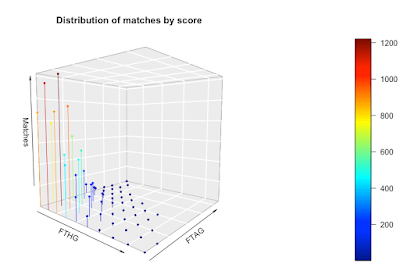
We can go one stage further and create a 3D scatter chart. On this chart, I've plotted the x, y, and z values and color-coded them so you get a sense of the magnitude of the z values. I've also connected the points to the axis (the zero plane if you like) to emphasize the data structure a bit more.


As with the persp function,  you can change your perspective on the plot and view it from another angle.

The downside with this approach is it requires the 'plot3D' library in R and it requires you to install a new graphics server (XQuartz). It's a chunk of work to get to a visualization. The function to draw the plot is 'scatter3D'. Here's my code:

scatter3D(x=goal_distribution$FTHG, 
          y=goal_distribution$FTAG, 
          z=goal_distribution$Matches, 
          xlab = "FTHG", ylab = "FTAG", zlab = "Matches",
          phi = 5, 
          theta = 40,
          bty = "g",  
          type = "h", 
          pch = 19,
          main="Distribution of matches by score",
          cex = 0.5)

What's my choice?

My goal was to understand the distribution of goals in the EPL, so what presentations of the data were most useful to me?

The simple table worked well and was the most informative, followed by the heatmap. I found both persp and scatter3D to be awkward to use and both consumed way more time than they were worth. The nice thing about the heatmap is that it's available as part of the wonderful ggplot library.

Bottom line: keep it simple.

Monday, September 14, 2020

The datasaurus: always visualize your data

The summary is not the whole picture

If you just use summary statistics to describe your data, you can miss the bigger picture, sometimes literally so. In this blog post, I'm going to show you how relying on summaries alone can lead you catastrophically astray and I'm going to tell you how you can avoid making career-damaging mistakes.

The datasaurus is why you need to visualize your data. Source: Alberto Cairo. Open source.

What are summary statistics?

Summary statistics are parameters like the mean, standard deviation, and correlation coefficient; they summarize the properties of the data and the relationship between variables. For example, if the correlation coefficient, r, is about 0.8 for two data sets x and y, we might think there's a relationship between them, but if it's about 0, we might think there isn't.

The use of summary statistics is widely taught, every textbook emphasizes them, and almost everyone uses them. But if you use summary statistics in isolation from other methods you might miss important relationships - you should always visualize your data as we'll see.

Anscombe's Quartet

Take a look at the four plots below. They're obviously quite different, but they all have the same summary statistics!

Here are the summary statistics data:

PropertyValue
Mean of x9
Sample variance of x : 11
Mean of y7.50
Sample variance of y : 4.125
Correlation between x and y0.816
Linear regression liney = 3.00 + 0.500x
Coefficient of determination of the linear regression : 0.67

These plots were developed in 1973 by the statistician Francis Anscombe to make exactly this point: you can't rely on summary statistics, you need to visualize your data. The graphical relationship between the x and y variables is different in each case and implies different things. By plotting the data out, we can see what the relationships are, but summary statistics hide what's going on.

The datasaurus

Let's zoom forward to 2016. The justly famous Alberto Cairo tweeted about Anscombe's quartet and illustrated the point with this cool set of summary statistics. He later expanded on his tweet in a short blog post.

Property Value
n 142
mean 54.2633
x standard deviation 16.7651
y mean 47.8323
y standard deviation 26.9353
Pearson correlation -0.0645

What might you conclude from these summary statistics? I might say, the correlation coefficient is close to zero so there's not much of a relationship between the x and the y variables. I might conclude there's no interesting relationship between the x and y variables - but I would be wrong.

The summary might not mean anything to you, but the visualization surely will. This is the datasaurus data set, the x and the y variables draw out a dinosaur.

The datasaurus dozen

Two researchers at Autodesk Research took things a stage further. They started with Alberto Cairo's datasaurus and created a dozen other charts with the same summary statistics as the datasaurus. Here they all are.

The summary statistics look like noise, but the charts reveal the underlying relationships between the x and y variables. Some of these relationships are obviously fun, like the star, but there are others that imply more meaningful relationships.

If all this sounds a bit abstract, let's think about how this might manifest itself in business. Let's imagine you're an analyst working for a large company. You have data on sales by store size for Europe and you've been asked to analyze the data to gain insights. You're under time pressure, so you fire up a Python notebook and get some quick summary statistics. You get summary statistics that look like the ones I showed you above. So you conclude there's nothing interesting in the data, but you might be very wrong.

You should plot the data out and look at the chart. You might see something that looks like the slanting charts above, maybe something like this:


the individual diagonal lines might correspond to different European countries (different regulations, different planning rules, different competition, etc.). There could be a very significant relationship that you would have missed by relying on summary data.

(The Autodesk Research team have posted their work as a paper you can read here.)

Lessons learned

The lessons you should take away from all this are simple:

  • summary statistics hide a lot
  • there are many relationships between variables that will give summary statistics that look like noise
  • always visualize your data!

Monday, August 10, 2020

Serial killer! How to lose business by the wrong serial numbers

Serial numbers and losing business

Here's a story about how something innocuous and low-level like serial numbers can damage your reputation and lose you business. I have advice on how to avoid the problem too!

(Serial numbers can give away more than you think. Image source: Wikimedia Commons. License: Public Domain.)

Numbered by design

Years ago, I worked for a specialty manufacturing company, its products were high precision, low-volume, and expensive. The industry was cut-throat competitive, and commentary in the press was that not every manufacturer would survive; as a result, customer confidence was critical.

An overseas customer team came to us to design a specialty item. The company spent a week training them and helping them design what they wanted. Of course, the design was all on a CAD system with some templated and automated features. That's where the trouble started.

One of the overseas engineers spotted that a customer-based serial number was automatically included in the design. Unfortunately, the serial number was 16, implying that the overseas team was only the 16th customer (which was true). This immediately set off their alarm bells - a company with only 16 customers was probably not going to survive the coming industry shake-out. The executive team had to smooth things over, which included lying about the serial numbers. As soon as the overseas team left, the company changed its system to start counting serial numbers from some high, but believable number (something like 857).

Here's the point: customers can infer a surprising amount from your serial numbers, especially your volume of business.

Invoices

Years later, I was in a position where I was approving vendor invoices. Some of my vendors didn't realize what serial numbers could reveal, and I ended up gaining insight into their financial state. Here are the rules I used to figure out what was going on financially, which was very helpful when it came to negotiating contract renewals.

  • If the invoice is unnumbered, the vendor is very small and they're likely to have only a handful of customers. All accounting systems offer invoice generation and they all number/identify individual invoices. If the invoice doesn't have a serial number, the vendor's business is probably too small to warrant buying an accounting system, which means a very small number of customers.
  • Naive vendors will start invoice numbering from 1, or from a number like 1,000. You can infer size if they do this.
  • Many accounting systems will increment invoice numbers by 1 by default. If you're receiving regular invoices from a vendor, you can use this to infer their size too. If this month's invoice is 123456 and next month's is 123466, this might indicate 10 invoices in a month and therefore 10 customers. You can do this for a while and spot trends in a vendor's customer base, for example, if you see invoices incrementing by 100 and later by 110, this may be because the vendor has added 10 customers.

The accounting tool suppliers are wise to this, and many tools offer options for invoice numbering that stop this kind of analysis (e.g. starting invoices from a random number, random invoice increments, etc.). But not all vendors use these features and serial number analysis works surprisingly often.

(Destroyed German Tank. Image source: Wikimedia Commons. License: Public Domain)

The German tank problem

Serial number analysis has been used in wartime too. In World War II, the allied powers wanted to understand the capacity of Nazi industry to build tanks. Fortunately, German tanks were given consecutive serial numbers (this is a simplification, but it was mostly true). Allied troops were given the job of recording the serial numbers of captured or destroyed tanks which they reported back. Statisticians were able to infer changes in Nazi tank production capabilities through serial number analysis, which after the war was found to be mostly correct. This is known as the German tank problem and you can read a lot more about it online.

My advice

For invoices, it's simple:
  • Always number your invoices and start the numbering from some high, but believable, number.
  • Increment your invoices using an offset that's not 1. Use your accounting package's features to obfuscate how many invoices you're sending out by setting the invoice number appropriately.
For customer IDs, it's a bit harder:
  • Use customer IDs that do not give away how many customers you have (so there's no customer 1, customer 2 etc.).  Review every artifact a customer might conceivable see and ensure there's nothing that gives away how many customers you have (this means checking folder numbers, checking any generated URLs etc.).

Simple things say a lot

The bottom line is simple: serial numbers can give away more about your business than you think. They can tell your customers how big your customer base is, and whether it's expanding or contracting; crucial information when it comes to renegotiating contracts. Pay attention to your serial numbers and invoices!

Saturday, June 13, 2020

Death by rounding

Round, round, round, round, I get around

Rounding errors are one of those basic things that every technical person thinks they're on top of and won't happen to them, but the problem is, it can and does happen to good people, sometimes with horrendous consequences. In this blog post, I'm going to look at rounding errors, show you why they can creep in, and provide some guidelines you should follow to keep you and your employer safe. Let's start with some real-life cases of rounding problems.


(Rounding requires a lot of effort. Image credit: Wikimedia Commons. License: Public Domain)

Rounding errors in the real world

The wrong rounding method

In 1992, there was a state-level election in Schleswig-Holstein in Germany. The law stated that every party that received 5% or more of the vote got a seat, but there were no seats for parties with less than 5%. The software that calculated results rounded the results up (ceil) instead of rounding the results down (floor) as required by law. The Green party received 4.97% of the vote, which was rounded up to 5.0%, so it appeared the Green party had won a seat. The bug was discovered relatively quickly, and the seat was reallocated to the Social Democrats who gained a one-seat majority because of it [Link]. 

Cumulative rounding

The more serious issue is cumulative rounding errors in real-time systems. Here a very small error becomes very important when it's repeatedly or cumulatively added.

The Vancouver Stock Exchange set up a new index in January 1982, with a value set to 1,000. The index was updated with each trade, but the index was rounded down to three decimal places (truncated) instead of rounding to the nearest decimal place. The index was calculated thousands of times a day, so the error was cumulative. Over time, the error built up from something not noticeable to something very noticeable indeed. The exchange had to correct the error; on Friday November 25th, 1983 the exchange closed at 524.811, the rounding error was fixed, and when the exchange reopened, the index was 1098.892 - the difference being solely due to the rounding error bug fix [Link].

The most famous case of cumulative rounding errors is the Patriot missile problem in Dharan in 1991. A Patriot missile failed to intercept a Scud missile, which went on to kill 28 people and injured a further 98. The problem came from the effects of a cumulative rounding error. The Patriot system updated every 0.1s, but 0.1 can't be represented exactly in a fixed point system, there's rounding, which in this case was rounding down. The processors used by the Patriot system were old 24-bit systems that truncated the 0.1 decimal representation. Over time, the truncation error built up, resulting in the Patriot missile incorrectly responding to sensor data and missing the Scud missile [Link].  

In-built bias

The way you were taught to round numbers in school leads to bias, it's a small, but it's there. You were taught to always round up numbers ending in 0.5, so 3.5 gets rounded to 4, 4.5. gets rounded to 5 and so on. Trouble is, by definition, 0.5 is exactly halfway. If you always round up, you're slightly biasing the results. Over time, or with a large enough data set, this can lead to errors.

To get round this problem, most modern languages uses something called banker's rounding (also known as Gaussian rounding or round to half-even) which round towards the nearest even number, so 3.5 gets rounded to 4 and 4.5 gets rounded to 4 too, however, 5.5 gets rounded to 6. This form of rounding is the one recommended by the IEEE and is the rounding method used in Python 3 and NumPy. However, not all libraries use it, some still use the round-to-nearest int method. 

Here's what you should do. If you need to use rounding, check out what rounding algorithm your system uses. If you have any choice, use banker's rounding. 

Theoretical explanation of rounding errors

Cumulative errors

Fairly obviously, cumulative errors are a sum:


E = ∑e

where E is the cumulative error and e is the individual error. In the Vancouver Stock Exchange example, the mean individual rounding error when rounding to three decimal places was 0.0005. From Wikipedia, there were about 3,000 transactions per day, and the period from January 1st 1982 when the index started to November 25th, 1983 when the index was fixed was about 473 working days. This gives an expected cumulative error of about 710, which is in the ballpark of what actually happened. 

Of course, if the individual error can be positive or negative, this can make the problem better or worse. If the error is distributed evenly around zero, then the cumulative error should be zero, so things should be OK in the long run. But even a slight bias will eventually result in a significant cumulative error - regrettably, one that might take a long time to show up.

Although the formula above seems trivial, the point is, it is possible to calculate the cumulative effect of rounding errors.

Combining errors

When we combine numbers, errors can really hurt depending on what the combination is. Let's start with a simple example, if:


z = x - y 

and:
 
sis the standard error in z
sis the standard error in x
sis the standard error in y

then

sz  = [s2x + s2y]1/2

If x and y are numerically close to one another, errors can quickly become very significant. My first large project involved calculating quantum states, which included a formula like z = x - y. Fortunately, the rounding was correct and not truncated, but the combination of machine precision errors and the formulae above made it very difficult to get a reliable result. We needed the full precision of the computer system and we had to check the library code our algorithms used to make sure rounding errors were correctly dealt with. We were fortunate in that the results of rounding errors were obvious in our calculations, but you might not be so fortunate.


Ratios are more complex, let's define:

z = x/y

with the s values defined as before, then:

sz /z = [(sx/x)2 + (sy/y)2]0.5

This suffers from the same problem as before, under certain conditions, the error can become very significant very quickly. In a system like the Patriot missile, sensor readings are used in some very complex equations. Rounding errors can combine to become very important.

The takeaway is very easy to state: if you're combining numbers using a ratio or subtracting them, rounding (or other errors) can hurt you very badly very quickly.

Insidious rounding errors

Cumulative rounding errors and the wrong type of rounding are widely discussed on the internet, but I've seen two other forms of rounding that have caught people out. They're hard to spot but can be damaging.

Rounding in the wrong places - following general advice too closely

Many technical degrees include some training on how to present errors and significant digits. For example, a quantity like 12.34567890 ∓ 0.12345678 is usually written 12.3 ∓ 0.1. We're told not to include more significant digits than the error analysis warrants. Unfortunately, this advice can lead you astray if you apply it unthinkingly.

Let's say we're taking two measurements:


x = 5.26 ∓0.14
y = 1.04 ∓0.12

following the rules of representing significant digits, this gives us

x = 5.3 ∓0.1
y = 1.0 ∓0.1

If :

z = x/y

then with the pre-rounded numbers:

z = 5.1 ∓ 0.6

but with the rounded numbers we have:

z = 5.3 ∓ 0.5

Whoops! This is a big difference. The problem occurred because we applied the advice unthinkingly. We rounded the numbers prematurely; in calculations, we should have kept the full precision and only shown rounded numbers for display to users.

The advice is simple: preserve full precision in calculations and reserve rounding for numbers shown to users.

Spreadsheet data

Spreadsheets are incredible sources of errors and bugs. One of the insidious things spreadsheets do is round numbers, which can result in numbers appearing not to add up. 

Let's have a look at an example. The left of the table shows numbers before rounding. The right of the table shows numbers with rounding (suppressing the decimal places). The numbers on the right don't add up because of rounding (they should sum to 1206). 


  No round   Round
 Jan121.4   Jan  121
 Feb 251.4  Feb 251
 Mar 311.4  Mar 311
 Apr 291.4  Apr 291
 May 141.4  May 141
 Jun 91.4  Jun 91
 TOTAL 1208.4  TOTAL 1208

An insidious problem occurs rounded when numbers are copied from spreadsheets and used in calculations - which is a manifestation of the premature rounding problem I discussed earlier.

1.999... = 2, why 2 != 2, and machine precision

Although it's not strictly a rounding error, I do have to talk about the fact that 1.999... = 2. This result often surprises people, but it's an easy thing to prove. Unfortunately, on machines with finite precision, 1.9999... == 2 will give you False! Just because it's mathematically true, doesn't mean it's true on your system.  

I've seen a handful of cases when two numbers that ought to be the same fail an equality test, the equivalent of 2 == 2 evaluating to False. One of the numbers has been calculated through a repeated calculation and machine precision errors propagate, the other number has been calculated directly. Here's a fun example from Python 3:

1 == (1/7) + (1/7) + (1/7) + (1/7) + (1/7) + (1/7) + (1/7)

evaluates to False!

To get round this problem, I've seen programmers do True/False difference evaluations like this:

abs(a - b) <= machine_precision

The machine precision constant is usually called epsilon.

What to watch for

Cumulative errors in fixed-point systems

The Patriot missile case makes the point nicely: if you're using sensor data in a system using fixed-point arithmetic, or indeed in any computer system, be very careful how your system rounds its inputs. Bear in mind, the rounding might be done in an ADC (analog-to-digital converter) beyond your control - in which case, you need to know how it converts data. If you're doing the rounding, you might need to use some form of dithering.

Default rounding and rounding methods

There are several different rounding methods you can use; your choice should be a deliberate one and you should know their behavior. For example, in Python, you have:

  • floor
  • ceil
  • round - which uses banker's rounding not the school textbook form of rounding and was changed from Python 2 to Python 3.

You should be aware of the properties of each of these rounding methods. If you wanted to avoid the Vancouver Stock Exchange problem, what form of rounding would you choose and why? Are you sure?

A more subtle form of rounding can occur when you mix integers and floating-point numbers in calculations. Depending on your system and the language you use, 7.5/2 can give different answers. I've seen some very subtle bugs involving hidden type conversion, so be careful.

Premature rounding

You were taught to only present numbers to an appropriate numbers of decimal places, but that was only for presentation. For calculations, use the full precision available.

Spreadsheets

Be extremely careful copying numbers from spreadsheets, the numbers may have been rounded and you may need to look closer to get extra digits of precision.

Closing thoughts

Rounding seems like a simple problem that happens to other people, but it can happen to you and it can have serious consequences. Take some time to understand the properties of the system and be especially careful if you're doing cumulative calculations, mixed floating-point and integer calculation, or if you're using a rounding function.

Wednesday, March 11, 2020

Benford's Law: finding fraud and data oddities

What links fraud detection, old-fashioned log tables, and error detection in data feeds? Benford’s Law provides the link and I'll show you what it is and how you might use it.

Imagine I gave you thousands of invoices and asked you to record the first digit of the amount. Out of say, 10,000 invoices, how many would you expect to start with the number 1, how many with the number 2, and so on? Naively, you might expect 1,111 to start with a 1; 1,111 to start with a 2 and so on. But that’s not what happens in the real world. 1 occurs more often than 2, which occurs more often than 3, and so on.

The Benford’s Law story starts in 1881, when Simon Newcomb, an astronomer, was using some mathematical log tables. For those of you too young to know, these are tables of the logarithms of numbers, very useful in pre-calculator days. Newcomb noticed that the pages for logarithms beginning 1 were more well-thumbed than the other pages, indicating that people were looking for the logarithms of some numbers more than others. Being an academic, he published a paper on it.

In 1938, a physicist called Frank Benford looked at a number of datasets and found the same relationship between the first digits. For example, he looked at the first digit of addresses and found that 1 occurred more frequently than 2, which occurred more frequently than 3 and so on. He didn't just look at addresses, he looked at the first digit of physical constants, the surface area of rivers, and numbers in the Reader's Digest etc. Despite being the second person to discover this relationship, the law is named after him and not Newcomb.

It turns out, we can mathematically describe Benford’s Law as:

P(d) = log(1 + (1/d))

Where d is the numbers 1 to 9 and P(d) is the probability of the number occurring. If we plot it out we get:

This means that for some datasets we expect the first digit to be one 30.1% of the time, the second digit to be two 17.6% of the time, three to be the first digit 12.5% of the time, etc.

The why of Benford’s Law is much too complex for this blog post. It was only recently (1998) proved by Hill [Hill] and involves digging into the central limit theorem and some very fundamental statistical and probability concepts.

Going back to my accounting example, it would seem all we have to do is plot the distribution for our invoice data and compare it to Benford’s Law. If there’s a difference, then there’s fraud. But the reality is, things are more complex than that.

Benford’s Law doesn’t apply everywhere, there are some conditions:

  • The data set must vary over several orders of magnitude (e.g. from 1 to 1,000)
  • The data set must have dimensions, or units. For example, Euros, or mm.
  • The mean is greater than the median and the skew is positive.

Collins provides a nice overview of how it can be used to detect accounting fraud [Collins]. But Linville [Linville] has poked some practical holes in its use. He conducted an experiment using graduate students to create fake test invoices (this was a research exercise, not an attempt at fraud!) that were mixed in with simulated invoice data. He found that if the fake invoices were less than 10% or so of the total dataset, the deviations from Benford’s Law were too small to be reliably detected.

Benford’s Law actually applies to all digits, not just the first. We can plot out an expected distribution for two digits as I’ve shown below. This has also been used for fraud detection as you might expect.

You can use Benford's Law to detect errors in incoming data. Let's say you have a datafeed of user addresses. You know the house numbers should obey Benford's Law, so you can work out the distribution the data actually has and compare it to the theoretical Benford's Law distribution. If the difference is above some threshold, you can set an alert. Bear in mind, it's not just addresses that follow the law, other properties of a data feed may too. A deviation from Benford"s Law doesn't tell you which particular items are wrong, but you do get a clue about which category, for example,  you might discover items starting with a 2 are too frequent. This is a special case of using the deviation of real data from an expected distribution as an error detection mechanism - a very useful data quality assurance method everyone should be using.

To truly understand Benford’s Law, you’ll need to dig deeply into statistics and possibly number theory, but using it is relatively straightforward. You should be aware it exists and know its limitations - especially if you’re looking for fraud.

References

[Collins] J. Carlton Collins, “Using Excel and Benford’s Law to detect fraud”, https://www.journalofaccountancy.com/issues/2017/apr/excel-and-benfords-law-to-detect-fraud.html
[Hill] Hill, T. P. "The First Digit Phenomenon." Amer. Sci. 86, 358-363, 1998.
[Linville] “The Problem Of False Negative Results In The Use Of Digit Analysis”, Mark Linville, The Journal of Applied Business Research, Volume 24, Number 1

Further reading

Wikipedia article https://en.wikipedia.org/wiki/Benford%27s_law
Mathworld article http://mathworld.wolfram.com/BenfordsLaw.html