Why aren't 2D plots good enough?
Most data visualization problems involve some form of two-dimensional plotting, for example plotting sales by month. Over the last two hundred years, analysts have developed several different types of 2D plots, including scatter charts, line charts, and bar charts, so we have all the chart types we need for 2D data. But what happens if we have a 3D dataset?
The dataset I'm looking at is English Premier League (EPL) results. I want to know how the full-time scores are distributed, for example, are there more 1-1 results than 2-1 results? I have three numbers, the full-time home goals (FTHG), the full-time away goals (FTAG). and the number of games that had that score. How can I present this 3D data in a meaningful way?
(You can't rely on 3D glasses to visualize 3D data. Image source: Wikimedia Commons, License: Creative Commons, Author: Oliver Olschewski)
Just the text
The easiest way to view the data is to create a table, so here it is. The columns are the away goals, the rows are the home goals, and the cell values are the number of matches with that result, so 778 is the number of matches with a score of 0-1.
This presentation is easy to do, and relatively easy to interpret. I can see 1-1 is the most popular score, followed by 1-0. You can also see that some scores just don't occur (9-9) and results with more than a handful of goals are very uncommon.
This is OK for a smallish dataset like this, but if there are hundreds of rows and/or columns, it's not really viable. So what can we do?
Heatmaps
A heatmap is a 2D map where the 3rd dimension is represented as color. The more intense (or lighter) the color, the higher the value. For this kind of plot to work, you do have to be careful about your color map. Usually, it's best to choose the intensity of just one color (e.g. shades of blue). In a few cases, multiple colors can work (colors for political parties), but those are the exceptions.
Here's the same data plotted as a heatmap using the Brewer color palette "RdPu" (red-purple).
The plot does clearly show the structure. It's obvious there's a diagonal line beyond which no results occur. It's also obvious which scores are the most common. On the other hand, it's hard to get a sense of how quickly the frequency falls off because the human eye just isn't that sensitive to variations in color, but we could probably play around with the color scale to make the most important color variation occur over the range we're interested in.
This is an easy plot to make because it's part of R's ggplot package. Here's my code:
Perspective scatter plot
Another alternative is the perspective plot, which in R, you can create using the 'persp' function. This is a surface plot as you can see below.
You can change your perspective on the plot and view it from other angles, but even from this perspective, it's easy to see the very rapid falloff in frequency as the scores increase.
However, I found this plot harder to use than the simple heatmap, and I found changing my viewing angle was awkward and time-consuming.
Here's my code in case it's useful to you:
3D scatter plot
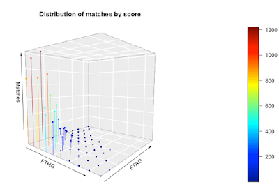
We can go one stage further and create a 3D scatter chart. On this chart, I've plotted the x, y, and z values and color-coded them so you get a sense of the magnitude of the z values. I've also connected the points to the axis (the zero plane if you like) to emphasize the data structure a bit more.
As with the persp function, you can change your perspective on the plot and view it from another angle.
The downside with this approach is it requires the 'plot3D' library in R and it requires you to install a new graphics server (XQuartz). It's a chunk of work to get to a visualization. The function to draw the plot is 'scatter3D'. Here's my code:
What's my choice?
My goal was to understand the distribution of goals in the EPL, so what presentations of the data were most useful to me?
The simple table worked well and was the most informative, followed by the heatmap. I found both persp and scatter3D to be awkward to use and both consumed way more time than they were worth. The nice thing about the heatmap is that it's available as part of the wonderful ggplot library.


No comments:
Post a Comment