A briefing on logistic regression
I've been looking again at logistic regression and going over some of the theory behind it. In a previous blog post, I talked about how I used Manus to get a report on logistic regression and I showed what Manus gave me. I thought it was good, B+, but not great, and I had some criticisms of what Manus produced. The obvious challenge is, could I do better? This blog post is my attempt to explain logistic regression better than Manus.
What problems are we trying to solve?
There are a huge class of problems where we’re trying to predict a binary result, here are some examples:
- The results of a referendum, e.g., whether or not to remain in or leave the EU.
- Whether to give drug A or drug B to a patient with a condition.
- Which team will win the World Cup or Super Bowl or World Series.
- Is this transaction fraudulent?
Typically, we’ll have a bunch of different data we can use to base our prediction model on. For example, for a drug choice, we may have age, gender, weight, smoker or not, and so on. These are called features. Corresponding to this feature set, we’ll have a set of outcomes (also called labels), for example, for the drug case, it might be something like percentage survival (a% survived given drug A compared to b% for drug B). This makes logistic regression a supervised machine learning method.
In this blog post, I’ll show you how you can turn feature data into binary classification predictions using logistic regression. I’ll also show you how you can extend logistic regression beyond binary classification problems.
Before we dive into logistic regression, I need to define some concepts.
What are the odds?
Logistic regression relies on the odds or the odds ratio, so I’m going to define what it is using an example.
For two different drug treatments, we have different rates of survival. Here’s a table adapted from [1] that shows the probability of survival for fictitious study.
|
Standard treatment |
New treatment |
Totals |
| Died |
152 (38%) |
17 (17%) |
169 |
| Survived |
248 (62%) |
103 (83%) |
351 |
| Totals |
400 (100%) |
120 (100%) |
520 |
Plainly, the new treatment is much better. But how much better?
In statistics, we define the odds as being the ratio of the probability of something happening to it not happening:
\[odds = \dfrac{p}{1 - p}\]
So, if there’s a 70% chance of something happening, the odds of it happening are 2.333. Probabilities can range from 0 to 1 (or 0% to 100%), whereas odds can range from 0 to infinity. Here’s the table above recast in terms of odds.
|
Standard treatment |
New treatment |
| Died |
0.613 |
0.165 |
| Survived |
1.632 |
6.059 |
The odds ratio tells us how much more likely an outcome is. A couple of examples should make this clearer.
The odds ratio for death with the standard treatment compared to the new is:
\[odds \: ratio = \dfrac{0.613}{0.165} = 3.71...\]
This means a patient is 3.71 times more likely to die if they’re given the standard treatment compared to the new.
More hopefully, the odds ratio for survival with the new treatment compared to the old is:
\[odds \: ratio = \dfrac{6.059}{1.632} = 3.71...\]
Unfortunately, most of the websites out there are a bit sloppy with their definitions. Many of them conflate “odds” and “odds ratio”. You should be aware that they’re two different things:
- The odds is the probability of something happening divided by the probability of it not happening.
- The odds ratio compares the odds of an event in one group to the odds of the same event in another group.
The odds are going to be important for logistic regression.
The sigmoid function
Our goal is to model probability (e.g. the probability that the best treatment is drug A), so mathematically, we want a modeling function that has a y-value that varies between 0 and 1. Because we’re going to use gradient methods to fit values, we need the derivative of the function, so our modeling function must be differentiable. We don’t want gaps or ‘kinks’ in the modeling function, so we want it to be continuous.
There are many functions that fit these requirements (for example, the error function). In practice, the choice is the sigmoid function for deep mathematical reasons; if you analyze a two-class distribution using Bayesian analysis, the sigmoid function appears as part of the posterior probability distribution [2]. That's beyond where I want to go for this blog post, so if you want to find out more, chase down the reference.
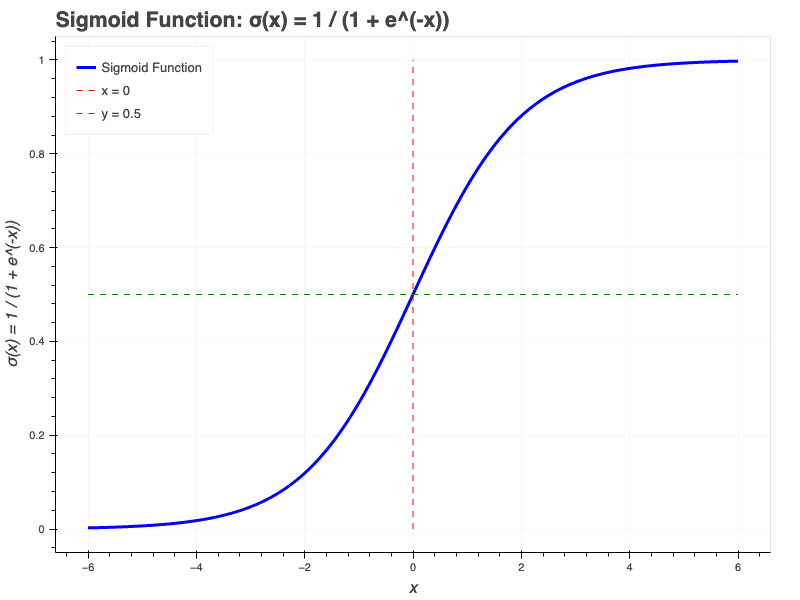
Mathematically, the sigmoid function is:
\[\sigma(x) = \dfrac{1}{1 + e^{-x}} \]
And graphically, it looks like this:
I’ve shown the sigmoid function in one dimension, as a function of \(x\). It’s important to realize that the sigmoid function can have multiple parameters (e.g. \(\sigma(x, y, z)\)), it’s just much, much harder to draw.
The sigmoid and the odds
We can write the odds as:
\[odds = \dfrac{1}{1-p}\]
Taking the natural log of both sides (this is called the logit function):
\[ln(odds) = ln \left( \dfrac{1}{1-p} \right)\]
In machine learning, we're building a prediction function from \(n\) features \(x\), so we can write:
\[\hat{y} = w_1 \cdot x_1 + w_2 \cdot x_2 \cdots + w_n \cdot x_n\]
For reasons I'll explain later, this is the log odds:
\[\hat{y} = w_1 \cdot x_1 + w_2 \cdot x_2 \cdots + w_n \cdot x_n = ln \left( \dfrac{1}{1-p} \right)\]
With a little tedious rearranging, this becomes:
\[p = \dfrac{1}{1 + e^{-(w_1 \cdot x_1 + w_2 \cdot x_2 \cdots + w_n \cdot x_n)}}\]
Which is exactly the sigmoid function I showed you earlier.
So the probability \(p\) is modeled by the sigmoid function.
This is the "derivation" provided in most courses and textbooks, but it ought to leave you unsatisfied. The key point is unexplained, why is the log odds the function \(w_1 \cdot x_1 + w_2 \cdot x_2 \cdots + w_n \cdot x_n \)? The answer is complicated and relies on a Bayesian analysis [3]. Remember, logistic regression is taught before Bayesian analysis, so lecturers or authors have a choice; either divert into Bayesian analysis, or use a hand-waving derivation like the one I've used above. Neither choice is good. I'm not going to go into Bayes here, I'll just refer you to more advanced references if you're interested [4].
Sigmoid to classification
In the previous section, I told you that we calculate a probability value. How does that relate to classification? Let's take an example.
Imagine two teams, A and B playing a game. The probability of team A winning is \(p(A)\) and the probability of team B winning is \(p(B)\). From probability theory, we know that \(p(A) + p(B) = 1\), which we can rearrange as \(p(B) = 1 - p(A)\). Let's say we're running a simulation of this game with the probability \(p = p(A)\). So when p is "close" to 1, we say A will win and when p is close to 0, we say B will win.
What do we mean by close? By "default", we might say that if \(p >= 0.5\) then we chose A and if \(p < 0.5\) we chose B. That seems sensible and it's the default choice of scikit-learn as we'll see, but it is possible to select other thresholds.
(Don't worry about the difference between \(p >= 0.5\) and \(p < 0.5\) - that only becomes an issue under very specific circumstances.)
Features and functions
Before we dive into an example of using logistic regression, it's worth a quick detour to talk about some of the properties of the sigmoid function.
- The y axis varies from 0 to 1.
- The x axis varies from \(-\infty\) to \(\infty\)
- The gradient changes rapidly around \(x=0\) but much more slowly as you move away from zero. In fact, once you go past \(x=5\) or \(x=-5\) the curve pretty much flattens. This can be a problem for some models.
- The "transition region" between \(y=0\) and \(y=1\) is quite narrow, meaning we "should" be able to assign probabilities away from \(p=0.5\) most of the time, in other words, we can make strong predictions about classification.
How logistic regression works
Calculating a cost function is key, however, it does involve some math that would take several pages and I don't want to turn this into a huge blog post. There are a number of blog posts online that delve into the details if you want more, checkout references [7, 8].
In linear regression, the method used to minimize the cost function is gradient descent (or a similar method like ADAM). That's not the case with logistic regression. Instead we use something called maximum likelihood estimation, and as its name suggests, this is based on maximizing the likelihood our model will predict the data we see. This approach relies on calculating a log likelihood function and using a gradient ascent method to maximize likelihood. This is an iterative process. You can read more in references [5, 6].
Some code
I'm not going to show you a full set of code, but I am going to show you the "edited highlights". I created an example for this blog post, but all the ancillary stuff got in the way of what I wanted to tell you, so I just pulled out the pieces I thought that would be most helpful. For context, my code generates some data and attempts to classify it.
There are multiple libraries on Python that have logistic regression, I'm going to focus on the one most people use to explore ideas, scikit-learn.
from sklearn.linear_model import LogisticRegression
from sklearn.model_selection import train_test_split
from sklearn.metrics import accuracy_score, classification_report
from sklearn.preprocessing import StandardScaler
train_test_split splits the data into a test set and training set. I'm not going to show how that works, it's pretty standard,
Machine learning algorithms tend to work better when the features are scaled. A lot of the time, this isn't an issue, but if the values of features range very, very differently, this can be an issue for the numeric algorithms. Here's an example: let's say feature 1 ranges from 0.001 to 0.002 and feature 2 ranges from 1,000,000 to 2,000,000, then we may have a problem. The solution is to scale the features over the same 0 to 1 range. Notably, scaling is also a problem for many curve fitting type algorithms too. Here's the scaling code for my simple example:
scaler = StandardScaler()
features_scaled = scaler.fit_transform(features)
Fitting is simply calling the fit method on the LogisticRegression model, so:
# Create and train scikit-learn logistic regression model
model = LogisticRegression(
random_state=random_state,
max_iter=max_iterations,
solver='liblinear'
)
# Train the model on scaled features
model.fit(features_scaled, labels)
As you might expect, max_iter stops the fitting process from going on forever. random_state controls the random number generator used; it's only applicable to some solvers like the 'liblinear' one I've used here. The solver is the type of equation solver used. There's a choice of different solvers which have different properties and are therefore good for different sorts of data, I've chosen 'liblinear' because it's simple.
fit works exactly as you think it might.
Here's how we make predictions with the test and training data sets:
test_features_scaled = scaler.transform(test_features)
train_features_scaled = scaler.transform(train_features)
train_predictions = model.predict(train_features_scaled)
test_predictions = model.predict(test_features_scaled)
This is pretty straightforward, but I want to draw your attention to the scaling going on here. Remember, we scaled the features when we created the model, so we have to scale the features when we're making predictions.
The predict method uses a 0.5 threshold as I explained earlier. If we'd wanted another threshold, say 0.7, we would have used the predict_proba method.
We can measure how good our model is with the function accuracy_score.
train_accuracy = accuracy_score(train_labels, train_predictions)
test_accuracy = accuracy_score(test_labels, test_predictions)
This gives a simple number for the accuracy of the train and test set predictions.
You can get a more detailed report using classification_report:
classification_report(test_labels, test_predictions)
This gives a set of various "correctness" measures.
Here's a summary of the stages:
- Test/train split
- Scaling
- Fit the model
- Predict results
- Check the accuracy of the prediction.
Some issues with the sigmoid
Logistic regression is core to neural nets (it's all in the activation function), and as you know, neural nets have exploded in popularity. So any issues with logistic regression take on an outsize importance.
Sigmoids suffers from the "vanishing gradient" problem I hinted at earlier. As \(x\) becomes more positive or negative, the \(y\) value gets closer to 0 or 1, so the gradient (first derivative) gets smaller and smaller. In turn, this can make training deep neural nets harder.
Sigmoids aren't zero centered, which can cause problems for modeling some systems.
Exponential calculations cost more computation time than other, simpler functions. If you have thousands, or evens millions of nets, that soon adds up.
Fortunately, sigmoids aren't the only game in town. There are a number of alternatives to the sigmoid, but I won't go into them here. You should just know they exist.
Beyond binary
In this post, I've talked about simple binary classification. The formula and examples I've given all revolve around simple binary splits. But what if you want to classify something into three or more buckets? Logistic regression can be extended for more than two possible outputs and can be extended to the case where the outputs are ordered (ordinal).
In practice, we use more or less the same code we used for the binary classification case, but we make slightly different calls to the LogisticRegression function. The scikit-learn documentation has a really nice three-way classification demo you can see here: https://scikit-learn.org/stable/auto_examples/linear_model/plot_logistic_multinomial.html.
What did Manus say?
Previously, I asked Manus to give me a report on logistic regression. I thought it's results were OK, but I thought I could do better. Here's what Manus did: https://blog.engora.com/2025/05/the-importance-of-logistic-regression.html, and of course, you're reading my take.
Manus got the main points of logistic regression, but over emphasized some areas and glossed over others. It was a B+ effort I thought. Digging into it, I can see Manus reported back on the consensus of the blogs and articles out there on the web. That's fine (the "wisdom of the crowd"), but it's limited. There's a lot of repetition and low-quality content out there, and Manus reflected that. It missed nuances because most of the stuff out there did too.
The code Manus generated was good and it's explanation of the code was good. It did miss explaining some things I thought were important, but on the whole I was happy with it.
Overall, I'm still very bullish on Manus. It's a great place to start and may even be enough of itself for many people, but if you really want to know what's going on, you have to do the work.
References
[1] Sperandei S. Understanding logistic regression analysis. Biochem Med (Zagreb). 2014 Feb 15;24(1):12-8. doi: 10.11613/BM.2014.003. PMID: 24627710; PMCID: PMC3936971.
[2] Bishop, C.M. and Nasrabadi, N.M., 2006. Pattern recognition and machine learning (Vol. 4, No. 4, p. 738). New York: springer.
[3] https://www.dailydoseofds.com/why-do-we-use-sigmoid-in-logistic-regression/
[4] Norton, E.C. and Dowd, B.E., 2018. Log odds and the interpretation of logit models. Health services research, 53(2), pp.859-878.
[5] https://www.geeksforgeeks.org/machine-learning/understanding-logistic-regression/
[6] https://www.countbayesie.com/blog/2019/6/12/logistic-regression-from-bayes-theorem
[7] https://medium.com/analytics-vidhya/derivative-of-log-loss-function-for-logistic-regression-9b832f025c2d
[8] https://medium.com/data-science/introduction-to-logistic-regression-66248243c148


_(5092283927).jpg)