Sunday, April 18, 2021

A/B testing basics: ways of being right and wrong (frequentist version)

What are we trying to achieve?

In a typical A/B test, we're trying to find out if a change has a (positive) effect. For example, does changing the page layout increase the clickthrough rate? Despite what you've been told, we can't answer these types of questions with absolute certainty: the best we can do is provide a probable answer.  We use statistical best practices to map a probability to a pass/fail answer. 

In this blog post, I'm going to lay out some fundamentals to help you understand the process a statistician follows to translate a probabilistic result into a pass/fail result. 

A typical A/B test

To provide some focus for discussion, let's imagine we're testing to see if a discount on a website increases the rate of purchase. We'll have a control branch that doesn't have the discount and a treatment branch that has the discount. We'll measure conversion for both branches: \(c_T\) for the conversion for the treatment branch and \(c_C\) for the conversion for the control branch.

This kind of test is called a null hypothesis test. The null hypothesis here is that there is no difference, the alternate hypothesis is that there is a difference. We can write this as:
\[H_0: c_T  - c_C = 0\]
\[H_1: c_T - c_C \neq 0\]
There's something subtle here you need to know. The conversion rate we measure is an average conversion rate over many visitors, probably several thousand. Because of this, some very important mathematics kicks in, specifically something called the Central Limit Theorem. This theorem tells us our results will be normally distributed, in other words, \(c_T - c_C\) will be normally distributed, which is important as we'll see in a minute.

Types of error

I've blogged about null hypothesis tests before, so I'm only going to summarize things here. We can assume there's some underlying truth: either \(H_0\) or \(H_1\) is true. We don't know which is true and we're making an educated true/false guess. This gives us two ways of being right and two ways of being wrong. I've shown this in the table below.

    Null Hypothesis is
    True False
Decision about null hypothesis  Fail to reject True negative
Correct inference
Probability threshold= 1 - \( \alpha \)
False negative
Type II error
Probability threshold= \( \beta \)
Reject False positive
Type I error
Probability threshold = \( \alpha \)
True positive
Correct inference
Probability threshold = Power = 1 - \( \beta \)

We can't know for certain what the truth is, but we can define limits on our uncertainty. We can also define thresholds that will enable us to make reasonable pass/fail estimates. I'll show you how this works.

Assuming the null is true

The first step is to assume the null hypothesis is true, which means \( c_T  - c_C = 0\). As I explained earlier, the quantity \(c_T - c_C\) is normally distributed (this is a probability distribution, which I've blogged about before). We can compare our actual measurement of  \( c_T  - c_C\) to the theoretical distribution and ask how likely it is that the underlying value really is zero (in other words, what's the probability of the null being true?). 

Let me take a second to explain this some more. Imagine I'm trying to find out if a coin is biased. I throw it ten times and see six heads. Does this prove the coin is biased? No. It could be biased, but I don't have enough throws to say. Now imagine I've thrown the coin 100,000 times and I see 60,000 heads, does this prove bias? It's not absolutely sure, but it's highly likely the coin is biased. With statistics, we quantify this kind of analysis and set ground rules for what we consider evidence.

We can take our hypothetical A/B test and map the expected result to a standard normal distribution (very easy to do). Let's look at the standard normal distribution below, which plots a probability vs. a measurement value \(z\). Although it's true that all values are possible, the likelihood of some of them occurring is very low. For example, the probability of measuring a \(z\) value in the range \(-1  \leq z \leq 1\) is 0.68, but the probability of measuring a \(z\) value in the range \(1  \leq z \leq 3\) is only 0.16.


Certainty is impossible, but what we want to do is say whether a measurement means the null hypothesis is true or the alternate is. Put it another way, for a given measurement, how likely is it that the null is true or not? What's our threshold for acceptance/rejection? The standard procedure is to compare our measurement to the chart above. If our measurement falls in the blue zone on the chart we'll consider it means the null hypothesis is true. Anything that falls in the red zone, we'll consider the alternate is true. But we might be wrong - we can never have certainty. The size of the red area gives us the limits on our certainty. By convention, the red zones are 5% of the probability.

The standard limits we use are that we have to be in the 95% probability (blue) zone around zero to accept the null, and in the red 5% area to accept the alternate. This 5% threshold is usually called significance level and is given the symbol \(\alpha\). 

Using a threshold of 5% crudely speaking means we'll be wrong 5% of the time. Let's imagine a company running 100 tests in a year, this threshold means they'll be wrong in about 5 cases.

Surely this is enough? Surely we can now do this calculation and use \(\alpha\) to say pass/fail? No. We have assumed the null is true. But we also need to do the opposite and assume the alternate is true. 

Assuming the alternate is true

Now, we assume the alternate is true, that \( c_T - c_C \neq 0\). We can plot this out as a normal distribution too, but there's a difference. When we considered the null hypothesis to be true, we considered both sides of the normal curve, but here we only care about one side of the distribution. Remember, we're looking at the difference \( c_T - c_C \), so one side of the curve 'points' towards zero (no difference), and the other side points towards a bigger difference. We only care about the side that 'points' towards zero.

If there really is a difference, we expect a probability distribution like this below. We'll consider the alternate hypothesis to be true if our measurement lands in the blue zone, if it lands in the red zone, we'll reject the alternate. As before, the alternate could be true, and by chance, we could land in the red zone. The threshold value we'll use here is called \(\beta\). 


For reasons I won't go into, the threshold value is called the power of a test and is given by \(1-\beta\). Typical values of power range from 80% to 95%, but 80% is considered a minimum threshold. I'll have a lot more to say about power in another blog post.

Putting it together

Usually, the two charts I've shown you are shown looking like this. The sample sizes are chosen so that \(\alpha\) and \(\beta\) line up.


For our A/B test, here are the simplified steps in the process.

  1. Note the number of samples in each branch, in this case, the number of samples is the number of website visitors.
  2. Work out the conversion rate for the two branches and work out \( c_T - c_C \).
  3. Work out the probability of observing \( c_T - c_C \) if the null is true. (This is a simplification, we work out a p-value, which is the probability of observing a measurement greater than or equal to the measurement we're seeing).
  4. Compare the p-value to \(\alpha\). If \(p < \alpha\) then we reject the null hypothesis (we believe the treatment had an effect). If \(p > \alpha\) we accept the null hypothesis (we believe the treatment had no effect).
  5. Work out the probability of observing \( c_T - c_C \) if the alternate is true. This is the observed power. The observed power should be greater than about 80%. An observed power lower than about 80% means the test is unreliable.

How to fail

When people new to statistics get involved in A/B testing, they sometimes make the mistake of focusing only on confidence (and p-values). This gives them insight into false positives, but it says nothing at all about false negatives. To put it bluntly, this incorrect process puts all the emphasis on the risk of doing something, but none at all on the risk of doing nothing. This kind of focus also leads to tests that are too short to be reliable.

Let me put this another way. Significance is about protecting you from buying something that doesn't work. Power is about protecting you from not buying something that works.

Why not just set the thresholds higher?

The widths of the normal distributions I've shown depend on the number of samples. The more samples there are, the narrower the curve. The thresholds depend on the narrowness of the curve. To put it simply, increasing confidence and power mean increasing the number of samples in the test, which means a longer test. So all we need to do is increase the length of the test? Not so fast, the relationship isn't a linear one. Increasing power or significance by a few percentage points could double the length of the test depending on what the power and significance levels are.

Where do these thresholds come from?

The choice of a confidence value of 95% is arbitrary and comes from statistical standard practice. There's a fierce ongoing debate in the social sciences about whether this threshold is appropriate; an emerging view is that it's too lax a standard. In a recent paper in Nature, Benjamin et al [Benjamin] argued passionately that 99.5% is a better threshold. 

Something similar applies to power. The 'industry standard' is 80%, a figure with a far murkier background [Cohen]. In my view, using this figure of 80% is wrong in almost all cases. 80% is a minimum. I'll have a lot more to say about power in another blog post.

Eye of newt and toe of frog...

I've talked glibly about accepting and rejecting hypothesis. This is a deliberate simplification on my part. The true statistical language is "fail to reject the null hypothesis" and "reject the null hypothesis". There are good fundamental reasons for using this language, but if you're not a statistical person, it's very confusing. I've chosen a simplified version to make my point.

The process for deciding an A/B test reads like a witches' brew recipe rather than a scientific process. It's reliant on arbitrary thresholds, some difficult concepts, and confusing language. The null hypothesis test itself is a shot-gun marriage of techniques. Unsurprisingly, p-values are widely misinterpreted and misunderstood [Amrhein]. 

Fundamentally, the whole process is a witches' brew; it works, but it's not satisfying. 

Fortunately, there is an alternative view using a Bayesian approach which is simpler, and more enlightening. I'll talk about the Bayesian approach in another blog post. If the Bayesian approach is more satisfying, why did I show this (frequentist) approach here? Because this approach is what people are taught.

References

[Amrhein] Valentin Amrhein, Sander Greenland, Blake McShane, Scientists rise up against statistical significance, Nature 567, 305-307 (2019)

[Benjamin] Benjamin, D.J., Berger, J.O., Johannesson, M. et al. Redefine statistical significance. Nat Hum Behav 2, 6–10 (2018). https://doi.org/10.1038/s41562-017-0189-z

[Cohen] Cohen, J. (1988). Statistical power analysis for the behavioral sciences (2nd ed.). Hillside, NJ: Lawrence Erlbaum Associates.

Monday, April 12, 2021

Goodies and baddies: how a poor model of history lets us down

The wrong model to understand history

Some of my history teachers taught me the wrong model to understand history. To be fair to them, they were simplifying complex events for children. But as an adult, I've seen journalists use the same simple model to stoke outrage and twist the meaning of historical discussions.

I'm going to tell you what the broken model of history is, show you how a simple local legend blasts it apart, and how seductive and damaging the model can be.

The heroes or villains model

There's a lot of English history, a good deal of it is bloody, complex, and hard to understand. To simplify subtle stories for schoolchildren, books and teachers often boil down stories to a few core elements, reducing historical figures to stereotypical heroes or villains. Sometimes, this works well, for example, Hitler and Mussolini fall neatly into the villain category, but in most cases, it doesn't work at all as we'll see. Even worse, the heroes or villains model lends itself to a kind of uncritical patriotism: "Britons good, foreigners bad". 

A good example of this simplification is Winston Churchill, who's often uncritically portrayed by the British press as a hero. Some writers consider any criticism of Churchill as unpatriotic and an attempt to portray him as a villain (hero or villain - no space for something else). My contention is, the hero or villain model is the wrong model to understand Churchill, or indeed any other historical figure.

Because the Churchill story is so charged, I'm going to use another historical example and try and apply the heroes or villains model to it. My story involves the English Civil War, regicide, death squads, and a local Massachusetts legend.

(The English Civil War - who were the heroes and who were the villains? Unknown author, Public domain, via Wikimedia Commons)

The backstory

The regicides of Charles I of England

By the late 1630s, Charles I and Parliament were at loggerheads over who governed the country with money, power, and religion as the key issues. The disagreement broke into armed conflict starting in 1642 and the country fought a long and bloodthirsty civil war that the Parliamentary forces eventually won in 1648. 

(Three views of Charles I, Royal Collection, Public domain, via Wikimedia Commons)

The victorious Parliamentarians put Charles I on trial for his life. Of course, the guilty verdict was obvious. In January 1649, 59 commissioners (judges) signed the death warrant for Charles I, who was executed soon after. These 59 commissioners became known as the regicides.

Oliver Cromwell

After Charles I's execution, the country became a republic, run by Oliver Cromwell who took the title "Lord Protector". Cromwell was a transformative figure in British history, his rule was effective but bloody. In particular, his Irish military campaign was brutal, even for the time, and involved multiple massacres. He violently suppressed Catholicism in both England and Ireland. Even to this day, Cromwell's name is cursed in Ireland for what he did.

(Oliver Cromwell, After Samuel Cooper, Public domain, via Wikimedia Commons)

The Restoration

Cromwell died of natural causes in 1658. Soon after, Charles' I son, Charles II, swept back into power and England's experiment with republicanism was at an end. Expediency meant that Charles II pardoned many Parliamentarians, but there was no forgiveness for the 59 commissioners who signed Charles I's death warrant. Understandably, Charles II wanted vengeance on those who'd killed his father. The fate that awaited the regicides was worse than torture and execution; they were to be hung, drawn, and quartered. Knowing this, many of them fled, some to Europe, but some fled to the new colonies in America.

(Charles II, Peter Lely, Public domain, via Wikimedia Commons)

One of the regicides, William Goffe, escaped to the New England colonies, starting off in Boston, then moving to Connecticut and then to central Massachusetts. Charles II sent secret agents to track all the regicides down, in effect, they had a license to kill. If Goffe was caught, he might be killed on the spot if he was lucky, if he was unlucky, he could expect unbearable torture before he was executed. To avoid Charles's agents, Goffe went into hiding in the town of Hadley, Massachusetts.

The angel of Hadley

In 1675, Hadley, Massachusetts was a border town. English settlers were displacing Native American tribes which led to an armed conflict called King Philip's war. On one side were the English settlers, and on the other were Native American tribes.

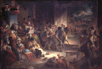
Legend has it that on September 1st, 1675, Hadley was attacked by Native American forces. The villagers responded to fight off the attack, but having no military experience, their defense was ineffective. It looked as if the village would be lost and destroyed.

Out of the confusion of battle, an old white-haired man appeared and took charge - none of the villagers had seen him before. He rallied and organized the villagers into an effective battle formation, and together, they managed to fend off the attack. The white-haired angel saved the village, but he vanished as soon as the battle was won. He became known as the 'angel of Hadley' for saving the town.

(The angel of Hadley, Frederick Chapman (1818-1891), Public domain, via Wikimedia Commons)

After the battle, Goffe went back into hiding with good reason. Charles' agents were still looking for him. He's rumored to have died in New Haven in 1680, though there are other accounts of him living and dying elsewhere in New England.

Goodies and baddies

Let's apply the heroes or villains model to the actors in this story and see how it holds up.

Goffe saved Hadley from destruction, therefore he's a hero. But only from the point of view of the white settlers in Hadley. If you were a Native American opponent, Goffe stopped your forces from retaking land that was rightfully yours, so he's a villain. If you were a Royalist, then Goffe was a villain because he signed Charles I's death warrant, but if you were a Parliamentarian, he was a hero.

What about Cromwell? To many in England, he's a hero for his strong leadership and military prowess, but to the Irish, he's a villain; a bloodthirsty tyrant who massacred the population and violently suppressed Catholicism.

The heroes or villains model doesn't work at all for this story. In fact, it doesn't work for almost all of history. In most cases, it's a reductio ad absurdum, suitable only for young children. Heroes or villains might be too serious a name - I should really call it the goodies and baddies model of history.

History and patriotism

All countries have their national myths and national heroes. The goodies or baddies model is often uncritically applied to historical figures, with parts of the press bolstering the goodies or baddies model, shouting down those who disagree and accusing them of a lack of patriotism.

Let's take another English example. On June 7th, 2020, protestors in the English city of Bristol pulled down the statue of Edward Colston (1636-1721) and threw it into the harbor. They were objecting to Colston's involvement in the slave trade where he made most of his money. Later in life, Colston became a philanthropist who donated large sums of money to support schools, hospitals, and almshouses, especially in the Bristol area. Because of his philanthropy, the people of Bristol erected a statue of him in 1895. 

(Edward Colston statue, Simon Cobb, CC0, via Wikimedia Commons)

Is Colston a goodie or a baddie? If you look at his involvement in the slave trade, he's definitely a baddie. If you look only at his philanthropy, he's a goodie. But as you can tell, I think the goodies or baddies model doesn't work at all. Edward Colston was both and neither - reducing him to wholly goodie or baddie is absurd.

Similarly, the model breaks down for historical greats like Churchill, who did both good things and questionable things. By unthinkingly applying a goodie and baddie model, we're preventing ourselves from reaching a deeper and richer understanding of historical people and events.

The goodies and baddies model has a use though. It generates outrage which in turn helps sell newspapers and increase ratings. It's a handy culture war tool to beat your opposition with. Most of the press coverage of the Colston statue saga focused on politicians condemning the protestors (goodies and baddies again). But what about discussing whether the statue should be there at all in the 21st century? Any criticism of Churchill is often met with a fierce response but was Churchill always and in every decision and action a goodie? Is anyone? Outrage displaces critical thinking, which may be the point.

A better model

Rather than label people goodies or baddies, it's better to ask what and why. What caused the English Civil War? Why did the victorious Parliamentarians execute Charles I? Why did Goffe believe what he believed? Why was the Colston statue still in place in 2021 and why was it erected in the first place when his role in slavery was known? 

These are deeper and less emotional topics, but if we want to truly understand history, we need to move away from a simplistic goodies and baddies model to an understanding of the times people lived in and the rich complexities of their actions. No one is wholly good or bad, and we shouldn't expect them to be.

Monday, April 5, 2021

Wicked problems in data science

Why some projects are harder than others

Over my career, I've had the experience of working on projects that have gone wonderfully well and I've worked on projects that just ran into the sand and went nowhere. I've come to recognize the red flashing warning signs for a certain type of project that's pathologically bad: they tend to be projects involving wicked problems or have the characteristics of wicked problems. Interestingly, I've come across more wicked problems in data science than elsewhere. 

(Wicked problems can be real devils to work on - they can damage your career if not handled correctly.  Elcom.stadler, CC BY-SA 4.0, via Wikimedia Commons)

Wicked problems

The term 'wicked problem' comes from the planning and policy world [Rittel and Webber] and refers to problems that are difficult or impossible to fix inside the current social, political, and economic system. A good example is solving poverty; there are many, many stakeholders, each with fiercely different views, and no clear measure of success (how is poverty measured, is the goal reduction or eliminations, etc.). Poverty is also linked to other factors too, like level of education, health, housing, etc. If you were a politician, do you think you could solve poverty?

(Properties of wicked problems. Image source: Wikimedia Commons, License: Creative Commons, Author: Christian Sarkar)

In the five decades since Rittel and Weber first discussed wicked problems, researchers have identified some of their key characteristics:

  • Wicked problems are not fully understood until after the creation of a solution.
  • Wicked problems have no stopping rule, there's nothing to tell you that you've reached an optimal solution.
  • Solutions to wicked problems are not right or wrong: they are better or worse, or good-enough or not-good-enough.
  • Every wicked problem is new: you can't apply prior learning to it.
  • Wicked problems have no alternative solutions to choose from.

Rittel and Weber's seminal paper points out a key feature of these types of problems: they're not amenable to traditional project management using a phased approach (usually something like "gather data", "synthesize data", "create plan", "execute on plan", etc.).  This is crucial to understanding why projects solving wicked problems go wrong.

Wicked problems in software

If you think wicked problems sound a lot like some software development projects, you're not alone. In 1990, DeGrace and Stahl published "Wicked problems, righteous solutions" which laid out the comparison and compared the utility of different software development methodologies to solve wicked problems. To state the obvious, the killers for software project predictability are understanding the problem and applying prior learning. 

Readers who know agile software development methods are probably jumping up right now and saying 'that's why agile was developed!' and they're partly right. Agile is a huge improvement on the waterfall approach, but it's not a complete solution. Even with agile, wicked problems can be extremely hard to solve. I've had the experience of working on a project where we found a new critical requirement right towards the end, and no amount of agile would have changed that. 

Wicked problems in data science

Data science has its own wicked problems, which I'll put into two buckets.

The first is the ethical implications of technology. Facial recognition obviously has profound implications for society, but there are well-known issues of racial bias in other data science-based systems too (see for example, Obermeyer). Resolving these issues isn't only a data science problem, in fact, I would say it can't only be a data science problem. This makes these projects wicked in the original sense of the term. 

The other bucket is operational. Although some data science problems are well-defined, many are not. In several projects, I've had the experience of finding out something new and fundamental late in the project. To understand the problem, you have to solve it. For example, you may be tasked with reducing the RMSE for a model below some threshold, but as your model becomes more sophisticated, you might find irreducible randomness or as your understanding of the problem increases by solving it, you may find there are key missing features.

Here are some signposts for wicked problems in data science:

  • Any algorithm involved in offering goods or services to the public. Racial, gender or other biases may become big issues and these risks are rarely outlined in the project documentation - in fact, they may only be discovered very, very late into the project. Even worse, there's often no resource allocation to manage them.
  • No one in your organization has attempted to solve a problem like this before and none of the people on the project have prior experience working on similar projects.
  • The underlying problem is not fully understood and/or not fully studied. 
  • No clear numerical targets for project quality. Good targets might be thresholds for false error rates, RMSE, F1 scores, and so on.

What's to be done?

Outline the risks and manage them

It's always good practice to have requirements specifications and similar documents. These project documents should lay out project risks and steps to counter them. For example, facial recognition projects might include sections on bias or ethics and the steps necessary to counter them. Managing these risks takes effort, which includes effort spent on looking for risks and estimating their impact.

Expect the unexpected

If wicked problems can't be fully understood until they're solved, this is a huge project risk. If a new requirement is found late in the project, it can add substantial project time. Project plans should allow for finding something new late into the project, in fact, if we're solving a wicked problem, we should expect to find something new late in the project.

Set expectations

All of the stakeholders (technical and non-technical) should know the risks before the project begins and should know the consequences of finding something late in the project. Everyone needs to understand this is a wicked project with all the attendant risks.

Communications

Stakeholders need to know about new issues and project progress. They must understand the project risks.

Overall

If a lot of this sounds like good project management, that's because it is. Data science projects are often riskier than other projects and require more robust project management. A good understanding of the dynamics of wicked problems is a great start.

Monday, March 29, 2021

Why we have runs on toilet paper

The great toilet paper shortage of 2020 and 2021 (?)

To properly understand the toilet paper shortage of 2020, we have to know what really changed at the start of the pandemic and understand a little of 'irrational' consumer behavior. Press stories at the time focused on panic buying but missed key parts of the bigger picture.

(No toilet paper in the supermarket. Image source: Wikimedia Commons, License: Creative Commons, Author: D.D.Teoli Jr)

Rolling forward to 2021, the grounding of the Ever Given has led to press reports suggesting new toilet paper shortages, but the press has written very little on why there might be a shortage and what parts of the world might be affected. Here's a sneak peek of what's ahead in this post: it isn't just the stuck ship that might cause a shortfall.

Where we use toilet paper (not the obvious place) and why it matters

Let's imagine you're a typical worker. You leave for the office or factory at 8 am, you get in for 9 am, leave at 5 pm, and get home at 6 pm. Of course, you use the restrooms at the office and you use the toilet paper there. 

(It used to be the office restroom... Image source: Wikimedia Commons, Licence: Creative Commons, Author: Chris Light)

Let's imagine you go out for a meal or a drink once a week. You might use the restrooms at the restaurant or pub. Similarly, if you go to a sporting event or a concert. You get the picture.

Prior to the pandemic, you probably spent something like 55+ hours a week doing things outside the home. Post-pandemic, you spend that time at home. Right now, you're using your bathroom a lot more and other bathrooms a lot less.

(...now, you spend your time at home. Image source: Wikimedia Commons, Licence: Creative Commons, Author: Infrogmation of New Orleans)

Commercial toilet paper is different from home toilet paper: the rolls are a lot bigger, the size of the hole is bigger, and the paper itself is more utilitarian. You can't just put a roll of toilet paper from the office into your home toilet paper holder.

In early 2020, pretty much overnight and across the world, demand for one type of toilet paper (commercial) went down substantially and demand for the other type of toilet paper (consumer) went up substantially. Bear in mind, toilet paper manufacturers have production lines for commercial and consumer paper, it takes time to slow down production on one line and ramp it up on another.

To put it simply, the overnight change in human behavior was a shock to the toilet paper supply chain. There wasn't enough of the right paper and there was too much of the wrong paper.

(See https://marker.medium.com/what-everyones-getting-wrong-about-the-toilet-paper-shortage-c812e1358fe0 for more details.)

Just-in-time delivery and manufacturing

Because of its proven financial advantages, for decades manufacturers have used just-in-time production. This applies to toiler paper too. Under normal conditions, the demand for toilet paper stays more or less the same (what would cause a sudden increase or decrease in demand?), which makes it an ideal industry for supply-chain optimization. Why pay to store toilet paper in warehouses when you can just ship it to retailers? After all, if demand is static, by optimizing logistics you can reduce costs.

The side effect of just-in-time manufacturing is reducing the amount of slack in the system. There are no giant toilet paper warehouses to cushion demand shocks (why should there be demand shocks?). This means the system has limited resilience to large swings in demand.

(See these sites for more information:

Runs on the bank

The closest analogy to the toilet paper panic of 2020 is a run on a bank.

Banks maintain a minimum amount of cash to serve the needs of their customers. They minimize cash because it earns no interest; far better to have money invested earning interest than not. Under normal circumstances, this works just fine, it's a model built on confidence.

In a bank run, the bank's customers come to believe the bank will go bankrupt and they'll lose their money, so they withdraw money from the bank as cash (or the equivalent). This rapidly depletes the bank's cash holdings. As a run starts, more and more customers may become convinced the bank is going under, not because the bank is fundamentally insolvent, but because the run will make it so. In other words, I need to get my money out because other people removing their money means there won't be any left for me.

What starts as a relatively minor problem can rapidly expand into a full-blown rout. Even a solvent bank can go under during a run.

(Run on the Norther Rock bank 2007 - which was nationalized to avoid failure. Image source: Wikimedia Commons, License: Creative Commons, Author: Lee Jordan)

There are several ways for banks and governments to stop bank runs:

  • closing banks temporarily (letting consumer rationality return)
  • guaranteeing banks (which has included nationalization)
  • imposing limits on withdrawals (rationing)
  • charging customers fees to withdraw money (pricing)

All of these actions require intervention in the free market.

(See these sites for more details:

What happened in 2020

The pandemic caused large numbers of workers to immediately work from home, increasing demand for home products, including of course toilet paper. This led to an oversupply of commercial toilet paper and an undersupply of consumer toilet paper.

As supplies decreased, consumers became concerned about future supplies and we had a classic run on the bank, or in this case, a run on toilet paper. 

Because the toilet paper supply chain is optimized, there is no slack in the system, so the demand went immediately to the manufacturers, who couldn't ramp up production fast enough. 

Panic buying was only stopped when supermarkets introduced rationing. 

(I need more toilet paper. Image source: Wikimedia Commons, License: Creative Commons, Author: Mwinog2777)

There were alternatives to rationing. The most obvious is to use the laws of supply and demand, in other words, increasing the price of toilet paper, which also happened. Interestingly, some authors suggested a form of 'nationalization' of toilet paper, which would have had the paper suppliers working together to produce unbranded toilet paper to meet demand.

As the supply chain settled down from the shock, supplies came back to normal levels.

To understand what might happen to toilet paper in 2021, we have to understand the toilet paper supply chain and the global shipping industry.

(See these sites for more details:

The toilet paper supply chain

Bear in mind, toilet paper is a bulky, low-cost, low-margin item. Economics dictates it's made as close as possible to where it's consumed. Here's a simplified view of the supply chain:

  • Forestry
  • Pulp production
  • Toilet roll manufacture
  • (Optional) wholesale
  • Retailers

Sometimes, pulp production is in the same facility as the manufacture of toilet paper, but sometimes not. In some cases, pulp is shipped from country to country, for example, Suzano ships wood pulp from Brazil to paper production facilities in Europe and Asia. Of course, shipping requires ships and shipping containers.

(See for example:

What containers have to do with anything - what could happen in 2021

Toilet paper consumed in the Americas is largely created in the Americas. North and Soth America have large forests and have paper processing plants, they also have extensive road and rail networks which reduce the need for transporting raw materials or the finished product by ship. Europe and Asia import wood pulp from South America and other places to manufacture paper, some of which travels via ships.

The pandemic has led to shipping container costs going through the roof. The chart below comes from Fitch Ratings who provide data on shipping prices worldwide. It's a pricing index based on the cost of renting a 40-ft shipping container for different shipping routes. It shows costs have shot up enormously for certain routes in 2021. COVID has disrupted the global supply chain, including disrupting port operations, which means containers are spending more time in ports and less time on the sea. In turn, the price of anything that comes via ship is going to go up, including toiler paper wood pulp.

(Container shipping prices. The chart is taken from Fitch Ratings who provide shipping data.)

As far as I can figure out, the volume of toilet paper shipped through the Suez Canal is minimal. Of itself, the Ever Given shouldn't cause interruptions to the toilet paper supply chain. But the traffic jam is tying up shipping containers and ships and may put upward pressure on shipping prices.

If you live in the Americas, probably nothing much changes with toilet paper. If you live in Europe or Asia, there's the potential for disruption and price increases. Will there be shortages again? Only if we have another run on toilet paper - and hopefully retailers will impose rationing more quickly this time.

(See for example:

What does this mean?

Toilet paper production is a triumph of modern supply chain management and just-in-time manufacturing. The whole system works like clockwork and delivers significant savings for consumers. But an optimized system is more vulnerable to external shocks because it has a limited capacity to recover - there's no slack in the system. Consumer panic buying makes the situation worse and can turn a small blip in supply into a full-blown shortage - with the only mechanisms to solve the problem being rationing or other interventions in the free market.

Medicated toilet paper - a peculiarly British obsession

I can't leave this discussion of toilet paper without mentioning something very weird and very British. When I grew up in the UK, schools and government buildings had a very particular kind of toilet paper. The brand name was Izal and it was stiff and coated with coal tar. The coal tar made it "medicated" and it was advertised as protecting against disease (what the diseases were was never stated). The joke was, it was John Wayne toilet paper, it was rough, tough, and took no... well, you know what I mean.

Why this ever became a thing mystifies me.

The company behind it was Newton, Chambers & Co. Originally, they gave it away to government offices and schools, possibly as an attempt to build a market. Later on, Newton sold it as a product in its own right and they were very successful. Advertising rules were laxer in the past, so they gleefully promoted its supposed health benefits. For a long time, schools and government buildings provided this type of toilet paper, and even some businesses used it. From personal experience, I can tell you using it was unpleasant.

My first job was at a retailer called Superdrug who sold toilet paper (among many other things). As the new boy, my responsibility was the toiler paper section (yes, literally starting at the bottom). I would stack the shelves with all brands of toilet paper and I used to know the price of every brand.  Astonishingly, Izal was a good seller and it was priced above most other brands. In other words, the most uncomfortable and least effective toilet paper on the market sold well and was more expensive than more pleasant and softer brands. Perhaps this should be a lesson about the complexities of the consumer retail market.

Izal (and its competitor, Bronco) are no longer around. People who liked firm toiler paper were gradually persuaded that softer was better, and I agree with them. You can still find Izal on eBay though - I guess people are selling rolls they found in the attic. 

Perhaps the biggest lesson here is that even something as mundane as toilet paper can reveal a great deal about markets and the modern world.

(See:

Tuesday, March 23, 2021

Know your rights: assignment of rights

Why assignment of rights matters

Let's imagine you're running a company that sells products or services to other companies (B2B). A big company wants to acquire you. They do their due diligence on your contracts to make sure they know what they're buying. They want all your contracts as part of the deal. What could possibly go wrong?

What could go very wrong is your contract terms, especially something called assignment of rights. In this blog post, I'm going to tell you what it is and what you should consider doing.


(Image source: Wikimedia Commons, License: Public Domain)

Obligatory disclosure

I am not a lawyer. Don't take legal advice from me. The goal of this blog entry is to inform you of a contractual term that's important for your business. Go and speak to a lawyer to find out more.

Everything I'm writing about assumes common law. Common law countries are countries that derive their legal system from the UK, which includes the US, Australia, Ireland, Canada, New Zealand, etc. If you're not in a common law country, this applies to you only so far as you do business with common law countries.

What is assignment of rights?

I'm going to simplify some things here. Let's say you're Company X and you're selling a product or service to Company Y. Who provides the service and who receives the money? In most cases, company X provides goods or services to Y and gets money from Y in return.  If something goes wrong, X and Y can sue each other. This is all very simple, and it's the basis of most contracts.

Let's look at two exceptions to this pattern:

  • Company X sub-contracts contract performance to another company, Company A. Company A could be a subsidiary of X or it could be an outsourcing company with no ownership relationship between X and A.
  • Company X is subsequently bought by Company B.

Some businesses have rules about who performs contract work; they won't allow outsourcing. In the contracts they write, they create a contract section, usually headed "Assignment of rights". This section says words to the effect of 'you can't assign the performance of this contract to another entity'. What this means is, Company X has to perform the contract, not some other legal entity.

If Company X is bought by Company B, in most cases, things are OK, but there can be exceptions that can badly hurt Company X. 

Most contracts have a section called something like "assignment of rights" that lays out the rules for who does the work and what happens in the case of a takeover.

What could go wrong?

Let's imagine the contract between X and Y states there can be no assignment of rights. X has to perform the contract.

Company X has a restructuring and wants to sell off a division to another company. Oops! It can sell off the division, but the contracts can't go with it. The new owners of the division will have to re-negotiate contracts, which could be disastrous. Customers now have the upper hand in any negotiation and can just say no. I can see some customers getting a nice discount to agree to the change.

What happens if Company X is bought? This is a change of control and could well invalidate the assignment of rights clause, depending on exactly how it's written. Customers could be within their contractual rights to terminate the contract because of a change of control. In the subsequent negotiation, they have the upper hand and could well demand a discount.

Here's another wrinkle. What if Company X is bought by a competitor to one of its customers? It's in the customers' interest to stop this from happening, so they should forbid it in the contract. In practice, this might mean specific language in the contract allowing termination in this case.

The final example is usually the simplest: bankruptcy. Most contracts have provisions that deal with the bankruptcy of one or both parties.

The consequences of not setting up assignment correctly

All the failure modes I'm talking about (and a lot more) are well-known. There's a reason why lawyers are experts. There are reasons why you need to have a lawyer review your contracts.

Let's say you wanted to buy Company X. One of the first things you would do in your due diligence is check out the contracts, especially the assignment of rights section. You're looking for language that allows the rights of the contract to be assigned to another entity (usually using terms like "successor entity", "change of control", etc.). A major problem is the existence of language that forbids the assignment of rights in a takeover or that requires permission from other parties. If this language exists, the acquisition costs go up and it may drive down the acquisition price.

In the case of a change of control (takeover), customers can suddenly get a windfall, they have an opportunity to negotiate their contracts downwards. To put it simply, Company X comes to them saying "we've been bought by Company B, we need to change our contract with you", customers can say, "we don't want to change, but we'll agree to it if you give us a 20% discount".

What should you do?

Go see a lawyer. Make sure a lawyer draws up your contract using standard contract templates. This is especially important if you think your company might be acquired.

In big deals, there's a back-and-forth on contract terms. In most cases, the bigger company gets the contract terms they want. In the excitement of the deal, sometimes companies agree to things they shouldn't. It's the end of the year, it's a marquee customer, and it's a huge deal that takes the sales team over quota. In a case like this, the temptation to agree is enormous. Don't do it, or at least, do it knowing the consequences.

In general, all contracts should be reviewed. You need to be very sure what your contracts say, and what an acquirer may find in due diligence.

Saturday, March 13, 2021

Forecasting the 2020 election: a retrospective

What I did  

One of my hobbies is forecasting US presidential elections using opinion poll data. The election is over and Joe Biden has been sworn in, so this seems like a good time to look back on what I got right and what I got wrong. 

I built a computer model that ingests state-level opinion poll data and outputs a state-level forecast of the election results. My model aggregates polling data, using the previous election results as a starting point. It's written in Python and you can get it from my GitHub page. The polling data comes from the ever-wonderful 538.
(This pole works, unlike some other polls. Image source: Wikimedia Commons, License: Creative Commons, Author: Daniel FR.)

What I got right

My final model correctly predicted the results of 49 out of 51 states (including Washington D.C.). 

What I got wrong

The two states my model got wrong were Florida and North Carolina, and these were big misses - beyond my confidence interval. The cause in both cases was polling data. In both states, the polls were consistently wrong and way overstated Biden's vote share. 

My model also overstated Biden's margin of victory in many of the states he won. This is hidden because my model forecast a Biden victory and Biden won, but in several cases, his margin of victory was less than my model predicted - and significantly so.

The cause of the problem was opinion polls overstating Biden's vote share.

The polling industry and 2020

The polling industry as a whole overstated Biden's support by several percentage points across many states. This is disguised because they got most states directionally correct, but it's still a wide miss. 

In the aftermath of 2016, the industry did a self-examination and promised it would do better next time, but 2020 was still way off. The industry is going to do a retrospective to find out what went wrong in 2020.

I've read a number of explanations of polling misses in the press but their motivation is selling advertising, not getting to the root cause. Polling is hard and 2020 was very different from previous years; there was a pandemic and Donald Trump was a highly polarizing candidate. This led to a higher voter turnout and many, many more absentee ballots. If the cause was easy to find, we'd have found it by now.

The 2020 investigation needs to be thorough and credible, which means it will be several months at least before we hear anything. My best guess is, there will be an industry paper in six months, and several independent research papers starting in a few months. I'm looking forward to the analysis: I'm convinced I'm going to learn something new.

Where next?

There are lots of tweaks I could make to my model, but I'm not going to do any of them until the underlying polling data improves. In other words, I'm going to forget about it all for three years. In fact, I'd quite like to forget about politics for a while.

If you liked this post, you might like these ones

Monday, March 8, 2021

A masterclass in information visualization: the tube map

Going underground

The London Underground tube map is a master class in information visualization. It's been described in detail in many, many places, so I'm just going to give you a summary of why it's so special and what we can learn from it. Some of the lessons are about good visual design principles, some are about the limitations of design, and some of them are about wealth and poverty and the unintended consequences of abstraction.

(London Underground map.)

The problem

From its start in 1863, the underground train system in London grew in a haphazard fashion. With different railway companies building different lines there was no sense of creating a coherent system. 

Despite the disorder, when it was first built it was viewed as a marvel and had a cultural impact beyond just transport; Conan Doyle wove it into Sherlock Holmes stories, H.G. Wells created science fiction involving it, and Virginia Woolf and others wrote about it too.

After various financial problems, the system was unified under government control. The government authority running it wanted to promote its use to reduce street-level congestion but the problem was, there were many different lines that only served part of the capital. Making it easy to use the system was hard.

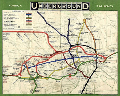
Here's an early map of the system so you can see the problem.

1908 tube map

(1908 tube map. Image source: Wikimedia Commons.)

The map's hard to read and it's hard to follow. It's visually very cluttered and there are lots of distracting details; it's not clear why some things are marked on the map at all (why is ARMY & NAVY AND AUXILLARY STORES marked so prominently?). The font is hard to read, the text orientation is inconsistent, and the contrast of station names with the background isn't high enough.

The problem gets even worse when you zoom out to look at the entire system. Bear in mind, stations in central London are close together but they get further apart as you go into the suburbs. Here's an early map of the entire system, do you think you could navigate it?

(1931 whole system tube map.)

Of course, the printing technology of the time was more limited than it is now, which made information representation harder.

Design ideas in culture

To understand how the tube map as we know it was created, we have to understand a little of the design culture of the time (the early 1930s).

Electrical engineering was starting as a discipline and engineers were creating circuit diagrams for new electrical devices. These circuit diagrams showed the connection between electrical components, not how they were laid out on a circuit board. Circuit diagrams are examples of topological maps.

(Example circuit diagram. Show electrical connections between components, not how they're laid out on a circuit board. Image source: Wikimedia Commons, License: Public domain.)

The Bauhaus school in Germany was emphasizing art and design in mass-produced items, bringing high-quality design aesthetics into everyday goods. Ludwig Mies van der Rohe, the last director of the Bauhaus school, used a key aphorism that summarized much of their design philosophy: "less is more".

(Bauhaus kitchen design 1928 - they invented much of the modern design world. Image source: Wikimedia Commons, License: Public domain)

The modern art movement was in full swing, with the principles of abstraction coming very much to the fore. Artists were abstracting from reality in an attempt to represent an underlying truth about their subjects or about the world.

(Piet Mondrian, Composition 10. Image source: Wikimedia Commons, License: Public Domain.)

To put it simply, the early 1930s were a heyday of design that created much of our modern visual design language.

Harry Beck's solution - form follows function

In 1931, Harry Beck, a draughtsman for London Underground, proposed a new underground map. Beck's map was clearly based on circuit diagrams: it removed unnecessary detail to focus on what was needed. In Beck's view, what was necessary for the tube map was just the stations and the lines, plus a single underlying geographical detail, the river Thames.

Here's his original map. There's a lot here that's very, very different from the early geographical maps.

The design grammar of the tube map

The modern tube map is a much more complex beast, but it still retains the ideas Harry Beck created. For simplicity, I'm going to use the modern tube map to explain Beck's design innovations. There is one underlying and unifying idea behind everything I'm going to describe: consistency.

Topological not geographical. This is the key abstraction and it was key to the success of Beck's original map. On the ground, tube lines snake around and follow paths determined by geography and the urban landscape. This makes the relationship between tube lines confusing. Beck redrew the tube lines as straight lines without attempting to preserve the geographic relations of tube lines to one another. He made the stations more or less equidistant from each other, whereas, on the ground, the distance between stations varies widely. 

The two images below show the tube map and a geographical representation of the same map. Note how the tube map substantially distorts the underlying geography.

(The tube map. Image source: BBC.)

(A geographical view of the same system. Image source: Wikimedia Commons.)

Removal of almost all underlying geographical features. The only geographical feature on tube maps is the river Thames. Some versions of the tube map removed it, but the public wanted it put back in, so it's been a consistent feature for years now.

(The river Thames, in blue, is the only geographic feature on the map.)

A single consistent font.  Station names are written with the same orientation. Using the same font and the same text orientation makes reading the map easier. The tube has its own font, New Johnston, to give a sense of corporate identity.

(Same text orientation, same font everywhere.)

High contrast. This is something that's become easier with modern printing technology and good-quality white paper. But there are problems. The tube uses a system of fare zones which are often added to the map (you can see them in the first two maps in this section, they're the gray and white bands). Although this is important information if you're paying for your tube ticket, it does add visual clutter. Because of the number of stations on the system, many modern maps add a grid so you can locate stations. Gridlines are another cluttering feature.

Consistent symbols. The map uses a small set of symbols consistently. The symbol for a station is a 'tick' (for example, Goodge Street or Russell Square). The symbol for a station that connects two or more lines is a circle (for example, Warren Street or Holborn).

Graphical rules. Angles and curves are consistent throughout the map, with few exceptions - clearly, the map was constructed using a consistent set of layout rules. For example, tube lines are shown as horizontal, vertical, or 45-degree lines in almost all cases.

The challenge for the future

The demand for mass transit in London has been growing for very many years which means London Underground is likely to have more development over time (new lines, new stations). This poses challenges for map makers.

The latest underground maps are much more complicated than Harry Beck's original. Newer maps incorporate the south London tram system, some overground trains, and of course the new Elizabeth Line. At some point, a system becomes so complex that even an abstract simplification becomes too complex. Perhaps we'll need a map for the map.

A trap for the unwary

The tube map is topological, not geographical. On the map, tube stations are roughly the same distance apart, something that's very much not the case on the ground.

Let's imagine you had to go from Warren Street to Great Portland Street. How would you do it? Maybe you would get the Victoria Line southbound to Oxford Circus, change to the Bakerloo Line northbound, change again at Baker Street, and get the Circle Line eastbound to Great Portland Street. That's a lot of changes and trains. Why not just walk from Warren Street to Great Portland Street? They're less than 500m apart and you can do the walk in under 5 minutes. The tube map misleads people into doing stuff like this all the time.

Let's imagine it's a lovely spring day and you're traveling to Chesham on the Metropolitan Line. If Great Portland Street and Warren Street are only 482m apart, then it must be a nice walk between Chalfont & Latimer and Chesham, especially as they're out in the leafy suburbs. Is this a good idea? Maybe not. These stations are 6.19km apart.

Abstractions are great, but you need to understand that's exactly what they are and how they can mislead you.

Using the map to represent data

The tube map is an icon, not just of the tube system, but of London itself. Because of its iconic status, researchers have used it as a vehicle to represent different data about the city.

James Cheshire of University College London mapped life expectancy data to tube stations, the idea being, you can spot health disparities between different parts of the city. He produced a great map you can visit at tubecreature.com. Here's a screenshot of part of his map.


You go from a life expectancy of 78 at Stockwell to 89 at Green Park, but the two stations are just 4 stops apart. His map shows how disparities occur across very short distances.

Mark Green of the University of Sheffield had a similar idea, but this time using a more generic deprivation score. Here's his take on deprivation and the tube map, the bigger circles representing higher deprivation.

Once again, we see the same thing, big differences in deprivation over short distances.

What the tube map hides

Let me show you a geographical layout of the modern tube system courtesy of Wikimedia. Do you spot what's odd about it?

(Geographical arrangement of tube lines. Image source: Wikimedia Commons, License: Creative Commons.)

Look at the tube system in southeast London. What tube system? There are no tube trains in southeast London. North London has lots of tube trains, southwest London has some, and southeast London has none at all. What part of London do you think is the poorest?

The tube map was never designed to indicate wealth and poverty, but it does that. It clearly shows which parts of London were wealthy enough to warrant underground construction and which were not. Of course, not every area in London has a tube station, even outside the southeast of London. Cricklewood (population 80,000) in northwest London doesn't have a tube station and is nowhere to be seen on the tube map. 

The tube map leaves off underserved areas entirely, it's as if southeast London (and Cricklewood and other places) don't exist. An abstraction meant to aid the user makes whole communities invisible.

Now look back at the previous section and the use of the tube map to indicate poverty and inequality in London. If the tube map is an iconic representation of London, what does that say about the areas that aren't even on the map? Perhaps it's a case of 'out of sight, out of mind'.

This is a clear reminder that information design is a deeply human endeavor. A value-neutral expression of information doesn't exist, and maybe we shouldn't expect it to.

Takeaways for the data scientist

As data scientists, we have to visualize data, not just for our fellow data scientists, but more importantly for the businesses we serve. We have to make it easy to understand and easy to interpret data. The London Underground tube map shows how ideas from outside science (circuit diagrams, Bauhaus, modernism) can help; information representation is, after all, a human endeavor. But the map shows the limits to abstraction and how we can be unintentionally led astray. 

The map also shows the hidden effects of wealth inequality and the power of exclusion; what we do does not exist in a cultural vacuum, which is true for both the tube map and the charts we produce too.