Monday, June 21, 2021

Unknown Pleasures: pulsars, pop, and plotting

The echoes of history

Sometimes, there are weird connections between very different cultural areas and we see the echoes of history playing out. I'm going to tell you how pulsars, Nobel Prizes, an iconic album cover, Nazi atrocities, and software chart plotting all came to be connected.

The discovery of pulsars

In 1967, Jocelyn Bell was working on her Ph.D. as a post-graduate researcher at the Mullard Radio Astronomy Observatory, near Cambridge in the UK. She had helped build a new radio telescope and now she was operating it. On November 28, 1967, she saw a strikingly unusual and regular signal, which the team nicknamed "little green men". The signal turned out to be a pulsar, a type of star new to science.

This was an outstanding discovery that shook up astronomy. The team published a paper in Nature, but that wasn't the end of it. In 1974, the Nobel committee awarded the Nobel Physics Prize to the team. To everyone on the team except Jocelyn Bell

Over the years, there's been a lot of controversy over the decision, with many people thinking she was robbed of her share of the prize, either because she was a Ph.D. student or because she was a woman. Bell herself has been very gracious about the whole thing; she is indeed a very classy lady.

The pulsar and early computer graphics

In the late 1960s, a group of Ph.D. students from Cornell University were analyzing data from the pulsar Bell discovered. Among them was Harold Craft, who used early computer systems to visualize the results. Here's what he said to the Scientific American in 2015: "I found that it was just too confusing. So then, I wrote the program so that I would block out when a hill here was high enough, then the stuff behind it would stay hidden."

Here are three pages from Craft's Ph.D. thesis. Take a close look at the center plot. If Craft had made every line visible, it would have been very difficult to see what was going on. Craft re-imagined the data as if he were looking at it at an angle, for example, as if it were a mountain range ridgeline he was looking down on.  With a mountain ridgeline, the taller peaks hide what's behind them. It was a simple idea, but very effective.

(Credit: JEN CHRISTIANSEN/HAROLD D. CRAFT)

The center plot is very striking. So striking in fact, that it found its way into the Cambridge Encyclopaedia of Astronomy (1977 edition):

(Cambridge Encyclopedia of Astronomy, 1977 edition, via Tim O'Riley)

Joy Division

England in the 1970s was not a happy place, especially in the de-industrialized north. Four young men in Manchester had formed a band and recorded an album. The story goes that one of them, Bernard Sumner, was working in central Manchester and took a break in the city library. He came across the pulsar image in the encyclopedia and liked it a lot.

The band needed an image for their debut album, so they selected this one. They gave it to a recently graduated designer called Peter Saville, with the instructions it was to be a black-on-white image. Saville felt the image would look better white-on-black, so he designed this cover.

This is the iconic Unknown Pleasures album from Joy Division.  

The starkness of the cover, without the band's name or the album's name, set it apart. The album itself was critically acclaimed, but it never rose high in the charts at the time. However, over time, the iconic status of the band and the album cover grew. In 1980, the lead singer, Ian Curtis, committed suicide. The remaining band members formed a new band, New Order, that went on to massive international fame.

By the 21st century, versions of the album cover were on beach towels, shoes, and tattoos.

Joy plots

In 2017, Claus Wilke created a new charting library for R, ggjoy.  His package enabled developers to create plots like the famous Unknown Pleasures album cover. In honor of the album cover, he called these plots joy plots.

Ridgeline plots

This story has a final twist to it. Although joy plots sound great, there's a problem.

Joy Division took their name from a real Nazi atrocity fictionalized in a book called House of Dolls. In some of their concentration camps, the Nazis forced women into prostitution. The camp brothels were called Joy Division

The name joy plots was meant to be fun and a callback to an iconic data visualization, but there's little joy in evil. Given this history, Wilke renamed his package ggridges and the plots ridgeline plots. 

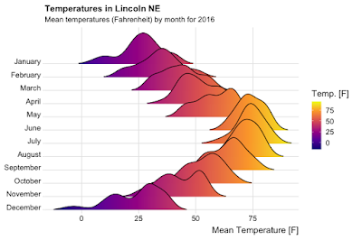
Here's an example of the great visualizations you can produce with it. 

If you search around online, you can find people who've re-created the pulsar image using ggridges.

It's not just R programmers who are playing with Unknown Pleasures, Python programmers have got into the act too. Nicolas P. Rougier created a great animation based on the pulsar data set using the venerable Matplotlib plotting package - you can see the animation here.

If you liked this post

You might like these ones:

Monday, June 14, 2021

Confidence, significance, and p-values

What is truth?

Statistical testing is ultimately all about probabilities and thresholds for believing an effect is there or not. These thresholds and associated ideas are crucial to the decision-making process but are widely misunderstood and misapplied. In this blog post, I'm going to talk about three testing concepts: confidence, significance, and p-values; I'll deal with the hugely important topic of statistical power in a later post.

(peas - not p-values. Author: Malyadri, Source: Wikimedia Commons, License: Creative Commons)

Types of error

To simplify, there are two kinds of errors in statistical testing:

  • Type I - false positive. You say there's an effect when there isn't. This is decided by a threshold \(\alpha\), usually set to 5%. \(\alpha\) is called significance.
  • Type II - false negative. You say there isn't an effect but there is. This is decided by a threshold \(\beta\) but is usually expressed as the statistical power which is \(1 - \beta\).

In this blog post, I'm going to talk about the first kind of error, Type I.

Distribution and significance

Let's imagine you're running an A/B test on a website and you're measuring conversion on the A branch (\(c_A\)) and on the B branch (\(c_B\)). The null hypothesis is that there's no effect, which we can write as:

\[H_0: c_A - c_B = 0\]

This next piece is a little technical but bear with me. Tests of conversion are usually large tests (mostly, > 10,000 samples in practice). The conversion rate is the mean conversion for all website visitors. Because there are a large number of samples, and we're measuring a mean, the Central Limit Theorem (CLT) applies, which means the mean conversion rates will be normally distributed. By extension from the CLT, the quantity \( c_A - c_B\) will also be normally distributed. If we could take many measurements of \( c_A - c_B\) and the null hypothesis was true, we would theoretically expect the results to look like something like this.

Look closely at the chart. Although I've cut off the x-axis, the values go off to \(\pm \infty\). If all values of \( c_A - c_B\) are possible, how can we reject the null hypothesis and say there's an effect?

Significance - \(\alpha\)

To decide if there's an effect there, we use a threshold. This threshold is referred to as the level of significance and is called \(\alpha\). It's usually set at the 0.05 or 5% level. Confusingly, sometimes people refer to confidence instead, which is 1 - significance, so a 5% significance level corresponds to a 95% confidence level.

In the chart below, I've colored the 95% region around the mean value blue and the 5% region (2.5% at each end) red. The blue region is called the acceptance region and the red region is called the rejection region.

What we do is compare the measurement we actually make with the chart. If our measurement lands in the red zone, we decide there's an effect there (reject the null), if our measurement lands in the blue zone, we'll decide there isn't an effect there (fail to reject the null or 'accept' the null).

One-sided or two-sided tests

On the chart with the blue and the red region, there are two rejection (red) regions. This means we'll reject the null hypothesis if we get a value that's more than a threshold above or below our null value. In most tests, this is what we want; we're trying to detect if there's an effect there or not and the effect can be positive or negative. This is called a two-sided test because we can reject the null in two ways (too negative, too positive).

But sometimes, we only want to detect if the treatment effect is bigger than the control. This is called a one-sided test. Technically, the null hypothesis in this case is:

\[H_0: c_A - c_B \leq 0\]

Graphically, it looks like this:

So we'll reject the null hypothesis only if our measured value lands in the red region on the right. Because there's only one rejection region and it's on one side of the chart, we call this a one-sided test.

p-values

I've very blithely talked about measured values landing in the rejection region or not. In practice, that's not what we do; in practice, we use p-values.

Let's say we measured some value x. What's the probability we would measure this value if the null hypothesis were true (in other words, if there were no effect)? Technically, zero because the distribution is continuous, but that isn't helpful. Let's try a more helpful form of words. Assuming the null hypothesis is true, what's the probability we would see a value of x or a more extreme value? Graphically, this looks something like the green area on the chart below.

Let me say again what the p-value is. If there's no effect at all, it's the probability we would see the result (or a more extreme result) that we measured, or how likely is it that our measurement could have been due to chance alone?

The chart below shows the probability the null hypothesis is true; it shows the acceptance region (blue), the rejection region (red), and the measurement p-value (green). The p-value is in the rejection region, so we'll reject the null hypothesis in this case. If the green overlapped with the blue region, we would accept (fail to reject) the null hypothesis.

Misunderstandings

There are some common misunderstandings around testing that can have quite bad commercial effects.

  • 95% confidence is too high a bar - we should drop the threshold to 90%. In effect, this means you'll accept a lot of changes that have no effect. This will reduce the overall effectiveness of your testing program (see this prior blog post for an explanation).
  • One-sided tests are OK and give a smaller sample size, so we should use them. This is true, but it's often important to determine if a change is having a negative effect. In general, hypothesis testing tests a single hypothesis, but sadly, people try and read more into test results than they should and want to answer several questions with a single question.
  • p-values represent the probability of an effect being present. This is just not true at all.
  • A small p-value indicates a big effect. p-values do not make any indication about the size of an effect; a low p-value does not mean there's a big effect.

Practical tensions

In practice, there can be considerable tension between business and technical people over statistical tests. A lot of statistical practices (e.g. 5% significance levels, two-sided testing) are based on experience built up over a long time. Unfortunately, this all sounds very academic to the business person who needs results now and wants to take shortcuts. Sadly, in the long run, shortcuts always catch you up. There's an old saying that's very true: "there ain't no such thing as a free lunch."

Tuesday, June 8, 2021

Management and technical career tracks: separate but not equal

Promotion paths for technical people

I’ve worked in technology companies and I’ve seen the same question arise several times: what to do with technical people who don’t want to be managers? What do you promote them to?

Managers and technical tracks are not equal
(Image credit: Louis-Henri de Rudder, source: Old Book Illustrations)

The traditional engineering career ladder emphasizes management as the desired end-goal and devalues anyone not in a management position. Not everyone wants to be a manager and not everyone is good at management. Some people are extremely technically competent and want to stay technical. What are they offered?

Separate, but not equal

Most companies deal with the problem by creating a parallel career path for engineers who don’t want to be managers. This is supposedly separate but equal, but it always ends up being very unequal in the management branch’s favor. The inequality is reflected in job titles. Director is a senior position in most companies and it comes with management responsibility. The equivalent technical role might be ‘Fellow’, which has overtones of putting someone out to grass. A popular alternative is ‘Technical Director’, but note the management equivalent is Director - the engineers get a qualifying word the managers don’t, it’s letting people know the person isn’t a real Director (they're technically a Director, but...). Until you get to VP or C-level, the engineering titles are always worse.

The management and technical tracks have power differences too. The managers get to decide pay raises and promotions and hiring and firing, the technical people don’t. Part of this is obviously why people choose management (and why some people don’t choose management), but often the technical path people aren’t even given a seat at the table. When there are business decisions to be made, the technical people are usually frozen out, even when the business decisions aren't people ones. Sometimes this is legitimate, but most of the time it’s a power thing. The message is clear: if you want the power to change things, you need to be a manager.

A way forward

Here’s what I suggest. The managerial/technical divide is a real one. Not everyone wants to be a manager and there should be a career path upward for them. I suggest having the same job titles for the managerial path and the technical path. There should be no Technical Directors and Directors, just Directors. People on the technical path should be given a seat at the power table and should be equals when it comes to making business decisions. This means managers will have to give up power and it will mean a cultural shift, but if we’re to give meaningful advancement to the engineering track, this is the way it has to be.

Sunday, May 23, 2021

Why A/B tests don't add up

All the executives laughed

A few years ago, I was at an industry event. The speaker was an executive talking about his A/B testing program. He joked that vendors and his team were unreliable because the overall result was less than the sum of the individual tests. Everyone laughed knowingly.

But we shouldn't have laughed.

The statistics are clear and he should have known better. By the rules of the statistical game, the benefits of an A/B program will be less than the sum of the parts and I'm going to tell you why.

Thresholds and testing

An individual A/B test is a null hypothesis test with thresholds that decide the result of the test. We don't know whether there is an effect or not, we're making a decision based on probability. There are two important threshold numbers:

  • \(\alpha\) - also known as significance and usually set around 5%. If there really is no effect, \(\alpha\) is the probability we will say there is an effect. In other words, it's the false positive rate (Type I errors).
  • \(\beta\) - is usually set around 20%. If there really is an effect, \(\beta\) is the probability we will say there is no effect. In other words, it's the false negative rate (Type II errors). In practice, power is used instead of \(\beta\), power is \(1-\beta\), so it's usual to set the power to 80%.

Standard statistical practice focuses on just a single test, but an organization's choice of \(\alpha\) and \(\beta\) affect the entire test program.

\(\alpha\), \(\beta\) and the test program

To see how the choice of \(\alpha\) and \(\beta\) affect the entire test program, let's run a simplified thought experiment. Imagine we choose  \(\alpha = 5\%\) and \(\beta = 20\%\), which are standard settings in most organizations. Now imagine we run 1,000 tests, in 100 of them there's a real effect and in 900 of them there's no effect. Of course, we don't know which tests have an effect and which don't.

Take a second to think about these questions before moving on:

  • How many many positive test results will we measure?
  • How many false positives will we see?
  • How many true positives will we see?

At this stage, you should have numbers in mind. I'm asking you to do this so you understand the importance of what happens next.

The logic to answer these questions is straightforward. In the picture below, I've shown how it works, but I'll talk you through it so you can understand it in more detail.

Of the 1,000 tests, 100 have a real effect. These are the tests that \(\beta\) applies to and \(\beta=20\%\), so we'll end up with:

  • 20 false negatives, 80 true positives

Of the 1,000 tests, 900 have no effect. These are the tests that \(\alpha\) applies to and \(\alpha=5\%\), so we'll end up with:

  • 855 true negatives, 45 false positives

Overall we'll measure:

  • 125 positives made up of
  • 80 true positives
  • 45 false positives

Crucially, we won't know which of the 125 positives are true and which are false.

Because this is so important, I'm going to lay it out again: in this example, 36% of all test results we thought were positive are wrong, but we don't know which ones they are. They will dilute the overall results of the overall program. The overall results of the test program will be less than the sum of the individual test results.

What happens in reality

In reality, you don't know what proportion of test results are 'true'. It might be 10%, or 20%, or even 5%. Of course, the reason for the test is that you don't know the result. What this means is, it's hard to do this calculation on real data, but the fact that you can't easily do the calculation doesn't mean the limits don't apply.

Can you make things better?

To get a higher proportion of true positives, you can do at least three things.

  • Run fewer tests - selecting only tests where you have a good reason to believe there is a real effect. This would certainly work, but you would forgo a lot of the benefits of a testing program.
  • Run with a lower \(\alpha\) value. There's a huge debate in the scientific community about significance levels. Many authors are pushing for a 0.5% level instead of a 5% level. So why don't you just lower \(\alpha\)? Because the sample size will increase greatly.
  • Run with a higher power (lower \(\beta\)). Using a power of 80% is "industry standard", but it shouldn't be - in another blog post I'll explain why. The reason people don't do it is because of test duration - increasing the power increases the sample size.

Are there other ways to get results? Maybe, but none that are simple. Everything I've spoken about so far uses a frequentist approach. Bayesian testing offers the possibility of smaller test sizes, meaning you could increase power and reduce \(\alpha\) while still maintaining workable sample sizes. Of course, A/B testing isn't the only testing method available and other methods offer higher power with lower sample sizes.

No such thing as a free lunch 

Like any discipline, statistical testing comes with its own rules and logic. There are trade-offs to be made and everything comes with a price. Yes, you can get great results from A/B testing programs, and yes companies have increased conversion, etc. using them, but all of them invested in the right people and technical resources to get there and all of them know the trade-offs. There's no such thing as a free lunch in statistical testing.

Monday, May 17, 2021

Counting on Poisson

Why use the Poisson distribution?

Because it has properties that make it great to work with, data scientists use the Poisson distribution to model different kinds of counting data. But these properties can be seductive, and sometimes people model data using the Poisson distribution when they shouldn't. In this blog post, I'll explain why the Poisson distribution is so popular and why you should think twice before using it.

(Siméon-Denis Poisson by E. Marcellot, Public domain, via Wikimedia Commons)

Poisson processes

The Poisson distribution is a discrete event probability distribution used to model events created using a Poisson process. Drilling down a level, a Poisson process is a series of events that have these properties:

  • They occur at random but at a constant mean rate,
  • They are independent of one another, 
  • Two (or more) events can't occur at the same time

Good examples of Poisson processes are website visits, radioactive decay, and calls to a help center. 

The properties of a Poisson distribution

Mathematically, the Poisson probability mass function looks like this:

\[ P_r (X=k) = \frac{\lambda^k e^{- \lambda}}{k!} \]

where 

  • k is the number of events (always an integer)
  • \(\lambda\) is the mean value (or expected rate)

It's a discrete distribution, so it's only defined for integer values of \(k\).

Graphically, it looks like this for \(\lambda=6\). Note that it isn't symmetrical and it stops at 0, you can't have -1 events.

(Let's imagine we were modeling calls per hour in a call center. In this case, \(k\) is the measured calls per hour, \(P\) is their frequency of occurrence, and \(\lambda\) is the mean number of calls per hour).

Here are some of the Poisson distribution's properties:

  • Mean: \(\lambda\)
  • Variance: \(\lambda\)
  • Mode: floor(\(\lambda\))

The fact that some of the key properties are given by \(\lambda\) alone makes using it easy. If your data follows a Poisson distribution, once you know the mean value, you've got the variance (and standard deviation), and the mode too. In fact, you've pretty much got a full description of your data's distribution with just a single number.

When to use it and when not to use it

Because you can describe the entire distribution with just a single number, it's very tempting to assume that any data that involves counting follows a Poisson distribution because it makes analysis easier.  Sadly, not all counts follow a Poisson distribution. In the list below, which counts do you think might follow a Poisson distribution and which might not?

  • The number of goals in English Premier League soccer matches.
  • The number of earthquakes of at least a given size per year around the world.
  • Bus arrivals.
  • The number of web pages a person visits before they make a purchase.

Bus arrivals are not well modeled by a Poisson distribution because in practice they're not independent of one another and don't occur at a constant rate. Bus operators change bus frequencies throughout the day, with more buses scheduled at busy times; they may also hold buses at stops to even out arrival times. Interestingly, bus arrivals are one of the textbook examples of a Poisson process, which shows that you need to think before applying a model.

The number of web pages a person visits before they make a purchase is better modeled using a negative binomial distribution

Earthquakes are well-modeled by a Poisson distribution. Earthquakes in different parts of the world are independent of one another and geological forces are relatively constant, giving a constant mean rate for quakes. It's possible that two earthquakes could happen simultaneously in different parts of the world, which shows that even if one of the criteria might not apply, data can still be well-modeled by Poisson.

What about soccer matches? We know two goals can't happen at the same time. The length of matches is fixed and soccer is a low-scoring game, so the assumption of a constant rate for goals is probably OK. But what about independence? If you've watched enough soccer, you know that the energy level in a game steps up as soon as a goal is scored. Is this enough to violate the independence requirement? Apparently not, scores in soccer matches are well-modeled by a Poisson distribution.

What should a data scientist do?

Just because the data you're modeling is a count doesn't mean it follows a Poisson distribution. More generally, you should be wary of making choices motivated by convenience. If you have count data, look at the properties of your data before deciding on a distribution to model it with. 

If you liked this blog post you might like

Monday, May 10, 2021

Soldiers on the moon: Project Horizon

The moon and the cold war

In 1959, Cold War rivalries were intense and drove geopolitics; the protagonists had already fought several proxy wars and the nuclear arms race was well underway. The Soviet Union put the first satellite into space in 1957, which was a wake-up call to the United States; if the Soviet Union could put a satellite in orbit, they could put a missile in orbit. By extension, if the Soviet Union got to the moon first, they could build a lunar military base and dominate the moon. The Soviet Union had announced plans to celebrate its 50th anniversary (1967) with a lunar landing. The race was on with a clear deadline.

(Phadke09, CC BY-SA 4.0 <https://creativecommons.org/licenses/by-sa/4.0>, via Wikimedia Commons)

In response to the perceived threat, the US Army developed an audacious plan to set up a military base on the moon by 1965 and beat the Soviets. The plan, Project Horizon, was 'published' in 1959 but only declassified in 2014. The plan is very extensive and covers living arrangements, spacesuits, power, and transport, it was published in two volumes with illustrations (Volume I, Volume II).

In some alternative history, something like this could have happened. The ideas in it still have some relevance, so let's dive in and take a look. 

Getting there

In 1959, the enormous Saturn V rockets didn't exist and the army planners knew that heavy-lift rockets would take years to develop. To meet the 1965 deadline, they needed to get going with current and near-future technology, which meant Saturn I and Saturn II rockets. The plan called for 61 Saturn I rockets and 88 Saturn IIs, with a launch rate of 5.3 per month. In reality, only 19 Saturn Is were ever launched (the Apollo project used Saturn Vs, of which 13 were launched). 

To state the obvious, smaller rockets carry smaller payloads. To maximize payloads to orbit, you need to think about launch sites; the closer you are to the equator the bigger boost you get from the Earth's rotation. Project Horizon considered several launch sites on the equator, none of which were in US territory. The map below comes from the report and I've indicated prospective launch sites in red.

  • Somalia. Rejected because of remoteness.
  • Manus Island. Rejected because of remoteness.
  • Christmas Island. Remote, but given serious consideration because of logistics.
  • Brazil. Closer to the US and given serious consideration.

The report doesn't decide between Christmas Island and Brazil but makes a good case for both. The launch site would obviously be huge and would have several gantries for multiple launches to hit the 5.3 launches per month target.

The next question is: how do you get to the moon? Do you go directly or do you attempt equatorial orbit refueling? In 1969, Apollo 11 went directly to the moon, but it was launched by the far larger Saturn V rocket. With just Saturn I and Saturn IIs, the team needed to take a different approach. They settled on orbital refueling from a 10-person space station followed by a direct approach once more powerful rockets became available.

Landing on the moon

The direct and indirect methods of getting to the moon led to two different lander designs, one of which I've shown below. The obvious question is, why is it streamlined? The upper stage is the return-to-earth vehicle so it's shaped for re-entry. In the Apollo missions, the reentry vehicle was part of the command module that stayed in lunar orbit, so the lunar lander could be any shape.

Staffing

The plan was for an initial landing by two astronauts followed by construction teams to build the base. The role of the first astronauts was scouting and investigating possible base sites, and they were to stay on the moon for 30-90 days, living in their lander. The construction crews would build the base in 18 months but the maximum tour of duty for a construction crew member was 12 months. By late 1965, the base would be staffed by a team of 12 (all men, of course, this was planned in 1959 after all).

The moon base

The moon crew was to have two different sorts of rides: a lunar bulldozer for construction and a rover for exploration (and 'surveillance'). The bulldozer was to dig trenches and drop the living quarter into them (the trenches would also be partially excavated by high explosives). The living quarters themselves were 10ft x 20ft cylinders. 

Burying living quarters helps with temperature regulation and provides protection against radiation. The cylinders themselves were to be giant double-walled thermos flasks (vacuum insulated) for thermal stability.

The finished base was to be l-shaped.

Lunar living

The initial construction camp looks spartan at best and things only improve marginally when the l-shaped base is completed.

In the finished base, toilets were to be 'bucket-type' with activated charcoal for odor control; urine was to be stored on the moon surface for later recycling.

The men were to be rationed to 6lb of water (2.7 liters) and 4lb of food per day - not starvation or dehydration, but not generous either. The initial plan was for all meals to be pre-cooked, but the soldiers would later set up a hydroponics farm for fresh fruit and vegetables.

Spacesuits

Curiously, there isn't as much as you'd expect about spacesuits, only a few pages. They knew that spacesuits would be restrictive and went so far as defining the body measurements of a standard man, including details like palm length. The idea seems straightforward, if technology restricts your design flexibility, then select your crew to fit what you can build. 

Power

Perhaps unsurprisingly for the 1950s, power for the base was to come from two nuclear reactors. both of which needed to be a safe distance from the base and recessed into the regolith in case of accidents. It seems like the lunar bulldozer was going to be very busy. 

Weapons

Soldiers mean guns or at least weapons. The report is surprisingly coy about weapons; it alludes to R&D work necessary to develop lunar weapons, but that's about it.

Costs

$6 billion total in 1959 dollars. Back then, this was an awful lot of money. The real Apollo program cost $25.4 billion and it's highly likely $6 billion was a substantial underestimate, probably by an order of magnitude.

Project Horizon's impact

As far as I can tell, very little. The plan was put to Eisenhower, who rejected it. Instead, NASA was created and the race to the moon as we know it started. But maybe some of the Project Horizon ideas might come back.

Burying habitats in the lunar regolith is an idea the Soviets used in their lunar base plans and has been used several times in science fiction. It's a compelling idea because it insulates the base from temperature extremes and from radiation. However, we now know lunar regolith is a difficult substance to work with.

Nuclear power makes sense but has obvious problems, and transporting nuclear power systems to orbit has risks. The 1970s British TV science fiction series "Space:1999" had a nuclear reactor explosion knocking the moon out of orbit, which is far-fetched, but a nuclear problem on the moon would be severe.

The ideas of in-flight re-fueling and lunar waystations have come up again in NASA's future lunar exploration plans.

What may have dealt a project like Project Horizon a final death blow is the 1967 Outer Space Treaty which bans weapons of mass destruction and the militarization of space.

Project Horizon is a footnote in the history of space exploration but an interesting one. It gives insight into the mind of the military planners of the time and provides a glimpse into one alternative path the world might have taken.

If you liked this blog post

You might like these other ones:

Monday, May 3, 2021

How to hire well

How I've learned to hire

I’ve done a lot of hiring and I’ve learned what works and what doesn’t work to make a good hire (someone who performs well and stays). I’ve come to trust my judgment but only within the confines of a hiring process that covers my blind spots. Here’s a description of what I typically like to do, but bear in mind this is an amalgamation of processes from different employers.

To be clear: what I say in this blog post might not reflect current or previous hiring processes at my current or former employers. I'm presenting a mix of processes with the goal of giving you insight into one amalgamated hiring process and how one hiring manager thinks.

Principles - caution, excitement, 'no', and decency

The hiring process is fraught for both parties. We're both trying to decide if we want to spend extended amounts of time with each other. The hiring manager wants someone who will fit in, perform well, and will stay. The applicant wants to work in an environment that suits them and rewards them appropriately. No one enjoys the interviewing process and everyone wants to get what they want quickly. This suggests the first principle: caution. It's easy to make a mistake when the pressure is on and the thing that will save you is having a good process.

Once the process starts, I try and follow an ‘excite and select’ approach. I want to excite candidates by meeting the team and by the whole interview process and I want them to feel energized by what they experience. I then select from enthusiastic and excited candidates.

My default position is always ‘no’ at all stages. If I’m in doubt, I sleep on it and say ‘no’ the next day. On occasions, I’ve been under a great deal of pressure to make a hire, but this attitude has saved me from hiring the wrong person. Even in the US, unwinding a bad hiring decision is extremely painful, and in Europe, it can be almost impossible. It’s far better to be sure than take a risk. I’ve only changed my mind after a ‘no’ once, and that turned out to be a good decision that I stand by.

My next principle is being humane. The interview process is stressful and I want to treat candidates well and with respect at every stage. Even if they’ve been rejected, I want them to feel good about the process. Let's be honest, sometimes there's just a mismatch of skills - I've said no to some really great people.


(Interviews should be friendly and humane, not an interrogation or a stress test. Image credit: Noh Mun Duek, license: Creative Commons, source: Wikimedia Commons.)

The hiring process

The job ad

I like to think very carefully about the wording of the job ad. It has to excite and attract candidates, but it also has to be honest and clear about the job.

I've had a few candidates who've misunderstood the job and that's become clear at the screening interview. To stop this from happening, I've sometimes created a longer form job description I've sent to candidates we've selected for screening. The longer form description describes more about the role and provides some background about the company. Some candidates have withdrawn from the process after seeing the longer form description and that's OK - better for everyone to stop the process sooner if there's no match.

Resume selection

This is an art. Here are some of the factors I consider for technical positions.

  • A Github page is real plus. I check out the content.
  • Blog posts (personal or company) or content for marketing is a plus.
  • Mention of methods and languages. Huge shopping lists of languages are a bad sign. I also want to know what they've done with languages and methods.
  • Clear descriptions of what they've done, with a focus on the technical piece. I prefer straightforward language.
  • Training courses. Huge shopping lists are again a no for me.

I don't tend to select on the college someone went to but I know lots of organizations that do.

The screening interview

The first interview is a screening interview with me as the hiring manager. I do this via video call so I can get a sense of the person’s responses and their ability to interact. I always have a script for these calls and always follow the same process. I work out the areas I want to talk about and create the best questions I can to differentiate between candidates. The script gives me a more consistent (and fairer) way to compare candidates and also enables me to learn what works and what doesn’t. For example, if candidates find a question confusing, or everyone answers a question well, I can change the question. For behavioral questions, I ask for examples of the behavior and my technical questions are usually about experience. Here are some examples:

  • Can you give me an example of how you dealt with conflicting demands?
  • Can you tell me about a time you managed an underperforming employee?
  • What’s the largest program you’ve written?
  • What are the biggest limitations of Python?

These questions are launch points for deeper discussions.

The technical screen

Next comes a technical screening. Again, this must be the same for all candidates. It must be fair and allow for nervousness. 

I'm very careful about the technical questions that my interview team asks. I make sure that people are asked relevant questions that reveal the extent of their knowledge and skills. For example, if my team were interviewing someone for a machine learning position, I would ask about their use of key libraries (e.g. caret), but I wouldn't ask them about building SVMs or random forest models from scratch unless that's something they'd be doing.

Cultural fit and add

Finally, there are in-person interviews. I like to use teams of two where I can so two people can get a read. Any more than two and it starts to feel like an interrogation. Each team has a brief for the areas they want to probe and a list of questions they want to ask. 

Team selection is something of an art; I’ve known interviewers who are unable to say ‘no’ to any candidate, no matter how bad. If I have to include someone like this on the interview team, I’ll balance them with someone who can say no.  

I’ve heard of companies doing all-day interviews, but this seems like overkill to me and it stresses the interviewee; there’s a balance here between thoroughness and being human. For in-person interviews, I ensure that every team offers the candidate a drink or time out to visit the restroom. 

Where I can, I have the very last interview as a discussion with the candidate, asking them what went well and what went badly in the process. Sometimes candidates answer a question badly and use the discussion opportunity to better answer the question. Everyone makes mistakes and interviews are stressful, it seems like a good opportunity to offer the candidate a pause for reflection and an opportunity to correct errors.

I always look for the ability to work well with others and I value that over technical skills. A good technical person can always learn new technical skills, but it's very difficult to train someone not to be a jerk.

Decision making

Before we go to a decision, I find people the candidate may have interacted with who are not on the interview team. Many times, I’ve asked the receptionist how the candidate treated them. On one occasion, a candidate upset the receptionist so badly, they came to me and told me what had happened. It was an instant ‘no’ from that point.

To decide hire or no hire, I gather the interview teams together and we have a discussion about the candidate. If consensus exists to hire, most of the time I go ahead and make an offer but only after probing to make sure this is a considered opinion of everyone in the room. On a few occasions, I’ve overruled the group and said no. This happens when I think some factor is very important but the group hasn’t considered it well enough. If the decision is a uniform no, I don’t hire. I reserve the right to overrule the group, but it’s almost inconceivable I’d overrule a uniform no. If the view of the group is mixed, I probe those in favor and those against. In almost all cases where views are mixed, I say no - this is part of my default ‘no’ position.

The benefits

I know this process sounds regimented, but there are important benefits. The first is fairness for candidates; everyone is treated the same and there’s a consistent set of filters. The second is learning; if the process is wrong or has failed in some respect, we can fix it. Thirdly, the process is inclusive - the team has a huge say in who gets hired and who doesn’t.

If hiring and retaining good staff is important, then it’s important to have a fair, decent, and thorough hiring process. Through years of experience, I’ve honed my process and I’ve been pleased that the companies I’ve worked for have all had similar underlying processes and similar principles.

Good luck

If you"re searching for a job, I hope this post has given you some insight into a hiring process and what you have to do to succeed. Good luck to you.