Monday, March 8, 2021

A masterclass in information visualization: the tube map

Going underground

The London Underground tube map is a master class in information visualization. It's been described in detail in many, many places, so I'm just going to give you a summary of why it's so special and what we can learn from it. Some of the lessons are about good visual design principles, some are about the limitations of design, and some of them are about wealth and poverty and the unintended consequences of abstraction.

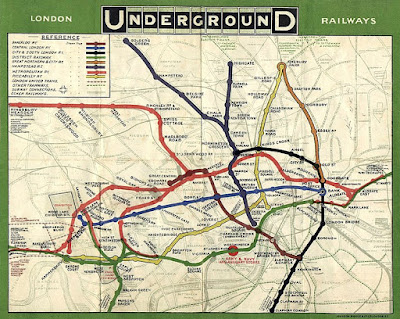
(London Underground map.)

The problem

From its start in 1863, the underground train system in London grew in a haphazard fashion. With different railway companies building different lines there was no sense of creating a coherent system. 

Despite the disorder, when it was first built it was viewed as a marvel and had a cultural impact beyond just transport; Conan Doyle wove it into Sherlock Holmes stories, H.G. Wells created science fiction involving it, and Virginia Woolf and others wrote about it too.

After various financial problems, the system was unified under government control. The government authority running it wanted to promote its use to reduce street-level congestion but the problem was, there were many different lines that only served part of the capital. Making it easy to use the system was hard.

Here's an early map of the system so you can see the problem.
1908 tube map

(1908 tube map. Image source: Wikimedia Commons.)

The map's hard to read and it's hard to follow. It's visually very cluttered and there are lots of distracting details; it's not clear why some things are marked on the map at all (why is ARMY & NAVY AND AUXILLARY STORES marked so prominently?). The font is hard to read, the text orientation is inconsistent, and the contrast of station names with the background isn't high enough.

The problem gets even worse when you zoom out to look at the entire system. Bear in mind, stations in central London are close together but they get further apart as you go into the suburbs. Here's an early map of the entire system, do you think you could navigate it?

(1931 whole system tube map.)

Of course, the printing technology of the time was more limited than it is now, which made information representation harder.

Design ideas in culture

To understand how the tube map as we know it was created, we have to understand a little of the design culture of the time (the early 1930s).

Electrical engineering was starting as a discipline and engineers were creating circuit diagrams for new electrical devices. These circuit diagrams showed the connection between electrical components, not how they were laid out on a circuit board. Circuit diagrams are examples of topological maps.

(Example circuit diagram. Show electrical connections between components, not how they're laid out on a circuit board. Image source: Wikimedia Commons, License: Public domain.)

The Bauhaus school in Germany was emphasizing art and design in mass-produced items, bringing high-quality design aesthetics into everyday goods. Ludwig Mies van der Rohe, the last director of the Bauhaus school, used a key aphorism that summarized much of their design philosophy: "less is more".

(Bauhaus kitchen design 1928 - they invented much of the modern design world. Image source: Wikimedia Commons, License: Public domain)

The modern art movement was in full swing, with the principles of abstraction coming very much to the fore. Artists were abstracting from reality in an attempt to represent an underlying truth about their subjects or about the world.

(Piet Mondrian, Composition 10. Image source: Wikimedia Commons, License: Public Domain.)

To put it simply, the early 1930s were a heyday of design that created much of our modern visual design language.

Harry Beck's solution - form follows function

In 1931, Harry Beck, a draughtsman for London Underground, proposed a new underground map. Beck's map was clearly based on circuit diagrams: it removed unnecessary detail to focus on what was needed. In Beck's view, what was necessary for the tube map was just the stations and the lines, plus a single underlying geographical detail, the river Thames.

Here's his original map. There's a lot here that's very, very different from the early geographical maps.

The design grammar of the tube map

The modern tube map is a much more complex beast, but it still retains the ideas Harry Beck created. For simplicity, I'm going to use the modern tube map to explain Beck's design innovations. There is one underlying and unifying idea behind everything I'm going to describe: consistency.

Topological not geographical. This is the key abstraction and it was key to the success of Beck's original map. On the ground, tube lines snake around and follow paths determined by geography and the urban landscape. This makes the relationship between tube lines confusing. Beck redrew the tube lines as straight lines without attempting to preserve the geographic relations of tube lines to one another. He made the stations more or less equidistant from each other, whereas, on the ground, the distance between stations varies widely. 

The two images below show the tube map and a geographical representation of the same map. Note how the tube map substantially distorts the underlying geography.

(The tube map. Image source: BBC.)

(A geographical view of the same system. Image source: Wikimedia Commons.)

Removal of almost all underlying geographical features. The only geographical feature on tube maps is the river Thames. Some versions of the tube map removed it, but the public wanted it put back in, so it's been a consistent feature for years now.

(The river Thames, in blue, is the only geographic feature on the map.)

A single consistent font.  Station names are written with the same orientation. Using the same font and the same text orientation makes reading the map easier. The tube has its own font, New Johnston, to give a sense of corporate identity.

(Same text orientation, same font everywhere.)

High contrast. This is something that's become easier with modern printing technology and good-quality white paper. But there are problems. The tube uses a system of fare zones which are often added to the map (you can see them in the first two maps in this section, they're the gray and white bands). Although this is important information if you're paying for your tube ticket, it does add visual clutter. Because of the number of stations on the system, many modern maps add a grid so you can locate stations. Gridlines are another cluttering feature.

Consistent symbols. The map uses a small set of symbols consistently. The symbol for a station is a 'tick' (for example, Goodge Street or Russell Square). The symbol for a station that connects two or more lines is a circle (for example, Warren Street or Holborn).

Graphical rules. Angles and curves are consistent throughout the map, with few exceptions - clearly, the map was constructed using a consistent set of layout rules. For example, tube lines are shown as horizontal, vertical, or 45-degree lines in almost all cases.

The challenge for the future

The demand for mass transit in London has been growing for very many years which means London Underground is likely to have more development over time (new lines, new stations). This poses challenges for map makers.

The latest underground maps are much more complicated than Harry Beck's original. Newer maps incorporate the south London tram system, some overground trains, and of course the new Elizabeth Line. At some point, a system becomes so complex that even an abstract simplification becomes too complex. Perhaps we'll need a map for the map.

A trap for the unwary

The tube map is topological, not geographical. On the map, tube stations are roughly the same distance apart, something that's very much not the case on the ground.

Let's imagine you had to go from Warren Street to Great Portland Street. How would you do it? Maybe you would get the Victoria Line southbound to Oxford Circus, change to the Bakerloo Line northbound, change again at Baker Street, and get the Circle Line eastbound to Great Portland Street. That's a lot of changes and trains. Why not just walk from Warren Street to Great Portland Street? They're less than 500m apart and you can do the walk in under 5 minutes. The tube map misleads people into doing stuff like this all the time.

Let's imagine it's a lovely spring day and you're traveling to Chesham on the Metropolitan Line. If Great Portland Street and Warren Street are only 482m apart, then it must be a nice walk between Chalfont & Latimer and Chesham, especially as they're out in the leafy suburbs. Is this a good idea? Maybe not. These stations are 6.19km apart.

Abstractions are great, but you need to understand that's exactly what they are and how they can mislead you.

Using the map to represent data

The tube map is an icon, not just of the tube system, but of London itself. Because of its iconic status, researchers have used it as a vehicle to represent different data about the city.

James Cheshire of University College London mapped life expectancy data to tube stations, the idea being, you can spot health disparities between different parts of the city. He produced a great map you can visit at tubecreature.com. Here's a screenshot of part of his map.


You go from a life expectancy of 78 at Stockwell to 89 at Green Park, but the two stations are just 4 stops apart. His map shows how disparities occur across very short distances.

Mark Green of the University of Sheffield had a similar idea, but this time using a more generic deprivation score. Here's his take on deprivation and the tube map, the bigger circles representing higher deprivation.

Once again, we see the same thing, big differences in deprivation over short distances.

What the tube map hides

Let me show you a geographical layout of the modern tube system courtesy of Wikimedia. Do you spot what's odd about it?

(Geographical arrangement of tube lines. Image source: Wikimedia Commons, License: Creative Commons.)

Look at the tube system in southeast London. What tube system? There are no tube trains in southeast London. North London has lots of tube trains, southwest London has some, and southeast London has none at all. What part of London do you think is the poorest?

The tube map was never designed to indicate wealth and poverty, but it does that. It clearly shows which parts of London were wealthy enough to warrant underground construction and which were not. Of course, not every area in London has a tube station, even outside the southeast of London. Cricklewood (population 80,000) in northwest London doesn't have a tube station and is nowhere to be seen on the tube map. 

The tube map leaves off underserved areas entirely, it's as if southeast London (and Cricklewood and other places) don't exist. An abstraction meant to aid the user makes whole communities invisible.

Now look back at the previous section and the use of the tube map to indicate poverty and inequality in London. If the tube map is an iconic representation of London, what does that say about the areas that aren't even on the map? Perhaps it's a case of 'out of sight, out of mind'.

This is a clear reminder that information design is a deeply human endeavor. A value-neutral expression of information doesn't exist, and maybe we shouldn't expect it to.

Takeaways for the data scientist

As data scientists, we have to visualize data, not just for our fellow data scientists, but more importantly for the businesses we serve. We have to make it easy to understand and easy to interpret data. The London Underground tube map shows how ideas from outside science (circuit diagrams, Bauhaus, modernism) can help; information representation is, after all, a human endeavor. But the map shows the limits to abstraction and how we can be unintentionally led astray. 

The map also shows the hidden effects of wealth inequality and the power of exclusion; what we do does not exist in a cultural vacuum, which is true for both the tube map and the charts we produce too.

Saturday, February 27, 2021

Simpson's paradox: a trap for the naive analyst

Simpson's paradox can mess up your business

Let's imagine you're the Chief Revenue Officer at a manufacturing company that sells tubes and cylinders. You're having trouble with European sales reps discounting, so you offer a spif: the country team that sells at the highest price gets a week-long vacation somewhere warm and sunny with free food and drink. The Italian and German sales teams are raring to go.

At the end of the quarter, you have these results [Wang]:

Product type
Cylinder Tube
Sales team No sales Average price No sales Average price
German 80 €100 20 €70
Italian 20 €120 80 €80

This looks like a clear victory for the Italians! They maintained a higher price for both cylinders and tubes! If they have a higher price for every item, then obviously, they've won. The Italians start packing their swimsuits.

Not so fast, say the Germans, let's look at the overall results.

Sales team Average price
German €94
Italian €88

Despite having a lower selling price for both cylinders and tubes, the Germans have maintained a higher selling price overall!

How did this happen? It's an instance of Simpon's paradox.

Why the results reversed

Here's how this happened: the Germans sold more of the expensive cylinders and the Italians sold more of the cheaper tubes. The average price is the ratio of the total monetary amount/total sales quantity. To put it very simply, ratios (prices) can behave oddly.

Let's look at a plot of the selling prices for the Germans and Italians.

German and Italian prices

The blue circles are tubes and the orange circles are cylinders. The size of the circles represents the number of sales. The little red dot in the center of the circles is the price. 

Let's look at cylinders. Plainly, the Italians sold them at a higher price, but they're the most expensive item and the Germans sold more of them. Now, let's look at tubes, once again, the Italians sold them at a higher price than the Germans, but they're cheaper than cylinders and the Italians sold more of them.

You can probably see where this is going. Because the Italians sold more of the cheaper items, their average (or pooled) price is dragged down, despite maintaining a higher price on a per-item basis. I've re-drawn the chart, but this time I've added a horizontal black line that represents the average.

The product type (cylinders or tubes) is known in statistics as a confounder because it confounds the results. It's also known as a conditioning variable.

A disturbing example - does this drug work?

The sales example is simple and you can see the cause of the trouble immediately. Let's look at some data from a (pretend) clinical trial.

Imagine there's some disease that impacts men and women and that some people get better on their own without any treatment at all. Now let's imagine we have a drug that might improve patient outcomes. Here's the data [Lindley].

Female Male
Recovered Not Recovered Rate Recovered Not Recovered Rate
Took drug 8 2 80% 12 18 40%
Not take drug 21 9 70% 3 7 30%

Wow! The drug gives everyone an added 10% on their recovery rate. Surely we need to prescribe this for everyone? Let's have a look at the overall data.

Everyone
Recovered Not Recovered Rate
Took drug 20 20 50%
Not take drug 24 16 60%

What this data is saying is, the drug reduces the recovery rate by 10%.

Let me say this again. 

  • For men, the drug improves recovery by 10%.
  • For women, the drug improves recovery by 10%.
  • For everyone, the drug reduces recovery by 10%. 

If I'm a clinician, and I know you have the disease, if you're a woman, I would recommend you take the drug, if you're a man I would recommend you take the drug, but if I don't know your gender, I would advise you not to take the drug. What!!!!!

This is exactly the same math as the sales example I gave you above. The explanation is the same. The only thing different is the words I'm using and the context.

Simpson and COVID

In the United States, it's pretty well-established that black and Hispanic people have suffered disproportionately from COVID. Not only is their risk of getting COVID higher, but their health outcomes are worse too. This has been extensively covered in the press and on the TV news.

In the middle of 2020, the CDC published data that showed fatality rates by race/ethnicity. The fatality rate means the fraction of patients with COVID who die. The data showed a clear result: white people had the worst fatality rate of the racial groups they studied.

Doesn't this contradict the press stories? 

No.

There are three factors at work:

  • The fatality rate increases with age for all ethnic groups. It's much higher for older people (75+) than younger people.
  • The white population is older than the black and Hispanic populations.
  • Whites have lower fatality rates in almost all age groups.

This is exactly the same as the German and Italian sales team example I started with. As a fraction of their population, there are more old white people than old black and Hispanic people, so the fatality rates for the white population are dominated by the older age group in a way that doesn't happen for blacks and Hispanics.

In this case, the overall numbers are highly misleading and the more meaningful comparison is at the age-group level. Mathematically, we can remove the effect of different demographics to make an apples-to-apples comparison of fatality rates, and that's what the CDC has done.

In pictures

Wikipedia has a nice article on Simpson's paradox and I particularly like the animation that's used to accompany it, so I'm copying it here.

(Simpson's paradox animated. Image source: Wikipedia, Credit: Pace~svwiki, License: Creative Commons)

Each of the dots represents a measurement, for example, it could be price. The colors represent categories, for example, German or Italian sales teams, etc. if we look at the results overall, the trend is negative (shown by the black dots and black line). If we look at the individual categories, the trend is positive (colors). In other words, the aggregation reverses the individual trends.

The classic example - sex discrimination at Berkeley

The Simpson's paradox example that's nearly always quoted is the Berkeley sex discrimination case [Bickel]. I'm not going to quote it here for two reasons: it's thoroughly discussed elsewhere, and the presentation of the results can be confusing. I've stuck to simpler examples to make my point.

American politics

A version of Simpson's paradox can occur in American presidential elections, and it very nicely illustrates the cause of the problem.

In 2016, Hilary Clinton won the popular vote by 48.2% to 46.1%, but Donald Trump won the electoral college by 304 to 227. The reason for the reversal is simple, it's the population spread among the states and the relative electoral college votes allocated to the states. As in the case of the rollup with the sales and medical data I showed you earlier, exactly how the data rolls up can reverse the result.

The question, "who won the 2016 presidential election" sounds simple, but it can have several meanings:

  • who was elected president
  • who got the most votes
  • who got the most electoral college votes

The most obvious meaning, in this case, is, "who was elected president". But when you're analyzing data, it's not always obvious what the right question really is.

The root cause of the problem

The problem occurs because we're using an imprecise language (English) to interpret mathematical results. In the sales and medical data cases, we need to define what we want. 

In the sales price example, do we mean the overall price or the price for each category? The contest was ambiguous, but to be fair to our CRO, this wasn't obvious initially. Probably, the fairest result is to take the overall price.

For the medical data case, we're probably better off taking the male and female data separately. A similar argument applies for the COVID example. The clarifying question is, what are you using the statistics for? In the drug data case, we're trying to understand the efficacy of a drug, and plainly, gender is a factor, so we should use the gendered data. In the COVID data case, if we're trying to understand the comparative impact of COVID on different races/ethnicities, we need to remove demographic differences.

If this was the 1980s, we'd be stuck. We can't use statistics alone to tell us what the answer is, we'd have to use data from outside the analysis to help us [Pearl]. But this isn't the 1980s anymore, and there are techniques to show the presence of Simpson's paradox. The answer lies in using something called a directed acyclic graph, usually called a DAG. But DAGs are a complex area and too complex for this blog post that I'm aiming at business people.

What this means in practice

There's a very old sales joke that says, "we'll lose money on every sale but make it up in volume". It's something sales managers like to quote to their salespeople when they come asking for permission to discount beyond the rules. I laughed along too, but now I'm not so quick to laugh. Simpson's paradox has taught me to think before I speak. Things can get weird.

Interpreting large amounts of data is hard. You need training and practice to get it right and there's a reason why seasoned data scientists are sought after. But even experienced analysts can struggle with issues like Simpson's paradox and multi-comparison problems.

The red alert danger for businesses occurs when people who don't have the training and expertise start to interpret complex data. Let's imagine someone who didn't know about Simpson's paradox had the sales or medical data problem I've described here. Do you think they could reach the 'right' conclusion?

The bottom line is simple: you've got to know what you're doing when it comes to analysis.

References

[Bickel] Sex Bias in Graduate Admissions: Data from Berkeley, By P. J. Bickel, E. A. Hammel, J. W. O'Connell, Science, 07 Feb 1975: 398-404
[Lindley] Lindley, D. and Novick, M. (1981). The role of exchangeability in inference. The Annals
of Statistics 9 45–58.
[Pearl] Judea Pearl, Comment: Understanding Simpson’s Paradox, The American Statistician, 68(1):8-13, February 2014.
[Wang] Wang B, Wu P, Kwan B, Tu XM, Feng C. Simpson's Paradox: Examples. Shanghai Arch Psychiatry. 2018;30(2):139-143. doi:10.11919/j.issn.1002-0829.218026

Sunday, February 21, 2021

The amazing gamma function

It blew my mind

A long time ago, I was a pure math student sitting in a lecture theater. The lecturer derived the gamma function (\(\Gamma(x)\)) and talked about its properties. It blew my mind. I love this stuff and I want to share my enjoyment with you.

(Leonhard Euler - who discovered e and the Gamma function. Image source: Wikimedia Commons. License: Public domain)

It must be important, it has an exclamation!

Factorials are denoted by a !, for example, \(6! = 6 \times 5 \times 4 \times 3 \times 2 \times 1 = 720\). The numbers get big very quickly, as we'll see, so the use of the ! sign seems appropriate. More generally, we can write:

\[n! = n \times (n-1) \times ...1 \]
where:
\[n \in \Bbb Z*\]
\(\Bbb Z*\) is the integers 0, 1,...

Let's plot the function \(y(n) = n!\) so we can see how quickly it grows.


I stopped at n = 6 because the numbers got too big to show what I want to show. 

To state the obvious, \(n!\) is defined for positive integers only. It doesn't make sense to talk about -1.3!  or does it?

Integration is fun

Leonard Euler is a huge figure in mathematics; the number \(e\) is named after him, as is the iconic identity \(e^{i\pi} + 1 = 0\). In my career, I've worked in a number of areas and used different forms of math, in most places, I've handled something that Euler had a hand in. It's sad that outside of the technical world his name isn't better known.

One of the many, many things Euler did was investigate the properties of series involving \(e\). In turn, this led to the creation of the gamma function, which has a startling property related to factorials. I'm going to show you what it is, but let's start with some calculus to get us to the gamma function. 

We're going to build up a sequence of integrations. hopefully, the pattern should be obvious to you:

\[ \int_0^\infty x^0 e^{-x} dx = -e^{-x} \vert_0^\infty= 1\]
\[ \int_0^\infty x^1 e^{-x} dx = 1\]
\[ \int_0^\infty x^2 e^{-x} dx = 2\]
\[ \int_0^\infty x^3 e^{-x} dx = 6\]

With some proof by induction, we can show that the general case is:

\[ \int_0^\infty x^n e^{-x} dx = n!\]

(The proof involves some calculus and some arithmetic. If I get some time, I might update this post with a full derivation, just because.)

Euler named a version of this relationship the gamma function and wrote it as:
\[\Gamma(n+1) = n!\] We have a relationship between integration and factorials. So what?

Go back and look at the integration. Where does it say in the integration that \(n\) has to be a positive integer? It's perfectly possible to evaluate \(\int_0^\infty x^{-1.356} e^{-x} dx\) for example. Can we evaluate the integral for positive real values of \(n\)? Yes, we can. What about negative numbers? Yes, we can. What about complex numbers? Yes, we can.

If we redefine factorial using the gamma function, it becomes meaningful to calculate \(2.321!\) or \(-0.5!\) or even \((1.1 + 2.2i)!\). To be clear, we now have a way of calculating factorials for real numbers and complex numbers, so:

\[n \in \Bbb C\]

or maybe we should write

\[x! \ where \ x \in \Bbb C\] 

The gamma function has a very curious property that struck me as being very cool. 

\[\Gamma \left( \frac{1}{2} \right) = \sqrt{\pi}\]

When I heard all this, my undergraduate mind was blown.

What Legendre did wrong

Euler defined the gamma function as:

\[\Pi(n) = n!\]

But for various reasons, Legendre re-formatted it as:

\[\Gamma(n+1) = n!\]

Sadly, this is the form universally used now. This form is inconvenient, but like the QWERTY layout of keys on a keyboard, we're stuck with it.

What does it look like?

The chart below shows the gamma function for a range of values.  I've limited the range of the x and y values so you can see its shape around zero.

For \(n > 0\), it's now a smooth curve instead of points. Below zero, it has poles (infinities) at negative integer values. 

What use is it?

Factorials are used in probability theory and any form of math involving combinations. They're one of the bedrock ideas you need to understand to do anything useful. The gamma function is used in statistics, number theory, and quantum physics. 

One cool use of the gamma function is calculating the volume and surface area of an n-dimensional sphere:

\[V = \frac {\ {\pi^{{1 \over 2} n}  r^n}}  {\Gamma(  {1\over 2} n + 1)}\]
\[S = \frac{n}{r} V\]

where:

  • r is the radius
  • n is the number of dimensions

(n-dimensional spheres crop up in information theory - as you're reading this, you're using something that relies on their consequences.)

But frankly, I don't care about uses in the real world. It's a great function with some really cool properties, and sometimes, that's enough for me.

Programmers are mathematicians too

My high school math teacher told us our calculators would give us an error if we tried calculating factorials for any non-positive integer number. She wanted us to know why it wouldn't work. The people who built my high school calculator had a very literal definition of factorial, but it looks like the good programmers at Google are mathematicians at heart. 

Type the word 'calculator' into the Google search box and you should see something like this.

Now type in -1.5! You should get -1.32934038818. Google has implemented the factorial key using the gamma function for numbers that are not just non-positive integers. I've heard that calculators on other systems do the same thing too. This makes me unreasonably happy.

Pure math - but...

Pure math has a very odd habit of becoming essential to business. The mathematicians who developed number theory or linear algebra or calculus didn't do so to make money, they did it to understand the world. But even some very abstract math has spawned huge businesses. The most obvious example is cryptography, but wireless communications rely on a healthy dose of pure math too, as I'll show in a future post.

Monday, February 15, 2021

Management degrees - how I went from a C to an A: buzzword bingo

How to do well on a management degree

I'm having a spring clean, I'm scanning old documents and throwing away the paper copies. It's a trip down memory lane as I'm reviewing old management essays and course notes. The management degree I did was part-time in the evenings and I did it over several years as well as doing a full-time job, so my notes built up over time and there's a lot to scan. Looking over it all, here's my guide to doing well on essays in a management master's degree program.

Sever Hall, Harvard
(A classroom in Sever Hall. I had several lectures in rooms just like this. Image source: Wikimedia Commons, License: Creative Commons, Author: Ario Barzan)

Why I did badly at first

I had been in the technology industry for a long time before I took management classes. I was used to coding and writing technical documentation and I'd become stuck in my ways. The thing about most technical documents is that no one reads them, and very rarely do you get feedback on your writing style. In the few years before I began the classes, I'd started to do more marketing work, and I found it challenging - for the first time, I was getting negative feedback on how I was writing, so I knew I had a problem.

My first course was accounting, which I did very well in. But of course I did well, accounting is another technical discipline. It's like coding, but with different rules and the added threat of lawsuits and jail time.

The second course I did was an HR course and we used the case study method in class. I was gung-ho for my first essay and I was convinced I was going to get a great mark for it. I got a C.

I did what every bad student does when they get a bad grade: I blamed the lecturer. Then I stopped and gave myself a talking to. I was determined to do better.

I did badly for two reasons:

  • A stilted, over-technical writing style.
  • I didn't understand what the lecturer wanted. The goal was to show that I had absorbed the terminology of HR and could appropriately apply it. The goal was not to solve the business problem. In my essay, I focused on solving the business problem and I didn't mention enough of the HR concepts we covered in class.

How I did well

The first order of business was fixing my writing style. I had a short period between essays, but fortunately, it was long enough to do some work. I did crash reading on how to write better in general and how to write better essays. Unashamedly, I went back to basics and read guides for undergraduates and even high school students.  I talked to other students online about writing. I realized I had some grammar and style issues, but I also knew I couldn't fix them all in one go, so I focused on the worst problems first. 

Next was understanding what the lecturer wanted. Once I understood that the essay was a means of checking my understanding of concepts, I had a clean way forward: buzzword bingo. Prior to beginning any essay, I made a list of all the relevant concepts we'd covered in class, and I added some that weren't covered but I'd found through reading around. My goal was to ensure that I applied every concept to the case study and make it clear I'd done so. The essays were a vehicle to show understanding of concepts.

The third step was a better essay plan. I figured out how I would apply my buzzwords to the case study and built my work into a narrative. I made sure that the logical steps made sense from one concept to another and I made sure to link ideas. Every essay has a maximum word (or page) count, so I developed a word budget for each idea, making sure the most important ideas got the most words. This also helps with a perennial student problem, spending too many words on the introduction and conclusion. The word budget idea was the biggest step forward for me, it made sure I focused my thoughts and it always led to my essays being too long. In the editing process, I chopped down the introduction and conclusion and removed extraneous words, I also cut down on the use of the passive voice, which is a real word hog.

My essay process

Buzzword bingo. Make a list of every concept you think is relevant to the case study, making sure to use the correct terminology. This list must cover everything mentioned in class but it also must cover ideas not mentioned in class, you have to go above and beyond.

Weighting buzzwords. Which concepts are more important? More important concepts get a higher word count, but you have to know what's more important.

What's the question? What precisely are the instructions for the essay? Make sure you follow the rules exactly. If necessary, make a tick list for the essay.

Word budget. You have a word count, now allocate the word count in proportion to the importance of the ideas, including the introduction and conclusion.

Link ideas. What ideas go together? If there are multiple linkages, what are the most important ones?

Essay plan. Plan the essay paragraph-by-paragraph and allocate a word budget for each paragraph.

Write the essay.

First-pass revision.  Are you under the word count? If so, you missed something. Does the written essay change your understanding of the problem? If so, re-allocate your word budget. Do you need to change the order of paragraphs or sentences for the narrative to make sense?

Rest. Leave the essay alone for a few days. You need some distance to critique it more.

Second-pass revision. Remove the passive voice as much as possible. Check for word repetition. Check the introduction and conclusion make sense and are coherent.

Rest. Leave the essay alone for a few days. You need some distance to critique it more.

Third pass revision. Have you missed any concepts? Does the essay hang together? Does it meet the instructions precisely?

Allocate plenty of time. This is a painstaking process. You can't do it at the last minute and you can't compress the timescales by doing it all in a day, you need time for reflection. You have to start work on your essay as soon as it's set. Realistically, this is at least two weeks of work.

What happened?

For the next essay, I got an A- and it went up from there. In pretty much every course I did after that, I got an A for my essays.

The degree program offered a writing module, which I took. Prior to the writing course, I read every writing book I could get my hands on, including many grammar books (most of which I didn't understand). Part of the writing course was writing an article for publication and I actually managed to get an article published in a magazine. The editor made minimal changes to my text, which was immensely satisfying. Bottom line: I fixed my writing problem.

Did my approach to essay writing help me learn? Yes, but only marginally so. It did result in a huge boost to my grades though, and that's the main thing. It taught me a lesson in humility too - just because you're an expert in one thing doesn't make you an expert in everything.

Of course, I did get my degree and I did graduate, I was on the Dean's list and I was the commencement speaker for my class. I got there partly because of a better approach to essay writing, and you can too.
Monday, February 8, 2021

Frequency hopping and the most beautiful woman in the world

Spread spectrum

Modern digital wireless systems rely on spread spectrum techniques. The story of how the most obvious of them, frequency hopping, was invented is not what you think. It involves a beautiful Hollywood actress (possibly the most beautiful ever), a music composer, and a dinner party. Let me tell you the story.

(The most beautiful girl in the world, and the inventor of modern communications.  Image source: Wikimedia Commons, License: Public Domain)

Hedy Lamar

This woman lived an incredible life, if you get the time, read some of her life story. I'm just going to summarize it here.

Hedy was born Eva Maria Kiesler in 1914, in Vienna. Her parents were both Jewish, which was to play a part in this story. Her father was an inventor, which was also to be important. 

She got her first film role in 1930, and her first starring role in 1932. However, her big break came in 1933 with the notorious movie Ecstasy. I've heard the movie described as soft porn and it has a number of notable cinematic firsts - even today, it's NSFW so don't look for it from your work computer. 

In 1933, Hedy married Friedrich Mandl, an arms dealer with strong connections to the Nazis and the Italian fascists. Mandl was controlling and domineering. By 1937, Hedy knew she had to escape, so she left Austria and headed for the United States via London. Of course, she headed for Hollywood.

In Hollywood, she appeared in a number of films, some very successful, others not so much. The studios labeled her 'the most beautiful girl in the world' and marketed movies based on her beauty. She also actively and successfully raised millions for the war effort.

George Antheil

George was born in Trenton, New Jersey in 1900 to German parents and grew up bilingual. As a musician, he was strongly influenced by the emerging avant-garde music coming out of Europe, in particular, 'mechanical' music. He wrote music for piano, films, and ballets.

The dinner party and the piano roll

Hedy and George met at a Hollywood dinner party. They talked about the problem of radio-controlled torpedoes. Although a good idea, the controlling radio signals could easily be intercepted and jammed, or even worse, the torpedo could be redirected. What was needed was some way of controlling a torpedo by radio that could not be jammed.

George knew about automatic piano players, Hedy knew about torpedoes from her ex-husband. Together, they came up with the idea of a radio control where the radio frequency changed very rapidly; so rapidly, a human trying to jam the signal couldn't do it because they wouldn't be able to keep up with the frequency changes.  Here's a fictitious timeline example:

  • 1.2s - transmitter transmits at 27.2 MHz, receiver receives at 27.2 MHz
  • 1.3s - transmitter transmits at 26.9 MHz, receiver receives at 26.9 MHz
  • 1.4s - transmitter transmits at 27.5 MHz, receiver receives at 27.5 MHz
  • etc.
(A piano roll for automatically playing the piano. Image source: Wikimedia Commons, License: Creative Commons, Author: Draconichiaro)

To keep the transmitter and receiver in sync, you could use the same technology that powers automatic piano players. In an automatic piano player, a perforated roll is fed through a reader, which in turn presses the appropriate key. The perforated roll is a list of which keys to press and when. 

In the torpedo case, instead of which keys to press, the piano roll could instruct the transmitter or receiver which frequency to use and when. The same piano roll would be inserted into the torpedo and controller and both roll readers would be synchronized. After the torpedo was launched, the controlling frequency would change dependent on the roll, and the transmitter and receiver would stay in sync so long as the piano roll readers stayed in sync. 

Using a mechanism like this, the controlling frequency would change, or hop, from one frequency to another, hence the name 'frequency hopping'. Frequency hopping takes up more radio spectrum than just transmitting on one frequency would, hence the more general name 'spread spectrum'.

Hedy and George patented the idea and you can read their patent here.

Although Hedy and George thought of torpedoes as their application, there's no reason why you couldn't use the same idea for more secure voice communications.

What happened next

The patent sat in obscurity for years. The idea was way ahead of the technology needed to implement it, so it expired before anyone used it. Hedy and George made no money from it.

By the 1960s, the technology did exist, and it was used by the US military for both voice communications and guided munitions. Notably, they used it in the disastrous Bay of Pigs Invasion and later in Vietnam.

Moving forwards to the end of the twentieth century, the technique was used in early WiFi versions and other commercial radio standards, for example, Bluetooth.

Frequency hopping isn't the only spread spectrum technology, it's the simplest (and first) of several that are out there. Interestingly, some of them make use of pure math methods developed over a hundred years ago. In any case, spread spectrum methods are at the heart of pretty much all but the most trivial wireless communication protocols.

Hedy and George lived out their lives and things continued for them as they had before.
George continued to write music and opera until his death at the age of 58.

Hedy's career had ups and downs. She had huge success in the 1940s, but by the 1950s, her star had waned considerably. She filmed her last role in 1958 and retired, spending much of the rest of her life in seclusion. She died at age 85.

When I first started to work in the radio communications industry, the Hedy Lamar story was known, but it was considered a bit of a joke. I'm pleased that over the last few years, her contribution has been re-assessed upwards. In 2014, she was inducted into the US National Inventors Hall of Fame - it would have been nice had this been done in her lifetime, but still, better late than never.

If you liked this post you might also like

Monday, February 1, 2021

What do Presidential approval polls really tell us?

This is a technical piece about the meaning of a type of polling. It is not political in favor of or against President Trump. I will remove any political comments.

What are presidential approval polls?

Presidential approval polls are a simple concept to grasp: do you approve or disapprove of President X? Because newspapers and TV channels can always use them for a headline or an on air-segment, they love to commission them. During President Trump's presidency, I counted 16,500 published approval polls.

But what do these polls mean and how should we interpret them? As it turns out, understanding what they're telling us is slippery. I'm going to offer you my guide for understanding what they mean.

(Image source: Wikimedia Commons. License: Public domain.)

My data comes from the ever-wonderful 538 which has a page showing the approval ratings for President Trump. Not only can you download the data from the page, but you can also compare President Trump's approval ratings with many previous presidents' approval ratings.

Example approval results

On 2020-10-29, Fox News ran an approval poll for President Trump. Of the 1,246 people surveyed:

  • 46% approved of President Trump
  • 54% disapproved of President Trump

which seems fairly conclusive that the majority disapproves. But not so fast. On the same day, Rasmussen Reports/Pulse Opinion Research also ran an approval poll, this time of 1,500 people, their results were:

  • 51% approved of President Trump
  • 48% disapproved of President Trump.

These were both fairly large surveys. How could they be so different?

Actually, it gets worse because these other surveys were taken on the same day too:

  • Gravis Marketing, 1,281 respondents, 52% approve, 47% disapprove
  • Morning Consult, 31,920 respondents, 42% approve, 53% disapprove

Let's plot out the data and see what the spread is, but as with everything with polls, this is harder than it seems.

Plotting approval and disapproval over time

Plotting out the results of approval polls seems simple, the x-axis is the day of the poll and the y-axis is the approval or disapproval percentage. But polls are typically conducted over several days and there's uncertainty in the results. 

To take a typical example, Global Marketing Research Services conducted a poll over three days 2020-10-23 to 2020-10-27. It's misleading to just plot the last day of the poll; we should plot the results over all the days the poll was conducted. 

The actual approval or disapproval number is subject to sampling error. If we assume random sampling (I'm going to come back to this later), we can work out the uncertainty in the results, more formally, we can work out a confidence interval. Here's how this works out in practice. YouGov did a poll over three days (2020-10-25 to 2020-10-27) and recorded 42% approval and 56% disapproval for 1,365 respondents. Using some math I won't explain here, we can write these results as:

  • 2020-10-25, approval 42 ± 2.6%, disapproval 56 ± 2.6%, undecided 2 ± 0.7%
  • 2020-10-26, approval 42 ± 2.6%, disapproval 56 ± 2.6%, undecided 2 ± 0.7%
  • 2020-10-27, approval 42 ± 2.6%, disapproval 56 ± 2.6%, undecided 2 ± 0.7%

We can plot this poll result like this:

Before we get to the plot of all approval ratings, let's do one last thing. If you're plotting large amounts of data, it's helpful to set a transparency level for the points you're plotting (often called alpha). There are 16,500 polls and we'll be plotting approve, disapprove, and undecided, which is a lot of data. By setting the transparency level appropriately, the plot will have the property where the more intense the color is, the more the poll results overlap. With this addition, let's see the plot of approval, disapproval, and undecided over time.

Wow. There's quite a lot going on here. It's hard to get a sense of changes over time. I've added a trend line for approval, disapproval, and undecided so you can get a better sense of the aggregate behavior of the data.

Variation between pollsters

There's wide variation between opinion pollsters. I've picked out just two, Rasmussen Reports/Pulse Opinion Research and Morning Consult. To see the variation more clearly, I'll just show approvals for President Trump and just show these two pollsters and the average for all polls.

To state the obvious, the difference is huge and way above random sampling error. Who's right, Rasmussen Reports or Morning Consult? How can we tell?

To understand what this chart means, we have to know a little bit more about how these polls are conducted.

How might you run an approval poll?

There are two types of approval polls.

  • One-off polls. You select your sample of subjects and ask them your questions. You only do it once.
  • Tracking polls. Technically, this is also called a longitudinal study. You select your population sample and ask them questions. You then ask the same group the same questions at a later date. The idea is, you can see how opinions change over time using the same group.

Different polling organizations use different methods for population sampling. It's almost never entirely random sampling. Bear in mind, subjects can say no to being involved, and can in principle drop out any time they choose. 

It's very, very easy to introduce bias by the people you select, slight differences in selection may give big differences in results. Let's say you're trying to measure President Trump's approval. Some people will approve of everything he does while others will disapprove of everything he does. There's very little point in measuring how either of these groups approves or disapproves over time. If your group includes a big measure of either of these groups, you're not going to see much variation. However, are you selecting for population representation or selecting to measure change over time? 

For these reasons, the sampling error in the polls is likely to be larger than random sampling error alone and may have different characteristics.

How accurate are approval polls?

This is the big question. For polls related to voting intention, you can compare what the polls said and the election result. But there's no such moment of truth for approval polls. I might disapprove of a President, but vote for them anyway (because of party affiliations or because I hate the other candidate more), so election results are a poor indicator of success.

One measure of accuracy might be agreement among approval polls from a number of organizations, but it's possible that the other pollsters could be wrong too. There's a polling industry problem called herding which has been a big issue in UK political polls. Herding means pollsters choose methodologies similar to other pollsters to avoid being outliers, which leads to polling results from different pollsters herding together. In a couple of notorious cases in the UK, they herded together and herded wrongly. A poll's similarity to other polls does not mean it's more accurate.

What about averaging?

What about aggregating polls? Even this isn't simple. In your aggregation:

  • Do you include tracking polls or all polls?
  • Do you weight polls by their size?
  • Do you weight polls by accuracy or partisan bias?
  • Do you remove 'don't knows'?
  • If a poll took place over more than one day, do you average results over each day the poll took place?

I'm sure you could add your own factors. The bottom line is, even aggregation isn't straightforward.

What all this means

Is Rasmussen Reports more accurate than Morning Consult? I can't say. There is no external source of truth for measuring who's more correct.

Even worse, we can see changes in the Rasmussen Reports approval that don't occur in the Morning Consult data (and vice versa). Was the effect Rasmussen Reports saw real and Morning Consult missed it, or was Morning Consult correct? I can't say.

It's not just these two pollsters. The Pew Research Center claims their data, showing a decline in President's Trump approval rating at the end of his presidency, is real. This may well be correct, but what external sources can we use to say for sure?

What can I conclude for President Trump's approval rating?

Here's my takeaway story after all this. 

President Trump had an approval rating above 50% from most polling organizations when he took office. Most, but not all, polling organizations reported a drop below 50% soon after the start of his presidency. After that, his approval ratings stayed pretty flat throughout his entire presidency, except for a drop at the very end. 

The remarkable story is how steady his approval ratings were. For most presidents, there are ups and downs throughout their presidency, but not so much for President Trump. It seems that people made their minds up very quickly and didn't change their opinions much. 

Despite the large number of approval polls, the headline for most of the last four years should have been: "President Trump's approval rating: very little change".

What about President Biden?

At a guess, the polls will start positive and decline. I'm not going to get excited about any one poll. I want to see averages, and I want to see a sustained trend over time. Only then do I think the polls might tell us something worth listening to.

If you liked this post, you might like these ones

Monday, January 25, 2021

3D plotting: how hard can it be?

Why aren't 2D plots good enough?

Most data visualization problems involve some form of two-dimensional plotting, for example plotting sales by month. Over the last two hundred years, analysts have developed several different types of 2D plots, including scatter charts, line charts, and bar charts, so we have all the chart types we need for 2D data. But what happens if we have a 3D dataset? 

The dataset I'm looking at is English Premier League (EPL) results. I want to know how the full-time scores are distributed, for example, are there more 1-1 results than 2-1 results? I have three numbers, the full-time home goals (FTHG), the full-time away goals (FTAG). and the number of games that had that score. How can I present this 3D data in a meaningful way? 

(You can't rely on 3D glasses to visualize 3D data. Image source: Wikimedia Commons, License: Creative Commons, Author: Oliver Olschewski)

Just the text

The easiest way to view the data is to create a table, so here it is. The columns are the away goals, the rows are the home goals, and the cell values are the number of matches with that result, so 778 is the number of matches with a score of 0-1.


This presentation is easy to do, and relatively easy to interpret. I can see 1-1 is the most popular score, followed by 1-0. You can also see that some scores just don't occur (9-9) and results with more than a handful of goals are very uncommon.

This is OK for a smallish dataset like this, but if there are hundreds of rows and/or columns, it's not really viable. So what can we do?

Heatmaps

A heatmap is a 2D map where the 3rd dimension is represented as color. The more intense (or lighter) the color, the higher the value. For this kind of plot to work, you do have to be careful about your color map. Usually, it's best to choose the intensity of just one color (e.g. shades of blue). In a few cases, multiple colors can work (colors for political parties), but those are the exceptions. 

Here's the same data plotted as a heatmap using the Brewer color palette "RdPu" (red-purple).

The plot does clearly show the structure. It's obvious there's a diagonal line beyond which no results occur. It's also obvious which scores are the most common. On the other hand, it's hard to get a sense of how quickly the frequency falls off because the human eye just isn't that sensitive to variations in color, but we could probably play around with the color scale to make the most important color variation occur over the range we're interested in. 

This is an easy plot to make because it's part of R's ggplot package. Here's my code:

plt_goal_heatmap <- goal_distribution %>% 
  ggplot(aes(FTHG, FTAG, fill=Matches)) + 
  geom_tile() +   
  scale_fill_distiller(palette = "RdPu") +
  ggtitle("Home/Away goal heatmap")

Perspective scatter plot

Another alternative is the perspective plot, which in R, you can create using the 'persp' function. This is a surface plot as you can see below.

You can change your perspective on the plot and view it from other angles, but even from this perspective, it's easy to see the very rapid falloff in frequency as the scores increase. 

However, I found this plot harder to use than the simple heatmap, and I found changing my viewing angle was awkward and time-consuming.

Here's my code in case it's useful to you:

persp(x = seq(0, max(goal_distribution$FTHG)), 
      y = seq(0, max(goal_distribution$FTAG)), 
      z = as.matrix(
        unname(
          spread(
            goal_distribution, FTAG, Matches, fill=0)[,-1])), 
      xlab = "FTHG", ylab = "FTAG", zlab = "Matches", 
      main = "Distribution of matches by score",
      theta = 60, phi = 20, 
      expand = 1, 
      col = "lightblue")

3D scatter plot

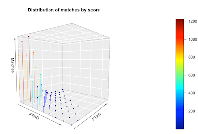
We can go one stage further and create a 3D scatter chart. On this chart, I've plotted the x, y, and z values and color-coded them so you get a sense of the magnitude of the z values. I've also connected the points to the axis (the zero plane if you like) to emphasize the data structure a bit more.


As with the persp function,  you can change your perspective on the plot and view it from another angle.

The downside with this approach is it requires the 'plot3D' library in R and it requires you to install a new graphics server (XQuartz). It's a chunk of work to get to a visualization. The function to draw the plot is 'scatter3D'. Here's my code:

scatter3D(x=goal_distribution$FTHG, 
          y=goal_distribution$FTAG, 
          z=goal_distribution$Matches, 
          xlab = "FTHG", ylab = "FTAG", zlab = "Matches",
          phi = 5, 
          theta = 40,
          bty = "g",  
          type = "h", 
          pch = 19,
          main="Distribution of matches by score",
          cex = 0.5)

What's my choice?

My goal was to understand the distribution of goals in the EPL, so what presentations of the data were most useful to me?

The simple table worked well and was the most informative, followed by the heatmap. I found both persp and scatter3D to be awkward to use and both consumed way more time than they were worth. The nice thing about the heatmap is that it's available as part of the wonderful ggplot library.

Bottom line: keep it simple.