Friday, February 18, 2022

RCT bingo!

A vocabulary of causal inference testing

I was having a clear-out and I came across a printout of some notes I made a while back. It was a list of terms used in causal inference testing. At the time, I used it as a checklist or dictionary to ensure I knew what I was talking about - a kind of RCT bingo if you like.

(Myriam Thomas, CC BY-SA 4.0, via Wikimedia Commons)

I thought I would post it here in case anyone wants to play the same game. Do you know what all these terms mean? Are there key terms I've missed off my list?

  • ATE - Average Treatment Effect
  • CATE - Conditional Average Treatment Effect
  • Counterfactual
  • DAG - Directed Acyclic Graph
  • Dynamic Treatment Effect
  • Epsilon greedy
  • Estimands
  • External and internal validity
  • Heterogeneity (treatment effect heterogeneity) 
  • Homophily
  • Instrumental Variable (IV)
  • LATE - Local Average Treatment Effect
  • Logit model
  • RCT - Randomized Control Trial
  • Regret
  • Salience
  • Spillover
  • Stationary effect (and it's opposite non-stationary effect)
  • Surrogate
  • SUTVA - Stable Unit Treatment Value Assumption
  • Thompson sampling
  • Treatment effect heterogeneity
  • Wald estimator

Monday, January 17, 2022

Cultural add or fit?

What does cultural fit mean?

At a superficial level, company culture can be presented as free food and drink, table tennis and foosball, and of course company parties. More realistically, it means how people interact with each other, what behavior is encouraged, and crucially what behavior isn't tolerated.  At the most fundamental level, it means who gets hired, fired, or promoted. 

Cultural fit means how well someone can function within a company or team. At best, it means their personality and the company's way of operating are aligned so the person thrives within the company, performs well, and stays a long time. In this case, everyone's a winner.

For a long time, managers have hired for cultural fit because of the benefits of getting it right.

The unintended consequences

Although cultural fit seems like a good thing to hire for, it has several downsides. 

Hiring for cultural fit over the long term means that you can get groupthink. In some situations that's fine, for example, mature or slowly moving industries benefit from a consistent approach over time. But during periods of rapid change, it can be bad because the team doesn't have the diversity of thought to effectively respond to threats; the old ways don't work anymore but the team still fights yesterday's battles.

For poorly performing teams, hiring for cultural fit can mean more of the same, which can be disastrous on two levels: it cements the existing problems and blocks new ways of working.

(Monks in a monastery are a great example of cultural fit. But not everyone wants to join a monastery. Abraham Sobkowski OFM, CC BY-SA 3.0, via Wikimedia Commons)

Cultural add

In contrast to cultural fit that focuses on conformity, cultural add focuses on what new and different things an employee can bring to the team. 

Cultural add is not (entirely) about racial diversity; in fact, I would argue it's a serious error to view cultural add solely in racial terms. I've worked with teams composed of individuals from different races, but they all went to the same universities and all had the same middle-class backgrounds. The team looked and sounded diverse but their thinking was strikingly uniform.

Here are some areas of cultural add you might think about:

  • Someone who followed a non-traditional path to get to where they got. This can mean:
    • Military experience
    • Non-university education
    • They transitioned from one discipline to another (e.g. someone who initially majored in law now working in machine learning).
  • Single parents. Many young tech teams are full of young single people. A single parent has a radically different set of experiences. They may well bring a much-needed focus on work-life balance.
  • Older candidates. Their experience in different markets and different companies may be just what you need.
  • Working-class backgrounds. Most people in tech come from middle-class backgrounds (regardless of country of origin). Someone whose parents were very blue-collar may well offer quite a different perspective.

I'm not saying anything new when I say a good hiring process considers the strengths and weaknesses of a team before the hiring process starts. For example, if a team is weak on communication with others, a desirable feature of a new hire is good communications skills. Cultural add takes this one stage further and actively looks for candidates who bring something new to the table, even when that new thing isn't well-defined.

Square pegs in round holes

The cultural add risk is the same as any hiring risk: you get someone who can't work with the team or who can't perform. Even with cultural add, you still need to recruit someone the team can work with. Cultural add can't be the number one hiring criteria, but it should be a key one. 

What all this means in practice

We can boil this down to some don'ts and dos.

Don'ts

  • Hire people who went to the same small group of universities.
  • Assume racial diversity = cultural add.
  • Add people who are exactly the same as the current team.
  • Rely on employee referrals (people tend to know people who are like them).
Do:
  • Look for people with non-traditional backgrounds.
  • Be aware of the hiring channels you use and try and reach out beyond the usual channels. 
  • Look for what new thing or characteristic the candidate brings. This means thinking about the interview questions you ask to find the new thing.
  • Think about your hiring process and how the process itself filters candidates. If you have a ten-stage process, or a long take-home test, or you do multiple group interviews, this can cause candidates to drop out - maybe even the candidates you most want to attract.

Cultural add goes beyond the hiring process, you have to think about how a person is welcomed. I've seen teams unintentionally (and intentionally) freeze people out because they were a bit different. If you really want to make cultural add work, management has to commit to making it work post-hire. 

An old joke

Two men become monks and join a monastery. One of the men is admitted because he's a cultural fit, the other because he's a cultural add. 

After dinner one evening, the monks are silent for a while, then one monk says "23" and the other monks smile. After a few minutes, another monk very loudly says "82", and the monks laugh. This goes on for a while to the confusion of the two newcomers. The abbot whispers to them: "We've been together so long, we know each other's jokes, so we've numbered them to save time". The new monks decide to join in.

The cultural fit monk says "82" and there's polite laughter - they've just heard the same joke. The cultural add monk thinks for a second and says "189". There's a pause for a second as the monks look at one another in wonder, then they burst out in side-splitting laughing. Some of the monks are crying with laughter and one looks like he might need oxygen. The laughter goes on for a good ten minutes. The abbot turns to the cultural add monk and says: "they've never heard that one before!".

If you want more of the same, go for cultural fit, if you want something new, go for cultural add.

Friday, January 7, 2022

Prediction, distinction, and interpretation: the three parts of data science

What does data science boil down to?

Data science is a relatively new discipline that means different things to different people (most notably, to different employers). Some organizations focus solely on machine learning, while other lean on interpretation, and yet others get close to data engineering. In my view, all of these are part of the data science role. 

I would argue data science generally is about three distinct areas:

  • Prediction. The ability to accurately extrapolate from existing data sets to make forecasts about future behavior. This is the famous machine learning aspect and includes solutions like recommender systems.
  • Distinction. The key question here is: "are these numbers different?". This includes the use of statistical techniques to decide if there's a difference or not, for example, specifying an A/B test and explaining its results. 
  • Interpretation. What are the factors that are driving the system? This is obviously related to prediction but has similarities to distinction too.

(A similar view of data science to mine: Calvin.Andrus, CC BY-SA 3.0, via Wikimedia Commons)

I'm going to talk through these areas and list the skills I think a data scientist needs. In my view, to be effective, you need all three areas. The real skill is to understand what type of problem you face and to use the correct approach.

Distinction - are these numbers different?

This is perhaps the oldest area and the one you might disagree with me on. Distinction is firmly in the realm of statistics. It's not just about A/B tests or quasi-experimental tests, it's also about evaluating models too.

Here's what you need to know:

  • Confidence intervals.
  • Sample size calculations. This is crucial and often overlooked by experienced data scientists. If your data set is too small, you're going to get junk results so you need to know what too small is. In the real world. increasing the sample size is often not an option and you need to know why.
  • Hypothesis testing. You should know the difference between a t-test and a z-test and when a z-test is appropriate (hint: sample size).
  • α, β, and power. Many data scientists have no idea what statistical power is. If you're doing any kind of statistical testing, you need to have a firm grasp of power.
  • The requirements for running a randomized control trial (RCT). Some experienced data scientists have told me they were analyzing results from an RCT, but their test just wasn't an RCT - they didn't really understand what an RCT was.
  • Quasi-experimental methods. Sometimes, you just can't run an RCT, but there are other methods you can use including difference-in-difference, instrumental variables, and regression discontinuity.  You need to know which method is appropriate and when. 
  • Regression to the mean. This is why you almost always need a control group. I've seen experienced data scientists present results that could almost entirely be explained by regression to the mean. Don't be caught out by one of the fundamentals of statistics.

Prediction - what will happen next?

This is the piece of data science that gets all the attention, so I won't go into too much detail.

Here's what you need to know:

  • The basics of machine learning models, including:
    • Generalized linear modeling
    • Random forests (including knowing why they are often frowned upon)
    • k-nearest neighbors/k-means clustering
    • Support Vector Machines
    • Gradient boosting.
  • Cross-validation, regularization, and their limitations.
  • Variable importance and principal component analysis.
  • Loss functions, including RMSE.
  • The confusion matrix, accuracy, sensitivity, specificity, precision-recall and ROC curves.

There's one topic that's not on any machine learning course or in any machine learning book that I've ever read, but it's crucially important: knowing when machine learning fails and when to stop a project.  Machine learning doesn't work all the time.

Interpretation - what's going on?

The main techniques here are often data visualization. Statistical summaries are great, but they can often mislead. Charts give a fuller picture. 

Here are some techniques all data scientists should know:

  • Heatmaps
  • Violin plots
  • Scatter plots and curve fitting
  • Bar charts
  • Regression and curve fitting.

They should also know why pie charts in all their forms are bad. 

A good knowledge of how charts work is very helpful too (the psychology of visualization).

What about SQL and R and Python...?

You need to be able to manipulate data to do data science, which means SQL, Python, or R. But plenty of people use these languages without being data scientists. In my view, despite their importance, they're table stakes.

Book knowledge vs. street knowledge

People new to data science tend to focus almost exclusively on machine learning (prediction in my terminology) which leaves them very weak on data analysis and data exploration; even worse, their lack of statistical knowledge sometimes leads them to make blunders on sample size and loss functions. No amount of cross-validation, regularization, or computing power will save you from poor modeling choices. Even worse, not knowing statistics can lead people to produce excellent models of regression to the mean.

Practical experience is hugely important; way more important than courses. Obviously, a combination of both is best, which is why PhDs are highly sought after; they've learned from experience and have the theoretical firepower to back up their practical knowledge.

Friday, December 31, 2021

COVID and the base rate fallacy

COVID and the base rate fallacy

Should we be concerned that vaccinated people are getting COVID?

I’ve spoken to people who’re worried that the COVID vaccines aren’t effective because some vaccinated people catch COVID and are hospitalized. Let’s look at the claim and see if it stands up to analysis.

Let's start with some facts:

Marc Rummy’s diagram

Marc Rummy created this diagram to explain what’s going on with COVID hospitalizations. He’s made it free to share, which is fantastic.

In this diagram, the majority of the population is vaccinated (91%). The hospitalization rate for the unvaccinated is 50% but for the vaccinated, it’s 10%. If the total population is 110, this leads to 5 unvaccinated people hospitalized and 10 vaccinated people hospitalized - in other words, 2/3 of those in hospital with COVID have been vaccinated. 

Explaining the result

Let’s imagine we just looked at hospitalizations: 5 unvaccinated and 10 vaccinated. This makes it look like vaccinations aren’t working – after all, the majority of people in hospital are vaccinated. You can almost hear ignorant journalists writing their headlines now (“Questions were raised about vaccine effectiveness when the health minister revealed the majority of patients hospitalized had been vaccinated.”). But you can also see anti-vaxxers seizing on these numbers to try and make a point about not getting vaccinated.

The reason why the numbers are the way they are is because the great majority of people are vaccinated

Let’s look at three different scenarios with the same population of 110 people and the same hospitalization rates for vaccinated and unvaccinated:

  • 0% vaccinated – 55 people hospitalized
  • 91% vaccinated – 15 people hospitalized
  • 100% vaccinated – 11 people hospitalized

Clearly, vaccinations reduce the number of hospitalizations. The anti-vaccine argument seems to be, if it doesn't reduce the risk to zero, it doesn't work - which is a strikingly weak and ignorant argument.

In this example, vaccination doesn’t reduce the risk of infection to zero, it reduces it by a factor of 5. In the real world, vaccination reduces the risk of infection by 5x and the risk of death due to COVID by 13x (https://www.nytimes.com/interactive/2021/us/covid-cases.html). The majority of people hospitalized now appear to be unvaccinated even though vaccination rates are only just above 60% in most countries (https://www.nytimes.com/interactive/2021/world/covid-cases.html, https://www.masslive.com/coronavirus/2021/09/breakthrough-covid-cases-in-massachusetts-up-to-about-40-while-unvaccinated-people-dominate-hospitalizations.html).

The bottom line is very simple: if you want to reduce your risk of hospitalization and protect your family and community, get vaccinated.

The base rate fallacy

The mistake the anti-vaxxers and some journalists are making is a very common one, it’s called the base rate fallacy (https://thedecisionlab.com/biases/base-rate-fallacy/). There are lots of definitions online, so I’ll just attempt a summary here: “the base rate fallacy is where someone draws an incorrect conclusion because they didn’t take into account the base rate in the general population. It’s especially a problem for conditional probability problems.”

Let’s use another example from a previous blog post:

“Imagine there's a town of 10,000 people. 1% of the town's population has a disease. Fortunately, there's a very good test for the disease:

  • If you have the disease, the test will give a positive result 99% of the time (sensitivity).
  • If you don't have the disease, the test will give a negative result 99% of the time (specificity).

You go into the clinic one day and take the test. You get a positive result. What's the probability you have the disease?” 

The answer is 50%.

The reason why the answer is 50% and not 99% is because 99% of the town’s population does not have the disease (the base rate), which means half of the positives will be false positives.

What’s to be done?

Conditional probability (for example, the COVID hospitalization data) is screwy and can sometimes seem counter to common sense. The general level of statistical (and probability) knowledge in the population is poor. This leaves people trying to make sense of the data around them but without the tools to do it, so no wonder they’re confused.

It’s probably time that all schoolchildren are taught some basic statistics. This should include some counter-intuitive results (for example, the disease example above). Even if very few schoolchildren grow up to analyze data, it would be beneficial for society if more people understood that interpreting data can be hard and that sometimes surprising results occur – but that doesn’t make them suspicious or wrong.

More importantly, journalists need to do a much better job of telling the truth and explaining the data instead of chasing cheap clicks.

Monday, November 29, 2021

What's a violin plot and how to make one?

What's a violin plot?

Over the last few years, violin plots and their derivatives have become a lot more common; they're a 'sort of' smoothed histogram. In this blog post, I'm going to explain what they are and why you might use them.

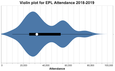
To give you an idea of what they look like, here's a violin plot of attendance at English Premier League (EPL) matches during the 2018-2019 season. The width of the plot indicates the relative proportion of matches with that attendance; we can see attendance peaks around 27,000, 55,000, and 75,000, but no matches had zero attendance. 

Violin plots get their name because they sort of resemble a violin (you'll have to allow some creative license here).

As we'll see, violin plots avoid the problems of box and whisker plots and the problems of histograms. The cost is greatly increased computation time, but for a modern computer system, violin plots are calculated and plotted in the blink of an eye. Despite their advantages, the computational cost is why these plots have only recently become popular.

Summary statistics - the mean etc.

We can use summary statistics to give a numerical summary of the data. The most obvious statistics are the mean and standard deviation, which are 38,181 and 16,709 respectively for the EPL 2018 attendance data. But the mean can be distorted by outliers and the standard deviation implies a symmetrical distribution. These statistics don't give us any insight into how attendance was distributed.

The median is a better measure of central tendency in the presence of outliers, and quartiles work fine for asymmetric distributions. For this data, the median is 31,948 and the upper and lower quartiles are 25,034 and 53,283. Note the median is a good deal lower than the mean and the upper and lower quartiles are not evenly spaced, suggesting a skewed distribution. The quartiles give us an indication of how skewed the data is.

So we should be just fine with median and quartiles - or are there problems with these numbers too?

Box and whisker plots

Box and whisker plots were introduced by Tukey in the early 1970s and evolved since then, currently, there are several slight variations. Here's a box and whisker plot for the EPL data for four seasons in the most common format; the median, upper and lower quartiles, and the lowest and highest values are all indicated. We have a nice visual representation of our distribution.

The box and whisker plot encodes a lot of data and strongly indicates if the distribution is skewed. Surely this is good enough?

The problem with boxplots

Unfortunately, box and whisker plots can hide important features of the data. This article from Autodesk Research gives a great example of the problems. I've copied one of their key figures here.

("Same Stats, Different Graphs: Generating Datasets with Varied Appearance and Identical Statistics through Simulated Annealing", Justin Matejka, George Fitzmaurice, ACM SIGCHI Conference on Human Factors in Computing Systems, 2017)

The animation shows the problem nicely; different distributions can give the same box and whisker plots. This doesn't matter most of the time, but when it does matter, it can matter a lot, and of course, the problem is hidden.

Histograms and distributions

If boxplots don't work, what about histograms? Surely they won't suffer from the same problem? It's true they don't, but they suffer from another problem; bin count, meaning the number of bins.

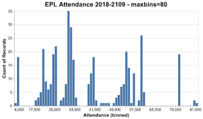
Let's look at the EPL data again, this time as a histogram.

Here's the histogram with a bin count of 9.

Here it is with a bin count of 37.

And finally, with a bin count of 80.

Which of these bin counts is better? The answer is, it depends on what you want to show. In some cases, you want a large number of bins, in other cases, a small number of bins. As you can appreciate, this isn't helpful, especially if you're at the start of your career and you don't have a lot of experience to call on. Even later in your career, it's not helpful when you need to move quickly.

An evolution of the standard histogram is using unequal bin sizes. Under some circumstances, this gives a better representation of the distribution, but it adds another layer of complexity; what should the bin sizes be? The answer again is, it depends on what you want to do and your experience.

Can we do better?

Enter the violin plot

The violin plot does away with bin counts by using probability density instead. It's a plot of the probability density function (pdf) that could have given rise to the measured data. 

In a handful of cases, we could estimate the pdf using parametric means when the underlying data follows a well-known distribution. Unfortunately, in most real-world cases, we don't know what distribution the data follows, so we have to use a non-parametric method, the most popular being kernel density estimation (kde). This is almost always done using a Gaussian estimator, though other estimators are possible (in my experience, the Gaussian calculation gives the best result anyway, but see this discussion on StackOverflow). The key parameter is the bandwidth, though most kde algorithms attempt to size their bandwidth automatically. From the kde, the probability density is calculated (a trivial calculation).

Here's the violin plot for the EPL 2018 data.

It turns out, violin plots don't have the problems of box plots as you can see from this animation from Autodesk Research. The raw data changes, the box plot doesn't, but the violin plot changes dramatically. This is because all of the data is represented in the violin plot.

("Same Stats, Different Graphs: Generating Datasets with Varied Appearance and Identical Statistics through Simulated Annealing", Justin Matejka, George Fitzmaurice, ACM SIGCHI Conference on Human Factors in Computing Systems, 2017)

Variations on a theme, types of violin plot, ridgeline plots, and mirror density plots

The original form of the violin plot included median and quartile data and you often see violin plots presented like this - a kind of hybrid of violin and box and whisker. This is how the Seaborn plotting package draws Violin plots (though this chart isn't a Seaborn visualization).

Now, let's say we want to compare the EPL attendance data over several years. One way of doing it is to show violin plots next to each other, like this.

Another way is to show two plots back-to-back, like this. This presentation is often called a mirror density plot.

We can show the results from multiple seasons with another form of violin plot called the ridgeline plot. In this form of plot, the charts are deliberately overlapped, letting you compare the shape of the distributions better. They're called ridgeline plots because they sort of look like a mountain ridgeline.

This plot shows the most obvious feature of the data, the 2019-2020 season was very different from the seasons that went before; a substantial number of matches were held with zero attendees.

When should you use violin plots?

If you need to summarize a distribution and represent all of the data, a violin plot is a good choice. Depending on what you're trying to do, it may be a better choice than a histogram and it's always a better choice than box and whisker plots.

Aesthetically, a violin plot or one of its variations is very appealing. You shouldn't underestimate the importance of clear communication and visual appeal. If you think your results are important, surely you should present them in the best way possible - and that may well be a violin plot.

Reading more

"Statistical computing and graphics, violin plots: a box plot-density trace synergism", Jerry Hintze, Ray Nelson, American Statistical Association, 1998. This paper from Hintze and Nelson is one of the earlier papers to describe violin plots and how they're defined, it goes into some detail on the process for creating them. 

"Violin plots explained" is a great blog post that provides a nice explanation of how violin plots work.

"Violin Plots 101: Visualizing Distribution and Probability Density" is another good blog post proving some explanation on how to build violin plots.

Monday, November 22, 2021

Mouse jiggling: the good, the bad, and the ugly

What's a mouse jiggler?

Recently, I was reading Hacker News and one of the contributors mentioned a mouse jiggler. I'd never heard of one before, so I searched around. I was both horrified and fascinated by what I discovered.

A mouse jiggler is a device that randomly 'jiggles' your mouse so it appears that you're at your computer. It prevents the screen saver from kicking in and it keeps your status as active in Slack and Zoom. Here's a picture of one type of mouse jiggler.

(Jamsim1975, CC BY-SA 4.0, via Wikimedia Commons)

The good

As it turns out, mouse jigglers are used by law enforcement during raids. One of the agents is tasked with getting to the suspect's computer quickly and setting up the mouse jiggler. The goal is to stop the computer from locking up; if that happens the suspect has to provide their password or a court has to order them to do so. Far better to stop the computer from locking up in the first place.

In the old days, the FBI and other agencies used software mouse jigglers; the mouse motion was set by software installed on a USB stick. Mechanical mouse jigglers are better because they don't rely on the availability of USB ports and they don't rely on security settings on the suspect's computer (not all systems will allow software to be installed via USB).

This blog post has some interesting things to say about mouse jigglers and other software/hardware used during raids.

The bad

There's a reason why security teams have computers lock themselves after a few minutes of user inactivity and the reason is security. Leaving a computer unattended and unlocked is bad, leaving a computer unattended and unlocked with a mouse jiggler over extended periods is even worse. If I were a CISO, I would ban mouse jigglers - or better still, make sure that no one feels the need to use one.

The ugly

For everyone who's not law enforcement, why would you want a jiggler? The sad answer seems to be fooling employee surveillance software. Instead of trusting their employees or measuring by results, some companies have installed surveillance software that tracks mouse usage (mouse use = work). Jigglers are an attempt to circumvent these kinds of trackers.

Jigglers have been around for a while and now there's software to detect them; you too can detect if your employees are jiggling. In response, some of the newer jigglers offer random and subtle jiggles that are harder to detect. I can see a jiggling arms race coming.

The reviews for this jiggler on Amazon are enlightening; there are 2,612 of them, an astonishing number, and the product has a 5-star rating overall. Many of the reviews mention fooling IT surveillance software. If you don't like this one, there are plenty of other models to choose from, many with over 1,000 reviews. 

Think about what this says. There are enough people who're concerned about surveillance to spawn a mini-industry for $30 devices. These devices add no value - it's not like a mouse or a keyboard or a camera. As one of the reviewers said, the jiggler lets them go to the bathroom without feeling like it's being noted. It's all about trust, or the lack of it.

If people are using mouse jigglers at your company, it's an indication that something has gone quite wrong.

Wednesday, November 17, 2021

Ice ice baby

Is this the coolest/most Canadian data set ever?

Late last year, I was studying for a machine learning course and I was looking for a data set I could use for the course capstone project. I settled on English Premier League data, but not before I had a serious look at what's probably the coolest (and most Canadian) dataset I've ever seen.

(cogdogblog, CC BY 2.0, via Wikimedia Commons)

The icicle atlas

The University of Toronto Physics Department has a large dataset on icicles created as part of a research project to understand the factors important for icicle formation, size, and shape. Under laboratory conditions, they grew 237 icicles, capturing movies and images of their growth. 

As part of the growth process, they varied speed, salinity, and water source, obviously having a little fun with their choice of water sources as you'll see in the atlas. As it turns out, the ridges that sometimes form in icicles are due to impurities in the water (maybe all of us need impurities to be interesting😉).

All the images, movies, and data are covered by a creative commons license. You can see all their icicle data on their icicle atlas page - the related links at the bottom of the page are fantastic.

Icicle pictures

You can view the rogues' gallery of icicle pictures here. Here are some pictures of my favorite icicles from the gallery.

(University of Toronto Physics Department, Icicle Atlas, Creative Commons License.)

Icicle movies

You can see videos of how most of the icicles formed. It's kind of interesting and restful to watch - the opposite of watching a fire burning, but still hypnotic and engaging. Here's a video that I found restful.

(University of Toronto Phyics Department, Icicle AtlasCreative Commons License.)

If you want more, there's a YouTube channel of the movies from the atlas.

Ice Ice baby

This winter, I'm going to see icicles form on my gutters. I've seen some weird formations over the years, and now I know that temperature, wind, and water purity govern the size and shape of icicles. It's nice to know that we can still take time to understand the processes that form the world around us.

Even though I better understand how icicles form, I know they can damage my gutters and house. Pretty as they are, I'm still going to smash them away.