What does data science boil down to?
Data science is a relatively new discipline that means different things to different people (most notably, to different employers). Some organizations focus solely on machine learning, while other lean on interpretation, and yet others get close to data engineering. In my view, all of these are part of the data science role.
I would argue data science generally is about three distinct areas:
- Prediction. The ability to accurately extrapolate from existing data sets to make forecasts about future behavior. This is the famous machine learning aspect and includes solutions like recommender systems.
- Distinction. The key question here is: "are these numbers different?". This includes the use of statistical techniques to decide if there's a difference or not, for example, specifying an A/B test and explaining its results.
- Interpretation. What are the factors that are driving the system? This is obviously related to prediction but has similarities to distinction too.
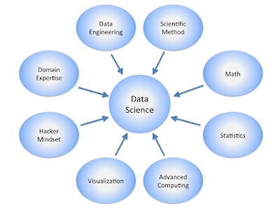
(A similar view of data science to mine: Calvin.Andrus, CC BY-SA 3.0, via Wikimedia Commons)
I'm going to talk through these areas and list the skills I think a data scientist needs. In my view, to be effective, you need all three areas. The real skill is to understand what type of problem you face and to use the correct approach.
Distinction - are these numbers different?
This is perhaps the oldest area and the one you might disagree with me on. Distinction is firmly in the realm of statistics. It's not just about A/B tests or quasi-experimental tests, it's also about evaluating models too.
Here's what you need to know:
- Confidence intervals.
- Sample size calculations. This is crucial and often overlooked by experienced data scientists. If your data set is too small, you're going to get junk results so you need to know what too small is. In the real world. increasing the sample size is often not an option and you need to know why.
- Hypothesis testing. You should know the difference between a t-test and a z-test and when a z-test is appropriate (hint: sample size).
- α, β, and power. Many data scientists have no idea what statistical power is. If you're doing any kind of statistical testing, you need to have a firm grasp of power.
- The requirements for running a randomized control trial (RCT). Some experienced data scientists have told me they were analyzing results from an RCT, but their test just wasn't an RCT - they didn't really understand what an RCT was.
- Quasi-experimental methods. Sometimes, you just can't run an RCT, but there are other methods you can use including difference-in-difference, instrumental variables, and regression discontinuity. You need to know which method is appropriate and when.
- Regression to the mean. This is why you almost always need a control group. I've seen experienced data scientists present results that could almost entirely be explained by regression to the mean. Don't be caught out by one of the fundamentals of statistics.
Prediction - what will happen next?
This is the piece of data science that gets all the attention, so I won't go into too much detail.
Here's what you need to know:
- The basics of machine learning models, including:
- Generalized linear modeling
- Random forests (including knowing why they are often frowned upon)
- k-nearest neighbors/k-means clustering
- Support Vector Machines
- Gradient boosting.
- Cross-validation, regularization, and their limitations.
- Variable importance and principal component analysis.
- Loss functions, including RMSE.
- The confusion matrix, accuracy, sensitivity, specificity, precision-recall and ROC curves.
There's one topic that's not on any machine learning course or in any machine learning book that I've ever read, but it's crucially important: knowing when machine learning fails and when to stop a project. Machine learning doesn't work all the time.
Interpretation - what's going on?
The main techniques here are often data visualization. Statistical summaries are great, but they can often mislead. Charts give a fuller picture.
Here are some techniques all data scientists should know:
- Heatmaps
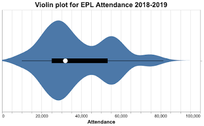
- Violin plots
- Scatter plots and curve fitting
- Bar charts
- Regression and curve fitting.
They should also know why pie charts in all their forms are bad.
A good knowledge of how charts work is very helpful too (the psychology of visualization).
What about SQL and R and Python...?
You need to be able to manipulate data to do data science, which means SQL, Python, or R. But plenty of people use these languages without being data scientists. In my view, despite their importance, they're table stakes.
Book knowledge vs. street knowledge
People new to data science tend to focus almost exclusively on machine learning (prediction in my terminology) which leaves them very weak on data analysis and data exploration; even worse, their lack of statistical knowledge sometimes leads them to make blunders on sample size and loss functions. No amount of cross-validation, regularization, or computing power will save you from poor modeling choices. Even worse, not knowing statistics can lead people to produce excellent models of regression to the mean.
Practical experience is hugely important; way more important than courses. Obviously, a combination of both is best, which is why PhDs are highly sought after; they've learned from experience and have the theoretical firepower to back up their practical knowledge.


.jpg)
_(5092283927).jpg)