Showing posts with label statistics. Show all posts

Wednesday, May 6, 2020

Florence Nightingale, data analyst

Introduction - why do I care about Florence Nightingale, data analyst?

I've used statistics and data visualizations for a long time now, and in the last few years, I've become increasingly interested in where the methods I use come from. Who were the founding figures of statistics and visualization? Why was their work important? How did their work influence the world? As I've looked back in time, I've found the data science creation stories more interesting than I thought. There were real people who struggled to achieve their goals and used early data science methods to do so. One of these pioneers was Florence Nightingale, more famous for founding modern nursing, but a key figure in analytics and data visualization. What she did and why she did it have clear lessons for analysts today.

(Simon Harriyott from Uckfield, England, CC BY 2.0, via Wikimedia Commons)

Early life

Florence was born on May 12th, 1820, near Florence in Italy. Her parents were wealthy and very well-connected, two factors that were to have a big impact on her later life. As the second daughter, she was expected to have the learning of a woman of her station and to marry well; her family, especially her mother, had a very definite expectation of the role she was to fulfill. Her upbringing was almost like a character from a Jane Austen novel, which was to cause Florence mental health problems.

Initially, the family lived in a fifteen-bedroom house in Derbyshire, but this was too small for them (!) and they wanted to be nearer to London, so they moved to Embley in the New Forest. They also had an apartment in London and spent a lot of time in the city. Given the family connections and their time spent in London, it’s not surprising that Florence met many influential men and women growing up, including future prime ministers and a young Queen Victoria. This was to be crucially important to her later.

Up until she was 12, Florence was educated by a governess, then her father took over her education. Unusually for the time, her father believed in equality of education for women and put considerable effort into educating his daughters [Bostridge]. Notably, she received no formal schooling and never took anything like university lectures or courses, however, she had a precocious intellect and had an appetite for statistics and data. When she was 17, the family took a six-month vacation to Italy, and along the way, Florence recorded their departure and arrival times, the distances they traveled, and kept notes on local conditions and laws [Bostridge, Huxley].

Throughout her life, she was deeply religious, and in her teenage years, she felt a call from God to do something useful, she wanted ‘some regular occupation, for something worth doing instead of frittering time away on useless trifles’ [Huxley]. On the 7th of February 1837, Florence recorded “...God spoke to me and called me to His service”, but what the form of that call was, Florence didn’t note [Bostridge]. This theme of a calling from God was to come up several times in her life.

Bear in mind, Florence’s life was a round of socializing to prepare her for an appropriate marriage, nothing more. For an intellectually gifted woman wanting to make a difference in the world, the tension between the life she wanted and the life she had was immense. It’s not a surprise to hear that she was often withdrawn and on the verge of a nervous breakdown; in modern times, she may well have been diagnosed with depression. By the age of 30, Florence wasn’t married, something that wasn’t respectable - however, she was to shock her family with a very disreputable request.

Introduction to nursing

Florence decided that nursing was her calling, unfortunately, her parents violently objected, and with good reason.

At the time, nursing was considered a disreputable profession. Hospitals were filthy and nurses were both ill-trained and poorly educated. In many cases, their role was little more than cleaning up the hospital messes, and in the worst cases, they were promiscuous with doctors and surgeons [Huxley]. It was also known that nurses were present at operations, which in the 1850s were bloody, gruesome affairs. Even Charles Dickens had a poor view of nurses. In Martin Chuzzlewit, published in 1843, Dickens created a character, Sarah Gamp, who was sloppy, a drunk, and a nurse. Dickens was playing to a well-known stereotype and adding to it.

Nursing as a profession was about as far away from a suitable occupation for Florence as you can imagine. Her family knew all about nursing’s reputation and vigorously objected to Florence having anything to do with it. Her mother in particular opposed Florence learning or practicing nursing for a very long time, going as far as actively blocking Florence’s training. However, Florence could read about nursing and health, which she did copiously.

There was one bright nursing light; the Institution of Deaconesses at Kaiserworth (Germany) was a quasi-religious institute that sought to improve nursing standards. Florence wanted to study there, but her parents stopped her. She managed to go for two weeks in 1850, but only with some shenanigans. Perhaps because of the deception, when she came back, she anonymously published a 32-page pamphlet on her experience which is her first known published work [Nightingale 1851]. After some blazing stand-up rows with her mother, she finally went for three months of training in 1853. Bear in mind, her family still controlled her life, even at this late age.

The discipline at Kaiserworth was harsh and the living conditions were spartan. Days consisted of prayer and patient support, in effect, it was living a religious life while learning nursing, fulfilling two of Florence’s needs. She learned the state of nursing as it stood at the time, even witnessing amputations and other operations, which would have horrified her parents had they known. However, Florence appreciated the limitations of the Kaiserworth system.

On her return to Britain, her appetite for nursing wasn’t diminished, in fact, she read widely about nursing, disease in general, and statistics - broadening her knowledge base. What was missing was an opportunity to practice what she’d learned, which finally arrived in April 1853. 

Through her extensive family connections, she was made superintendent of a new ‘Institution for the Care of Sick Gentlewomen’ based in Harley Street in London. This was a combination of hospital and recuperation unit for sick women, with the goal of providing a better standard of care than was currently offered. With Florence, the founders thought they were getting a hands-off lady of leisure, instead, they got a human dynamo who was waiting to put into practice years of learning and preparation. Not only did Florence do nursing, she also fought on committees to get the funding she needed, became a tough people manager, and put the institution’s finances in order. Under Florence’s guidance, the institution became groundbreaking in simple but effective ways; it treated its patients well, it was clean, and its nurses were professional.

Had she continued in Harley Street, she probably would have still been a founding figure of modern nursing, but events elsewhere were conspiring to thrust her into the limelight and make her a national hero.

The Crimean War

Britain has fought almost every country in Europe many times. Sometimes with the French and sometimes against the French. By the mid-1850s, Britain and France were becoming worried about the influence of Russia in the Middle East, which resulted in the Crimean War, where Britain and France fought Russia [Britannica]. This was a disastrous war for pretty much everyone.

Painting of the Siege of Sevastapol
(Siege of Sevastopol (1854–55), Franz Roubaud)

British troops were shipped to Turkey to fight the Russians. Unfortunately, cholera, diarrhea, and dysentery ripped through the men, resulting in large numbers of casualties before the war had even started; the men were too sick to fight. Of the 30,000 British troops dispatched to Turkey, 1,000 died of disease before a single shot was fired [Bostridge].

Hospitals were squalid and poorly equipped; the main British hospital at Scutari was a national shame; men were trying to recover from their injuries in filthy conditions with poor food and limited supplies. The situation was made worse by bureaucratic blundering and blind rule-following, there were instances of supplies left to rot because committees hadn’t approved their release. By contrast, the French were well-equipped and were running effective field hospitals.

In an early example of embedded journalism, William Howard Russell provided dispatches for The Times exposing the poor treatment of the troops, incompetent management, and even worse, the superiority of the French. His reports riled up the British people, who in turn pressured politicians to do something; it became politically imperative to take action [Huxley].

Florence in Crimea

War and medicine were male preserves, but politicians needed votes, meaning change came quickly. Russell’s dispatches made it clear that troops were dying in hospital, not on the battlefield, so medical support was needed. This is where Florence’s family connections came in. Sidney Herbert, Secretary at War, wrote to Florence asking her to run nursing operations in the Crimea. The War Office needed to give Florence a title, so they called her ‘Superintendent of the Female Nursing Establishment of the English General Military Hospitals in Turkey’. Nothing like this had ever been done before - women had never been sent to support war - which would cause problems later.

Florence was asked to recruit 50 nurses, but there were no female nurses at all in the British Army, and nursing was in its infancy. She found 14 women with hospital experience and several nuns from various religious orders - 38 women in total. On October 21st, 1854, this rag-tag army set out from England to go to the war in the Crimea.

The conditions they found in the barrack hospital at Scutari were shocking. The place was filthy and vermin-infested, rats were running around in plain view, and even the kitchens weren’t clean. Bedding and clothing weren’t washed, which meant soldiers preferred to keep their existing filthy bedding and clothing rather than changing them for someone else's equally unclean items - better to have your own lice bite you than someone else’s.  Basics like furniture were in short supply, there weren’t even enough tables for operations. Soldiers were left untreated for long periods of time, and there were many cases when maggots weren’t cleaned out of wounds. Unsurprisingly, cholera and dysentery were rampant. The death rate was high. As a further twist, the military wasn’t even using the whole building, the cellars had refugees living in them, and there was a prostitution ring operating there [Huxley].


(The military hospital at Scutari. Image source: The Wellcome Collection. License: Creative Commons.)

Florence wanted to make a difference, but military rules and misogyny prevented her nurses from taking up their duties. Her title was, “Superintendent of the Female Nursing Establishment of the English General Hospitals in Turkey”, but military orders didn’t say what she was to do. This was enough of an excuse for the (male) doctors and surgeons to block her nurses. Despite being blocked, the nurses did what they could to improve things, by ensuring clean bedding and better quality food for example.

Things changed, but for the worst reason. The Battle of Balaclava brought a tidal wave of wounded into the hospital, too many for the existing system to cope with, so the military gave in and let the women in. Florence’s nurses finally got to nurse.

Given her opportunity, Florence moved quickly to establish hygiene, cleanliness, and good nutrition. The rats were dispatched, the tenants in the basement were removed, and food quality was improved. Very unusually for the time, Florence insisted on hand washing, which of itself reduced the death rate [Globalhandwashing]. Back in London, The Times had established a fund to care for wounded soldiers, so Florence had a pot of money to spend as she chose, free of military rules. She set up contracts with local suppliers to improve the food supply, she set up washrooms to clean bedding and clothes, and she provided soldiers with new, clean clothing.

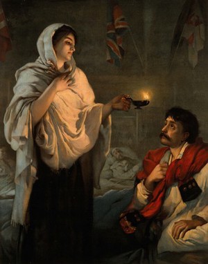
Her nurses tended to the men during the daytime, treating their wounds and ensuring they were clean and cared for. Florence’s administrative work tied her up in the daytime, but she was able to walk the wards at night to check on the men. She nursed them too and stayed with them as they died. Over the winter of 1855/1856, it’s estimated she saw something like 2,000 men die.

To light her way on her nocturnal rounds, she used a Turkish lamp. This is where the legend of the ‘lady with the lamp’ came from. Under desperate conditions, men would see a beacon of hope in the darkness. This is such a strong legend in UK culture that even 170 years later, it still resonates.

Drawing of Florence doing her rounds
(Illustrated London News, 24 Feb 1855, Source: Wikimedia Commons)

The difference Florence’s nurses made was eagerly reported back to the British public who were desperate for a good news story. The story was perfect, a heroine making a difference under terrible conditions while being blocked by the intransigence of military bureaucracy, and the ‘lady with the lamp’ image sold well. The donations came rolling in.

A highly fanciful representation of Florence
(A fanciful depiction of Florence doing her rounds. Creative Commons license.)

In May 1855, Florence got closer to the Crimean War when she toured Balaclava in the Crimea itself. Unfortunately, on 13th May 1855, she collapsed through exhaustion and became gravely ill, suffering fevers and delirium. The word was, she was close to death. On hearing of her condition, it’s said the patients in the Scutari hospital turned towards the wall and wept. Florence recovered, but she continued to suffer debilitating illness for the rest of her long life.

The war finally ended on 30th March 1856, and Florence returned to England in July of the same year. She left an unknown but came back a celebrity.

Florence as a data analyst and statistician

The Crimean War was a disaster for the British military and the public was angry; the political fall-out continued after the war was over and the poor medical treatment the troops received was a hot topic. After some delay, a “Royal Commission on the Health of the Army” was formed to investigate the health of the British Army, and Florence was its powerhouse. Sadly, as a woman, she couldn't formally be appointed to the Commission, so her role was less formal. Despite the informality, she was determined to prove her points with data and to communicate clearly with the public.

In the 1850s, statistics was in its infancy, but there were some early pioneers, including Willam Farr at the General Registry Office who was an early epidemiologist and one of the founders of medical statistics. Of course, Florence was a friend of Farr’s. Farr had introduced the idea of comparing the mortality rates of different occupations, which Florence was to run with [Cohen]. He also had a dismal view of data visualization which Florence disagreed with.

Florence’s stand-out piece of work is her report “Mortality of the British Army: at home and abroad, and during the Russian war, as compared with the mortality of the civil population in England.” which was appended to the Commission's main report. She knew she needed to reach the general public who wouldn’t read a huge and dull tome, she had to make an impact quickly and clearly, and she did so through the use of tables and data visualization. Bear in mind, the use of charts was in its infancy.

Here's one of the tables from her report, it's startlingly modern in its presentation. The key column is the one on right, the excess of deaths in the army compared to the general population. The excess deaths weren't due to warfare.

Incredibly, the excess of deaths was due to disease as we can see in the table below. The death rate for the general population for 'chest and tubercular disease' was 4.5 per 1,000, but for the army, it was 10.1. Tubercular disease isn't a disease of war, it's a disease of poor living conditions and poor sanitation.

The report is full of these kinds of tables, presented in a clear and compelling way that helped tell the terrible story: the British Army was killing its own soldiers through neglect.

Of course, tables are dry; charts make a more immediate impression and Florence used bar charts to great effect. Here's a bar chart of death by age group for the British Army (red) and the general population (black). Bear in mind, the period leading up to the Crimean War was peaceful - there were no major engagements, so the excess deaths aren't battle casualties. In fact, as Florence showed in the tables and in the charts, these excess death were avoidable.

In private, Florence was more forceful about the effect of poor medical treatment on the strength of the army. Salisbury Plain was (and is), a big British Army practice area, and she said: "it is as criminal to have a mortality of 17, 19, and 20 per thousand in the Line, Artillery and Guards, when in civilian life it is on 11 per thousand as it would be to take 1,100 men every year out upon Salisbury Plain and shoot them" [Kopf].

The death toll is shocking in human terms, but it also has a profound impact in terms of the army's efficiency, fighting ability, and recruitment needs. Men dying early means a loss of experience and a continued high need for recruitment. Florence illustrated the impact of early deaths with a pair of charts I've shown below.

The chart on the left showed the effect of disease at home on the army. The chart on the right showed what would happen if death rates came down to those of the general population. If people didn't care about lives, they might care about the strength of the army and do something about medical care.

The Royal Commission wasn't the end of it. A little later, Florence produced yet another report, "Notes on matters affecting the health, efficiency, and hospital administration of the British Army: founded chiefly on the experience of the late war". This report is notable because it contains the famous coxcomb plot. If you read anything about Florence and visualization online, this is what you'll find. I'm going to take some time to explain it because it's so fundamental in the history of data visualization.

(I should note that Florence never called these plots coxcomb plots, the use of the term came far later and not from her. However, the internet calls these charts coxcomb plots and I'm going to follow the herd for now.)

The visualization takes its name from the comb on a rooster's head.

(Image credit: Lander. Source. License Creative Commons.)

There are two coxcomb plots in the report, appearing on the same pull-out page. To make it easier to understand them, I'm going to show you the two plots separately.

The plot is divided into twelve segments, one for each month from April 1854 to March 1855. The area of each segment represents the number of deaths. The red wedges are deaths from wounds, the blue (gray in the image) represents deaths from preventable diseases, and the black wedges are deaths from other causes. You can plainly see the battle deaths. But what's really shocking is the number of deaths from preventable diseases. Soldiers are dying in battle, but many more of them are dying from preventable diseases. In other words, the soldiers didn't have to die.

Here's the other part of the diagram, from April 1855 to March 1856 (the end of the war) - not to scale with the previous plot.

Interestingly, Florence preferred the coxcomb plots to bar charts because she felt they were more mathematically accurate.

Although William Farr was an advisor to Florence and involved in building the coxcomb plots, he wasn't a fan of data visualization. He advised her that 'statistics should be as dry as possible' [Bostridge]. But Florence's aim was influencing the public, not a stone-cold presentation of data. In the introduction, I said there were lessons that modern analysts could learn from Florence, and this is the key one: you have to communicate your results clearly to a general audience to influence opinion and effect change.

The lessons from Florence's analysis are very clear: the men in the British Army were dying through poor treatment. They were dying at home, and dying after battle. The disaster in the Crimea was avoidable.

The Commission had far-reaching effects, specifically, the radical restructuring of the British Army's healthcare system, including the construction of a new army hospital. Florence had firm views on hospital design, which the new hospital didn't meet. Unfortunately, by the time she was involved in the project, it was too late to change some of the design basics, but she did manage to make it less bad. Radical reform doesn't happen overnight, and that was the case here. 

Florence's friend, Lord Herbert carried out a series of reforms over many years. Unfortunately, he died 1861. Two years later, Florence published a monograph in his honor, "Army Sanitary Administration, and Its Reform under the Late Lord Herbert", which included more charts and data [McDonald]. As before, Florence's goal was communication, but this time communicating the impact her friend and collaborator had on saving lives.

Florence was famous by the 1860s, famous enough to have an early photograph taken.


Florence and nursing

Quite rightly, Florence is considered one of the founding figures of modern nursing. She wrote a short book (75 pages), called "Notes on nursing: what it is and what it is not", which was by far her most widely read publication and stayed in print for a long time. In 1860, St Thomas's hospital in London opened a nursing school with Florence as an advisor, this was the "Nightingale Training School for Nurses", which was to set the standard for nursing education.

Florence and public health

The illness she picked up in the Crimea prevented her from traveling but didn't prevent her from absorbing data and influencing public health. In 1859, she took part in a Royal Commission, the "Royal Commission on the Sanitary State of the Army in India", which aimed to do for the British Army in India what the previous Royal Commission did for the Army in Britain. Sadly, the story was the same as the Crimea, poor health leading to premature death. Once again, Florence illustrated her work with visualizations and statistics. 

This report is notable for another type of visualization: woodcut drawings. Royal Commission reports are known to be dull, worthy affairs, but Florence wanted her work to be read and she knew she had to reach a wider audience (the same lesson about communicating effectively to create change). Her relative, Hilary Bonham Carter, drew the woodcuts she included in her report. The Treasury balked at the printing costs and wanted the report without the woodcuts, but Florence knew that some people would only read the report for the woodcuts, so she insisted they be included. Her decision was the right one, by communicating clearly, she was more effective in winning reforms.

(Image source: Wikimedia Commons)

Sadly, as a woman, Florence couldn't formally be part of the Commission, despite her huge input.

To use statistics to understand what's going on requires agreement and consistency in data collection. If different authorities record illnesses differently, then there can be no comparison and no change. Florence realized the need for consistent definitions of disease and proposed a classification scheme that was endorsed by the International Statistical Congress, held in London in 1860 [Magnello]. Sadly, only a few hospitals adopted her scheme and an opportunity to improve healthcare through data was lost.

Hospital design 

In 1859, Florence's writings on hospital design were consolidated into a book 'Notes on Hospitals' which led her to become the leading authority on hospital design.  Many British cities asked her to consult on their proposed hospital-building programs, as did the Government of India, the Queen of Holland, and the King of Portugal.

Decline and death

She never enjoyed good health after the Crimea, and never again traveled far from home. In her later years, she spent her time at home with her cats, occasionally doling out nursing or public health advice. In her last few years, her mental acuity fell away, and she retreated from public life. She died in 1910, aged 90.

(Florence shortly before her death in 1910. Lizzie Caswall Smith. Source: Wikimedia Commons.)

Florence as a Victorian

Florence was very much a product of her time and her class, she wasn't a feminist icon and she wasn't an advocate for the working classes - in many ways, she was the reverse [Stanley]. I've read some quotes from her which are quite shocking to modern ears [Bostridge]. However, I'm with the historians here, we have to understand people in their context and not expect them to behave in modern ways or judge them against modern standards.

Florence’s legacy

During her life, she received numerous honors, and the honors continued after her death.

The Royal Statistical Society was founded in 1834 as the Statistical Society of London, and Florence became its first female member in 1858 and was elected a Fellow in 1859. The American Statistical Association gave her honorary membership in 1874.

The Queen’s head appears on all British banknotes, but on the other side, there’s usually someone of historical note. On the £10 note, from 1975-1992, it was Florence Nightingale, the first woman to be featured on a banknote [BoE].

(UK £10 note)

For a very long time, many British hospitals have had a Nightingale ward. Things went a step further in response to the coronavirus pandemic; the British Army turned large conference centers into emergency hospitals for the infected, for example, the ExCel Center in London was turned into a hospital in nine days. Other large conference venues in the UK were also converted. The name of these hospitals? Nightingale Hospitals.

Her legend and what it says about society

Florence Nightingale is a revered figure in nursing, and rightly so, but her fame in the UK extends beyond the medical world to the general population. She’s known as the founder of nursing, and the story of the “lady with the lamp” still resonates. But less well-known is her analysis work on soldiers’ deaths during the war, her work on hospital design, and her role in improving public health. She probably saved more lives with her work after Crimea than she did during the Crimean War. Outside of the data analytics world, her ground-breaking visualizations are largely unknown. In my view, there’s definitely gender stereotyping going on; it’s fine for a woman to be a caring nurse, but not fine for her to be a pioneering public health analyst. Who society chooses as its heroes is very telling, but what society chooses to celebrate about them is even more telling.

The takeaways for analysts

I've read a lot on Florence's coxcomb charts, but less on her use of tables, and even less on her use of woodcut illustrations. The discussions mostly miss the point; Florence used these devices as a way of communicating a clear message to a wide audience, her message was all about the need for change. The diagrams weren't the goal, they were a means to an end - she spent a lot of time thinking about how to present data meaningfully; a lesson modern analysts should take to heart.

References

[BofE] https://www.bankofengland.co.uk/museum/noteworthy-women/historical-women-on-banknotes
[Bostridge] Mark Bostridge, “Florence Nightingale The Making Of An Icon”, Farrar, Straus, and Giroux, New York, 2008
[Britannica] https://www.britannica.com/event/Crimean-War
[Cohen] I Bernard Cohen, "Florence Nightingale", Scientific American, 250(3):128-137, March 1984 
[Kopf] Edwin Kopf, "Florence Nightingale as Statistician", Publications of the American Statistical Association, Vol. 15, No. 116 (Dec., 1916), pp. 388-404
[Globalhandwashing] https://globalhandwashing.org/about-handwashing/history-of-handwashing/
[Huxley] Elspeth Huxley, “Florence Nightingale”, G.P. Putnam’s Sons, New York, 1975
[Magnello] https://plus.maths.org/content/florence-nightingale-compassionate-statistician 
[McDonald] https://rss.onlinelibrary.wiley.com/doi/10.1111/1740-9713.01374
[Nightingale 1851] Florence Nightingale, “The institution of Kaiserswerth on the Rhine, for the practical training of deaconesses”, 1851
[Stanley] David Stanley, Amanda Sherratt, "Lamp light on leadership: clinical leadership and Florence Nightingale", Journal of Nursing Management, 18, 115–121, 2010

Sunday, April 5, 2020

Sherlock Holmes, business books, Nazi fighters, and survivor bias

In the Sherlock Holmes story, Silver Blaze, Holmes solved the case by a deduction from something that didn’t happen. In the story, the dog didn’t bark, implying the dog knew the horse thief. This a neat twist on something called survivor bias, the best example of which is Abraham Wald’s analysis of surviving bombers. I’ll talk about how survivor bias rears its ugly head and tell you about Wald and what he did.

Survivor bias occurs when we look at the survivors of some process and we try to deduce something about their commonality without considering external factors. An obvious example might be collating details on lottery winners’ lives in an attempt to figure out what factors might lead to winning the lottery. For example, I might study what day of the week and time of day winners bought their tickets, I might look at where winning tickets were bought, and I might look at the age and gender of winners. From this, I might conclude that to improve my chances of winning the lottery I need to be a 45-year-old man who buys tickets at 3:40pm on Wednesday afternoon at a gas station. But the lottery is a random process and all we've done is analyze who's playing, not the causes of winning. Put like this, it seems almost incredible that anyone could have problems with survivor bias, but survivor bias doesn’t always manifest itself in obvious ways.

Let’s imagine I want to write a bestselling business book unraveling the secrets of how to win at business. I could select businesses that have been successful over several years and look for factors they have in common. I might call my book “Building excellent businesses that last”. As you surely know, there have been several bestselling books based on this premise. Unfortunately, they age like milk; it turns out that most of the companies these books identify as winners subsequently performed poorly - which is a regression to the mean. The problem is, other factors may have contributed to these businesses' success, for example, the competitive environment, new product innovation, a favorable economy, and so on. Any factors I derived from commonalities between winning companies today are just like an analysis of the common factors of lottery winners. By focusing on (current) winners, the door is open to survivor bias [Shermer, Jones].

The most famous example of survivor bias is Wald and the bombers. It is a little cliched to tell the story, but it’s such a great story, I’m going to tell it again, but my way.

Abraham Wald (1902-1950) was a great mathematician who made contributions to many fields, including econometrics, statistics, and geometry. A Hungarian Jew, he suffered discrimination and persecution while looking for work in Vienna, Austra in 1938, and so emigrated with his family to New York. During World War II, he worked in the Statistical Research Group at Columbia University. This is where he was given the task of improving bomber survivability; where should armor go to best protect bombers given that armor is heavy and not everywhere can be protected [Wallis]?

Not all bombers came home after bombing runs over Nazi-occupied Europe. Nazi fighter planes attacked bombers on the way out and the way back, and of course, they shot down many planes. To help his analysis, Wald had data on where surviving planes were hit. The image below is a modern simulation of the kind of data he had to work with; to be clear, this is not the exact data Wald had, it’s simulated data. The visualization shows where the bullet holes were on returning planes. If you had this data, where would you put the extra armor to ensure more planes came home?


(Simulated data on bomber aircraft bullet holes. Source: Wikipedia - McGeddon, License: Creative Commons)

Would you say, put the extra armor where the most bullet holes are? Doesn’t that seem the most likely answer?

Wrong.

This is the most famous example of survivor bias - and it’s literally about survival. Wald made the reasonable assumption that bullets would hit the plane randomly, remember, this is 1940’s technology and aerial combat was not millimeter precision. This means the distribution of bullet holes should be more or less even on planes. The distribution he saw was not even - there were few bullet holes in the engine and cockpit, but he was looking at surviving planes. His conclusion was, planes that were hit in key places did not survive. Look at the simulated visualization above - did you notice the absence of bullet holes in the engine areas? If you got hit in an engine, you didn’t come home. This is the equivalent of the dog that didn’t bark in the night. The conclusion was of course to armor the places where there were not bullet holes.

A full appreciation of survivor bias will mean you're more skeptical of many self-help books. A lot of them proceed on the same lines: let's take some selected group of people, for example, successful business people or sports people, and find common factors or habits. By implication, you too can become a winning athlete or business person or politician just by adopting these habits. But how many people had all these habits or traits and didn't succeed? All Presidents breathe, but if you breathe, does this mean you'll become President? Of course, this is ludicrous, but many self-help books are based on similar assumptions, it's just harder to spot.

Survivor bias manifests itself on the web with e-commerce. Users visit websites and make purchases or not. We can view those who make purchases as survivors. One way of increasing the number of buyers (survivors) is to focus on their commonalities, but as we’ve seen, this can give us biased results, or even the wrong result. A better way forward may be to focus on the selection process (the web page) and understand how that’s filtering users; in other words, understanding why people didn't buy.

One of the things I like about statistics in business is that correctly applying what seems like esoteric ideas can lead to real monetary impact, and survivor bias is a great example.

Tuesday, March 24, 2020

John Snow, cholera, and the origins of data science

The John Snow story is so well known, it borders on the cliched, but I discovered some twists and turns I hadn't known that shed new light on what happened and on how to interpret Snow's results. Snow's story isn't just a foundational story for epidemiology, it's a foundational story for data science too.


(Image credit: Cholera bacteria, CDC; Broad Street pump, Betsy Weber; John Snow, Wikipedia)

To very briefly summarize: John Snow was a nineteenth-century doctor with an interest in epidemiology and cholera. When cholera hit London in 1854, he played a pivotal role in understanding cholera in two quite different ways, both of which are early examples of data science practices.

The first way was his use of registry data recording the number of cholera deaths by London district. Snow was able to link the prevalence of deaths to the water company that supplied water to each district. The Southwark & Vauxhall water company sourced their water from a relatively polluted part of the river Thames, while the Lambeth water company took their water from a relatively unpolluted part of the Thames. As it turned out, there was a clear relationship between drinking water source and cholera deaths, with polluted water leading to more deaths.

This wasn't a randomized control trial, but was instead an early form of difference-in-difference analysis. Difference-in-difference analysis was popularized by Card and Krueger in the mid-1990's and is now widely used in econometrics and other disciplines. Notably, there are many difference-in-difference tutorials that use Snow's data set to teach the method. 

I've reproduced one of Snow's key tables below, the most important piece is the summary at the bottom comparing deaths from cholera by water supply company. You can see the attraction of this dataset for data scientists, it's calling out for the use of groupby.

The second way is a more dramatic tale and guaranteed his continuing fame. In 1854, there was an outbreak of cholera in the Golden Square part of Soho in London. Right from the start, Snow suspected the water pump at Broad Street was the source of the infection. Snow conducted door-to-door inquiries, asking what people ate and drank. He was able to establish that people who drank water from the pump died at a much higher rate than those that did not. The authorities were desperate to stop the infection, and despite the controversial nature of Snow's work, they listened and took action; famously, they removed the pump handle and the cholera outbreak stopped.

Snow continued his analysis after the pump handle was removed and wrote up his results (along with the district study I mentioned above) in a book published in 1855. In the second edition of his book, he included his famous map, which became an iconic data visualization for data science. 

Snow knew where the water pumps were and knew where deaths had occurred. He merged this data into a map-bar chart combination; he started with a street map of the Soho area and placed a bar for each death that occurred at an address. His map showed a concentration of deaths near the Broad Street pump.

I've reproduced a section of his map below. The Broad Street pump I've highlighted in red and you can see a high concentration of deaths nearby. There are two properties that suffered few deaths despite being near the pump, the workhouse and the brewery. I've highlighted the workhouse in green. Despite housing a large number of people, few died. The workhouse had its own water supply, entirely separate from the Broad Street pump. The brewery (highlighted in yellow) had no deaths either; they supplied their workers with free beer (made from boiled water).


(Source: adapted from Wikipedia)

I've been fascinated with this story for a while now, and recent events caused me to take a closer look. There's a tremendous amount of this story that I've left out, including:

  • The cholera bacteria and the history of cholera infections.
  • The state of medical knowledge at the time and how the prevailing theory blocked progress on preventing and treating cholera.
  • The intellectual backlash against John Snow.
  • The 21st century controversy surrounding the John Snow pub.

I've written up the full story in a longer article you can get from my website. Here's a link to my longer article.


Wednesday, March 11, 2020

Benford's Law: finding fraud and data oddities

What links fraud detection, old-fashioned log tables, and error detection in data feeds? Benford’s Law provides the link and I'll show you what it is and how you might use it.

Imagine I gave you thousands of invoices and asked you to record the first digit of the amount. Out of say, 10,000 invoices, how many would you expect to start with the number 1, how many with the number 2, and so on? Naively, you might expect 1,111 to start with a 1; 1,111 to start with a 2 and so on. But that’s not what happens in the real world. 1 occurs more often than 2, which occurs more often than 3, and so on.

The Benford’s Law story starts in 1881, when Simon Newcomb, an astronomer, was using some mathematical log tables. For those of you too young to know, these are tables of the logarithms of numbers, very useful in pre-calculator days. Newcomb noticed that the pages for logarithms beginning 1 were more well-thumbed than the other pages, indicating that people were looking for the logarithms of some numbers more than others. Being an academic, he published a paper on it.

In 1938, a physicist called Frank Benford looked at a number of datasets and found the same relationship between the first digits. For example, he looked at the first digit of addresses and found that 1 occurred more frequently than 2, which occurred more frequently than 3 and so on. He didn't just look at addresses, he looked at the first digit of physical constants, the surface area of rivers, and numbers in the Reader's Digest etc. Despite being the second person to discover this relationship, the law is named after him and not Newcomb.

It turns out, we can mathematically describe Benford’s Law as:

P(d) = log(1 + (1/d))

Where d is the numbers 1 to 9 and P(d) is the probability of the number occurring. If we plot it out we get:

This means that for some datasets we expect the first digit to be one 30.1% of the time, the second digit to be two 17.6% of the time, three to be the first digit 12.5% of the time, etc.

The why of Benford’s Law is much too complex for this blog post. It was only recently (1998) proved by Hill [Hill] and involves digging into the central limit theorem and some very fundamental statistical and probability concepts.

Going back to my accounting example, it would seem all we have to do is plot the distribution for our invoice data and compare it to Benford’s Law. If there’s a difference, then there’s fraud. But the reality is, things are more complex than that.

Benford’s Law doesn’t apply everywhere, there are some conditions:

  • The data set must vary over several orders of magnitude (e.g. from 1 to 1,000)
  • The data set must have dimensions, or units. For example, Euros, or mm.
  • The mean is greater than the median and the skew is positive.

Collins provides a nice overview of how it can be used to detect accounting fraud [Collins]. But Linville [Linville] has poked some practical holes in its use. He conducted an experiment using graduate students to create fake test invoices (this was a research exercise, not an attempt at fraud!) that were mixed in with simulated invoice data. He found that if the fake invoices were less than 10% or so of the total dataset, the deviations from Benford’s Law were too small to be reliably detected.

Benford’s Law actually applies to all digits, not just the first. We can plot out an expected distribution for two digits as I’ve shown below. This has also been used for fraud detection as you might expect.

You can use Benford's Law to detect errors in incoming data. Let's say you have a datafeed of user addresses. You know the house numbers should obey Benford's Law, so you can work out the distribution the data actually has and compare it to the theoretical Benford's Law distribution. If the difference is above some threshold, you can set an alert. Bear in mind, it's not just addresses that follow the law, other properties of a data feed may too. A deviation from Benford"s Law doesn't tell you which particular items are wrong, but you do get a clue about which category, for example,  you might discover items starting with a 2 are too frequent. This is a special case of using the deviation of real data from an expected distribution as an error detection mechanism - a very useful data quality assurance method everyone should be using.

To truly understand Benford’s Law, you’ll need to dig deeply into statistics and possibly number theory, but using it is relatively straightforward. You should be aware it exists and know its limitations - especially if you’re looking for fraud.

References

[Collins] J. Carlton Collins, “Using Excel and Benford’s Law to detect fraud”, https://www.journalofaccountancy.com/issues/2017/apr/excel-and-benfords-law-to-detect-fraud.html
[Hill] Hill, T. P. "The First Digit Phenomenon." Amer. Sci. 86, 358-363, 1998.
[Linville] “The Problem Of False Negative Results In The Use Of Digit Analysis”, Mark Linville, The Journal of Applied Business Research, Volume 24, Number 1

Further reading

Wikipedia article https://en.wikipedia.org/wiki/Benford%27s_law
Mathworld article http://mathworld.wolfram.com/BenfordsLaw.html

Saturday, February 22, 2020

The Monty Hall Problem

Everyone thinks they understand probability, but every so often, something comes along that shows that maybe you don’t actually understand it at all. The Monty Hall problem is a great example of something that seems very counterintuitive and teaches us to be very wary of "common sense".

The problem got its fame from a 1990 column written by Marilyn vos Savant in Parade magazine. She posed the problem and provided the solution, but the solution seemed so counterintuitive that several math professors and many PhDs wrote to her saying she was incorrect. The discussion was so intense, it even reached the pages of the New York Times. But vos Savant was indeed correct.


(Monty Hall left (1976) - image credit: ABC Television - source Wikimedia Commons, no known copyright, Marilyn vos Savant right (2017) - image credit: Nathan Hill via Wikimedia Commons - Creative Commons License.  Note: the reason why the photos are from different years/ages is the availability of open-source images.)

The problem is loosely based on a real person and a real quiz show. In the US, there’s a long-running quiz show called ‘Let’s make a deal’, and its host for many years was Monty Hall, in whose honor the problem is named. Monty Hall was aware of the fame of the problem and had some interesting things to say about it.

Vos Savant posed the Monty Hall problem in this form:

  • A quiz show host shows a contestant three doors. Behind two of them is a goat and behind one of them is a car. The goal is to win the car.
  • The host asked the contestant to choose a door, but not open it.
  • Once the contestant has chosen a door, the host opens one of the other doors and shows the contestant a goat. The contestant now knows that there’s a goat behind that door, but he or she doesn’t know which of the other two doors the car’s behind.
  • Here’s the key question: the host asks the contestant "do you want to change doors?".
  • Once the contestant decided whether to switch or not, the host opens the contestant's chosen door and the contestant wins the car or a goat.
  • Should the contestant change doors when asked by the host? Why?

What do you think the probability of winning is if the contestant does not change doors? What do you think the probability of winning is if they do?

Here are the results.

  • If the contestant sticks with their choice, they have a ⅓ chance of winning.
  • If the contestant changes doors, they have a ⅔ chance of winning.

What?

This is probably not what you expected, so let’s investigate what’s going on.

I’m going to start with a really simple version of the game. The host shows me three doors and asks me to choose one. There’s a ⅓ probability of the car being behind my door and ⅔ probability of the car being behind the other two doors.

Now, let’s add in the host opening one of the other doors I haven’t chosen, showing me a goat, and asking me if I want to change doors. If I don’t change doors, the probability of me winning is ⅓ because I haven’t taken into account the extra information the host has given me.

What happens if I change my strategy? When I made my initial choice of doors, there was a ⅔ probability the car was behind one of the other two doors. That can't change. Whatever happens, there are still three doors and the car must be behind one of them. There’s a ⅔ probability that the car is behind one of the two doors.

Here’s where the magic happens. When the host opens a door and shows me a goat, there’s now a 0 probability that the car’s behind that door. But there was a ⅔ probability the car was behind one of the two doors before, so this must mean there’s a ⅔ probability the car is behind the remaining door!

There are more formal proofs of the correctness of this solution, but I won’t go into them here. For those of you into Bayes theorem, there’s a really nice formal proof.

I know some of you are probably completely unconvinced. I was at first too. Years ago, I wrote a simulator and did 1,000,000 simulations of the game. Guess what? Sticking gave a ⅓ probability and changing gave a ⅔ probability. You don’t even have to write a simulator anymore, there are many websites offering simulations of the game so you can try different strategies.

If you want to investigate the problem in-depth, read Rosenhouse's book. It's 174 pages on this problem alone, covering the media furor, basic probability theory, Bayes theory, and various variations of the game. It pretty much beats the problem to death.

The Monty Hall problem is a fun problem, but it does serve to illustrate a more serious point. Probability theory is often much more complex than it first appears and the truth can be counter-intuitive. The problem teaches us humility. If you’re making business decisions on multiple probabilities, are you sure you’ve correctly worked out the odds?

References

  • The Wikipedia article on the Monty Hall problem is a great place to start.
  • New York Times article about the 1990 furor with some background on the problem.
  • Washington Post article on the problem.
  • 'The Monty Hall Problem', Jason Rosenhouse - is an entire book on various aspects of the problem. It's 174 pages long but still doesn't go into some aspects of it (e.g. the quantum variation).

Sunday, February 16, 2020

Coin tossing: more interesting than you thought

Are the books right about coin tossing?

Almost every probability book and course starts with simple coin-tossing examples, but how do we know that the books are right? Has anyone tossed coins several thousand times to see what happens? Does coin-tossing actually have any relevance to business? (Spoiler alert: yes it does.) Coin tossing is boring, time-consuming, and badly paid, so there are two groups of people ideally suited to do it: prisoners and students.


(A Janus coin. Image credit: Wikimedia Commons. Public domain.)

Prisoner of war

John Kerrich was an English/South African mathematician who went to visit in-laws in Copenhagen, Denmark. Unfortunately, he was there in April 1940 when the Nazis invaded. He was promptly rounded up as an enemy national and spent the next five years in an internment camp in Jutland. Being a mathematician, he used the time well and conducted a series of probability experiments that he published after the War [Kerrich]. One of these experiments was tossing a coin 10,000 times. The results of the first 2,000 coin tosses are easily available on Stack Overflow and elsewhere, but I've not been able to find all 10,000, except in outline form.

We’re going to look at the cumulative mean of Kerrich’s data. To get this, we’ll score a head as 1 and a tail as 0. The cumulative mean is the cumulative mean of all scores we’ve seen so far; if after 100 tosses there are 55 heads then it’s 0.55 and so on. Of course, we expect to go to 0.5 ‘in the long run’, but how long is the long run? Here’s a plot of Kerrich’s data for the first 2,000 tosses

(Kerrich's coin-flipping data up to 2,000 tosses.)

I don’t have all of Kerrich’s tossing data for individual tosses, but I do have his cumulative mean results at different numbers of tosses, which I’ve reproduced below.

Number of tosses Mean Confidence interval (±)
100.40.303
200.50.219
300.5660.177
400.5250.155
500.50.139
600.4830.126
700.4570.117
800.4370.109
900.4440.103
1000.440.097
2000.490.069
3000.4860.057
4000.4980.049
5000.510.044
6000.520.040
7000.5260.037
8000.5160.035
9000.5090.033
10900.4610.030
20000.5070.022
30000.5030.018
40000.5070.015
50000.5070.014
60000.5020.013
70000.5020.012
80000.5040.011
90000.5040.010
100000.50670.009

Do you find something surprising in these results? There are at least two things I constantly need to remind myself when I’m analyzing A/B test results and simple coin-tossing serves as a good wake-up call.

The first piece is how many tosses you need to do to get reliable results. I won’t go into probability theory too much here, but suffice to say, we usually quote a range, called the confidence interval, to describe our level of certainty in a result. So a statistician won’t say 0.5, they’d say 0.5 +/- 0.04. You can unpack this to mean “I don’t know the number exactly, but I’m 95% sure it lies in the range 0.46 to 0.54”. It’s quite easy to calculate a confidence interval for an unbiased coin for different numbers of tosses. I've put the confidence interval in the table above.

The second piece is the structure of the results. Naively, you might have thought the cumulative mean would smoothly approach 0.5, but it doesn’t. The chart above shows a ‘blip’ around 100 where the results seem to change, and this kind of ‘blip’ happens very often in simulation results.

There’s a huge implication for both of these pieces. A/B tests are similar in some ways to coin tosses. The ‘blip’ reminds us we could call a result too soon and the number of tosses needed reminds us that we need to carefully calculate the expected duration of a test. In other words, we need to know what we're doing and we need to interpret results correctly.

Students

In 2009, two Berkeley undergraduates, Priscilla Ku and Janet Larwood, tossed a coin 20,000 times each and recorded the results. It took them about one hour a day for a semester. You can read about their experiment here. I've plotted their results on the chart below.

The results show a similar pattern to Kerrich’s. There’s a ‘blip’ in Priscilla's results, but the cumulative mean does tend to 0.5 in the ‘long run’ for both Janet and Priscilla.

These two are the most quoted coin-tossing results you see on the internet, but in textbooks,  Kerrich’s story is told more because it’s so colorful. However, others have spent serious time tossing coins and recording the results; they’re less famous because they only quoted the final number and didn’t give the entire dataset. In 1900, Karl Pearson reported the results of tossing a coin 24,000 times (12,012 heads), which followed on from the results of Count Buffon who tossed a coin 4,040 times (2,048 heads).

Derren Brown

I can’t leave the subject of coin tossing without mentioning Derren Brown, the English mentalist. Have a look at this YouTube video where he flips an unbiased coin heads ten times in a row. It’s all one take and there’s no trickery. Have a think about how he might have done it.

Got your ideas? Here’s how he did it; the old-fashioned way. He recorded himself flipping coins until he got ten heads in a row. It took hours.

But what if?

So far, all the experimental results match theory exactly and I expect they always will. I had a flight of fancy one day that there’s something new waiting for us out past 100,000 or 1,000,000 tosses - perhaps theory breaks down as we toss more and more. To find out if there is something there, all I need is a coin and some students or prisoners.

More technical details

I’ve put some coin tossing resources on my Github page under the coin-tossing section.

  • Kerrich is the Kerrich data set out to 2,000 tosses in detail and out to 10,000 tosses in summary. The Python code kerrich.py  displays the data in a friendly form.
  • Berkeley is the Berkeley dataset. The Python code berkeley.py reads in the data and displays it in a friendly form. The file 40000tosses.xlsx is the Excel file containing the Berkeley data.
  • coin-simulator is some Python code that shows multiple coin-tossing simulations. It's built as a Bokeh app, so you'll need to install the Bokeh module to use it.

References

[Kerrich] “An Experimental Introduction to the Theory of Probability". - Kerrich’s 1946 monograph on his wartime exploration of probability in practice.

Saturday, February 8, 2020

The Anna Karenina bias

Russian novels and business decisions

What has the opening sentence of a 19th-century Russian novel got to do with quantitative business decisions in the 21st century? Read on and I'll tell you what the link is and why you should be aware of it when you're interpreting business data.

Anna Karenina

The novel is Leo Tolstoy's 'Anna Karenina' and the opening line is: "All happy families are alike; each unhappy family is unhappy in its own way". Here's my take on what this means. For a family to be happy, many conditions have to be met, which means that happy families are all very similar. Many things can lead to unhappiness, either on their own or in combination, which means there's more diversity in unhappy families. So how does this apply to business?

Leo Tolstoy's family
(Leo Tolstoy's family. Do you think they were happy? Image source: Wikimedia Commons. License: Public Domain)

Survivor bias

The Anna Karenina bias is a form of survivor bias, which is, in turn, a form of selection bias. Survivor bias is the bias introduced by concentrating on the survivors of some selection process and ignoring those that did not. The famous story of Wald and the bombers is, in my view, the best example of survivor bias. If Wald had focused on the surviving bombers, he would have recommended putting armor in the wrong place.

When we look at the survivors of some selection process, they will necessarily be more alike than non-survivors because of the selection process (unhappy families vs. happy families).  Let me give you an example, buying groceries on the web. Imagine a group of people surfing a grocery store. Some won't buy (unhappy families), but some will (happy families). To buy, you have to find an item you want to buy, you have to have the money, you have to want to buy now, and so on. This selection process will give a group of people who are very similar in a number of dimensions - they will exhibit less variability than the non-purchasers.

Some factors will be important to a purchaser's decision and other factors might not be. In the purchaser group, we might expect to see more variation in factors that aren't important to the buying decision and less variation in factors that are. To quote Shugan [Shugan]:

"Moreover, variables exhibiting the highest levels of variance in survivors might be unimportant for survival because all observed levels of those variables have resulted in survival. One implication is a possible inverse correlation between the importance of a variable for survival and the variable’s observed variability"

In the opinion poll world, the Anna Karenina bias rears its ugly head too. Pollsters often use robocalls to try and reach voters. To successfully record an opinion, the call has to go through, it has to be answered, and the person has to respond to the survey questions. This is a selection process. Opinion pollsters try and correct for biases, but sometimes they miss them. If the people who respond to polls exhibit less variability than the general population on some key factor (e.g. education), then the poll may be biased.

In my experience, most forms of B2C data analysis can be viewed as a selection process, and the desired outcomes of most analysis is figuring out the factors that lead to survival (in other words, what made people buy). The Anna Karenina bias warns us that some of the observed factors might be unimportant for survival and gives us a way of trying to understand which factors are relevant.


Leo Tolstoy in 1897. (Image credit: Wikipedia. Public domain image.)

The takeaways

If you're analyzing business data, here's what to be aware of:

  • Don't just focus on the survivors, you need to look at the non-survivors too.
  • Survivors will all tend to look the same - there will be less variability among survivors than among non-survivors. 
  • Survivors may look the same on many factors, only some of which may be relevant.
  • The factors that vary the most among survivors might be the least important.

References

[Shugan] "The Anna Karenina Bias: Which Variables to Observe?", Marketing Science, Vol. 26, No. 2, March–April 2007, pp. 145–148

Saturday, January 25, 2020

How to lie with statistics

I recently re-read Darrell Huff's classic text from 1954, 'How to lie with statistics'. In case you haven't read it, the book takes a number of deceitful statistical tricks of the trade and explains how they work and how to defend yourself from being hoodwinked. My overwhelming thought was 'plus ça change'; the more things change, the more they remain the same. The statistical tricks people used to mislead 50 years ago are still being used today.


(Image credit: Wikipedia)

Huff discusses surveys and how very common methodology flaws can produce completely misleading results. His discussion of sampling methodologies and the problems with them are clear and unfortunately, still relevant. Making your sample representative is a perennial problem as the polling for the 2016 Presidential election showed. Years ago, I was a market researcher conducting interviews on the street and Huff's bias comments rang very true with me - I faced these problems on a daily basis. In my experience, even people with a very good statistical education aren't aware of survey flaws and sources of bias.

The chapter on averages still holds up. Huff shows how the mean can be distorted and why the median might be a better choice. I've interviewed people with Master's degrees in statistics who couldn't explain why the median might be a better choice of average than the mean, so I guess there's still a need for the lesson.

One area where I think things have moved in the right direction is the decreasing use of some types of misleading charts. Huff discusses the use of images to convey quantitative information. He shows a chart where steel production was represented by images of a blast furnace (see below). The increase in production was 50%, but because the height and width were both increased, the area consumed by the images increases by 150%, giving the overall impression of a 150% increase in production1. I used to see a lot of these types of image-based charts, but their use has declined over the years. It would be nice to think Huff had some effect.


(Image credit: How to lie with statistics)

Staying with charts, his discussion about selecting axis ranges to mislead still holds true and there are numerous examples of people using this technique to mislead every day. I might write a blog post about this at some point.

He has chapters on the post hoc fallacy (confusing correlation and causation) and has a nice explanation of how percentages are regularly mishandled. His discussion of general statistical deceitfulness is clear and still relevant.

Unfortunately, the book hasn't aged very well in other aspects. 2020 readers will find his language sexist, the jokey drawings of a smoking baby are jarring, and his roundabout discussion of the Kinsey Reports feels odd. Even the writing style is out of date.

Huff himself is tainted; he was funded by the tobacco industry to speak out against smoking as a cause of cancer. He even wrote a follow-up book, How to lie with smoking statistics to debunk anti-smoking data. Unfortunately, his source of authority was the widespread success of How to lie with statistics. How to lie with smoking statistics isn't available commercially anymore, but you can read about it on Alex Reinhart's page.

Despite all its flaws, I recommend you read this book. It's a quick read and it'll give you a grounding in many of the problems of statistical analysis. If you're a business person, I strongly recommend it - its lessons about cautiously interpreting analysis still hold.

This is a flawed book by a flawed author but it still has a lot of value. I couldn't help thinking that the time is probably right for a new popular book on how people are lying and misleading you using charts and statistics.

Correction

[1] Colin Warwick pointed out an error in my original text. My original text stated the height and width of the second chart increased by 50%. That's not quite what Huff said. I've corrected my post.