Sometimes, visualization is very, very difficult
I want to visualize the frequency of scores in English league football from 1888 to today so I can see if there are any discernable patterns, e.g., is a score of 2-1 becoming more common than a score of 1-2? Trouble is, I’ve run into problems figuring out how to visualize my data in a way that provides insight. This blog post is all about the things I’ve tried and what I've discovered about score distributions. If you’re trying to visualize complex data, this might be helpful.
The dataset is scores and their frequency for English league football games by season and by league, so it looks like this:
| Season | League tier | Home goals | Away goals | Frequency |
|---|---|---|---|---|
| 1888-1889 | 1 | 0 | 0 | 0.015152 |
| 1888-1889 | 1 | 0 | 1 | 0.007576 |
| 1888-1889 | 1 | 0 | 2 | 0.037879 |
| 1888-1889 | 1 | 0 | 3 | 0.015152 |
| 1888-1889 | 1 | 0 | 4 | 0.022727 |
| ... |
I want investigate if there are differences by league and changes over time. The obvious problem is, this data set has five dimensions.
3D bar charts
For one league and one season, I can plot a 3D bar chart. Here are two examples for the top tier in the 1888-1889 (left) and 2024-2025 seasons (right) (in 2025 it was called the Premier League, in 1888 it was the only tier). There’s plainly a big change in score distributions, so how can we investigate it over time?
Although these 3D bar charts have some use, they suffers from a number of problems:
- The chart perspective means some scores can be hidden by others; you can change the viewpoint to avoid blockages, but it’s not a good solution.
- I can’t show multiple charts on the same diagram because the 3D nature of the plot makes things confusing. Comparing two charts side by side means you can only pick out gross differences.
- Finally, there are over 100 seasons for the top tier and there are currently five tiers, which is an awful lot of charts to compare.
Bottom line: 3D bar charts don’t fit the bill.
3D animated bar charts
I can animate the 3D bar chart so I can see changes over time. This doesn’t let me see different leagues on the same chart, but I can show leagues in separate charts. The two charts below show how scoring evolves for the top tier (currently called the Premier League) from 1888, and the lowest tier (currently called the National League) from 1979.
The animations show two different things. For the Premier League, large numbers of goals have become less frequent, and it’s much more common now to see low scoring games, e.g., 0-0 or 2-1, compared to high scoring games, e.g., 5-4, or 6-0. For both leagues, there’s notable variation season to season.
Other than that, it’s slim pickings. Animated 3D charts still suffer from many of the same problems as non-animated 3D charts. Time to try something else.
Heatmaps
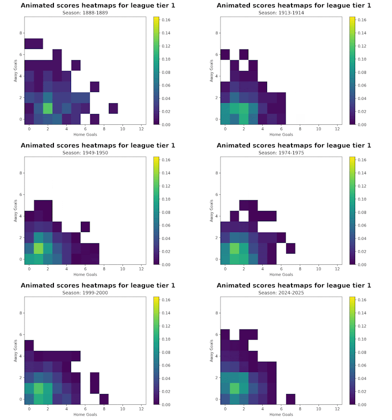
Here are two heatmaps for two seasons for the top tier.
I find this easier to analyze than the 3D bar charts because bars aren't blocking the view of other bars. On the downside, it’s hard to resolve fine differences by color and of course, it’s hard to see multiple leagues on the same chart. There are over 100 season’s worth of data, and I don’t want to look at over 100 charts.
Animated heatmaps
To investigate changes over time I animated the heatmap for the top league and the fifth league
For my money, this is a better representation than the animated 3D bar chart. It’s clear that scores have become concentrated around 1-1 since 1888, but there are exceptions, big scores still happen.
Of course, animations are nice, but maybe a slider control would be a bit better?. I decided to try out a different plotting package to see if a slider makes things easier. On the chart below, click on the slider and move it around to see the changes over time.
The problem with heatmaps is it can be hard to see smallish changes, and although the animation and sliders are helpful, they don't really let you see changes over time very clearly.
Line chart grids
One obvious data representation is to draw a grid, with the axis representing home and away goals. Each box in the grid represents a score. In each box in the grid, put a line chart showing the change in frequency over time for that score. That’s what I’ve done in the chart below.
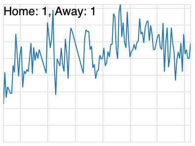
All of these charts have the same x-axis and y-axis scale, the x-axis is the season from 1888 to the present, and the y-axis is frequency. Some scores don't occur at all in the data set, so the chart is empty. I've labeled each of the charts with the score they represent. Here's a zoom in on the 1-1 score chart.
On this chart, the x-axis is the year and the y-axis is the frequency. To keep clutter down, I haven't labeled the axis.
The big grid chart is very squished-up here on this blog post, but on my big screen, I can make sense of it. I can see some trends:
- ‘Extreme’ scores are rare and there’s been little change since 1888, but they do occur.
- Low scores (e.g., 5 or fewer goals per match) are much more common than extreme scores, and that’s been the way mostly since 1888.
- Home advantage exists, but it’s getting smaller.
- All of the 'action' is in the bottom left corner.
The obvious downside is how incredibly busy the big chart is. It’s helpful to just look at a subset (the bottom left) as I’ve shown below.
It would be possible to show multiple leagues on this type of plot. Maybe not on the full grid, but certainly on a subset.
Where I’ve ended up
Reviewing all of these charts, here are my takeaways about chart choice for multi-dimensional data.
- The best approach is the line chart grids. The downside is, the grid can get huge, but the upside is, you get information on where to focus your analysis. Notably, the level of coding effort for the line chart grid is the lowest of all the other methods I used.
- Heatmap animations are helpful, but they’re really more something that looks good rather than gives you a lot of insight. Heatmaps, whether animated or not, are better than 3D bar charts.
- 3D bar charts look pretty, but they’re not very useful.
And what did I discover about scores? The frequency of different scores hasn’t changed much over time. Low scores are much more frequent than high scores, but high scoring games still occur. In the top tier, there’s a noticeable drop in home wins.
The role of AI code generation
I used AI code generation to help with this investigation. I used Cursor as my editor, and used code completion extensively. Notably, Cursor did really badly with generating animations, so I used Claude to generate example code to get me started. Claude gave me a good starting place, but I had to extensively modify what it gave me. Code generation for some of the more complex Pandas operations wasn’t good in Cursor.
I found getting started with an example to be far more helpful than using documentation or using StackOverflow, in fact, a big waste of time for me was trying to get examples sourced from websites to work. Once I told Claude what I wanted, things went much more quickly.
The bottom line is, AI was a very helpful tool, but not magic fairy dust.
Similar posts you might like
- A mini-app that has highlights of all the blog posts - https://blog.engora.com/2025/08/english-league-football-mini-app.html
- Win, lose, or draw: trends in English football match results - https://blog.engora.com/2025/06/english-football-data.html
- G-O-A-L! Goals in English football - https://blog.engora.com/2025/07/g-o-l-goals-in-english-football.html
- Attendance at English football: tragedy and recovery - https://blog.engora.com/2025/07/attendance-at-english-football-tale-of.html
- Vanishing home field advantage in English football - https://blog.engora.com/2025/07/vanishing-home-field-advantage-in.html
- Visualizing multi-dimensional data: score distributions in English football - https://blog.engora.com/2025/07/visualizing-multi-dimensional-data.html
- COVID and soccer home team advantage - winning less often - https://blog.engora.com/2021/01/covid-and-soccer-home-team-advantage.html - an old post based on older data.


