Monday, August 15, 2022

A small revolution happened when I wasn't looking

The revolution is complete but I didn't notice

The other day I realized a market segment revolution had happened and I hadn’t noticed. There’d been a fundamental shift in the underlying technology and the change was nearly complete, to the point where very few new devices are based on the old technology. It's a classic case of technology disruption.

Batteries included

I was chopping up an old tree stump with an ax when a neighbor came over with his new chainsaw and offered to help. I gratefully accepted and he sliced up my large tree stump very quickly. Afterward, we got chatting about his new chainsaw; it was battery-powered.

(Not my tree stump, but it looked like this: allen watkin from London, UK, CC BY-SA 2.0, via Wikimedia Commons)

Frankly, I was astonished that a battery-powered chainsaw could chop up a tree stump this big and I said so. He told me the battery was good for more cutting if I had other trees to cut. He also told me he used the same batteries to power his lawn mower and he could cut his whole lawn (suburban New England) on one charge. I was taken aback, last time I looked battery powered devices were a joke.

No more gasoline internal combustion engines

The next time I went to Home Depot, I had a look at their lawnmowers and garden equipment. Almost all the lawnmowers were battery-powered, including ride-on mowers. Almost all the hedge cutters and trimmers and blowers were now battery powered too. In the last few years, garden equipment that was only ever gasoline powered has now become almost entirely battery-powered. 

The benefits are obvious: no storing gasoline, no pull starts, no winter maintenance, and so on. The only drawback I could see was battery price and power, but battery prices have fallen substantially at the same time as battery capacity has gone up. We crossed a usability threshold a while back and the benefits of battery power have led manufacturers to make the switch.

Brushless is the business

Two technologies have made this change possible: brushless motors and improved batteries. Everyone knows battery technology has improved, but brushless technology gets far less attention. Brushless motors are far more energy efficient, which means longer operation and/or more usable power for the same energy cost. They’ve been around for years but they rely on electronic control circuity to work, which made them too expensive for all but specialist applications. However, the cost of electronics has tumbled which meant cheaper brushless motors became possible. The garden equipment I saw all uses brushless motors, as do modern power tools, lawnmowers, and even snow blowers (see next section). It’s the combination of modern batteries and brushless motors that's led to a small revolution.

There's no business like snow business

For home and garden devices, the ultimate test for battery power is a snowblower. For those of you who don’t know, these are a bit bigger than a lawnmower, they’re very heavy, and they have a powerful gasoline engine. To clear a big New England snow dump, you’ll need to use a big snowblower and maybe a gallon or more of gasoline. Here’s a picture of one in use. 

(Image from https://www.wnins.com/resources/personal/features/snowblowersafety.shtml)

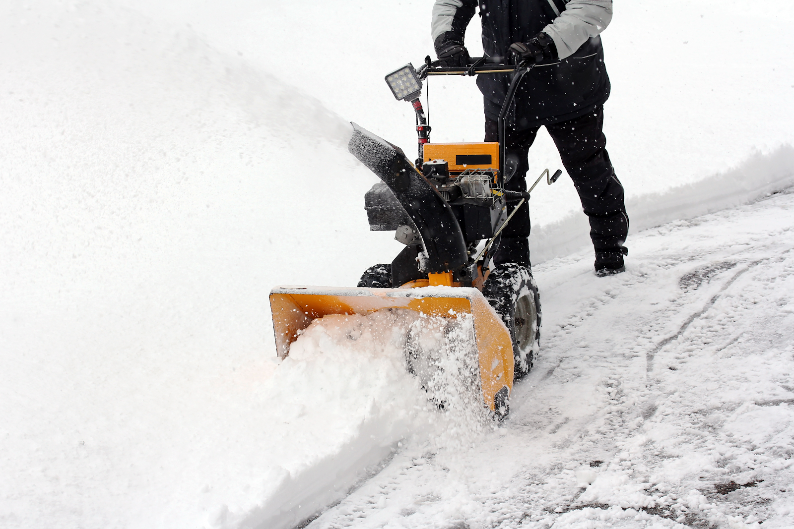
Snowblowers consume a lot of power. Is it even possible to have a battery-powered snowblower? Astonishingly, the answer is yes. There are at least two powerful battery-powered snowblowers on the market. You can see a video of one here.

These new snowblowers are a lot lighter than their gasoline cousins, they don’t need you to store gasoline, and they don’t require a pull start or an electric starter. The bigger two-stage snow blowers (which you need in New England) use two big brushless motors and 80V batteries. 

There are downsides though: batteries only last about 40 minutes clearing heavy snow and battery snowblowers are about 20-25% more expensive. This feels like an early adopter market right now, but in a few years, battery snowblowers will probably be the market standard. 

The revolution will not be televised

Batteries have taken over the garden equipment world. The revolution has succeeded but no one is talking about it.

There are a couple of lessons here and some pointers for the future.

It’s not just about better batteries. This garden revolution relied on brushless motor technology too. If we think of what's next for battery power or alternative energy, we need to think about enabling technologies, for example, solar panels are sometimes coupled with inverters, so advances in inverter technology are key.  

Manufacturers had an innovation pathway that made the problem more tractable. Home and garden devices have a range of power requirements. Electric screwdrivers and drills don’t need that much power, blowers and strimmers need more, lawnmowers still more, and snowblowers most of all. Manufacturers could solve the problems of lower power devices before moving up the ‘power’ chain. This is similar to Clayton Christensen’s “innovator’s dilemma” model of disruption.

Battery garden devices will put high-powered batteries in people’s homes, but they’ll be lying idle most of the time. What about using these powerful batteries to smooth out spikes in power demand or provide emergency power? What about charging the batteries at night when power is cheap and using the batteries during the day when power is more expensive? The problem is the step change needed in home electricity management, but maybe some incremental steps are possible. 

Other battery uses become possible too, for example, bigger motorized children’s toys, outdoor power away from electricity supplies, or even battery-powered boats. If powerful batteries are there, innovators will find a use for them.

Perhaps the next steps in home energy technology won’t be led by battery technology imported from cars but by battery technology imported from humble garden tools.

Sunday, July 24, 2022

Understanding Asia better

Misunderstanding Asia

Growing up in the UK, I never really understood Asia well. I heard the usual mix of opinions; that ‘they’ had developed their economies by adopting the free market, that there was something special about Asian societies that favored prosperity, and of course, that 'they' cheated and stole intellectual property. 

(Dado, Public domain, via Wikimedia Commons)

Years ago, I visited South Korea, China, Japan, and Taiwan. Immediately, I realized that what I’d read and understood was mostly wrong or at best very distorted. Even worse, the popular narratives in the west were pretty useless for understanding what I saw and heard.

Recently, I read a very illuminating book, “How Asia Works” by Joe Studwell.  Studwell provides a much better model for understanding Asia than anything I’d read before and I’m going to provide a quick overview of Studwell’s ideas here. I recommend you read his book.

How Asia Works

Studwell divides Asia into two broad groups: the successful trinity of Taiwan, South Korea, and Japan, and everyone else. China is of course a special case, but similar in many ways to the successful trinity. He immediately does away with geography and culture as factors explaining why the trinity was successful and others were not. Instead, he focuses on the development policies they followed and how they executed them.

In his view, there are three key drivers responsible for the rise of Japan, South Korea, and Taiwan; agriculture, industry, and finance. Behind these three drivers, there were crucial policies that enabled these countries to rise, but perhaps more important than the policies was the disciplined execution behind them. 

To set the scene, at the start of his narrative, all the countries were relatively poor with little industry. Each of them had a large population and each had the desire to develop and improve the lives of their people.

(Studwell's book.)

Studwell’s key insight into agriculture is the difference between productivity and efficiency. We can define productivity as the human consumable output per hectare and efficiency as the human consumable output per hour of human effort. Gardens are typically much more productive than farms at the cost of being more effort-intensive (less efficient). This is because gardeners plant their crops closer together and make better use of limited space, the price of which is the substantial human effort to maintain and harvest crops. Poor countries typically have lots of people they need to feed and little foreign exchange to pay for imported food. It makes a great deal of sense therefore to use their labor in highly productive agriculture, which usually means smallholdings. 

This is Studwell’s first key policy insight. Encouraging smallhold farming requires land reform. When people work for themselves and their families, they’re much more motivated to produce than when they’re tenants on someone else’s property. Each of the four countries, Japan, South Korea, Taiwan, and China all pursued land reform which involved redistributing land to smallhold farmers.  In all cases, landlords took a beating and saw little compensation for losing their lands. In each case, the countries were disciplined and prevented landlords from re-establishing control. All four countries saw agricultural productivity sharply rise. Rising agricultural productivity meant reduced food imports, agricultural exports to generate foreign exchange, and a surplus that was used to create demand for industrial output.

Other countries in Asia tried land reform but allowed landlords backdoors to rebuild their property portfolios. Although productivity rose in these countries, it wasn’t anything like the rise in Japan, Taiwan, South Korea, and China. It seems like a disciplined approach to land reform is key. 

Land reform also sheds some light on why the Soviet and Chinese experimentation with collective farming was a disaster; it destroyed the incentive for people to produce more for their families. Collectivization wiped out China’s agricultural productivity gains. 

It’s also the first area where Studwell’s ideas depart from standard economics. Western free-market economics stresses property rights. Forcing landlords to sell their land at low prices is very much counter to key free-market thought.

Industry is the next step. Studwell makes the same observation that everyone else does; textiles are the usual industrialization starting point because the skill set needed is relatively low. After textiles come other low-skilled products with countries working their way up the value chain to cars and semiconductors. The successful countries placed high import tariffs to protect their infant industries from more advanced foreign competition (again, deviation from free-market doctrine). They made capital available at low-interest rates to encourage company formation and growth, but crucially, they created a highly competitive internal market with companies forced to compete against each other (but not against foreign competition). The key policy was a disciplined focus on exports. South Korea tied investment capital access to foreign export targets; if your company hit its export targets you could get money, if it didn’t, you wouldn’t get money. This ensured export-led growth. Bear in mind that well-developed export markets usually have higher standards than developing domestic markets, so this policy forces manufacturers to meet higher foreign standards right from the start. He gives the example of a car produced by Malaysia’s Proton that lacked airbags and other safety features required for foreign markets, meaning the car could only be sold in Malaysia, limiting sales. Cars require imported parts, so a car produced for domestic consumption only means a hit to foreign currency reserves.


(Assembly line at Hyundai Motor Company’s car factory in Ulsan, South KoreaUser: Anonyme, CC BY-SA 3.0, via Wikimedia Commons)

Studwell made a comment that hit me between the eyes and woke me up. A highly competitive domestic market coupled with disciplined export-focused finance led to companies failing. Governments didn’t step in to prop up failing companies, rather they allowed the survivors to pick apart the carcasses of the dead companies. It’s not about governments picking winners, it’s about governments culling losers, but using a version of the free market to do so. Over the years in the UK, I’ve seen various attempts to build national champions in different segments, I can remember talk of “wasteful competition”, “world beaters”, and other rhetoric. It seems the successful Asian countries had a much better Darwinian survival-of-the-fittest approach. It’s cage-match economics, but it works.

The last part of Studwell’s trinity was finance; a disciplined approach to finance is what holds the entire thing together. In the agricultural stage, the goal is to finance smallhold farmers to enable them to buy fertilizer and the equipment they need to develop their farms. In the manufacturing stage, finance was tied to exports with very few exceptions. Disciplined finance becomes an extension of government development policy; countries that didn’t follow a disciplined path did not see the same level of investment. He points out that several countries used foreign investment to finance luxury real-estate developments that promised high short-term returns. Unfortunately, these types of projects don’t generate much foreign exchange and don’t offer long-term employment. The point is simple: don’t chase the highest returns, use finance to support strategic development initiatives. Once again, this runs counter to much free-market economic thought.

Studwell’s model explains much of what I saw and heard in Asia, for example, it explains why joint ventures are usually structured in the way they are. It also helps explain why South Korea, Japan, and Taiwan used currency controls for as long as they did. Conversely, it explains why development in other parts of Asia was so stunted. 

Where next?

For me, one of the benefits of reading the book was helping me shake off the intellectual straitjacket of western free-market economics. Successful Asian countries embraced some key free market ideas (“culling losers”) but rejected “the invisible hand” laissez-faire idea; governments very actively intervened in markets. It seems that development in the real world is not about intellectual purity but about what works.

The obvious questions for me are where next for the successful countries, will they continue with activist government intervention, and conversely, will the unsuccessful countries learn lessons from the winners? It left me thinking more broadly about the west, if we accept the premise that governments should intervene in markets, how could we improve life for people in the west?

Sunday, June 12, 2022

Compost!

Recycling waste in the garden and on the internet

My blog is supposed to be about technical and management issues, but today I'm going to write about composting. There are obvious 'humorous' comparisons with the technical world, most obviously about recycling ideas and rotting content, but beyond the obvious, there are lessons about material on the internet.

How it works for me

I have what's called a tumbling composter. It has two chambers. The idea is you fill one chamber with material to compost and while that's decomposing, you fill the other chamber. Complete composting takes a few weeks in summertime, a little longer in spring and fall, and stops almost completely in winter. You're supposed to rotate the drum every few days to aerate the compost. Each chamber gives about a wheelbarrow load of compost and you get several loads per chamber per year.

(My garden compost tumbler.)

Garden waste: a waste of time

The first lesson I learned is that it's hard or impossible to compost garden waste in bulk. In principle, garden waste is ideal, but in practice, there's so much of it that it overwhelms the compost mix and stops the decomposition process. You need a mix of materials for successful composting and garden waste is just too much of one thing. 

Of course, the first thing I tried to compost was leaves and I learned they break down extremely slowly. A friend suggested I shred them first, but even then, the rotting process is slow. Leaves just aren't good for compost and you should dispose of them separately.

Sticks and branches decompose slowly too. If you're going to put woody material into the compost heap, you need to chop it up into small pieces first. Even then, they don't tend to rot completely.

If you look at the Amazon reviews of composting bins, you'll find multiple reviews from people who've stuffed their bins full of grass clippings, leaves, or other garden waste and they're complaining that it doesn't compost. They're publicly blaming the product instead of figuring out why they made a mistake. (First internet lesson: reviews and comments from people on the internet can be wrong and/or misinformed. The customer isn't always right, especially when they're writing reviews.) To make composters work, you have to mix your content.

Greens and browns: the golden ratio

Almost all composting websites talk about greens and browns and the correct ratio. Here's what they consider browns (the list varies from source to source):

  • Dried grass clippings
  • Woody plant material
  • Pine needles
  • Oats, grains, and feedstock
  • Autumn leaves
  • Oak leaves
  • Sawdust
  • Wood chips
  • Straw and hay
  • Uncooked pasta
  • Shredded paper 
                    Here's what they consider greens (again the list varies):
                    • Grass clippings
                    • Coffee grounds/tea bags
                    • Vegetable and fruit scraps
                    • Trimmings from perennial and annual plants
                    • Annual weeds that haven't set seed
                    • Eggshells
                    • Animal manure
                    • Seaweed

                                The correct ratio is something like 3 brown to 1 green, but the ratio varies from site to site and I've even seen it stated as 1 to 1. I try to stick roughly to a 3 brown to 1 green ratio, but it's never exact.

                                Initially, I found my composter gave balls or clumps of material. This is a well-known problem with tumbling composters like mine and is caused by the mixture being too wet and/or an insufficient amount of brown material. If your mix is clumping into balls, add more shredded paper, but mix it in thoroughly.

                                I've visited lots of sites to find details of the mix and what I should do. Strikingly, the writers all made similar statements about greens and browns and the ratio, but they never backed their assertions with science and they never linked to other resources. After a while, I realized I was seeing the same content over and over again, and even though it wasn't an exact copy, it was so close it might as well have been. Many of the sites didn't read that well and contained a lot of repetition, which leads me to think they were being SEO'd to death, it also explains the lack of links; they want to keep people on the site. Overall, I visited a lot of low-quality sites that didn't say very much. There are a couple of internet lessons here:

                                • Wily marketers are out-smarting search engines and getting low-quality pages to score highly.
                                • Content is recycled from site to site with almost nothing informative added.
                                • Many sites with information on the home and garden are just junk sites with low-quality copied content.
                                • I'll still read the low-quality content because I'm looking for advice; the marketers' tactics are working.

                                Am I guilty of the same thing? I hope not. I'm trying to say something new, but then this is a hobby site and I'm not making any money out of it.

                                Paper and kitchen waste: a working combo

                                The thing that works wonders for me is kitchen waste coupled with shredded paper; this gives me the best compost and it decays quickly. There are some rules though.

                                • No meat or dairy. Rotting meat or dairy attracts animals. No one wants rats dining in their backyard. Don't do it.
                                • Rules for paper:
                                  • Whole pages take ages to decompose so shred paper or tear it up into small strips. 
                                  • Shredded paper from a shredder works well, but don't add it all at once as it tends to clump. 
                                  • Don't include paper with bright metallic inks, waxed paper, or glossy or shiny paper. 
                                  • Kitchen paper and similar paper will compost, but you have to tear it up into small strips.
                                  • No pizza boxes with meat waste on them (it's the animal thing again).
                                  • Cardboard will decompose well if you tear it up into small strips. It helps to soak it thoroughly first for several days. Adding too much cardboard can stop the decomposition process, so be careful about your mix.
                                • Coffee grounds and tea bags are great, but tear tea bags to speed decomposition.
                                • Add kitchen waste little and often rather than a lot at once. Chop up larger pieces (e.g. broccoli stems). Banana skins rot very quickly!

                                Blood and maggots

                                I used some kitchen paper to mop up blood from meat and threw the kitchen paper into the composter. A few days later, I saw maggots eating the blood-stained paper; but only the spots where the blood was. Gross, but fascinating. Maggots usually indicate you have animal products in your compost.

                                Starter mix

                                The composting process is mainly bacterial and the bacteria has to come from somewhere. To get started, I threw in several handfuls of soil from different parts of my garden. When I empty my composter, I don't remove all the compost, I leave some in so the decomposition process for the next load can get started.

                                I also added worms to my bins too. I hope they like the paper and cardboard I'm putting in. I don't want to be cruel, even to worms.

                                How much waste?

                                Once food and paper rot, it takes up a lot less space. I've found that a nearly full compost chamber has a lot more space after a week or two when the contents have decayed a bit. The lesson here is that even when a chamber looks full, if you leave it a while, you can fit more waste in.

                                Wasps and rats

                                I'd heard blood-curdling stories of wasps setting up home inside rotating compost bins. In practice, that didn't happen to me, maybe because I rotated the bins every few days during the warmer weather. I can see if you left the bins alone for a week or so, it might be an attractive place for wasps to nest, after all, it's warm and dry. The moral is: don't neglect your compost!

                                Because I don't compost any animal products, I've never had a rat or raccoon problem.

                                Winter is coming - even for the compost heap

                                I found that decomposition stops in winter. Once my chambers were full up in late November, that was it until March. The advice I read was not to rotate the drum once the weather gets cold, the idea is that rotating the drum causes the compost to lose heat; if you keep the drum still, decomposition can go on a bit longer. Of course, once winter really set in, the chamber contents froze solid and after a while, the sliding chamber cover froze in place so I couldn't view the chamber contents anyway. 

                                To keep my recycling going during winter, I filled up cardboard boxes with food and paper waste and waited for the spring to restart composting; of course, I composted the cardboard box too. Because I didn't throw out meat products, I didn't have any problems with animals.

                                The secret composting benefit: garbage reduction

                                I bought the composter to get rid of garden waste and found out that it wasn't good for that. What I found in practice was it was great for disposing of kitchen waste and paper. Using my composter, I've managed to reduce the amount of waste I throw out by several trash bags per year. Of course, I also get several wheelbarrow loads of compost per year. Overall, composting is both better for the planet and better for my garden. 

                                Sadly, I found that it wasn't just my composter that was full of recycled material, it turns out, that a lot of internet sites are too. Who knew.

                                Thursday, April 14, 2022

                                All about pens

                                Handwriting is the new typing

                                After many years of terrible handwriting (think spiders on LSD), I recently decided to improve it. I bought a book on handwriting and practiced, practiced, practiced. Along the way, I learned something about the writing experience; the choice of pen and ink matters. I'm going to share what I learned with you.

                                This post is all about ball pens within a reasonable price range, fountain pens are just too advanced for me and I'm cheap.

                                What makes a good handwriting experience?

                                Early on, I discovered that the pen and ink you use make a big difference, not only to the quality of the result (legible handwriting) but also to the tactile pleasure of writing. I found the smoothness of the pen moving across the paper was important; some pens just glide across the page and are wonderful to use, while others skip and drag like taking a pet to the vet. Some otherwise great pens gave smooth and thick lines that bled through to the other side of the paper, while other pens gave precise narrowness at the expense of scratchiness. After some experimentation, I concluded that the thrill of the writing experience is governed by two things: the pen barrel and the refill. 

                                For the pen barrel, its weight, width,  and the feel of the pen in my hand were the most important factors. As we'll see later, the weight of pens varies by almost an order of magnitude and I had very different writing experiences at either end of the scale. After many trials, I found I like heavier pens. The feel of the pen is harder to describe; I like pens with some form of special 'grip' or finger guide, but my favorite pen is all metal and smooth (I'm obviously not consistent). In the picture below, only the Pilot G-2 (2nd from top) and the Zebra Sarasa (3rd from top) have guides. The width is important too, I don't like wider barrel pens.

                                (Muji 0.38mm, Pilot G-2 0.7mm, Zebra Sarasa 0.7mm, AliExpress 0.5mm)

                                Refills for ball pens are of two general types, ballpoint ink, and gel ink. Ballpoint ink is thicker and heavier but lasts longer, while gel ink is smoother on the paper but doesn't last as long. For a better writing experience, the choice for me is clear: gel ink. As a bonus, gel ink pens come in a rainbow of colors.

                                Gel ink refills (and pen refills in general) are like dogs, they come in a range of different sizes. There are international standards, but even within standards, the variation is great. The image below shows some refills which are all about the same length (110mm) and all about the same width (6mm). As you've probably guessed, some of these refills fit some pens and not others. Is there any way of knowing what size refill a pen will take? No. You just have to guess or buy the same refill that went into your pen.

                                The size of the ball on the refill is hugely important. Typically, gel refills have the following ball sizes:

                                • 1.0 mm bold
                                • 0.7 mm medium
                                • 0.5 mm fine
                                • 0.4 mm extra fine

                                The thicker the ball, the better the pen glides across the paper, but the cost is thicker lines which may lead to ink bleeding through to the other side of the paper. Thinner balls give more writing precision but can feel a bit scratchy and you have to be careful about the angle you use to write.

                                The other obvious factor to consider is the manufacturer. I tried M&G, Zebra, Muji, and Pilot. I found I liked the Muji 0.38mm refill for precision at the cost of a little scratchiness. Sadly, all of the Muji refills froze partway through and I couldn't revive them (see below). I ended up using the Zebra and M&J refills but I'll probably move to Zebra permanently soon (see below for why).

                                Frozen balls

                                A few times, I've had the experience where a new refill stops working partway through. There are two closely related symptoms: it just stops writing altogether or it only writes in one direction. I've tried cleaning the type with alcohol, putting the refill in hot water, and removing the nib and cleaning the insides with alcohol. Nothing worked. On the internet, I've heard stories of people using heat guns or using naked flames to heat the refill nib, however, I've also heard stories of refills exploding when people do this kind of thing, so perhaps it's not a good idea.

                                It's annoying, but typically refills cost around $1, so I just buy another refill and move on.

                                Different weights

                                I thought I liked heavier pens, but I wanted to be sure, and what better way for a nerd to be sure than weigh his pens? I weighed all my pens without their refills to avoid differences due to the refills themselves. Here are the results.

                                Pen Weight
                                Muji Gel Ink Ball Point Pen  6g
                                Pilot G-2 8g
                                Zebra Sarasa 23g
                                AliExpress solid brass pen #1 42g
                                AliExpress solid brass pen #2 43g

                                There's a 7x weight difference between the Muji and the AliExpress pens. I knew the Muji was light, but I didn't think it was that light.

                                Interchangeable refills - or not

                                My favorite pen was my $2 solid brass AliExpress pen which takes M&G refills. M&G is a Chinese brand and unfortunately, it's recently become harder to get their refills in the US. I wondered if I could use the Zebra refills in my AliExpress pen. Sadly not. The M&G refills are slightly narrower than the Muji refill and have a slightly different end. These differences are small, less than 1mm, but pens are precision instruments, and when something won't fit, something won't fit. I couldn't find a non-M&G refill that fit, so when I finish my last M&G refill, my $2 brass pen becomes a $2 brass stick.

                                But all is not lost. I actually bought two seemingly identical brass pens from AliExpress a few weeks apart. It turns out, the second one is ever so slightly different. Different enough that the Zebra refill fits. 

                                I'm lost

                                Before the pandemic, I mislaid my $2 (actually $1.99) AliExpress brass pen at work. The office manager asked me what I was looking for and I told her "My one ninety-nine pen". She dropped everything to help me find it, which we did after a thorough search. Once we'd found it, she said it didn't look expensive and I said it was $1.99, not $199. She gave me a look that said "you're an idiot" and of course, she was right.

                                Tuesday, April 5, 2022

                                Propaganda and public relations

                                Different name, same thing

                                I've just read a book that's both inspiring from a business perspective and at the same time, deeply worrying from a society perspective. It's about public relations and propaganda. The kicker is that the book was published in 1928.

                                (Propaganda, Edward Bernays, 1928)

                                The author was Edward Bernays who's generally regarded as the father of public relations and was and is a controversial figure. He was born in Vienna in 1891 and was Sigmund Freud's nephew - another example of the huge influence of the Frued family. In the 1890's, the family moved to the US, where he lived for the rest of his long life, he died in 1995 at the age of 103. During the first world war, he worked for a US government propaganda unit where he learned most of the tools of his trade. In 1929, he successfully promoted smoking to women, and in the 1950's, he worked with the United Fruit Company and the CIA to topple the democratically elected government of Nicaragua. 

                                His 1928 book, Propaganda, outlines the theory behind public relations and gives details of how successful PR campaigns work. Although Bernays draws a distinction between propaganda and public relations, the line is very, very thing (if it's there at all). The book provides a psychological and sociological background for how PR works and even suggests that it's morally necessary for society to function. He then dives into the use of PR for commerce, politics, and education etc., providing examples of successful campaigns and how they were orchestrated. He very clearly explains, in terms of psychology and sociology, why some influence approaches work and some don't.  What's striking is how politicians and companies are still using these techniques today; it helps explain why some of our media are the way they are.

                                The book isn't an easy read. In my view, it's repetitive, overwritten, and lacks detail in many places. Bernays' moral justification for propaganda feels paper thin. But despite this, I recommend reading it, or at least reading a more recent book on propaganda, it's eye-opening.

                                The highlights

                                I'm not going to review the book in detail, instead, I'm going to give you some key quotes so you get a sense of what it says. You can decide for yourself if it's worth a trip to the library (or a click to download).

                                "In theory, every citizen makes up his mind on public questions and matters of private conduct. In practice, if all men had to study for themselves the abstruse economic, political, and ethical data involved in every question, they would find it impossible to come to a conclusion about anything."

                                In other words, people need PR to understand the world and form opinions about things.

                                "It has been found possible so to mold the mind of the masses that they will throw their newly gained strength in the desired direction. In the present structure of society, this practice is inevitable. Whatever of social importance is done to-day, whether in politics, finance, manufacture, agriculture, charity, education, or other fields, must be done with the help of propaganda. Propaganda is the executive arm of the invisible government."

                                Bernays talks a lot about the invisible government, these are the people who shape the thoughts and opinions of the masses.

                                "The mechanism by which ideas are disseminated on a large scale is propaganda, in the broad sense of an organized effort to spread a particular belief or doctrine."

                                "Small groups of persons can, and do, make the rest of us think what they please about a given subject."

                                "There are invisible rulers who control the destinies of millions. It is not generally realized to what extent the words and actions of our most influential public men are dictated by shrewd persons operating behind the scenes."

                                "The invisible government tends to be concentrated in the hands of the few because of the expense of manipulating the social machinery which controls the opinions and habits of the masses."

                                "Trotter and Le Bon concluded that the group mind does not think in the strict sense of the word. In place of thoughts it has impulses, habits and emotions. In making up its mind its first impulse is usually to follow the example of a trusted leader."

                                "The newer salesmanship, understanding the group structure of society and the principles of mass psychology, would first ask: "Who is it that influences the eating habits of the public?" The answer, obviously, is: "The physicians." The new salesman will then suggest to physicians to say publicly that it is wholesome to eat bacon. He knows as a mathematical certainty, that large numbers of persons will follow the advice of their doctors, because he understands the psychological relation of dependence of men upon their physicians."

                                "This point is most important in successful propaganda work. The leaders who lend their authority to any propaganda campaign will do so only if it can be made to touch their own interests. There must be a disinterested aspect of the propagandist's activities. In other words, it is one of the functions of the public relations counsel to discover at what points his client's interests coincide with those of other individuals or groups."

                                "Just as the production manager must be familiar with every element and detail concerning the materials with which he is working, so the man in charge of a firm's public relations must be familiar with the structure, the prejudices, and the whims of the general public, and must handle his problems with the utmost care. The public has its own standards and demands and habits. You may modify them, but you dare not run counter to them."

                                "The public is not an amorphous mass which can be molded at will, or dictated to. Both business and the public have their own personalities which must somehow be brought into friendly agreement."

                                "A sound public relations policy will not attempt to stampede the public with exaggerated claims and false pretenses, but to interpret the individual business vividly and truly through every avenue that leads to public opinion"

                                "Continuous interpretation is achieved by trying to control every approach to the public mind in such a manner that the public receives the desired impression, often without being conscious of it. High-spotting, on the other hand, vividly seizes the attention of the public and fixes it upon some detail or aspect which is typical of the entire enterprise."

                                "Present-day politics places emphasis on personality. An entire party, a platform, an international policy is sold to the public, or is not sold, on the basis of the intangible element of personality. A charming candidate is the alchemist's secret that can transmute a prosaic platform into the gold of votes."

                                "Propaganda will never die out. Intelligent men must realize that propaganda is the modern instrument by which they can fight for productive ends and help to bring order out of chaos."

                                Final thoughts

                                I can clearly see companies pursuing Bernays' PR strategy even today and what's more, I can see why they're doing it and why they're successful. I can see the role of newspapers and magazines in shaping public preferences and I can see how organizations are using social media in the same way. The same goes for politics. 

                                It's nice to be idealistic about the future, but reading Bernays' book, I get the feeling people have been trying to manipulate me my entire life and that it's not going to stop.

                                Saturday, March 26, 2022

                                Plagiarism and blog posts

                                Imitation is not the sincerest form of flattery

                                Prior to the pandemic, I wrote a thought piece on data science. It compared the work of data science to building Lego models and called back to some of my childhood memories of building Lego models with my brothers. I deliberately wrote it to have a slightly dreamy and nostalgic quality. I was very pleased with the finished piece and I referenced it from my LinkedIn profile. You can read it here: https://www.truefit.com/blog/Data-is-the-New-Lego.

                                The other day, I was thinking about this piece and did a Google search on it. I found someone had plagiarized it. They'd taken the whole article and replaced a few sentences with their 'own' work. They'd even used the same type of images I did. It was pretty much a word-for-word copy (to be clear: it's blindingly obvious this is a direct copy of my work). Of course, they didn't acknowledge my piece at all. What was truly galling was a comment someone had made calling the piece insightful. The plagiarist replied commenting that they were glad they liked it. 

                                (Hariadhi, CC BY-SA 3.0, via Wikimedia Commons)

                                The plagiarist has several other pieces on Medium. I have no idea if they copied the other pieces too. They're studying data science and on their profile, they say they want to tell stories with data. Perhaps the biggest story they're telling is that they cheat and take credit for other people's work.

                                The borders of originality

                                In this case, the copying was a blatant lift of my work, but other cases are more difficult. There's a nuanced question of what's plagiarism and what's not, for example, many people have written stories about time machines after H.G. Wells, are they all guilty of plagiarism? 

                                For me, the line is the story arc and ideas. If you're telling the same story as someone else and using the same ideas, you're on very thin ice. If you're using the same metaphors, similies, or allegories then you've crossed the line. If you must tell the same story as someone else (and you really shouldn't), at least use your own imagery.

                                What have I done?

                                On the person's Medium post, I have called out their plagiarism and I've reported the piece as violating Medium's terms and conditions. It was posted in the "Towards Data Science" publication so I complained to them too. The Towards Data Science team removed the author from their publication and reported the plagiarism to Medium. I reported the author for plagiarism to Medium again.

                                It also set me thinking about the interview process. I've looked at people's Github pages and their portfolios. Up to now, it didn't occur to me that people might blatantly cheat. After this experience, I'm going to up my checks.

                                Wednesday, March 9, 2022

                                What brown M&Ms can tell you about a company

                                Small things reveal deeper truths

                                I was reading an old story on the internet and it struck me that there's something I could learn from it about diagnosing company culture. I'll tell you the story and show you how small things can be very revealing.

                                The Van Halen story

                                Here's a quote from David Lee Roth’s autobiography, Crazy from the Heat, that tells the story. 

                                "Van Halen was the first band to take huge productions into tertiary, third-level markets. We’d pull up with nine eighteen-wheeler trucks, full of gear, where the standard was three trucks, max. And there were many, many technical errors — whether it was the girders couldn’t support the weight, or the flooring would sink in, or the doors weren’t big enough to move the gear through. The contract rider read like a version of the Chinese Yellow Pages because there was so much equipment, and so many human beings to make it function. So just as a little test, in the technical aspect of the rider, it would say “Article 148: There will be fifteen amperage voltage sockets at twenty-foot spaces, evenly, providing nineteen amperes . . .” This kind of thing. And article number 126, in the middle of nowhere, was: “There will be no brown M&M’s in the backstage area, upon pain of forfeiture of the show, with full compensation.”

                                So, when I would walk backstage, if I saw a brown M&M in that bowl . . . well, line-check the entire production. Guaranteed you’re going to arrive at a technical error. They didn’t read the contract. Guaranteed you’d run into a problem. Sometimes it would threaten to just destroy the whole show. Something like, literally, life-threatening."

                                In other words, the no brown M&Ms clause was a simple compliance check that the venue had read the contract and taken it seriously. It was an easy test of much deeper problems.

                                (This would fail the test - there are brown M&Ms! Evan-Amos, Public domain, via Wikimedia Commons)

                                Tells

                                The brown M&Ms story shows that something simple can be used to uncover a fundamental and harder-to-check problem. The same idea appears in Poker too - it's the ideas that players have "tells" that reveal something about their hands. It occurred to me that over the years, I'd seen something similar in business. I've seen cases where companies have made sweeping statements about culture but small actions have given the game away. Unlike the Van Halen story, the tells are usually unintentional, but nonetheless, they're there. Here are some examples.

                                Our onboarding is the best, but we won't pay you

                                Years ago, I worked for a company that made a big deal of how great its onboarding was; the CEO and other executives claimed it was "industry-leading" and praised the process. 

                                When I was onboarded, the company messed up its payroll and didn't pay me for a while; way past the legal deadline. I asked when it was going to be resolved and I was told I should "manage my finances better". I later learned this was a common experience and many new employees weren't paid on time, the "manage your finances better" was the stock response. In one extreme case, I know someone who wasn't paid for over two months.

                                As it turned out, this was a brown M&Ms case. It indicated profound issues at the company and in particular with the executive team; they were too remote from what was going on and they really weren't interested in hearing anything except praise. It took me and others a long time to discover these issues. The brown M&Ms should have warned us very early that something was quite broken. 

                                I'm too important to talk to you

                                At another company, a new C-level executive joined the organization and there was a long announcement about how great they were and how they exhibited the company values, one of which was being people-centric. I reported to the new person's organization. 

                                One day, early on in their tenure, the new C-level person visited the office I was working at. They walked straight by me and my team without stopping to say hello. During the week they were with us, they didn't meet or talk with any of us. They even managed to avoid being in the break room at the same time as the little people (and people tried very hard to meet the new executive). On that visit, the new C-level person didn't meet or say hello to anyone below vice-president level. Later on, they gave a talk to their organization that included a discussion of the necessity of connecting with people and how it was important to them.

                                I didn't see many of their other actions, but this was very definitely a brown M&M moment for me. I saw trouble ahead and left the company not long after, and I wasn't the only one.

                                Candies: going, going, gone

                                My last example is actually about candy. 

                                I worked for a company that provided candy and snacks. It was very proud that what it provided was top quality, and I agreed; it really did provide great treats. The company presented top-quality candy and snacks as a way of showing how much it valued its employees; we were told that we got the best because we were valued. 

                                You can probably guess what happened next. The snack and candy brands went from well-known brands to own-label brands, while the company insisted that nothing had changed. After a few months of own-label brands, the candy and snacks stopped altogether, and the company never said a word. A number of other things happened too, including worse terms and conditions for new employees (less leave etc.), more restrictions on travel, and fewer corporate lunches, but these were harder to see. The company started valuing employees less and the treats and candies were only the most visible of several actions that took place at the same time; they were the canary in the coal mine.

                                What can you do?

                                Small issues can give you a clue that things are deeply broken in hard-to-detect ways. You should be on the lookout for brown M&M moments that give you advance warning of problems.

                                As an employee, these moments provide insight into what the company really is. If the M&M moment is serious enough, it's time to think about employment elsewhere, even if you've just started.

                                As an executive, you need to be aware that you're treated differently from other people. You might not experience the brown M&M moment yourself, but people in your organization might. Listen to people carefully and hear these moments; use them to diagnose deeper issues in your organization and fix the root cause. Be aware that this is one of the few moments in your life you might get to be like David Lee Roth.

                                Saturday, February 26, 2022

                                W.E.B. Du Bois - data scientist

                                Changing the world through charts

                                Two of the key skills of a data scientist are informing and persuading others through data. I'm going to show you how one man, and his team, used novel visualizations to illustrate the lives of African-Americans in the United States at the start of the 20th century. Even though they created their visualizations by hand, these visualizations still have something to teach us over 100 years later. The team's lack of computers freed them to try different forms of data visualizations; sometimes their experimentation was successful, sometimes less so, but they all have something to say and there's a lesson here about communication for today's data scientists.

                                I'm going to talk about W.E.B. Du Bois and the astounding charts his team created for the 1900 Paris exhibition.

                                (W.E.B. Du Bois in 1904 and one of his 1900 data visualizations.)

                                Who was W.E.B. Du Bois?

                                My summary isn't going to do his amazing life justice so I urge you to read any of these short descriptions of who he was and what he did:

                                To set the scene here's just a very brief list of some of the things he did. Frankly, summarizing his life in a few lines is ridiculous.

                                • Born 1868, Great Barrington, Massachusetts.
                                • Graduate of Fisk University and Harvard - the first African-American to gain a Ph.D. from Harvard.
                                • Conducted ground-breaking sociological work in Philadelphia, Virginia, Alabama, and Georgia.
                                • His son died in 1899 because no white doctor would treat him and black doctors were unavailable.
                                • Was the primary organizer of "The Exhibit of American Negroes" at the Exposition Universelle held in Paris between April and November 1900.
                                • NAACP director and editor of the NAACP magazine The Crisis.
                                • Debated Lothrop Stoddard, a "scientific racist" in 1929 and thoroughly bested him.
                                • Opposed US involvement in World War I and II.
                                • Life-long peace activist and campaigner, which led to the FBI investigating him in the 1950s as a suspected communist. They withheld his passport for 8 years.
                                • Died in Ghana in 1963.

                                Visualizing Black America at the start of the twentieth century

                                In 1897, Du Bois was a history professor at Atlanta University. His former classmate and friend, Thomas Junius Calloway, asked him to produce a study of African-Americans for the 1900 Paris world fair, the "Exposition Universelle". With the help of a large team of Atlanta University students and alumni, Du Bois gathered statistics on African-American life over the years and produced a series of infographics to bring the data to life. Most of the names of the people who worked on the project are unknown, and it's a mystery who originated the form of the plots, but the driving force behind the project was undoubtedly Du Bois. Here are some of my favorite infographics from the Paris exhibition.

                                The chart below shows where African-Americans lived in Georgia in 1890. There are four categories: 

                                • Red - country and villages
                                • Yellow - cities 2,500-5,000
                                • Blue - cities 5,000-10,000
                                • Green - cities over 10,000

                                the length of the lines is proportional to the population and obviously, the chart shows the huge majority of the population lived in the country and villages. I find the chart striking for three reasons: it doesn't follow any of the modern charting conventions, it clearly represents the data, and it's visually very striking. My criticism is that the design makes it hard to visually quantify the differences, for example, how many more people live in the country and villages compared to cities 5,000-10,000? If I were drawing a chart with the same data today, I might use an area chart to represent the same data; it would quantify things better, but it would be far less visually interesting.


                                The next infographic is two choropleth charts that show the African-American population of Georgia counties in 1870 and 1880. Remember that the US civil war ended in 1865, and with the Union victory came freedom for the slaves. As you might expect, there was a significant movement of the now-free people. Looking at the charts in detail raises several questions, for example, why did some areas see a growth in the African-American population while other areas did not? Why did the highest populated areas remain the highest populated? The role of any good visualization is to prompt meaningful questions.

                                This infographic shows the income and expenditure of 150 African-American families in Georgia. The income bands are on the left-hand side, and the bar chart breaks down the families' expenses by category:

                                • Black - rent
                                • Purple - food
                                • Pink - clothes
                                • Dark blue - direct taxes
                                • Light blue - other expenses and savings

                                There are several notable observations from this chart: the disappearance of rent above a certain income level, the rise in other expenses and savings with rising income, and the declining fraction spent on clothing. There's a lot on this chart and it's worthy of greater study; Du Bois' team crammed a great deal of meaning into a single page. For me, the way the key is configured at the top of the chart doesn't quite work, but I'm willing to give the team a pass on this because it was created in the 19th century. A chart like this wouldn't look out of place in a 2022 report - which of itself is startling.

                                My final example is a comparison of the occupations of African-Americans and the white population in Georgia. It's a sort-of pie chart, with the upper quadrant showing African Americans and the bottom quadrant showing the white population. Occupations are color-coded:

                                • Red - agriculture, fishery, and mining
                                • Yellow - domestic and personal service
                                • Blue - manufacturing and mechanical industries
                                • Grey - trade and transportation
                                • Brown - professions

                                The fraction of the population in these employment categories is written on the slices, though it's hard to read because the contrast isn't great. Notably, the order of the occupations is reversed from the top to the bottom quadrant, which has the effect of making the sizes of the slices easier to compare - this can't be an accident. I'm not a fan of pie charts, but I do like this presentation.

                                Influences on later European movements - or not?

                                Two things struck me about Du Bois' charts: how modern they looked and how similar they were to later art movements like the Italian Futurists and Bauhaus. 

                                At first glance, his charts look to me like they'd been made in the 1960s. The typography and coloring were obviously pre-computerization, but everything else about them suggests modernity, from the typography to the choice of colors to the layout. The experimentation with form is striking and is another reason why this looks very 1960s to me; perhaps the use of computers to visualize data has constrained us too much. Remember, Du Bois's mission was to explain and convince and he chose his charts and their layout to do so, hence the experimentation with form. It's quite astonishing how far ahead of his time he was.  

                                Italian Futurism started in 1909 and largely fizzled out at the end of the second world war due to its close association with fascism. The movement emphasized the abstract representation of dynamism and technology among other things. Many futurist paintings used a restricted color palette and have obvious similarities with Du Bois' charts, here are just a few examples (below). I couldn't find any reliable articles that examined the links between Du Bois' work and futurism.

                                Numbers In Love - Giacomo Balla
                                Image from WikiArt
                                Music - Luigi Russolo
                                Image from WikiArt

                                The Bauhaus design school (1919-1933) sought to bring modernity and artistry into mass production and had a profound and lasting effect on the design of everyday things, even into the present day. Bauhaus designs tend to be minimal ("less is more") and focus on functionality ("form follows function") but can look a little stark. I searched, but I couldn't find any scholarly study of the links between Du Bois and Bauhaus, however, the fact the Paris exposition charts and the Bauhaus work use a common visual language is striking. Here's just one example, a poster for the Bauhaus school from 1923.

                                (Joost Schmidt, Public domain, via Wikimedia Commons)

                                Du Bois' place in data visualization

                                I've read a number of books on data visualization. Most of them include Nightingale's coxcomb plots and Playfair's bar and pie charts, but none of them included Du Bois charts.  Du Bois didn't originate any new chart types, which is maybe why the books ignore him, but his charts are worth studying because of their experimentation with form, their use of color, and most important of all, their ability to communicate meaning clearly. Ultimately, of course, this is the only purpose of data visualization.

                                Reading more

                                W. E. B. Du Bois's Data Portraits: Visualizing Black America, Whitney Battle-Baptiste, Britt Rusert. This is the book that brought these superb visualizations to a broader audience. It includes a number of full-color plates showing the infographics in their full glory.

                                The Library of Congress has many more infographics from the Paris exhibition, it also has photos too. Take a look at it for yourself here https://www.loc.gov/collections/african-american-photographs-1900-paris-exposition/?c=150&sp=1&st=list - but note the charts are towards the end of the list. I took all my charts in this article from the Library of Congress site. 

                                "W.E.B. Du Bois’ Visionary Infographics Come Together for the First Time in Full Color" article in the Smithsonian magazine that reviews the Battle-Baptiste book (above).

                                "W. E. B. Du Bois' Hand-Drawn Infographics of African-American Life (1900)" article in Public Domain Review that reviews the Battle-Baptiste book (above).

                                Friday, February 18, 2022

                                RCT bingo!

                                A vocabulary of causal inference testing

                                I was having a clear-out and I came across a printout of some notes I made a while back. It was a list of terms used in causal inference testing. At the time, I used it as a checklist or dictionary to ensure I knew what I was talking about - a kind of RCT bingo if you like.

                                (Myriam Thomas, CC BY-SA 4.0, via Wikimedia Commons)

                                I thought I would post it here in case anyone wants to play the same game. Do you know what all these terms mean? Are there key terms I've missed off my list?

                                • ATE - Average Treatment Effect
                                • CATE - Conditional Average Treatment Effect
                                • Counterfactual
                                • DAG - Directed Acyclic Graph
                                • Dynamic Treatment Effect
                                • Epsilon greedy
                                • Estimands
                                • External and internal validity
                                • Heterogeneity (treatment effect heterogeneity) 
                                • Homophily
                                • Instrumental Variable (IV)
                                • LATE - Local Average Treatment Effect
                                • Logit model
                                • RCT - Randomized Control Trial
                                • Regret
                                • Salience
                                • Spillover
                                • Stationary effect (and it's opposite non-stationary effect)
                                • Surrogate
                                • SUTVA - Stable Unit Treatment Value Assumption
                                • Thompson sampling
                                • Treatment effect heterogeneity
                                • Wald estimator

                                Monday, January 17, 2022

                                Cultural add or fit?

                                What does cultural fit mean?

                                At a superficial level, company culture can be presented as free food and drink, table tennis and foosball, and of course company parties. More realistically, it means how people interact with each other, what behavior is encouraged, and crucially what behavior isn't tolerated.  At the most fundamental level, it means who gets hired, fired, or promoted. 

                                Cultural fit means how well someone can function within a company or team. At best, it means their personality and the company's way of operating are aligned so the person thrives within the company, performs well, and stays a long time. In this case, everyone's a winner.

                                For a long time, managers have hired for cultural fit because of the benefits of getting it right.

                                The unintended consequences

                                Although cultural fit seems like a good thing to hire for, it has several downsides. 

                                Hiring for cultural fit over the long term means that you can get groupthink. In some situations that's fine, for example, mature or slowly moving industries benefit from a consistent approach over time. But during periods of rapid change, it can be bad because the team doesn't have the diversity of thought to effectively respond to threats; the old ways don't work anymore but the team still fights yesterday's battles.

                                For poorly performing teams, hiring for cultural fit can mean more of the same, which can be disastrous on two levels: it cements the existing problems and blocks new ways of working.

                                (Monks in a monastery are a great example of cultural fit. But not everyone wants to join a monastery. Abraham Sobkowski OFM, CC BY-SA 3.0, via Wikimedia Commons)

                                Cultural add

                                In contrast to cultural fit that focuses on conformity, cultural add focuses on what new and different things an employee can bring to the team. 

                                Cultural add is not (entirely) about racial diversity; in fact, I would argue it's a serious error to view cultural add solely in racial terms. I've worked with teams composed of individuals from different races, but they all went to the same universities and all had the same middle-class backgrounds. The team looked and sounded diverse but their thinking was strikingly uniform.

                                Here are some areas of cultural add you might think about:

                                • Someone who followed a non-traditional path to get to where they got. This can mean:
                                  • Military experience
                                  • Non-university education
                                  • They transitioned from one discipline to another (e.g. someone who initially majored in law now working in machine learning).
                                • Single parents. Many young tech teams are full of young single people. A single parent has a radically different set of experiences. They may well bring a much-needed focus on work-life balance.
                                • Older candidates. Their experience in different markets and different companies may be just what you need.
                                • Working-class backgrounds. Most people in tech come from middle-class backgrounds (regardless of country of origin). Someone whose parents were very blue-collar may well offer quite a different perspective.

                                I'm not saying anything new when I say a good hiring process considers the strengths and weaknesses of a team before the hiring process starts. For example, if a team is weak on communication with others, a desirable feature of a new hire is good communications skills. Cultural add takes this one stage further and actively looks for candidates who bring something new to the table, even when that new thing isn't well-defined.

                                Square pegs in round holes

                                The cultural add risk is the same as any hiring risk: you get someone who can't work with the team or who can't perform. Even with cultural add, you still need to recruit someone the team can work with. Cultural add can't be the number one hiring criteria, but it should be a key one. 

                                What all this means in practice

                                We can boil this down to some don'ts and dos.

                                Don'ts

                                • Hire people who went to the same small group of universities.
                                • Assume racial diversity = cultural add.
                                • Add people who are exactly the same as the current team.
                                • Rely on employee referrals (people tend to know people who are like them).
                                Do:
                                • Look for people with non-traditional backgrounds.
                                • Be aware of the hiring channels you use and try and reach out beyond the usual channels. 
                                • Look for what new thing or characteristic the candidate brings. This means thinking about the interview questions you ask to find the new thing.
                                • Think about your hiring process and how the process itself filters candidates. If you have a ten-stage process, or a long take-home test, or you do multiple group interviews, this can cause candidates to drop out - maybe even the candidates you most want to attract.

                                Cultural add goes beyond the hiring process, you have to think about how a person is welcomed. I've seen teams unintentionally (and intentionally) freeze people out because they were a bit different. If you really want to make cultural add work, management has to commit to making it work post-hire. 

                                An old joke

                                Two men become monks and join a monastery. One of the men is admitted because he's a cultural fit, the other because he's a cultural add. 

                                After dinner one evening, the monks are silent for a while, then one monk says "23" and the other monks smile. After a few minutes, another monk very loudly says "82", and the monks laugh. This goes on for a while to the confusion of the two newcomers. The abbot whispers to them: "We've been together so long, we know each other's jokes, so we've numbered them to save time". The new monks decide to join in.

                                The cultural fit monk says "82" and there's polite laughter - they've just heard the same joke. The cultural add monk thinks for a second and says "189". There's a pause for a second as the monks look at one another in wonder, then they burst out in side-splitting laughing. Some of the monks are crying with laughter and one looks like he might need oxygen. The laughter goes on for a good ten minutes. The abbot turns to the cultural add monk and says: "they've never heard that one before!".

                                If you want more of the same, go for cultural fit, if you want something new, go for cultural add.

                                Friday, January 7, 2022

                                Prediction, distinction, and interpretation: the three parts of data science

                                What does data science boil down to?

                                Data science is a relatively new discipline that means different things to different people (most notably, to different employers). Some organizations focus solely on machine learning, while other lean on interpretation, and yet others get close to data engineering. In my view, all of these are part of the data science role. 

                                I would argue data science generally is about three distinct areas:

                                • Prediction. The ability to accurately extrapolate from existing data sets to make forecasts about future behavior. This is the famous machine learning aspect and includes solutions like recommender systems.
                                • Distinction. The key question here is: "are these numbers different?". This includes the use of statistical techniques to decide if there's a difference or not, for example, specifying an A/B test and explaining its results. 
                                • Interpretation. What are the factors that are driving the system? This is obviously related to prediction but has similarities to distinction too.

                                (A similar view of data science to mine: Calvin.Andrus, CC BY-SA 3.0, via Wikimedia Commons)

                                I'm going to talk through these areas and list the skills I think a data scientist needs. In my view, to be effective, you need all three areas. The real skill is to understand what type of problem you face and to use the correct approach.

                                Distinction - are these numbers different?

                                This is perhaps the oldest area and the one you might disagree with me on. Distinction is firmly in the realm of statistics. It's not just about A/B tests or quasi-experimental tests, it's also about evaluating models too.

                                Here's what you need to know:

                                • Confidence intervals.
                                • Sample size calculations. This is crucial and often overlooked by experienced data scientists. If your data set is too small, you're going to get junk results so you need to know what too small is. In the real world. increasing the sample size is often not an option and you need to know why.
                                • Hypothesis testing. You should know the difference between a t-test and a z-test and when a z-test is appropriate (hint: sample size).
                                • α, β, and power. Many data scientists have no idea what statistical power is. If you're doing any kind of statistical testing, you need to have a firm grasp of power.
                                • The requirements for running a randomized control trial (RCT). Some experienced data scientists have told me they were analyzing results from an RCT, but their test just wasn't an RCT - they didn't really understand what an RCT was.
                                • Quasi-experimental methods. Sometimes, you just can't run an RCT, but there are other methods you can use including difference-in-difference, instrumental variables, and regression discontinuity.  You need to know which method is appropriate and when. 
                                • Regression to the mean. This is why you almost always need a control group. I've seen experienced data scientists present results that could almost entirely be explained by regression to the mean. Don't be caught out by one of the fundamentals of statistics.

                                Prediction - what will happen next?

                                This is the piece of data science that gets all the attention, so I won't go into too much detail.

                                Here's what you need to know:

                                • The basics of machine learning models, including:
                                  • Generalized linear modeling
                                  • Random forests (including knowing why they are often frowned upon)
                                  • k-nearest neighbors/k-means clustering
                                  • Support Vector Machines
                                  • Gradient boosting.
                                • Cross-validation, regularization, and their limitations.
                                • Variable importance and principal component analysis.
                                • Loss functions, including RMSE.
                                • The confusion matrix, accuracy, sensitivity, specificity, precision-recall and ROC curves.

                                There's one topic that's not on any machine learning course or in any machine learning book that I've ever read, but it's crucially important: knowing when machine learning fails and when to stop a project.  Machine learning doesn't work all the time.

                                Interpretation - what's going on?

                                The main techniques here are often data visualization. Statistical summaries are great, but they can often mislead. Charts give a fuller picture. 

                                Here are some techniques all data scientists should know:

                                • Heatmaps
                                • Violin plots
                                • Scatter plots and curve fitting
                                • Bar charts
                                • Regression and curve fitting.

                                They should also know why pie charts in all their forms are bad. 

                                A good knowledge of how charts work is very helpful too (the psychology of visualization).

                                What about SQL and R and Python...?

                                You need to be able to manipulate data to do data science, which means SQL, Python, or R. But plenty of people use these languages without being data scientists. In my view, despite their importance, they're table stakes.

                                Book knowledge vs. street knowledge

                                People new to data science tend to focus almost exclusively on machine learning (prediction in my terminology) which leaves them very weak on data analysis and data exploration; even worse, their lack of statistical knowledge sometimes leads them to make blunders on sample size and loss functions. No amount of cross-validation, regularization, or computing power will save you from poor modeling choices. Even worse, not knowing statistics can lead people to produce excellent models of regression to the mean.

                                Practical experience is hugely important; way more important than courses. Obviously, a combination of both is best, which is why PhDs are highly sought after; they've learned from experience and have the theoretical firepower to back up their practical knowledge.

                                Friday, December 31, 2021

                                COVID and the base rate fallacy

                                COVID and the base rate fallacy

                                Should we be concerned that vaccinated people are getting COVID?

                                I’ve spoken to people who’re worried that the COVID vaccines aren’t effective because some vaccinated people catch COVID and are hospitalized. Let’s look at the claim and see if it stands up to analysis.

                                Let's start with some facts:

                                Marc Rummy’s diagram

                                Marc Rummy created this diagram to explain what’s going on with COVID hospitalizations. He’s made it free to share, which is fantastic.

                                In this diagram, the majority of the population is vaccinated (91%). The hospitalization rate for the unvaccinated is 50% but for the vaccinated, it’s 10%. If the total population is 110, this leads to 5 unvaccinated people hospitalized and 10 vaccinated people hospitalized - in other words, 2/3 of those in hospital with COVID have been vaccinated. 

                                Explaining the result

                                Let’s imagine we just looked at hospitalizations: 5 unvaccinated and 10 vaccinated. This makes it look like vaccinations aren’t working – after all, the majority of people in hospital are vaccinated. You can almost hear ignorant journalists writing their headlines now (“Questions were raised about vaccine effectiveness when the health minister revealed the majority of patients hospitalized had been vaccinated.”). But you can also see anti-vaxxers seizing on these numbers to try and make a point about not getting vaccinated.

                                The reason why the numbers are the way they are is because the great majority of people are vaccinated

                                Let’s look at three different scenarios with the same population of 110 people and the same hospitalization rates for vaccinated and unvaccinated:

                                • 0% vaccinated – 55 people hospitalized
                                • 91% vaccinated – 15 people hospitalized
                                • 100% vaccinated – 11 people hospitalized

                                Clearly, vaccinations reduce the number of hospitalizations. The anti-vaccine argument seems to be, if it doesn't reduce the risk to zero, it doesn't work - which is a strikingly weak and ignorant argument.

                                In this example, vaccination doesn’t reduce the risk of infection to zero, it reduces it by a factor of 5. In the real world, vaccination reduces the risk of infection by 5x and the risk of death due to COVID by 13x (https://www.nytimes.com/interactive/2021/us/covid-cases.html). The majority of people hospitalized now appear to be unvaccinated even though vaccination rates are only just above 60% in most countries (https://www.nytimes.com/interactive/2021/world/covid-cases.html, https://www.masslive.com/coronavirus/2021/09/breakthrough-covid-cases-in-massachusetts-up-to-about-40-while-unvaccinated-people-dominate-hospitalizations.html).

                                The bottom line is very simple: if you want to reduce your risk of hospitalization and protect your family and community, get vaccinated.

                                The base rate fallacy

                                The mistake the anti-vaxxers and some journalists are making is a very common one, it’s called the base rate fallacy (https://thedecisionlab.com/biases/base-rate-fallacy/). There are lots of definitions online, so I’ll just attempt a summary here: “the base rate fallacy is where someone draws an incorrect conclusion because they didn’t take into account the base rate in the general population. It’s especially a problem for conditional probability problems.”

                                Let’s use another example from a previous blog post:

                                “Imagine there's a town of 10,000 people. 1% of the town's population has a disease. Fortunately, there's a very good test for the disease:

                                • If you have the disease, the test will give a positive result 99% of the time (sensitivity).
                                • If you don't have the disease, the test will give a negative result 99% of the time (specificity).

                                You go into the clinic one day and take the test. You get a positive result. What's the probability you have the disease?” 

                                The answer is 50%.

                                The reason why the answer is 50% and not 99% is because 99% of the town’s population does not have the disease (the base rate), which means half of the positives will be false positives.

                                What’s to be done?

                                Conditional probability (for example, the COVID hospitalization data) is screwy and can sometimes seem counter to common sense. The general level of statistical (and probability) knowledge in the population is poor. This leaves people trying to make sense of the data around them but without the tools to do it, so no wonder they’re confused.

                                It’s probably time that all schoolchildren are taught some basic statistics. This should include some counter-intuitive results (for example, the disease example above). Even if very few schoolchildren grow up to analyze data, it would be beneficial for society if more people understood that interpreting data can be hard and that sometimes surprising results occur – but that doesn’t make them suspicious or wrong.

                                More importantly, journalists need to do a much better job of telling the truth and explaining the data instead of chasing cheap clicks.