Monday, November 28, 2022

Is this coin biased?

Tossing and turning

A few months ago, someone commented on one of my blog posts and asked how you work out if a coin is biased or not. I've been thinking about the problem since then. It's not a difficult one, but it does bring up some core notions in probability theory and statistics which are very relevant to understanding how A/B testing works, or indeed any kind of statistical test. I'm going to talk you through how you figure out if a coin is biased, including an explanation of some of the basic ideas of statistical tests.

The trial

A single coin toss is an example of something called a Bernoulli trial, which is any kind of binary decision you can express as a success or failure (e.g. heads or tails). For some reason, most probability texts refer to heads as a success. 

We can work out what the probability is of getting different numbers of heads from a number of tosses, or more formally, what's the probability \(P(k)\) of getting \(k\) heads from \(n\) tosses, where \(0 < k ≤ n\)? By hand, we can do it for a few tosses:

 Number of heads (k) Combinations (n)  Count  Probability 
 0 TTT 1 1/8
 1 HTT
 THT
 TTH
 3 3/8 
 2 THH
 HTH
 HHT
 3  3/8
 4 HHH 1 1/8

But what about 1,000 or 1,000,000 tosses - we can't do this many by hand, so what can we do? As you might expect, there's a formula you can use: 
\[P(k) = \frac{n!} {k!(n-k)!} p^k (1-p)^{n-k}\]
\(p\) is the probability of success in any trial, for example, getting a head. For an unbiased coin \(p=0.5\); for a coin that's biased 70% heads \(p=0.7\). 

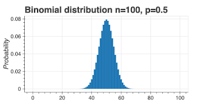
If we plot this function for an unbiased coin (\(p=0.5\)), where \(n=100\), and \(0 < k ≤ n\), we see this probability distribution:

This is called a binomial distribution and it looks a lot like the normal distribution for large (\(> 30\)) values of \(n\). 

I'm going to re-label the x-axis as a score equal to the fraction of heads: 0 means all tails, 0.5 means \(\frac{1}{2}\) heads, and 1 means all heads. With this slight change, we can more easily compare the shape of the distribution for different values of \(n\). 

I've created two charts below for an unbiased coin (\(p=0.5\)), one with \(n=20\) and one with \(n=40\). Obviously, the \(n=40\) chart is narrower, which is easier to see using the score as the x-axis. 

As an illustration of what these charts mean, I've colored all scores 0.7 and higher as red. You can see the red area is bigger for \(n=20\) than \(n=40\). Bear in mind, the red area represents the probability of a score of 0.7 or higher. In other words, if you toss a fair coin 20 times, you have a 0.058 chance of seeing a score of 0.7 or more, but if you toss a fair coin 40 times, the probability of seeing a 0.7 score drops to 0.008.


These charts tell us something useful: as we increase the number of tosses, the curve gets narrower, meaning the probability of getting results further away from \(0.5\) gets smaller. If we saw a score of 0.7 for 20 tosses, we might not be able to say the coin was biased, but if we got a score of 0.7 after 40 tosses, we know this score is very unlikely so the coin is more likely to be biased.

Thresholds

Let me re-state some facts:

  • For any coin (biased or unbiased) any score from 0 to 1 is possible for any number of tosses.
  • Some results are less likely than others; e.g. for an unbiased coin and 40 tosses, there's only a 0.008 chance of seeing a score of 0.7.

We can use probability thresholds to decide between biased and non-biased coins.  We're going to use a threshold (mostly called confidence) of 95% to decide if the coin is biased or not. In the chart below, the red areas represent 5% probability, and the blue areas 95% probability.

Here's the idea to work out if the coin is biased. Set a confidence value, usually at 0.05. Throw the coin \(n\) times, record the number of heads and work out a score. Draw the theoretical probability chart for the number of throws (like the one I've drawn above) and color in 95% of the probabilities blue and 5% red. If the experimental score lands in the red zones, we'll consider the coin to be biased, if it lands in the blue zone, we'll consider it unbiased.

This is probabilistic decision-making. Using a confidence of 0.05 means we'll wrongly say a coin is biased 5% of the time. Can we make the threshold higher, could we use 0.01 for instance? Yes, we could, but the cost is increasing the number of trials.

As you might expect, there are shortcuts and we don't actually have to draw out the chart. In Python, you can use the binom_test function in the stats package. 

To simplify, binom_test has three arguments:

  • x - the number of successes
  • n - the number of samples
  • p - the hypothesized probability of success
It returns a p-value which we can use to make a decision.

Let's see how this works with a confidence of 0.05. Let's take the case where we have 200 coin tosses and 140 (70%) of them come up heads. We're hypothesizing that the coin is fair, so \(p=0.5\).

from scipy import stats
print(stats.binom_test(x=140, n=200, p=0.5))

the p-value we get is 1.5070615573524992e-08 which is way less than our confidence threshold of 0.05 (we're in the red area of the chart above). We would then reject the idea the coin is fair.

What if we got 112 heads instead?

from scipy import stats
print(stats.binom_test(x=115, n=200, p=0.5))

This time, the p-value is 0.10363903843786755, which is greater than our confidence threshold of 0.05 (we're in the blue area of the chart), so the result is consistent with a fair coin (we fail to reject the null).

What if my results are not significant? How many tosses?

Let's imagine you have reason to believe the coin is biased. You throw it 200 times and you see 115 heads. binom_test tells you you can't conclude the coin is biased. So what do you do next?

The answer is simple, toss the coin more times.

The formulae for the sample size, \(n\), is:

\[n = \frac{p(1-p)} {\sigma^2}\]

where \(\sigma\) is the standard error. 

Here's how this works in practice. Let's assume we think our coin is just a little biased, to 0.55, and we want the standard error to be \(\pm 0.04\). Here's how many tosses we would need: 154. What if we want more certainty, say \(\pm 0.005\), then the number of tosses goes up to 9,900. In general, the bigger the bias, the fewer tosses we need, and the more certainty we want the more tosses we need. 

If I think my coin is biased, what's my best estimate of the bias?

Let's imagine I toss the coin 1,000 times and see 550 heads. binom_test tells me the result is significant and it's likely my coin is biased, but what's my estimate of the bias? This is simple, it's actually just the mean, so 0.55. Using the statistics of proportions, I can actually put a 95% confidence interval around my estimate of the bias of the coin. Through math I won't show here, using the data we have, I can estimate the coin is biased 0.55 ± 0.03.

Is my coin biased?

This is a nice theoretical discussion, but how might you go about deciding if a coin is biased? Here's a step-by-step process.

  1. Decide on the level of certainty you want in your results. 95% is a good measure.
  2. Decide the minimum level of bias you want to detect. If the coin should return heads 50% of the time, what level of bias can you live with? If it's biased to 60%, is this OK? What about biased to 55% or 50.5%?
  3. Calculate the number of tosses you need.
  4. Toss your coin.
  5. Use binom_test to figure out if the coin deviates significantly from 0.5.
Other posts like this

Wednesday, November 23, 2022

The London weighting

London is an oddity

I was born and grew up in London but it was only after I left that I started to realize how much of an oddity it is; it's almost as if it's a different country from the rest of the UK. I thought other capital cities would have a similar disjointed relationship with their host countries, and I was partly right, but I was also mostly wrong. Let me explain why London is such an international oddity.

Zipf's law

Zipf's law refers to the statistical distribution of observations found in some types of data, for example, word frequency in human languages. It isn't a law in the sense of a scientific 'law', it's a distribution. 

In simple terms, for measurements that follow Zipf's law, the first item is twice the second item, three times the third, and so on. For example, in English, the word 'the' is the most frequent word and it occurs twice as often as the next most common word ('of') [https://www.cs.cmu.edu/~cburch/words/top.html]. 

I found some readable articles on Zipf's law here: [http://www.casa.ucl.ac.uk/mike-michigan-april1/mike's%20stuff/attach/Gabaix.pdf, https://gizmodo.com/the-mysterious-law-that-governs-the-size-of-your-city-1479244159].

It turns out that a number of real-world measurements follow Zipf's law, including city sizes. 

The US and elsewhere

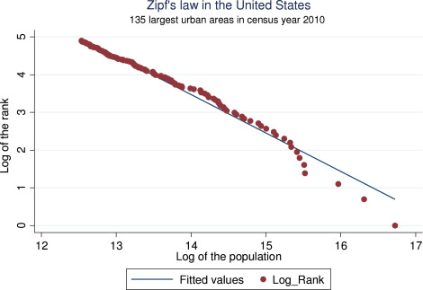
Here's what city size looks like in the US. This is a plot of ln(Rank) vs ln(Population) with the biggest city (New York) being bottom right (ln meaning natural logarithm). 


It's close to an ideal Zipf law distribution.

You can see the same pattern in other cities around the world [https://arxiv.org/pdf/1402.2965.pdf].

One of the interesting features of the Zipf city distribution is that it's mostly persistent over time [http://www.casa.ucl.ac.uk/mike-michigan-april1/mike's%20stuff/attach/Gabaix.pdf]. Although the relative size of a few cities may change, for most of the cities in a country, the relationship remains the same. Think about what this means for a minute; if the largest city has a population of 1,000,000 and the second largest has a population of 500,000, then if the population increases by 150,000 we would expect the largest city to increase to 1,100,000 and the second to increase to 550,000; most of the increase goes to the bigger city [https://www.janeeckhout.com/wp-content/uploads/06.pdf]. The population increase is not evenly spread.

A notable aside is how the press manages to miss the point when census data is released. If the population increases, most of the increase will go to the bigger cities. The story ought to be that bigger cities are getting bigger (and what that means). Instead, the press usually focuses on smaller cities that are growing or shrinking more than the average growth rate.

The UK and the London weighting

There's a big exception to the Zipf law relationship. London is much bigger than you would expect it to be. Here's the Zipf law relationship for UK cities with London in red.

London is twice the size you would expect it to be.

There are many theories about why London is so big. Some authors flip the question around and ask why Britain's second cities aren't larger, but that doesn't help explain why [http://spatial-economics.blogspot.com/2012/10/are-britains-second-tier-cities-too.html]. Here are some theories I've seen:

  • The UK is an overly centralized country.
  • London was an imperial city for a long time and that drove London's growth. The comparison group should have been imperial cities, and now the empire has gone, London is left as an oddity.
  • London (was) in an economic zone that included the major cities of western Europe, so the comparison group isn't the UK, it's western Europe.

I think there's an element of truth in all of them. Certainly, UK governments (of all parties) have often prioritized spending on London, for example, there are no large-scale public construction projects anything like the Elizabeth Line elsewhere in the UK. Culture and the arts are also concentrated in London too, think of any large cultural organization in the UK (British Museum, National Theatre Company, Victoria & Albert...) and guess where they'll be located - and they're all government-funded. Of course, cause and effect are deeply intertwined here,  London gets more spending because it's big and important, therefore it stays big and important.

What are the implications?

London's size difference from other UK cities drives qualitative and quantitative differences. It's not the only UK city with a subway network but it's by far the largest (more than twice as big as the next networks).  It has more airports serving it than any other UK city. Its system of governance is different. Its politics are different. The fraction of people born overseas is different. And so on. Without change, these differences will continue and London will continue to look and feel very different from the rest of the UK, the country will be two countries in one.

As a child, I was right to pick up on the feeling that London was different; it really does feel like a different country. It's only as an adult that I've understood why. I've also realized that the UK's second-tier cities are falling behind, and that's a real problem. The UK is over-centralized and that's harming everyone who doesn't live in London.

London is considered a first-tier or world city [https://mori-m-foundation.or.jp/english/ius2/gpci2/index.shtml] and the challenge for UK governments is to bring the UK's other cities up while not dragging London down.

Wednesday, November 16, 2022

London and New York - different but similar

World cities but different geographies

In German, a world city (or "weltstadt") is a large, sophisticated, cosmopolitan city. There are only a handful of them and the list includes New York and London. Although there are obvious differences between these two cities, there are many, many similarities; no wonder they're sister or twin cities.

I was reading a National Geographic article about geographic misconceptions and it set me thinking about some of the less obvious, but profound differences between London and New York. 

Let's dive into them.

If London was in North America...

Cities north and south of New York

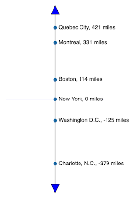
Let's line up some of the major North American cities in terms of miles north or south of New York. I'm going to ignore miles east or west and just focus on north and south. Here's the line on the left. 

As you can see, Quebec City is 421 miles north of New York and Charlotte is 379 miles south.

On this line, where do you think London would appear? How many miles north or south of New York is London? Take a guess before scrolling down and peeking.

Here's the answer: 745 miles north.

That's right, London is way further north than Quebec City. London is actually slightly further north than Calgary. In fact, the UK as a whole is entirely north of the contiguous United States. 

745 miles is a long way north and it has some consequences.


Daylight saving

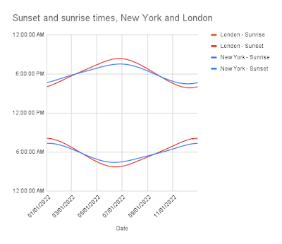
Let's look at sunrise and sunset times and how they vary through the year. In the chart below, I've plotted sunrise and sunset times by month, removing daylight savings time shifts. 

To show the differences a bit more starkly, let's take sunrise and sunset on solstice days:

 Date City Sunrise Sunset Daylight time
         
2022-06-21 London 4:43:09 AM 9:21:41 PM 16h 38m 32s
2022-06-21 New York 5:25:09 AM 8:30:53 PM 15h 5m 44s
         
2022-12-21 London 8:03:52 AM 3:53:45 PM 7h 49m 53s
2022-12-21 New York 7:16:52 AM 4:32:12 PM 9h 15m 20s

That's a big difference. In London in the summer, you can party in daylight until 9pm, by which time in New York, it's gone dark. Conversely, in London in winter, the city is dark by 4pm, while New Yorkers can still enjoy the winter sunshine as they do their Christmas shopping.

On the face of it, it would seem like it's better to spend your summers in London and your winters in New York. If London is so far north of New York, surely New York winters must be better?

Blowing hot and cold

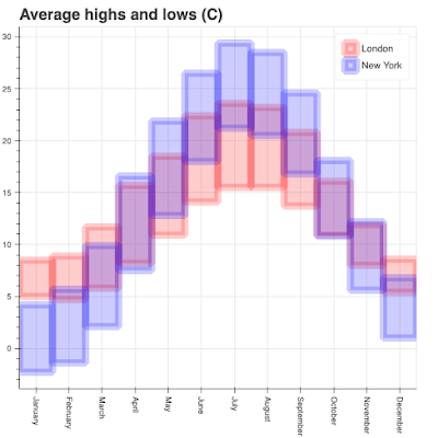
I've plotted the average monthly high and low temperatures for London and New York. London has cooler summers but warmer winters. Is this what you expected?

In winter, Londoners might still enjoy a drink outside, but in New York, this isn't going to happen. People in London don't wear hats in winter, but in New York they do. New Yorkers know how to deal with snow, Londoners don't. In the summer, New Yorkers use A/C to cool down, but Londoners don't even know how to spell it because it rarely gets hot enough to need it.

London's climate, and in fact much of Europe's, is driven by the Gulf Stream. This keeps the UK much warmer than you would expect from its latitude. Of course, the fact the UK is a small island surrounded by lots of water helps moderate the climate too.

The moderate London climate is probably the main reason why people think London and New York are much closer on the north-south axis than they really are.

Climate as an engine of culture

On the face of it, you would think cities with different climates would have different cultures, but New York and London show that's not always the case. These two cities are hundreds of miles apart (north/south) and have noticeably different climates, but they're culturally similar, and obviously, they're both 'world cities'. Perhaps the best we can say about climate is that it drives some features of city life but not the most fundamental ones.