Showing posts with label data visualization. Show all posts

Tuesday, March 3, 2020

Cheating charts: the axes of evil

As you might have guessed from the title, this post is all about how you can play around with chart axes to lie like truth. It's about being evil with axes.

In the Harry Potter books, the children are taught 'Defence Against the Dark Arts' not to teach them how to be evil, but rather to teach them how to defend against evil. I'm using the same approach here; this blog post is about defending yourself against being misleading or being misled.  I'm going to show you ways that people have used chart axes to obscure the truth. But we need to be careful with blame; sometimes, charts are unintentionally deceitful, the author miscommunicated rather than set out to misinform, and sometimes it's a matter of opinion. Read what I have to say and decide for yourself.


(2x2 matrix - an example of evil axes)

Zero axis

In most cases, charts should include zero so as not to mislead about the size of an effect. Let's take house prices in London as our example. UK inflation (CPI) was 1.8% for the twelve months from January 2019 to January 2020, over the same period, London house prices increased 2.8% - not a bad increase, but we can make it look much larger.

Let's start with an honest chart.

It clearly shows a small increase, but it would be hard to get a newspaper headline from it. Imagine you were a newspaper editor and you needed to squeeze a sensationalist story from the data. You need to make the difference appear much bigger, but still have a fig leaf of decency. How can you do it? The simplest way is excluding zero and zooming in.

Imagine that we coupled it with a headline like, 'London Property Market Booms' and had an article with examples of extremely expensive houses and some anecdotes of house buying. If you just glanced at the chart and read the story, you might think the market was growing explosively. This trick works even better if you make the axes text small, reduce their contrast with the background color, or even remove them altogether.

If you're trying to be honest, most of the time, you should include zeros to truly scale the effect and not mislead. But there are exceptions. Sometimes you do want to exclude zero as in the example below.

I have some data on human body temperature over the course of a day, taken from Wikipedia. Here's a chart including zero (as in 0 centigrade).

There really doesn't seem to be much variation does there? It looks like the human body temperature stays more or less constant during the day. In fact, the data looks just like noise. I could flatten the chart further by using degrees Kelvin or even showing a Fahrenheit scale starting from zero. 

When we zoom in and exclude zero, a clearer picture emerges.

Plainly, human body temperature does change during the day. Given the fact that a few degrees difference in body temperature can make the difference between someone who's fine and someone who's in medical danger, the second chart is a better and more honest and useful representation.

If you want to cheat and misrepresent, here's what you should do:

  • If you want to exaggerate a small difference, don't include zero and zoom into your chart to expand the difference.
  • If you want to suppress a difference, include zero and choose units that minimize the difference.

If you want to be honest:

  • Include zero by default.
  • Don't include zero when you're looking at small changes and the changes matter, in this case, exclude zero to focus on the change.

Extending the axis

This is a really fun way to mislead people and it's something I've only seen recently. You can extend the perception of the axis to reduce the effect. Let's use the same election example I used in my blog post on pie (lie) charts. Imagine there are four parties standing in an election and you have a record of what percentage of the vote each candidate and party received. Here's an honest bar chart showing the results.

Plainly, the Bird party did very badly (15% of the vote). Now let's see if we can minimize the scale of their defeat by redrawing the chart in a deceitful way. Let's remove the x-axis, extend the y-axis labels, color and box the labels, and introduce some bar coloring.

It's still obviously a defeat, but we've made it look much smaller. If you take the time to look, it's obvious that something funky is going on here, but most people don't have time and don't look closely.

If you want to be honest, don't play around with axis labels and colors.

Unequal steps

If you want to imply things are getting worse, or better, when they're not, then a good option is to use unequal axis scaling. Most viewers expect that an axis will scale consistently, for example, an axis might be labeled 1, 2, 3, 4, 5, 6, 7, 8, 9, 10  and more sophisticated viewers might be very comfortable with log scales, for example, axis labels 1,10, 100, 1000. Almost no one can interpret what unequal scaling means, which makes it great for evil. To make your deception even better, use a line chart (which implies continuity) rather than a bar chart (which implies category).

Let's take an example that appeared in the media, US gas prices in 2012. The AAA produces a daily set of gas price data. This has today's price, yesterday's price, last week's price, last month's price, and last year's price. It's not the greatest presentation of data and it's hard to pick out trends, but at least the data exists - and more importantly, they don't chart it. In 2012, a US media outlet (who shall remain nameless) took the data and ran a story on gas price increases under Obama. Here's my version of their chart.


At a quick glance, it looks like there was a massive increase. But was there? The periods on the x-axis aren't equal and they've used a line to indicate a continuous variable. The AAA data quotes last month's number, but that isn't shown here, why? The y axis starts at $2.80 which is an odd choice, more rational choices might have been $3.00 or $0. If you take the time to look at the chart, it's really hard to draw any conclusions, but most people don't have the time and will just conclude 'gas prices up under Obama'.

If you really want to mislead, use unequal scaling and a line chart.

Scale inversion

If you really, really want to mislead, choose a scale inversion. 

I'm going to show you one of the most controversial charts of the last ten years. The author has vigorously defended their work, and after reading their comments, I understand that they had no intention to deceive. Because I don't wish to make the author's life more difficult, I'm not going to name them or give you their employer's name.

The chart below shows homicides in Florida and what happened when the 'Stand Your Ground' Law was enacted. Before reading on, how would you interpret the chart?


Almost everyone I've spoken to interprets the chart as implying that homicides went down. But look at the y axis. It's inverted. Here's how the plot would look if the author had chosen normal scaling.


This conveys a hugely different message.

The author wasn't trying to mislead here, rather they were trying to use art to make a more emotionally informative representation of the data. You can judge for yourself whether they succeeded or not. This raises the more general topic of who is visualizing data and how it's done. 

In the last few years, there's been a tremendous rise in the use of infographics for all kinds of topics. These tend to be more poster art than information sharing, which leads us to a problem. In the information world, a large number of informal practices have grown up around how to display data in a truthful way. Infographics are sometimes created by people familiar with these practices, but sometimes not. When designers start using artist interpretation to make data more impactful, we can get distortions and unintentionally misleading people. Personally, I think infographics are little more than visual fluff.

Getting back to where I started in this section, scale inversion is a wonderful way of reversing the evidence.

Log plots

This isn't so much deceit as obfuscation or confusion.  

A logarithmic scale is one that varies logarithmically, so instead of an axis increasing like 1,2,3,4,5, it increases like 1, 10, 100, 1000, 10000. Logarithmic scales are used when data varies by orders of magnitude. 

Unfortunately, many viewers aren't familiar with the idea and it can be hard to interpret, a good example being the recent coronavirus chart in a New York Times article. Here's the chart:


(Imaged credit: New York Times, copyright New York Times)

The logarithmic axis is the y axis. What conclusions would you draw about the coronavirus from this chart? I've used log plots for years and I struggled to understand what this chart means. 

2x2 charts

2x2 charts are a special case of confusion with axis. Unfortunately, they're beloved of MBA courses and books on management and marketing. Let's take the classic BCG product matrix as an example. In the 1960s, the consulting company BCG came up with a way for companies to view their product portfolio and make more rational product investment decisions. They recommended plotting market share on the x-axis, growth on the y axis, and dividing the plot into four quadrants, each with a name, you can read more about it here. Here's a representation of their matrix.

Note that although the axes are marked, there's no scale and it's not clear where the quadrant lines are drawn. In practice, companies using this methodology may well draw scales, but in almost all cases you find on the internet, there are no scales.

The BCG matrix is just one of a large number of 2x2 matrices you can find out there. Very few of them have any kind of scale, so it's very hard to understand and interpret what they mean in practice. Bear in mind that they often imply quite different management choices for different chart quadrants, but who's in what quadrant may depend on exactly where the quadrant boundaries are drawn, and that's almost never made clear. It's really tempting to say that you need to employ consultants to tell you what they mean and to interpret the charts for you.

I'm not a fan of 2x2 matrices because I find that they confuse rather than enlighten, but if you want to produce a chart that looks pretty and requires you to interpret it for your management, a 2x2 matrix might well be the place to go.

You can fool all the people some of the time and some of the people all the time

If you know what you're looking for, you can see through deceit or malpractice with some effort. But if you're in a hurry, not paying attention, or a chart is flashed on the screen for a short period of time, a chart with evil axes will probably slip by your defenses against the dark arts.

In many ways, playing around with chart axes is one of the easiest ways to mislead people. I've shown you how people have been evil with axes in the hope that you'll be truthful and honest in your own visualizations.

I'd love to hear what you think about the 'axes of evil'. Have you come across other axis manipulations that I haven't included here?

Thursday, February 27, 2020

Pie charts are lie charts

There are lots of chart types, but if you want to lie or mislead people, the best chart to use is the pie chart. I’m going to show you how to distort reality with pie charts, not so you can be a liar, but so you know never to use pie charts and to choose more honest visualizations.

Let's start with the one positive thing I know about pie charts: they're called camembert charts in France and cake charts in Germany. On balance, I prefer the French term, but we're probably stuck with the English term. Unlike camembert, pie charts often leave a bad taste in my mouth and I'll show you why.


(Camembert cheese - image credit: Coyau, Wikipedia - license : Creative Commons)

Take a look at the pie chart below. Can you put the six slices in order from largest to smallest? What percentages do you think the slices represent?


Here’s how I’ve misled you:

  • Offset the slices from the 12 o’clock position to make size comparison harder. I've robbed you of the convenient 'clock face' frame of reference.
  • Not put the slices in order (largest to smallest). Humans are bad at judging the relative sizes of areas and by playing with the order, I'm making it even harder.
  • Not labeled the slices. This ought to be standard practice, but shockingly often isn't.
The actual percentages are:
Gray20.9
Green17.5
Light blue16.8
Dark blue16.1
Yellow15.4
Orange13.3

How close were you? How good was my attempt to deceive you?

Let’s use a bar chart to represent the same data.


Simple, clear, unambiguous.

I've read guidance that suggests you should only use a pie chart if you're showing two quantities that are obviously unequal. This gives the so-called pac-man pie charts. Even here, I think there are better representations, and our old-friend the bar chart would work better (albeit less interestingly).


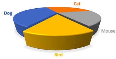
Now let’s look at the king of deceptive practices, the 3d pie chart. This one is great because you can thoroughly mislead while still claiming to be honest. I’m going to work through a short deceptive example.

Let’s imagine there are four political parties standing in an election. The percentage results are below.
Dog36
Cat28
Mouse21
Bird15

You work for Bird, which unfortunately got the lowest share of the vote. Your job is to deceive the electorate into thinking Bird did much better than they did.

You can obscure the result by showing it as a pie chart without number labels. You can even mute the opposition colors to fool the eye. But you can go one better. You can create a 3d pie chart with shifted perspective and 'point explosion' using the data I gave above like so.

Here's what I did to create the chart:

  • Took the data above as my starting point and created a pie chart.
  • Rotated the chart so my slice was at the bottom.
  • Made the pie chart 3d.
  • Changed the perspective to emphasize my party.
  • Used 'point explosion' to pull my slice out of the main body of the chart to emphasize it.
  • Used shading.

This now makes it look like Bird was a serious contender in the election. The fraction of the chart area taken up with the Bird party’s color is completely disproportionate to their voter share. But you can claim honesty because the slice is still the correct proportion if the chart was viewed from above. If challenged, you can turn it into a technical/academic debate about data visualization that will turn off most people and make your opponents sound like they’re nit-picking.

You don’t have to go this far to mislead with a pie chart. All you have to do is increase the cognitive burden to interpret a chart. Some, maybe even all, of your audience might not spot what you’re trying to hide because they’re in a hurry. You can mislead some of your audience all of the time.

I want to be clear, I'm telling you about these deceptive practices so you can avoid them. There are good reasons why honest analysts don’t use pie charts. In fact, I would go one stage further; if you see a pie chart, be on your guard against dishonesty. As one of my colleagues used to say, ‘friends don’t let friends use pie charts’.

Tuesday, January 28, 2020

Future directions for Python visualization software

The Python charting ecosystem is highly fragmented and still lags behind R, it also lacks some of the features of paid-for BI tools like Tableau or Qlik. However, things are slowly changing and the situation may be much better in a few years' time.


Theoretically, the ‘grammar of graphics’ approach has been a substantial influence on visualization software. The concept was introduced in 1999 by Leland Wilkinson in a landmark book and gained widespread attention through Hadley Wickham’s development of ggplot2  The core idea is that a visualization can be represented as different layers within a framework, with rules governing the relationship between layers. 

Bokeh was influenced by the 'grammar of graphics' concept as were other Python charting libraries. The Vega project seeks to take the idea of the grammar of graphics further and creates a grammar to specify visualizations independent of the visualization backend module. Building on Vega, the Altair project is a visualization library that offers a different approach from Bokeh to build charts. It’s clear that the grammar of graphics approach has become central to Python charting software.

If the legion of charting libraries is a negative, the fact that they are (mostly) built on the same ideas offers some hope for the future. There’s a movement to convergence by providing an abstraction layer above the individual libraries like Bokeh or Matplotlib. In the Python world, there’s precedence for this; the database API provides an abstraction layer above the various Python database libraries. Currently, the Panel project and HoloViews are offering abstraction layers for visualization, though there are discussions of a more unified approach.

My take is, the Python world is suffering from having a confusing array of charting library choices which splits the available open-source development efforts across too many projects, and of course, it confuses users. The effort to provide higher-level abstractions is a good idea and will probably result in fewer underlying charting libraries, however, stable and reliable abstraction libraries are probably a few years off. If you have to produce results today, you’re left with choosing a library now.

The big gap between Python and BI tools like Tableau and Qlik is the ease of deployment and speed of development. BI tools reduce the skill level to build apps, deploy them to servers, and manage tasks like access control. Projects like Holoviews may evolve to make chart building easier, but there are still no good, easy, and automated deployment solutions. However, some of the component parts for easier deployment exist, for example, Docker, and it’s not hard to imagine the open-source community moving its attention to deployment and management once the various widget and charting issues of visualization have been solved.

Will the Python ecosystem evolve to be as good as R’s and be good enough to take on BI tools? Probably, but not for a few years. In my view, this evolution will happen slowly and in public (e.g. talks at PyCon, SciPy etc.). The good news for developers is, there will be plenty of time to adapt to these changes.

Saturday, January 25, 2020

How to lie with statistics

I recently re-read Darrell Huff's classic text from 1954, 'How to lie with statistics'. In case you haven't read it, the book takes a number of deceitful statistical tricks of the trade and explains how they work and how to defend yourself from being hoodwinked. My overwhelming thought was 'plus ça change'; the more things change, the more they remain the same. The statistical tricks people used to mislead 50 years ago are still being used today.


(Image credit: Wikipedia)

Huff discusses surveys and how very common methodology flaws can produce completely misleading results. His discussion of sampling methodologies and the problems with them are clear and unfortunately, still relevant. Making your sample representative is a perennial problem as the polling for the 2016 Presidential election showed. Years ago, I was a market researcher conducting interviews on the street and Huff's bias comments rang very true with me - I faced these problems on a daily basis. In my experience, even people with a very good statistical education aren't aware of survey flaws and sources of bias.

The chapter on averages still holds up. Huff shows how the mean can be distorted and why the median might be a better choice. I've interviewed people with Master's degrees in statistics who couldn't explain why the median might be a better choice of average than the mean, so I guess there's still a need for the lesson.

One area where I think things have moved in the right direction is the decreasing use of some types of misleading charts. Huff discusses the use of images to convey quantitative information. He shows a chart where steel production was represented by images of a blast furnace (see below). The increase in production was 50%, but because the height and width were both increased, the area consumed by the images increases by 150%, giving the overall impression of a 150% increase in production1. I used to see a lot of these types of image-based charts, but their use has declined over the years. It would be nice to think Huff had some effect.


(Image credit: How to lie with statistics)

Staying with charts, his discussion about selecting axis ranges to mislead still holds true and there are numerous examples of people using this technique to mislead every day. I might write a blog post about this at some point.

He has chapters on the post hoc fallacy (confusing correlation and causation) and has a nice explanation of how percentages are regularly mishandled. His discussion of general statistical deceitfulness is clear and still relevant.

Unfortunately, the book hasn't aged very well in other aspects. 2020 readers will find his language sexist, the jokey drawings of a smoking baby are jarring, and his roundabout discussion of the Kinsey Reports feels odd. Even the writing style is out of date.

Huff himself is tainted; he was funded by the tobacco industry to speak out against smoking as a cause of cancer. He even wrote a follow-up book, How to lie with smoking statistics to debunk anti-smoking data. Unfortunately, his source of authority was the widespread success of How to lie with statistics. How to lie with smoking statistics isn't available commercially anymore, but you can read about it on Alex Reinhart's page.

Despite all its flaws, I recommend you read this book. It's a quick read and it'll give you a grounding in many of the problems of statistical analysis. If you're a business person, I strongly recommend it - its lessons about cautiously interpreting analysis still hold.

This is a flawed book by a flawed author but it still has a lot of value. I couldn't help thinking that the time is probably right for a new popular book on how people are lying and misleading you using charts and statistics.

Correction

[1] Colin Warwick pointed out an error in my original text. My original text stated the height and width of the second chart increased by 50%. That's not quite what Huff said. I've corrected my post.

Wednesday, January 22, 2020

The Python plotting ecosystem

Python’s advance as a data processing language had been hampered by its lack of good quality chart visualization libraries, especially compared to R with its ggplot2 and Shiny packages. By any measure, ggplot2 is a superb package that can produce stunning, publication-quality charts. R’s advance has also been helped by Shiny, a package that enables users to build web apps from R, in effect allowing developers to create Business Intelligence (BI) apps. Beyond the analytics world, the D3 visualization library in JavaScript has had an impact on more than the JavaScript community; it provides an outstanding example of what you can do with graphics in the browser (if you get time check out some of the great D3 visualization examples). Compared to D3, ggplot2, and Shiny, Python’s visualization options still lag behind, though things have evolved in the last few years.


(An example Bokeh application. Multi-tabbed, widgets, chart.)

Matplotlib is the granddaddy of chart visualization in Python, it offers most of the functionality you might want and is available with almost every Python distribution. Unfortunately, its longevity is also its problem. Matplotlib was originally based on MATLAB’s charting features, which were in turn developed in the 1980’s. Matplotlib's longevity has left it with an awkward interface and some substantially out-of-date defaults. In recent years, the Matplotlib team has updated some of their visual defaults and offered new templates that make Matplotlib charts less old-fashioned, however, the library is still oriented towards non-interactive charts and its interface still leaves much to be desired.

Seaborn sits on top of Matplotlib and provides a much more up-to-date interface and visualization defaults. If all you need is a non-interactive plot, Seaborn may well be a good option; you can produce high-quality plots in a rational way and there are many good tutorials out there.

Plotly provides static chart visualizations too, but goes a step further and offers interactivity and the ability to build apps. There are some great examples of Plotly visualizations and apps on the web. However, Plotly is a paid-for solution; you can do most of what you want with the free tier, but you may run into cases where you need to purchase additional services or features.

Altair is another plotting library for Python based on the 'grammar of graphics’ concept and the Vega project. Altair has some good features, but in my view, it isn’t as complete as Bokeh for business analytics.

Bokeh is an ambitious attempt to offer D3 and ggplot2-like charts plus interactivity, with visualizations rendered in a browser, all in an open-source and free project. Interactivity here means having tools to zoom into a chart or move around in the chart, and it means the ability to create (browser-based) apps with widgets (like dropdown menus) similar to Shiny. It’s possible to create chart-based applications and deploy them via a web server, all within the Bokeh framework. The downside is, the library is under active development and therefore still changing; some applications I developed a year ago no longer work properly with the latest versions. Having said all that, Bokeh is robust enough for commercial use today, which is why I’ve chosen it for most of my visualization work.

Holoviews sits on top of Bokeh (and other plotting engines) and offers a higher-level interface to build charts using less coding.

It’s very apparent that the browser is becoming the default visualization vehicle for Python. This means I need to mention Flask, a web framework for Python. Although Bokeh has a lot of functionality for building apps, if you want to build a web application that has forms and other typical features of web applications, you should use Flask and embed your Bokeh charts within it.

If you’re confused by the various plotting options, you’re not alone. Making sense of the Python visualization ecosystem can be very hard, and it can be even harder to choose a visualization library. I looked at the various options and chose Bokeh because I work in business and it offered a more complete and reliable solution for my business needs. In a future blog post, I'll give my view of where things are going for Python visualization.

Saturday, January 11, 2020

Choropleth maps - pretty but misleading

Pretty, but misleading

You see choropleth maps everywhere: on websites, on the TV news, and in applications. They’re very pretty, they appeal to our sense of geography, but they can be horribly misleading. I’m going to show you why that’s the case and show you ways designers have sought to get around their problems.

What's a choropleth map?

A choropleth map is a geographic map with regions colored according to some criteria. A great example is election maps used in US Presidential elections. Each of the states is colored according to the party that won the state. Here’s an example result from a US Presidential election. Can you see what the problem is?


(Image Credit: adapted from Wikipedia.)

Looking at the map, who do you think won the election (I’m deliberately not telling you which election)? Do you think this election was a close one?

The trouble is, the US population density varies considerably from state to state, as does the number of Electoral College votes. In 2020, Rhode Island will have 4 Electoral College votes compared to Montana’s 3, but Montana is 120 times larger on the map. If you just glance at most US Presidential election choropleth maps, it looks like the Republican candidate won, even when he didn’t. The reason is the geographically large rural states are mostly Republican but have few Electoral College votes because their populations are relatively low. So the election choropleth map looks mostly red. Our natural tendency is to assume more ink = more important, but the choropleth map breaks this relationship giving a misleading representation.

By the way, the map I showed you is from the 1976 election, in which Jimmy Carter won 267 Electoral College votes to Gerard Ford's 240 (24 states to 27). Did you get who won from the map? Did you get the size of the victory?

Let’s take another example, the 2014 Scottish Independence referendum. Here’s the result by council area (local government area), pink for remain, green for independence. In this case, the remainers won, but what do you think the margin was? Was it close?

Despite the choropleth map’s overwhelming remain coloring, the actual result was 55%-45%. It looks like an overwhelming remain victory because the Scottish population is concentrated in a few areas. As in the US, there are large rural areas with few people that take up large amounts of chart space, exaggerating their level of importance.

Cartograms

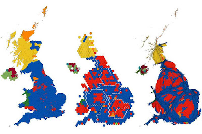
Can we somehow represent data using some kind of map in a more proportional way? Cartograms distort the underlying geography to better represent some underlying variable. There’s a great example on the Geographical.co.uk website for the UK 2019 general election.


(Image credit: geographical.co.uk - taken from the article: http://geographical.co.uk/geopolitics/geopolitics/item/3557-ukge2019)

The chart on the left is a straight-up choropleth map of the UK by parliamentary constituency - note that constituencies have roughly equal populations but can have very different geographical areas. Blue is a Conservative parliamentary seat, yellow is SNP, orange is Liberal Democrat and red is Labour.  The result was a decisive Conservative victory, but the choropleth map makes it look like a wipeout, which it wasn't. The middle chart makes each parliamentary constituency the same size on the page (actually hexagons for reasons I won't go into). Rural areas are shrunk and urban areas (especially London) are greatly expanded. The cartogram shows a much fairer, and in my view, more reasonable representation of the result. The chart on the right is a 'gridded population cartogram' that sizes each constituency by the number of people living in it. There are several of these maps on the web, but frankly, I've never been able to make much sense of them.

Cartograms in the house of mirrors

Mark Newman at the University of Michigan has a site presenting the 2016 US Presidential election as cartograms which is worth a look. Here's his map scaling the states to their Electoral College votes. Because the proportion of red and blue ink follows the Electoral College votes, the cartogram gives a fairer representation of the result (I find this representation easier to understand than the 2019 UK election result in the third chart above.).


An alternative approach is to use hexagons to represent the result:


The hexagon representation has become much more popular in recent years, leading to designers calling this kind of chart a hexagram. As you might have guessed, on the whole, I prefer this type of cartogram.

All this is great in theory, but in practice there are problems. Hexagrams are great, but they're still unfamiliar to many users and might require explanation. They can also distort geography, reducing the display's usefulness, for example, can you easily identify Utah on the 2016 US Presidential hexagram above? Most packages and modules that display data don't yet come with out-of-the-box cartograms, meaning developers have to create something from scratch, which takes more effort.

What I do

Here's my approach: use choropleth maps for planning and hexagrams or other charts to represent quantitative results. Planning usually involves some sense of geography, for example, territory allocation in sales, in this case, a choropleth map can be useful because of its close ties to the underlying geography. To represent quantitative information (like election results), I prefer bar charts or other traditional charts. If you want something that's more geographical, I recommend some form of hexagram, but with the warning that you might have to build it yourself which can be very time-consuming.

Finding out more

Danny Dorling has written extensively about cartograms and I recommend his website: http://www.dannydorling.org/
The WorldMapper website presents lots of examples of cartograms using social and political data: https://worldmapper.org/