Thursday, February 27, 2020

Pie charts are lie charts

There are lots of chart types, but if you want to lie or mislead people, the best chart to use is the pie chart. I’m going to show you how to distort reality with pie charts, not so you can be a liar, but so you know never to use pie charts and to choose more honest visualizations.

Let's start with the one positive thing I know about pie charts: they're called camembert charts in France and cake charts in Germany. On balance, I prefer the French term, but we're probably stuck with the English term. Unlike camembert, pie charts often leave a bad taste in my mouth and I'll show you why.


(Camembert cheese - image credit: Coyau, Wikipedia - license : Creative Commons)

Take a look at the pie chart below. Can you put the six slices in order from largest to smallest? What percentages do you think the slices represent?


Here’s how I’ve misled you:

  • Offset the slices from the 12 o’clock position to make size comparison harder. I've robbed you of the convenient 'clock face' frame of reference.
  • Not put the slices in order (largest to smallest). Humans are bad at judging the relative sizes of areas and by playing with the order, I'm making it even harder.
  • Not labeled the slices. This ought to be standard practice, but shockingly often isn't.
The actual percentages are:
Gray20.9
Green17.5
Light blue16.8
Dark blue16.1
Yellow15.4
Orange13.3

How close were you? How good was my attempt to deceive you?

Let’s use a bar chart to represent the same data.


Simple, clear, unambiguous.

I've read guidance that suggests you should only use a pie chart if you're showing two quantities that are obviously unequal. This gives the so-called pac-man pie charts. Even here, I think there are better representations, and our old-friend the bar chart would work better (albeit less interestingly).


Now let’s look at the king of deceptive practices, the 3d pie chart. This one is great because you can thoroughly mislead while still claiming to be honest. I’m going to work through a short deceptive example.

Let’s imagine there are four political parties standing in an election. The percentage results are below.
Dog36
Cat28
Mouse21
Bird15

You work for Bird, which unfortunately got the lowest share of the vote. Your job is to deceive the electorate into thinking Bird did much better than they did.

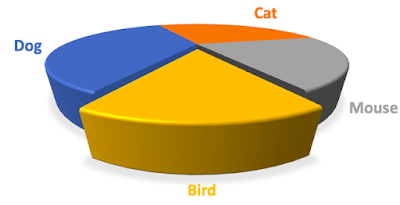
You can obscure the result by showing it as a pie chart without number labels. You can even mute the opposition colors to fool the eye. But you can go one better. You can create a 3d pie chart with shifted perspective and 'point explosion' using the data I gave above like so.

Here's what I did to create the chart:

  • Took the data above as my starting point and created a pie chart.
  • Rotated the chart so my slice was at the bottom.
  • Made the pie chart 3d.
  • Changed the perspective to emphasize my party.
  • Used 'point explosion' to pull my slice out of the main body of the chart to emphasize it.
  • Used shading.

This now makes it look like Bird was a serious contender in the election. The fraction of the chart area taken up with the Bird party’s color is completely disproportionate to their voter share. But you can claim honesty because the slice is still the correct proportion if the chart was viewed from above. If challenged, you can turn it into a technical/academic debate about data visualization that will turn off most people and make your opponents sound like they’re nit-picking.

You don’t have to go this far to mislead with a pie chart. All you have to do is increase the cognitive burden to interpret a chart. Some, maybe even all, of your audience might not spot what you’re trying to hide because they’re in a hurry. You can mislead some of your audience all of the time.

I want to be clear, I'm telling you about these deceptive practices so you can avoid them. There are good reasons why honest analysts don’t use pie charts. In fact, I would go one stage further; if you see a pie chart, be on your guard against dishonesty. As one of my colleagues used to say, ‘friends don’t let friends use pie charts’.

Tuesday, February 25, 2020

What I learned from a day in the woods

Leadership in the woods

A few years ago, I went on a one-day leadership course outdoors. We did various team-building and leadership activities, all based on outdoor exercises. I gained something from the experience, but there were positives and negatives. I would send people on a similar course, but with reservations. Here’s what happened, what I got out of it, and what I would do differently.

The woods
(Image credit: Mike Woodward, copyright Mike Woodward)

What happened

The group of us that did this course were all employees of the same company, company X, but from different departments. Some of us worked together occasionally, others did not. We knew one another, just not very well. The goal of the course was to prepare us for leadership positions.

The course took place at a facility in the countryside, not too far from civilization. This definitely wasn't an extreme survival course; the worst survival hardship was getting the wrong sandwich at lunchtime.

Once we'd all arrived, we were briefed on the day, split into groups, and given exercises to do on outdoor equipment. Before each exercise, we were informed of its purpose, and instructors helped us through it. 

One exercise was walking across a log suspended about 5m in the air; all perfectly safe because we wore harnesses and helmets etc. The instructor said the point of the exercise was to face fear and uncertainty and move forward with the support of the team. The team was encouraged to shout positive things to the person walking across; but nothing that might cause them to fall! However, the main instructor left halfway through, leaving us with more junior staff who focused on safety and didn’t reinforce the message about teamwork and support. 

In another exercise, we were led around blindfolded to build trust. 

The rest of the day went on in a similar vein, with similar exercises, and we had a debriefing session at the end of it.

What happened afterwards

I liked the program a lot and I took the message to heart about teamwork and support. Some months later, I faced a business decision that made me very nervous. I thought about my experience walking the log 5m in the air, and I went forward with my decision with more confidence (if I can do that, I can do this). However, my log walking boost wore off after about a year. Overall, the gains I made from the course only lasted for about twelve months.

Smaller, but not insignificant benefits of the whole thing for me were a day out of the office and the sense that my employer was investing in me.

There was a major problem with the day though; some people absolutely hated it. They hated the exercises, they hated having people watch them fail, and they hated the whole idea of running around in the woods; they got nothing out of the day. Bear in mind, this kind of group physical activity may bring back painful school memories for some people, and this is what happened when I was there. There was just too much baggage to learn. Although I felt good about the course, some people felt worse about the company for making them go and I'm sympathetic to their position. Did this make them less suitable as managers? I don’t think so.

Lessons learned

Would I spend corporate money to run an event like this again? Yes, but with reservations.
  • I would consider very carefully people’s objections to these kinds of events. I would not coerce anyone to go. If there were a number of people firmly opposed, I would try and find something else. 
  • I would consider disabled access very carefully. If someone on the team was a wheelchair user, for example, I would execute the program in an inclusive way, if at all.
  • I would make sure the teamwork and leadership message was reinforced all the time. There would be a briefing before the day, and afterward. 
  • I would schedule something like this once every year or two to reinforce the learning.

There are things to learn from a day in the woods, but maybe not everyone learns the same things.

Saturday, February 22, 2020

The Monty Hall Problem

Everyone thinks they understand probability, but every so often, something comes along that shows that maybe you don’t actually understand it at all. The Monty Hall problem is a great example of something that seems very counterintuitive and teaches us to be very wary of "common sense".

The problem got its fame from a 1990 column written by Marilyn vos Savant in Parade magazine. She posed the problem and provided the solution, but the solution seemed so counterintuitive that several math professors and many PhDs wrote to her saying she was incorrect. The discussion was so intense, it even reached the pages of the New York Times. But vos Savant was indeed correct.


(Monty Hall left (1976) - image credit: ABC Television - source Wikimedia Commons, no known copyright, Marilyn vos Savant right (2017) - image credit: Nathan Hill via Wikimedia Commons - Creative Commons License.  Note: the reason why the photos are from different years/ages is the availability of open-source images.)

The problem is loosely based on a real person and a real quiz show. In the US, there’s a long-running quiz show called ‘Let’s make a deal’, and its host for many years was Monty Hall, in whose honor the problem is named. Monty Hall was aware of the fame of the problem and had some interesting things to say about it.

Vos Savant posed the Monty Hall problem in this form:

  • A quiz show host shows a contestant three doors. Behind two of them is a goat and behind one of them is a car. The goal is to win the car.
  • The host asked the contestant to choose a door, but not open it.
  • Once the contestant has chosen a door, the host opens one of the other doors and shows the contestant a goat. The contestant now knows that there’s a goat behind that door, but he or she doesn’t know which of the other two doors the car’s behind.
  • Here’s the key question: the host asks the contestant "do you want to change doors?".
  • Once the contestant decided whether to switch or not, the host opens the contestant's chosen door and the contestant wins the car or a goat.
  • Should the contestant change doors when asked by the host? Why?

What do you think the probability of winning is if the contestant does not change doors? What do you think the probability of winning is if they do?

Here are the results.

  • If the contestant sticks with their choice, they have a ⅓ chance of winning.
  • If the contestant changes doors, they have a ⅔ chance of winning.

What?

This is probably not what you expected, so let’s investigate what’s going on.

I’m going to start with a really simple version of the game. The host shows me three doors and asks me to choose one. There’s a ⅓ probability of the car being behind my door and ⅔ probability of the car being behind the other two doors.

Now, let’s add in the host opening one of the other doors I haven’t chosen, showing me a goat, and asking me if I want to change doors. If I don’t change doors, the probability of me winning is ⅓ because I haven’t taken into account the extra information the host has given me.

What happens if I change my strategy? When I made my initial choice of doors, there was a ⅔ probability the car was behind one of the other two doors. That can't change. Whatever happens, there are still three doors and the car must be behind one of them. There’s a ⅔ probability that the car is behind one of the two doors.

Here’s where the magic happens. When the host opens a door and shows me a goat, there’s now a 0 probability that the car’s behind that door. But there was a ⅔ probability the car was behind one of the two doors before, so this must mean there’s a ⅔ probability the car is behind the remaining door!

There are more formal proofs of the correctness of this solution, but I won’t go into them here. For those of you into Bayes theorem, there’s a really nice formal proof.

I know some of you are probably completely unconvinced. I was at first too. Years ago, I wrote a simulator and did 1,000,000 simulations of the game. Guess what? Sticking gave a ⅓ probability and changing gave a ⅔ probability. You don’t even have to write a simulator anymore, there are many websites offering simulations of the game so you can try different strategies.

If you want to investigate the problem in-depth, read Rosenhouse's book. It's 174 pages on this problem alone, covering the media furor, basic probability theory, Bayes theory, and various variations of the game. It pretty much beats the problem to death.

The Monty Hall problem is a fun problem, but it does serve to illustrate a more serious point. Probability theory is often much more complex than it first appears and the truth can be counter-intuitive. The problem teaches us humility. If you’re making business decisions on multiple probabilities, are you sure you’ve correctly worked out the odds?

References

  • The Wikipedia article on the Monty Hall problem is a great place to start.
  • New York Times article about the 1990 furor with some background on the problem.
  • Washington Post article on the problem.
  • 'The Monty Hall Problem', Jason Rosenhouse - is an entire book on various aspects of the problem. It's 174 pages long but still doesn't go into some aspects of it (e.g. the quantum variation).

Wednesday, February 19, 2020

Urban myths are poor motivators

Getting people to work harder by lying to them

I like motivational stories. Hearing about how people overcame adversity and achieved success or redemption can be inspiring. But there can be a problem with using stories as motivators; some of them aren't true. I'm going to look at one such motivational story that's common on the internet, describe its old and modern forms, and take it to pieces. Let's start with the original version of the story.

The original fake story - Christopher Wren and the bricklayers


(Sir Christopher Wren. Image credit: Wellcome Images Wikimedia Commons, Creative Commons License)

Sir Christopher Wren was one of the greatest English architects. He was commissioned to design a replacement for St Paul's Cathedral which was burned to the ground in the devastating 1666 Great Fire of London. So far, all of this is well-established history.

The story goes that Sir Christopher was inspecting the construction work one day when he met three bricklayers. He asked them what they were doing.

The first bricklayer said, "I'm laying bricks. I'm doing it to feed my family."

The second bricklayer said, "I'm a builder. I'm doing it because I'm proud of my work."

The third bricklayer said, with a gleam in his eye, "I'm building a cathedral that will last a thousand years and be a wonder for the ages".

Some versions of the story stop here, other versions make the third bricklayer a future manager, or the most productive, or give him some other desirable property.

The story is meant to inspire people to see the bigger picture and feel motivated about being something larger than themselves. Plainly, the listener is expected to identify with the third bricklayer. But there are two problems with the story: internal and external.

Children's stories are for children

In many versions of the story, it doesn't say who was the better bricklayer. Even if the third bricklayer was the best, or a future manager, or some other good thing, was this because of his vision, or was it a coincidence? Was the third bricklayer being inspirational or was he trying to curry favor with Sir Christopher?

It seems astonishingly unlikely that in 1671, on the basis of a single conversation, anyone would record bricklayer productivity or future career trajectory. Maybe Sir Christopher was so motivated by the third bricklayer that he did both.

The most important problem with this story is the veracity. I couldn't find this story in any biography of Sir Christopher Wren or any academic writing about his life. With some internet sleuthing, I found what appears to be the first occurrence of this story in a 1927 religious inspirational book (''What can a man believe?" [Barton]). The book gives no reference for the story's provenance.

To put it bluntly: this story was probably made up and doesn't stand up to any scrutiny.

A made-up story about a janitor

There's a more modern version of this story, this time set in the 1960s. President Kennedy was visiting a NASA establishment where he saw a janitor sweeping the floor. The President asked the janitor what he was doing and the janitor said "I'm helping put a man on the moon". Once again, there's no evidence that this ever happened.

The odd thing about the moon landing story is there are very well-documented examples of NASA staff commenting on how motivated they felt [Wiseman]. The flip side is, there's the well-known fact that many were so motivated to work long hours to achieve the moon landing that their marriages ended or they turned to alcohol [Rose]. Leaving aside the negative effects, it's easy to find verifiable quotes that tell the same story as the fake janitor story, so why use something untrue when the truth doesn't take much more effort?

'I can motivate people by telling them fairy stories'

Most of the power of motivational stories relies on their basis in truth. If I told you stories to motivate you and then admitted that they probably weren't true, do you think my coaching would be successful? What if I told you a motivational story that I told you was true, but you later found out was made up, would it undermine my credibility?

There are great and true stories of success, redemption, leadership, and sacrifice that you can use to inspire yourself and others. I'm in favor of using true stories, but I'm against using made-up stories because it undermines my leadership, and frankly, it's an insult to the intelligence of my team.

References

[Barton] "What can a man believe?", Bruce Barton, 1927
[Rose] https://historycollection.jsc.nasa.gov/JSCHistoryPortal/history/oral_histories/RoseRG/RoseRG_11-8-99.htm
[Wiseman] "Moonshot: What Landing a Man on the Moon Teaches Us About Collaboration, Creativity, and the Mind-set for Success", Richard Wiseman

Sunday, February 16, 2020

Coin tossing: more interesting than you thought

Are the books right about coin tossing?

Almost every probability book and course starts with simple coin-tossing examples, but how do we know that the books are right? Has anyone tossed coins several thousand times to see what happens? Does coin-tossing actually have any relevance to business? (Spoiler alert: yes it does.) Coin tossing is boring, time-consuming, and badly paid, so there are two groups of people ideally suited to do it: prisoners and students.


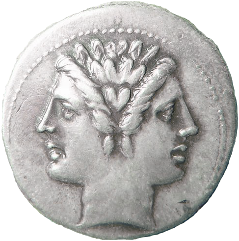
(A Janus coin. Image credit: Wikimedia Commons. Public domain.)

Prisoner of war

John Kerrich was an English/South African mathematician who went to visit in-laws in Copenhagen, Denmark. Unfortunately, he was there in April 1940 when the Nazis invaded. He was promptly rounded up as an enemy national and spent the next five years in an internment camp in Jutland. Being a mathematician, he used the time well and conducted a series of probability experiments that he published after the War [Kerrich]. One of these experiments was tossing a coin 10,000 times. The results of the first 2,000 coin tosses are easily available on Stack Overflow and elsewhere, but I've not been able to find all 10,000, except in outline form.

We’re going to look at the cumulative mean of Kerrich’s data. To get this, we’ll score a head as 1 and a tail as 0. The cumulative mean is the cumulative mean of all scores we’ve seen so far; if after 100 tosses there are 55 heads then it’s 0.55 and so on. Of course, we expect to go to 0.5 ‘in the long run’, but how long is the long run? Here’s a plot of Kerrich’s data for the first 2,000 tosses

(Kerrich's coin-flipping data up to 2,000 tosses.)

I don’t have all of Kerrich’s tossing data for individual tosses, but I do have his cumulative mean results at different numbers of tosses, which I’ve reproduced below.

Number of tosses Mean Confidence interval (±)
100.40.303
200.50.219
300.5660.177
400.5250.155
500.50.139
600.4830.126
700.4570.117
800.4370.109
900.4440.103
1000.440.097
2000.490.069
3000.4860.057
4000.4980.049
5000.510.044
6000.520.040
7000.5260.037
8000.5160.035
9000.5090.033
10900.4610.030
20000.5070.022
30000.5030.018
40000.5070.015
50000.5070.014
60000.5020.013
70000.5020.012
80000.5040.011
90000.5040.010
100000.50670.009

Do you find something surprising in these results? There are at least two things I constantly need to remind myself when I’m analyzing A/B test results and simple coin-tossing serves as a good wake-up call.

The first piece is how many tosses you need to do to get reliable results. I won’t go into probability theory too much here, but suffice to say, we usually quote a range, called the confidence interval, to describe our level of certainty in a result. So a statistician won’t say 0.5, they’d say 0.5 +/- 0.04. You can unpack this to mean “I don’t know the number exactly, but I’m 95% sure it lies in the range 0.46 to 0.54”. It’s quite easy to calculate a confidence interval for an unbiased coin for different numbers of tosses. I've put the confidence interval in the table above.

The second piece is the structure of the results. Naively, you might have thought the cumulative mean would smoothly approach 0.5, but it doesn’t. The chart above shows a ‘blip’ around 100 where the results seem to change, and this kind of ‘blip’ happens very often in simulation results.

There’s a huge implication for both of these pieces. A/B tests are similar in some ways to coin tosses. The ‘blip’ reminds us we could call a result too soon and the number of tosses needed reminds us that we need to carefully calculate the expected duration of a test. In other words, we need to know what we're doing and we need to interpret results correctly.

Students

In 2009, two Berkeley undergraduates, Priscilla Ku and Janet Larwood, tossed a coin 20,000 times each and recorded the results. It took them about one hour a day for a semester. You can read about their experiment here. I've plotted their results on the chart below.

The results show a similar pattern to Kerrich’s. There’s a ‘blip’ in Priscilla's results, but the cumulative mean does tend to 0.5 in the ‘long run’ for both Janet and Priscilla.

These two are the most quoted coin-tossing results you see on the internet, but in textbooks,  Kerrich’s story is told more because it’s so colorful. However, others have spent serious time tossing coins and recording the results; they’re less famous because they only quoted the final number and didn’t give the entire dataset. In 1900, Karl Pearson reported the results of tossing a coin 24,000 times (12,012 heads), which followed on from the results of Count Buffon who tossed a coin 4,040 times (2,048 heads).

Derren Brown

I can’t leave the subject of coin tossing without mentioning Derren Brown, the English mentalist. Have a look at this YouTube video where he flips an unbiased coin heads ten times in a row. It’s all one take and there’s no trickery. Have a think about how he might have done it.

Got your ideas? Here’s how he did it; the old-fashioned way. He recorded himself flipping coins until he got ten heads in a row. It took hours.

But what if?

So far, all the experimental results match theory exactly and I expect they always will. I had a flight of fancy one day that there’s something new waiting for us out past 100,000 or 1,000,000 tosses - perhaps theory breaks down as we toss more and more. To find out if there is something there, all I need is a coin and some students or prisoners.

More technical details

I’ve put some coin tossing resources on my Github page under the coin-tossing section.

  • Kerrich is the Kerrich data set out to 2,000 tosses in detail and out to 10,000 tosses in summary. The Python code kerrich.py  displays the data in a friendly form.
  • Berkeley is the Berkeley dataset. The Python code berkeley.py reads in the data and displays it in a friendly form. The file 40000tosses.xlsx is the Excel file containing the Berkeley data.
  • coin-simulator is some Python code that shows multiple coin-tossing simulations. It's built as a Bokeh app, so you'll need to install the Bokeh module to use it.

References

[Kerrich] “An Experimental Introduction to the Theory of Probability". - Kerrich’s 1946 monograph on his wartime exploration of probability in practice.

Wednesday, February 12, 2020

Presentation advice from a professional comedian

In 2019, I heard a piece of presentation advice I'd never heard before. It shook me out of my complacency and made me rethink some key and overlooked aspects of giving a talk. Here's the advice:

"You should have established your persona before you get to the microphone."

There's a lot in this one line. I'm going to explore what it means and its consequences for anyone giving a talk.

(Me, not a professional comedian, speaking at an event in London. Image credit: staff photographer at Drapers.)

Your stage persona is who you are to the audience. People have expectations for how a CEO will behave on stage, how a comedian will behave, and how a developer will behave, etc. For example, let's say you're giving a talk on a serious business issue (e.g. bankruptcy and fraud) to a serious group (lawyers and CEOs), then you should also be serious. You can undermine your message and credibility by straying too far from what people expect.

One of the big mistakes I've seen people make is forgetting the audience doesn't know them. You might be the funniest person in your company, or considered as the most insightful, or the best analyst, but your stage audience doesn't know that; all they know about you is what you tell them. You have to communicate who you are to your audience quickly and consistently; you have to bend to their expectations. This is a lesson performers have learned very well, and comedians are particularly skilled at it.

If they think about their stage persona at all, most speakers think about what they say and how they say it. For example, someone giving a serious talk might dial back the jokes, a CEO rallying the troops might use rhetorical techniques to trigger applause, and a sales manager giving end-of-year awards might use jokes and funny anecdotes. But there are other aspects to your stage persona.
Let's go back to the advice: "you should have established your persona before you get to the microphone". In the short walk to the microphone, how might you establish who you are to the audience? As I see it, there are three areas: how you look, how you move, and how you interact with the audience.

How you look includes your shoes and clothing and your general appearance (including your haircut). Audiences make an immediate judgment of you based on what you're wearing. If I'm speaking to a business audience, I'll wear a suit. If I'm talking to developers, I'll wear chinos and a shirt (never a t-shirt). Shoes are often overlooked, but they're important; you can undermine an otherwise good choice of outfit by a poor choice of shoes (usually, wearing cheap shoes). Unless you're going for comic effect, your clothes should fit you well. Whatever your outfit and appearance, you need to be comfortable with it. I've seen men in suits give talks where they're clearly uncomfortable with a suit and tie. Being obviously uncomfortable undermines the point of dressing up - to be blunt, you look like a boy in a man's clothes.

How you move is a more advanced topic. You can stride confidently to the microphone, or walk normally, or walk timidly with your head down. If you're stressed and tensed, an audience will see it in how you move. By contrast, more fluid movements indicate that you're relaxed and in control. What you do with your hands also conveys a message. Audiences can see if you have a death grip on your notes or if you're using your hands to acknowledge applause. Think about the stage persona you want to create and think about how that person moves to the microphone. For example, if you're a newly appointed CEO, you might want to establish comfortable authority, which you might try and do by the way you walk, what you do with your hands and how you face the audience.

The moment the audience first sees you is where communication between you and the audience begins. How and when you look at an audience sends a message to them. For example, your gaze acknowledges you've seen your audience and that you're with them. Your facial expression tells the audience how you're feeling inside - a comfortable smile communicates one message, a blank expression communicates something else, and a scowl warns the audience the talk might be uncomfortable. You can also use your body to acknowledge applause, telling them that you hear them, which is an obvious piece of non-verbal communication between you and your audience.

In short: think about the seconds before you begin talking. How might you communicate who and what you are without saying a single word?

Where did I hear this advice? I've been listening to a great podcast, 'The Comedian's Comedian' by Stuart Goldsmith, a UK comic. Stuart interviews comics about the art and business of comedy. In one podcast, a comedian told the story of advice he'd received early in his career. The comedian was saying that after five years of performing, he'd managed to establish his stage persona within a minute or so of speaking. The advice he got was: "You should have established your persona before you get to the microphone."

A good presentation is a subtle dialog between the presenter and the audience. The speaker does or says something and the audience responds (or doesn't). Comedians are the purest example of this, they respond in the moment to the audience and they live or die by the interaction. If communicating your message to your audience is important to you, you have to interact with them - including the moments before you begin speaking. Ultimately, all presentations are performance art.

Saturday, February 8, 2020

The Anna Karenina bias

Russian novels and business decisions

What has the opening sentence of a 19th-century Russian novel got to do with quantitative business decisions in the 21st century? Read on and I'll tell you what the link is and why you should be aware of it when you're interpreting business data.

Anna Karenina

The novel is Leo Tolstoy's 'Anna Karenina' and the opening line is: "All happy families are alike; each unhappy family is unhappy in its own way". Here's my take on what this means. For a family to be happy, many conditions have to be met, which means that happy families are all very similar. Many things can lead to unhappiness, either on their own or in combination, which means there's more diversity in unhappy families. So how does this apply to business?

Leo Tolstoy's family
(Leo Tolstoy's family. Do you think they were happy? Image source: Wikimedia Commons. License: Public Domain)

Survivor bias

The Anna Karenina bias is a form of survivor bias, which is, in turn, a form of selection bias. Survivor bias is the bias introduced by concentrating on the survivors of some selection process and ignoring those that did not. The famous story of Wald and the bombers is, in my view, the best example of survivor bias. If Wald had focused on the surviving bombers, he would have recommended putting armor in the wrong place.

When we look at the survivors of some selection process, they will necessarily be more alike than non-survivors because of the selection process (unhappy families vs. happy families).  Let me give you an example, buying groceries on the web. Imagine a group of people surfing a grocery store. Some won't buy (unhappy families), but some will (happy families). To buy, you have to find an item you want to buy, you have to have the money, you have to want to buy now, and so on. This selection process will give a group of people who are very similar in a number of dimensions - they will exhibit less variability than the non-purchasers.

Some factors will be important to a purchaser's decision and other factors might not be. In the purchaser group, we might expect to see more variation in factors that aren't important to the buying decision and less variation in factors that are. To quote Shugan [Shugan]:

"Moreover, variables exhibiting the highest levels of variance in survivors might be unimportant for survival because all observed levels of those variables have resulted in survival. One implication is a possible inverse correlation between the importance of a variable for survival and the variable’s observed variability"

In the opinion poll world, the Anna Karenina bias rears its ugly head too. Pollsters often use robocalls to try and reach voters. To successfully record an opinion, the call has to go through, it has to be answered, and the person has to respond to the survey questions. This is a selection process. Opinion pollsters try and correct for biases, but sometimes they miss them. If the people who respond to polls exhibit less variability than the general population on some key factor (e.g. education), then the poll may be biased.

In my experience, most forms of B2C data analysis can be viewed as a selection process, and the desired outcomes of most analysis is figuring out the factors that lead to survival (in other words, what made people buy). The Anna Karenina bias warns us that some of the observed factors might be unimportant for survival and gives us a way of trying to understand which factors are relevant.


Leo Tolstoy in 1897. (Image credit: Wikipedia. Public domain image.)

The takeaways

If you're analyzing business data, here's what to be aware of:

  • Don't just focus on the survivors, you need to look at the non-survivors too.
  • Survivors will all tend to look the same - there will be less variability among survivors than among non-survivors. 
  • Survivors may look the same on many factors, only some of which may be relevant.
  • The factors that vary the most among survivors might be the least important.

References

[Shugan] "The Anna Karenina Bias: Which Variables to Observe?", Marketing Science, Vol. 26, No. 2, March–April 2007, pp. 145–148